CAUTION: This is still just a hasty rough draft. It requires considerable further work, editing, and illustration. USE IT CAUTIOUSLY.
(I am largely interrupt-driven. If there's something here that is puzzling to you - especially if it is puzzling with regard to understanding a particular example in a specific type specimen - please e-mail me so that I can revise the material so as better to explain it. dmm@Lemur.com )
Note: This present study relies upon much of the research documented more thoroughly in the Notebooks which comprise the "theoretical" and "terminological" sections of "A Heretic's Guide to Type."
To a modern graphic designer seeking inspiration from or understanding of a specimen or specimen book of metal type, there are puzzles. What are the "triangle" numbers in Mergenthaler Linotype specimens? Why don't they remain consistent between typefaces? What is one to make of something like a single Linotype font which is both Elzevir and Cheltenham Bold? Why is Bruce's Ornamented No. 3 a completely different face in Long Primer vs. Brevier? Why do they have different numbers in later specimens? Why aren't the "Gothics" gothic, and where are the sans serifs?
These specimens were intended to sell type (or in the case of Linotype, Ludlow, Monotype, and other "hot metal" machines, to sell matrices). They're not treatises on letteform design. They weren't written to promote these designs to 21st century digital graphic artists. As such there are aspects of them which will be confusing if you are unfamiliar with the machines and with real, physical, type.
Further, there will be aspects of them which are confusing because we have lost many of the subtleties of metal type in the transition to the digital age [1]. If you think that "leading" is the distance between successive baselines (it is not) or that you as a user can do "kerning" (you cannot) [2], then you will be unable to understand these specimen books as anything more than collections of pretty pictures.
The real solution here is to understand metal type (hot and cold) in detail, and to understand in at least general terms the operation of the composing machines (Linotype, Intertype, Ludlow, Monotype, etc.) Even if your work will always remain digital, I believe that no one ever regrets learning the history of their field.
As a stopgap which falls short of this solution, this present Notebook discusses briefly some of the these matters. If you are confused by things such as a single font which is both "Russian Condensed No. 3" and "Antique Black No. 3", or the description "one point leaded" for a showing of type which is clearly larger than 1 point, then you may find some explanations here.
The first thing you must realize, coming from the common but inaccurate use of the 21st century, is that a "font" is not a "typeface." As used for type from the late 19th century to the present, the term "typeface" signifies the visual design of the letterforms themselves [3]. It is relatively abstract. A particular "typeface" is still the same typeface across any number of sizes, weights, variations, implementation technologies, and even makers.
A "font," by way of contrast, is a unit of purchase or acquisition. It always has been, and always will be - even in the digital world. A typeface is abstract and without limits. A font is a finite thing.
In hand-set metal type, a font is a set of types at one particular body (point) size, in one weight, in one variation, by one maker. You could, for example, buy a font of 18 point Cheltenham Bold. If you wanted 24 point Cheltenham Bold, you'd have to buy another font. If you wanted 18 and 24 point Cheltenham Bold Italic, you'd have to buy two more fonts.
In later technologies (hot metal, phototype, digital) the term "font" was (and is) naturally extended to encompass the basic unit of acquisition. In each case, certain limitations were relaxed. So if you have a font of digital Cheltenham on your computer, you can use an unlimited number of each letter at the same time (unlike metal type, where you can run out). You can probably get variations such as Bold automatically. But you're still limited to the particular variations provided, and (perhaps more importantly) to the particular set of characters (sorts) provided. Your digital "Cheltenham" is unlikely to have, say, Cheltenham Extrabold Shaded or Cheltenham Inline (even though both exist as a part of the typeface family Cheltenham), and it comes with only the characters it has (even though other characters may exist in Cheltenham). Your computer has a font installed; you cannot "install a typeface."
For "hot metal" technologies such as the Linotype, Ludlow, and Monotype a "font" became a font of matrices: the letterform molds used to cast type interactively on the machine. The details of these matrices depended upon the machine itself, but the concept of a font of matrices is common to them all.
In a matrix font, you can cast and use any number of types from the matrices (you can never be "out of sorts"; this was a great selling point). But you're still limited to a particular body (point) size, a particular weight, and a particular variation. If you bought a matrix font of 12 point Cloister, you didn't have 18 point Cloister Bold - that's another font and another purchase. They weren't cheap.
It is always a good idea to remember that these metal type specimens are not academic treatises on the aesthetics of typefaces - they're selling fonts of type or of matrices.
Actually it is more complex than "a font is not a typeface." Before the last quarter of the 19th century, a typeface is not a typeface.
To take a concrete example, if you look at the 1812 Specimen of Printing Types from the Foundery of Binny & Ronaldson ) you will find that the first "typeface" in it is simply called "Seven Lines Pica." This isn't a name, it's a size designation. (Pica is the size which became, roughly, 12 point. "Seven line pica" is 12 * 7 = about 84 point.) It's followed by Five Lines Pica, and then French Canon Roman, etc. What are these? What typefaces are they? Seven Lines Pica What?
The answer is that they're not "typefaces" at all. They're particular types cut in some general style, at a particular size. There is more variation between Binny & Ronaldson's Seven Lines Pica and their Five Lines Pica than there is between many different typefaces today (compare the uppercase 'E', for example). As early as 1937, Harry Carter noted that the same thing was true for the faces shown on Caslon's famous broadsheet [3]. Ironically, William Caslon the First never cut a Caslon typeface.
As noted earlier, the same thing can be seen quite clearly in the numbered ornamented faces in early-to-mid 19th century specimens from the Bruce foundry. Their primary organization is by size, and within each size they simply numbered the faces as they cut them. Only much later did they begin to group faces in roughly the same style together, and only later still did they renumber them and present them as a single "typeface."
The concept of a "typeface" is a modern notion which represents a simplification of type and cannot adequately describe type as it was made prior to around the 1870s. If you're reading a specimen book from after that period, then this doesn't really matter - by the late 19th century the modern concept of a "typeface" was firmly in place, and the concept of a typeface "family" was soon to evolve. But trying to apply the concept of "typeface" to types before this is a recipe for confusion.
So when you're reading an earlier specimen book, try to see it from the perspective of its era. If you're going to have a Seven Line Pica roman face and a Five Line Pica roman, they don't have to have a common source pattern - even if you plan to use them together. If you're mining these specimens for inspiration for new type, recognize that the concept of a "typeface" is not inherent in type itself. It is a modern idea which regularizes a much more complex underlying field. That we have developed a way of seeing which makes a well-tilled and furrowed field look mathematically flat does not imply that we have improved the field. "Typeface" is a concept which simultaneously empowers and impoverishes.
For a more complete discussion of this, see the Notebook Clubs and Cults: Revisiting the Concept of "Typeface" and the Optical Scale in Typefounding.
In the digital world, we have come to expect a number of variations in style to be "part of" a digital lettering font. These include variations in weight (normal, bold, etc.), sometimes variations in horizontal extension (condensed, extended, etc.), and variations in style (italic, etc.) But in older type specimens, this is not necessarily the case. It is important for the modern reader of a type specimen book to realize that this isn't because we have better technology now and can do this automatically. The very idea that we can do many of these variations automatically is itself a great simplification of the much richer underlying field of type as it once was.
Variations in weight and the italic variation in style are the prime examples.
Italic types originated as a separate style of type. There have been many italics which were designed and made as their own face (not as a variation of some roman face). Perhaps the best known today would be Arrighi. Bruce Rogers created Centaur in 1914 as a pure roman face, without an italic. He based it on a roman type of Nicolas Jenson from 1470. It was designed for, and cut originally in, only one size (14 point). In 1925 Frederic Warde had Arrighi created, based on a roman by Ludovico degli Arrighi from 1524. In 1929 English Monotype recut it and marketed it as a companion italic to Centaur. I can think of no clearer demonstration that romans and italics - even when they are thought of as companions to each other - are separate types.
There has been a tendency, however, to integrate italics into roman faces and to treat them as just another variation on the same level as bold, extended, etc. Today, in all but the finest cases, italics have been degraded to nothing more than slanted and slightly curvier romans.
The metal type (cold and hot) of the 20th century represented an intermediate case where sometimes a "font" included an italic variation and sometimes it did not.
The same points can be made not only for fancier variations (shaded, inline, sets of swash caps) but even for what at first seem to be the more mechanical variations of weight and extent. Before the introduction of pantographic techniques, a bold variant was cut by hand as a separate thing. It would not necessarily be a mechanical variation on another design. The pantograph allowed the mechanical production of bold, extended, and slanted variations, but although this was often done with considerable sophistication, this was precisely the mechanization of aesthetics that fine printers such as Updike objected to.
Moreover - and I believe that this is important - even in the era of pantographic type-making while the variations in letterform may have been accomplished by machine, the lining and fitting of these variations was always done by hand in an iterative process involving printing proofs and evaluating them by eye.
These older type specimen books - particularly the more complete ones produced in the first half of the 20th century - had showings of each size and each variation in weight, extension, and style. Each was a separate object of design and implementation. It is unwise to lump them all together as one thing.
In traditional American type, "gothic" is the term applied to what would now be called "sans serif" types (or "lineale" types in the Vox classification system). It has nothing to do with blackletter, Fraktur, or related types. (These frequently were called "German" types in American specimens.) It is no accident that the European term equivalent to "gothic" was "grotesque." Neither it nor "gothic" were intended originally as compliments.
It is in my opinion best to retain the term "gothic" for these types, both when it appears literally in their names and in speaking generally about them. Not only is it the proper term for them in their era, but the renaming of types is nothing but a source of confusion.
One other aspect of the nature of a font in metal type is that not every body (point) size, weight, and variation existed. For example, there is no such thing as Linotype Jenson Condensed 36 point. Linotype cut their Jenson (not their Janson) at 18 point (18 TRI 53), but at no other size. At first this might seem like a great limitation, coming from an era where we just scale letterforms arbitrarily to whatever size we wish. It is a limitation, yes, but it is also a sophistication which has been lost to us.
In metal type before the introduction of machine methods of matrix making at the Central Type Foundry in 1882 [4], each body size (and each variation) was cut individually, by hand. As Daniel Berkely Updike famously said, each size was "law unto itself" [5]. With the introduction of pantographic machine methods in the 1880s, it became possible for the first time to scale multiple sizes of a type from a single pattern. This of course is what we do today, digitally (though not always with as much care).
However, this flexibility did not come without compromise or protest. When each size is cut individually, it is to a great extent also designed individually at that size. Even with pantographic methods, each size of metal type must be lined and fitted individually. (In principle we should do the same digitally; that we do not is no advance in the art of making type.) We know that it took a great deal of time to do this. Intertype noted in an advertisement that on average it took three years to develop a complete series of type in all sizes. It took Claire van Vliet an entire year to line and fit all of the sizes of two Goudy faces for Lanston Monotype - faces that Goudy considered "finished," but which were not yet suitable for commercial use.
In doing this individual cutting, lining, and fitting at each size, the most basic decision to be made is so obvious that it is probably inconceivable today: do we cut it at this size at all? Is this face one which works at this size? Should it even exist at this size, either due to reasons of aesthetics (it just doesn't work) or economics (nobody will buy it)?
Today we scale type indiscriminately to all sizes. If we want to be particularly fancy, in theory (but rarely in reality) we do "optical scaling" - which we think of as applying various more or less complex optical distortions to the simple linear scaling of type. But when Harry Carter introduced the concept of "The Optical Scale in Typefounding" in 1937 {Carter 1937}, he meant by it precisely the opposite of "optical scaling." What he meant is that each letterform design works well at certain sizes and not others, and that type simply should not be made at scales at which it does not work well.
In pre-pantograph metal type, when matrices (or patrices or punches) were made by hand, we got Carter's optical scale automatically. Type was made for each individual size at which it was cut.
In pantographic metal type making the economics of the trade to some extent gave these same results. While there was enough mechanical scaling to cause Updike's outrage, (a) type makers did try to apply various more or less sophisticated techniques to make the type appropriate to those sizes which were cut, and (b) sizes which wouldn't sell simply weren't cut at all.
So when in a 20th century metal type specimen book you come across a face which exists only in a small range of sizes, you should realize that you are being presented with additional information about this face. Either for reasons of aesthetics or reasons of economy - but always for a reason - this is type for which the decision was made to make it only in those sizes. This is design information communicated to you from the makers of the type. Nothing prevents you from adapting this type and scaling it digitally beyond its original limits, but to the extent that you respect the original makers of this type do not scale it thoughtlessly.
For a further discussion of this and related topics, see the Notebook Clubs and Cults: Revisiting the Concept of "Typeface" and the Optical Scale in Typefounding.
Conventionally in our digital era, the term "leading" is beingused to mean the distance between baselines of successive lines as they are set by the user. This usage is inaccurate. It differs from the meaning of the term in metal type, and cannot be applied to metal type sensibly.
Metal type has a well-defined body height, expressed in points. So for hand-set metal type a 12 point piece of type (for example) has a body which is 12 points in height. The height of the printing face of the type is independent of this body size; it is usually less, though at times it can be more.
Body size is defined for Linotype slugs, as well. So if you are composing 12 point type at the Linotype, you set the mold to 12 points and cast 12 point slugs.
If you set lines of type (or Linotype slugs) together without any additional spacing between them, you have set the type "solid" and have type set with what the type's designers indended as its default vertical spacing.
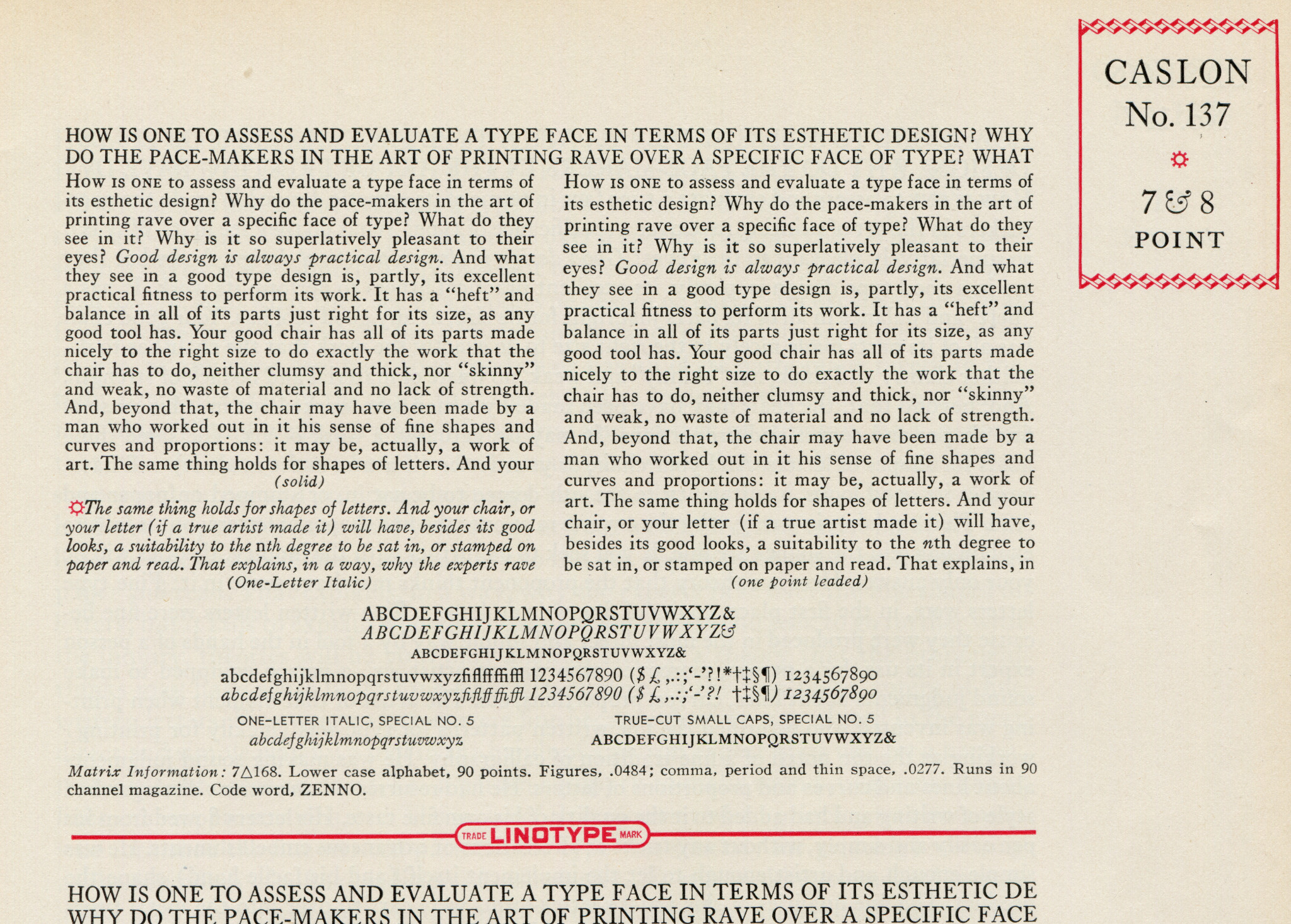
You can increase the space between lines by adding leads (pronounced "leds," like the metal lead). These are strips of non-printing typemetal material. Consider as an example 7 point Caslon No. 137. This is shown on p. 115 of Linotype Faces ("Big Red") . Here it is:
The paragraph in the upper left which begins "How is one to assess..." is Linotype Caslon No. 137, 7 point, set solid (as indicated by the note: "(solid)"). The body size of the type is 7 points, and the distance between similar points (such as baselines, where-ever you might care to think they are) on successive lines of type is also 7 points.
The paragraph to its right is 7 point Caslon No. 137 set with one point of leading (as indicated by the note: "(one point leaded)".) The body size of the type is 7 points, just as it is on the left, but the distance between similar points (such as baselines, where-ever you might care to think they are) on successive lines of type is now 8 points: 7 points of the body plus 1 point of leading.
Note: There is a potential confusion here for those trained in metal type who have perhaps spent too much time in the digital world. It is possible for the typefounder to cast type of one intended body size on larger bodes. There are several practical reasons to do this. For example, when recasting a face which was designed with vertical kerns, a typefounder who wished to avoid the expense and difficulty of kerning type [2] might cast it on a larger body size. If, for example, they were casting from matrices intended for 10 point type and using a 12 point body, the resulting type would be "10 on 12".
The Linotype/Intertype (or Monotype) user can do the same thing. So in the Caslon No. 137 example above, the one point leaded version could have been cast as 7 point slugs to which actual 1 point leads would have been added. But 1 point leads are hard to work with. So it is much more likely that the operator merely set the mold size to 8 point and cast it as "7 on 8 point" slugs [6].
Now, the final output is 8 points in height. And it has been "leaded" (even if the leading is integral with the slug). But this does not mean that this is "8 point leaded" type. It is 7 point type on 8 point slugs, which is "one point leaded" - exactly as the Mergenthaler Linotype Company indicated in their specimen.
It may or may not be possible to measure the body (point) size from a showing of type. You need to know the leading. For types with multiple face sizes on the same body (e.g., the Ludlow "Lining Plate Gothics," but many others as well) you would also need to have - and need to know that you have - examples of all face sizes at a given body size. If your specimen has only capital letters, you would also need to know if this was a showing printed from a true Titling font or merely an all-caps font (see below).
Even if you can do this measurement, you cannot derive the lining (or fitting) information from the showing.
A Titling Font is a font consisting only of capital letters (or other sorts which do not extend into the space of the descenders) cast such that it occupies substantially the full body of the type. You could not cast a lowercase sort with descenders on the same body.
A Caps Font is a font consisting only of capital letters cast such that they are in the normal vertical alignment of a regular upper-and-lower-case casting for this face.
A Titling Font and a Caps Font of the same type face at the same body size will not line with each other.
Given only a showing of a particular face which contains only capital letters, you cannot determine if it is a Caps Font or a Titling Font unless it is shown lining with something else.
The type specimen books often refer to matters of "line" or "lining": "American Line," "Standard Line," "Advertising Line," and so forth (and also, confusingly, to particular faces as "Lining Faces," which will turn out to be a related but distinct issue). These will be alien concepts to the 21st century student, because in digital lettering as we know it presently, we have lost entirely the concept of line along with the concept of body (point) size (you may think you have and can specify point size in digital lettering, but ask yourself what it really is and you find that you cannot; it no longer exists).
To come to an understanding of this, let's start with the following advertisement by the Inland Type Foundry from an 1896 issue of The Inland Printer. Examine it, and ask yourself this: from the long perspective of type as it was known from Gutenberg on, why is the showing of type in this advertisement unusual?
If you answer that this is a crazy jumble of unrelated types characteristic of the bad layout of the Victorian period, you're missing the point. It is quite deliberately a jumble of aesthetically unrelated types. The actual point is that this advertisement is a typefounder's tour de force. For the first 440 years or so of type, a piece like this would have been exceedingly difficult to set.
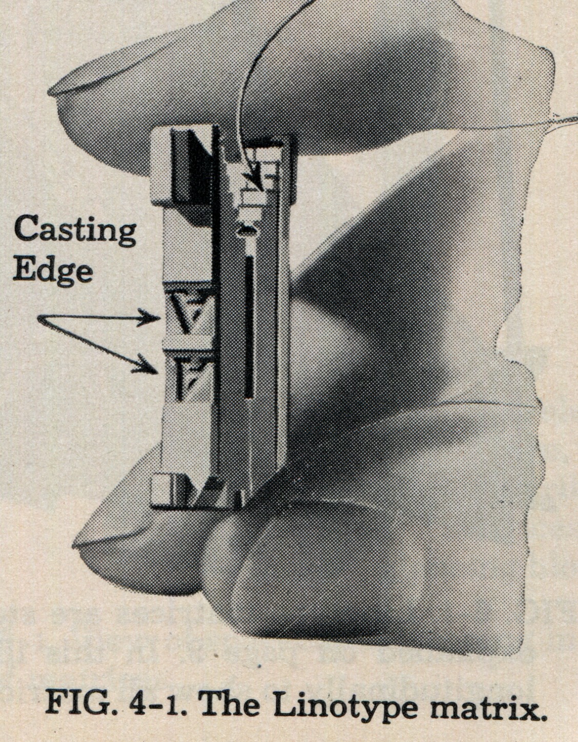
Fonts for composing (e.g., Linotype, Monotype) and non-composing (e.g., Ludlow, Nebitype) casting machines were fonts of matrices, not fonts of type. For Ludlow and the various Monotype machines, these matrices carried only one character per matrix.
Soon after the Linotype was introduced, however, the Mergenthaler firm realized that they had enough room on their matrices to carry not one but two characters for text and small display sizes. These were called, not surprisingly, "two-letter" matrices. Here's an illustration of a Linotype two-letter matrix showing its casting side. The regular casting position is the top letter, the auxiliary casting position is the bottom letter.
(This image, and the one below, are from the essay "The Big Scheme of Simple Operation" as reprinted (in this case) in the 1951 edition of the Linotype Maintenance Manual.)
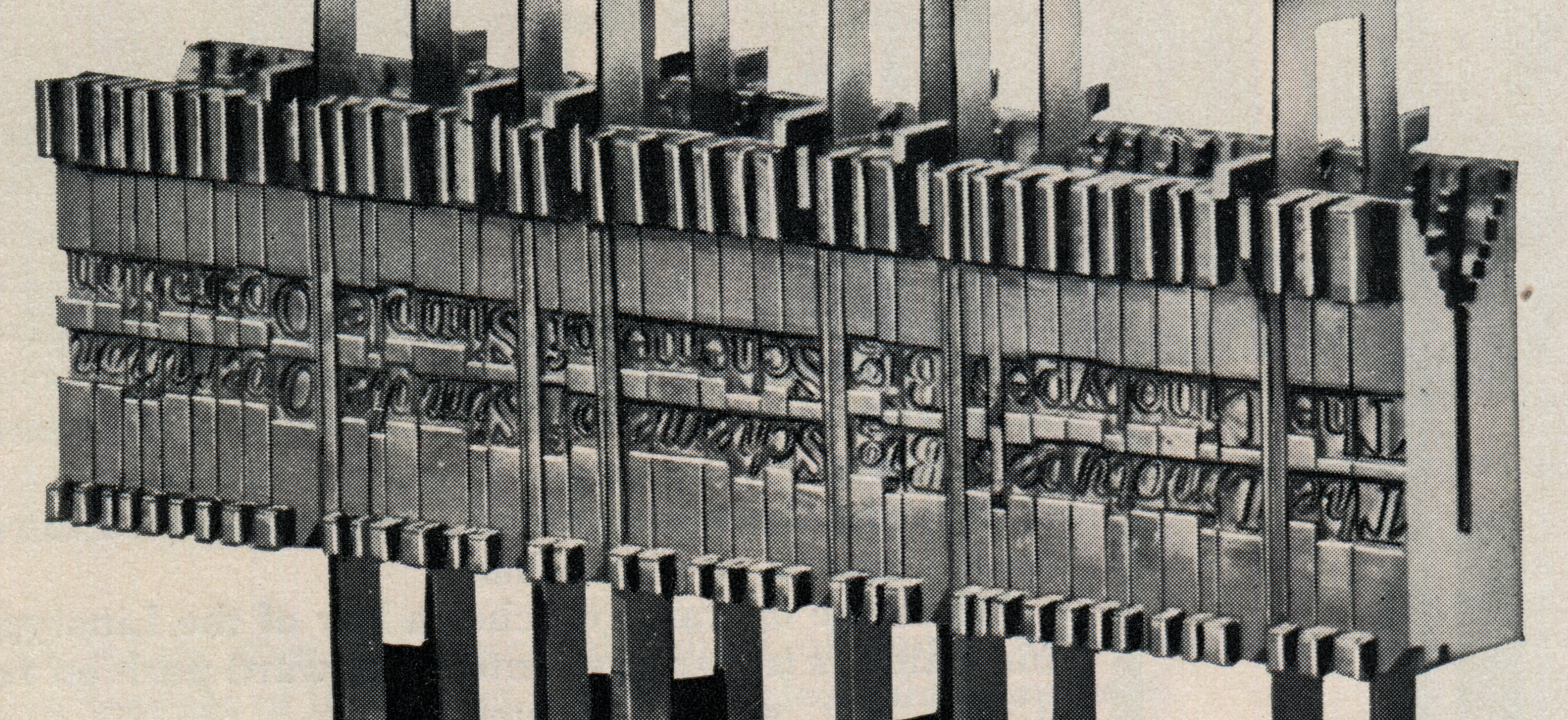
Here's an example of a line of matrices composed and ready for justification and casting:
Typically, the typeface in the auxiliary position was related to the one in the main position, but the relationship could be complex. It wasn't always simply an italic (as it is shown in the examples above). Sometimes it was a bold version of the same face. In many instances it was a different face altogether. So for example font 8 triangle 172 was Corona No. 2 with Erbar Bold.
The Linotype standard 90 channel magazine (and consequently the keyboard layouts for it) was typically laid out in thirds: lowercase on the left third, uppercase on the right third, and "everything else" in the middle third. There was enough room in this middle third potentially to accomodate a set of Small Caps. So it is not unusual, for example, to find a font which contains a roman, its related italic, and related small caps. (Example at random: 8 triangle 82, "Scotch w. It. & S.C.")
In each font the layout of the font itself provides information to you. For two-letter fonts which link together different typefaces, you know that the typographical department of the Mergenthaler company - an organization which by the middle of the 20th century was quite sophisticated - felt strongly enough that they were worth linking to go to the expense of cutting them as such.
Terminological note: typically, a font which was specified simply as "X with It." had the base typeface with its corresponding italic. Thus Linotype 10 triangle 18 was "Cheltenham w. It. & S.C." which contained Cheltenham roman with Cheltenham italic and Cheltenham small caps (all at 10 point). 10 triangle 82 was "Cheltenham Bold w. It." which contained Cheltenham Bold and Cheltenham Bold Italic. However, there were faces with names which can cause confusion. Thus 10 triangle 540 was "Corona w. B. F. No. 2," which contained Corona paired with the separate face called Bold Face No. 2 (not with a bold version of Corona).
It is also possible, within limits, to have two body sizes on the same matrix. This wasn't common, but it was done. Thus Mergenthaler Linotype 24 TRI 122 was "[24 point] Spartan Black Condensed with 18 point Spartan Heavy."
(Intertype also provided two-letter matrices, of course, as did third-party matrix manufacturers such as Simoncini and Star Parts. The Linograph used two-letter matrices as well. I'm not yet certain about some of the less common machines such as the Rogers Typograph and the Linotype Junior - but in any event they are not well represented in the literature of type specimens.)
One of the startling things you learn when studying older type specimens is that type body size, not face design, is the single most important aspect of type. This is at odds with the 21st century understanding of type, which valorizes letterform design above all else. It is also at odds with 21st century practice, where you simply have the computer scale your lettering to whatever size you wish. But even today it remains true when you really think it through. If you have a need for type at a particular size, and your preferred font doesn't really look good at that size, you'll change the font before you change the size.
Until the middle of the 19th century, typeface specimens were arranged in this natural order: by size. Often there was a loose overall grouping by style (romans, italics, ionics, egyptians, ornamented, etc.) Types were then shown by size within these groups and either named or numbered within the size.
By around 1870 (before the advent of the pantograph, it should be noted) typefounders began to gather up their existing types and arrange them by face design. This is the origin of the modern conception of the "typeface."
The introduction of the pantograph into type-making in the 1880s permitted, for the first time, the creation of a range of sizes from one pattern (or a few patterns at several sizes within the range). This inverted the natural order of type and allowed face design to be the primary aspect of type.
From this point on, type specimens assumed an essentially modern look, with typefaces offered in a series of sizes. (This is precisely what Updike objected to, and we should always recall that it is not the "natural" order of type, but a cost-cutting simplification introduced by a new technology).
In particular, in the early 20th century American Type Founders, under the guidance of the two Bentons, undertook an enormous program to re-line, re-fit, and generally regularize much of their vast stock of inherited types (while also introducing many new types, of course).
It wasn't until the 1930s, however, that ATF started to identify each "series" of types by a number. While these series were quite familiar to 20th century printers (and remain familiar to those early 21st century letterpress printers still using metal type), they are not present in any of the large ATF specimen books (e.g., 1906, 1912, 1923).
A type "series," in this mid-20th century use, was a single face design in a single variation over a range of body (point) sizes. So for example ATF series no. 67 was Cheltenham Bold in all sizes, while ATF series no. 73 was Cheltenham Bold Italic in all sizes. The unit of purchase was a font [7] at (of course) a partiular size. So if you ordered from your ATF dealer a job font of 12 point series 67, you got a couple of pounds of 12 point Cheltenham Bold.
Because ATF was an amalgamation of many type foundries, it at times used types which were already well known by the numbers of the foundries which developed them. These numbers were incorporated into the name, not the series number. So for example ATF series 50 was Caslon Oldstyle No. 471. (But in complex ways sometimes earlier series numbers were integrated into ATF series numbers. McGrew discusses this in his appendix on ATF series numbers.)
Note that the series numbers of different type foundries and matrix manufacturers were independent of each other. So for example Lanston Monotype also made Cheltenham and would rent or sell matrices for Cheltenham Bold. It was their series 86. (ATF series 86 was Cheltenham Medium Expanded; there is a regrettable and accidental overlap of numbers between ATF and Lanston for Cheltenham.)
The best list of ATF series numbers is in McGrew's American Metal Typefaces of the Twentieth Century.
The numbering/coding system used for Lanston Monotype matrices and matrix fonts was simultaneously precise and very confusing. The notes here barely begin to address their issues.
The first point for the modern reader to realize is that the series numbers for the American (Lanston Monotype Machine Co.) and English (Monotype Corporation Limited) companies were completely independent of each other. Series number lists for Lanston in the back of McGrew and online in the Notebook on Lanston Monotype Type Series Lists and Indexes. The corresponding lists for the English firm are not online (and are in copyright, so they cannot be literally reprinted). However, the holdings of the Offizin Parnassia are extensive, and their list of their holdings can serve as a reasonable approximation to a complete list for the English company. See http://www.parnassia.org/
Lanston Monotype used the same series number across all sizes: matrices for the Composition Caster, for the Type-&-Rule Caster, and for the Giant Caster. Often these series numbers bore alphabetic suffixes. For a more complete discussion of these, see the Lanston "Monotype Matrix Information" literature reprinted in the Notebook on Lanston Monotype Matrix and Case Arrangement Information.
In display sizes, the 'H' suffixes are of particular interest. They indicated matrices with various typographical refinements (e.g., 'H1' for shortened descenders). On the matrices themselves, these 'H' (and other) codes appeared after the point size, not the series number. This distinction is not always easy to maintain in lists (which can lead to confusion since 'H' was also used after the series number; see below).
In composition sizes, various single-letter suffixes indicated the style of the matrix in relatively loose (and sometimes confusing) terms. Thus, 'A' meant that the face was a "Modern Roman," 'C' that it was a "Modern Italic," and so forth. ('H' in this use indicates "Old Style Italic Small Caps"). Lanston did not seem to use these suffixes for display sizes, but type founders using Lanston matrices certainly did (at least in their markings on boxes of mats).
These have occasionally caused trouble for those involved with digital lettering. Even the great Don Knuth (a hero of mine) slipped. He cites the source for his " Computer Modern" digital lettering face as "Monotype Modern 8A." ( {Knuth 1986}, p. vi). But 8A indicates just the roman within series 8. It's pretty clear that Knuth meant to include other variations as well (e.g., italic). So he should have said simply Monotype Modern Series 8 [8].
[TO DO: I have a composition matrix case with series 8 in it; photograph it.]
Matrix fonts from the Mergenthaler Linotype Company were identified by means of a numeric code which contained a triangle symbol in it. The triangle itself was simply an identifying mark unique to Mergenthaler. The number before the triangle indicated the body (point) size of the font. But the number after the triangle was not a typeface number. It was simply a numeric code which uniquely identified this particular matrix font within Mergenthaler's matrix fonts at that size.
So for example 24 TRI 122 was "Spartan Black Condensed with 18 point Spartan Heavy" while 8 TRI 122 was "Century Expanded with Century Bold."
Very late in Mergenthaler Linotype history there seems to have been some attempt made to use the same post-triangle number for the various sizes of a single type series, but this was a late development not typical of their practice for most of their history. It cannot be relied upon.
To the modern reader who probably isn't running a Linotype or Intertype (though some of us are), the important thing to realize is just that the post-triangle number isn't a typeface number. So if you run across a showing of 24 TRI 122 and really like it (why this would be so I couldn't say), don't assume that 122 means "Spartan Black."
For more on Mergenthaler Linotype matrix and font identification, see the Notebook Mergenthaler Linotype Matrix Identification (which also reprints several editions of the booklet Useful Matrix Information).
Note that the Mergenthaler Linotype Company (the American company) was a separate concern from Linotype & Machinery Ltd. (the English company). While at times they shared information (and had a complex history of mutual ownership which hasn't been sorted out completely), their matrix font development was mutually independent.
For more on identifying linecaster matrices and fonts generally, see the collection of Notebooks on Matrix Information and Identification for Composing Linecasters.
Intertype used the symbol "Pt" (meaning "point," obviously) where Mergenthaler used a Triangle (but often it split the code over two lines as stamped on the matrix itself). In the simplest terms, just treat these "Pt" codes in the same way that you treat Mergenthaler "triangle" codes: The number before the "Pt" symbol is the body size while the number after uniquely identifies the font.
There is a subtle difference between the two systems. For Mergenthaler Linotype the post-triangle number was unique only over the specific body size, for Intertype the post-"Pt" number was unique across the entire line of Intertype matrix fonts. So, for example, you could get away with specifying just Intertype "1772" for a font number - looking it up you discover that this is 10 point Vogue with Bold. But still it is best to cite the entire font code, "10 Pt 1772", so as to avoid the implication that 1772 somehow indicates Vogue generally.
For more on Intertype matrix and font identification, see the Notebook Intertype (US) Matrix Identification (which also reprints several of the Intertype matrix identification booklets.
Mergenthaler Linotype specimens from the 1930s on often refer to the "A-P-L." This was the confusingly named "All-Purpose Linotype." It was made by Mergenthaler Linotype, and was based on Linotype technology, but it wasn't really a Linotype as we generally think of it, and it certainly wasn't all-purpose.
The (regular) Linotype was always limited in the maximum size of type that it could produce. (The limiting factor turned out to be not so much the maximum point size you could fit on a matrix but the width of the matrix. Width goes up as point size goes up, and they ran out of width in the magazine channels first. So there were some very condensed faces up to 60 point which could run in the magazines, but this was not possible with regular width faces.)
The practical solution for the printer was to purchase a machine from another company to do their headlines: the Ludlow Typograph. This worked for the printer, but not for the Mergenthaler Linotype Company in its attempt to be all things to all printers. For a very brief time early on, Mergenthaler was a Ludlow reseller, but this arrangement broke down for reasons unknown. (They also resold the Thompson Type-Caster briefly.)
The Ludlow was (and is - they're nearly indestructable) a machine in which you set matrices by hand to produce slugs of type. It has no keyboard. Its advantage is that it allowed much larger type. You can set headlines on the Ludlow, and food store and other advertising becomes simple.
In the 1930s, the Mergenthaler company built a machine to compete with the Ludlow. They started with a Linotype base and casting mechanism and added to it equipment for setting matrices by hand in sticks (like a Ludlow, but incompatible). It had its own native matrix format, but could also be adapted to use matrices from other machines. It could do the same thing as a Ludlow (possibly more), but it cost twice as much. It was a commercial failure, and only a very few survive.
But Mergenthaler Linotype undertook an extensive program of type development for the "A-P-L." These are prominent, for example, in the massive circa 1939 Specimen Book of Linotype Faces ("Big Red") .
For the modern reader, the important point is that in a Mergenthaler specimen book the A-P-L matrix fonts were intended for hand setting while the regular fonts were intended for machine composition.
(Aside: Ludlow made matrices in a very wide range of sizes as well - not just display and headline sizes. These were all meant for hand setting (even 6 pt. Lining Plate Gothic No. 1, which sets solid at 4 points). But while in text sizes Ludlow matrix fonts were intended for hand setting, in text sizes Linotype matrix fonts were intended for machine setting. This may or may not be significant; probably it isn't.
One other feature in these specimens which might now be puzzling has nothing to do with type, but rather is a part of late 19th and early 20th century commercial practice: telegraph codes.
[TO DO (but the answer is "yes" - see On the Importance of All Typefoundries)]
As you begin to work through the literature of type specimen books, you'll discover (of course) specimen books by establishments which cast type or which made matrices. But you'll also discover a different kind of specimen book: those put together by printers to advertise the types that they were capable of using. Such printers' specimen books are not, of course, primary documents in the history of the making of type. As such, they've received scant attention.
Yet they are not to be despised, and they have several merits or advantages. Precisely because they have not been seen as important they're often the only specimen books which remain affordable to the impoverished student. As such they are valuable sources for (usually) well-printed specimens of types - full analog on-paper originals in a world where, increasingly, all the poor student has are low-resolution scans. They're also important as source documents in the use (vs. the making) of type. They show the types the presses laid down good money to buy. As such they may be better indicators of what types were used when than the specimen books of the typefounders and matrix makers.
I suppose that it is only natural when looking at a beautiful old type specimen book to look primarily at aspects of the letterforms. It thus seems a shame that so many of these books are cluttered up with other, boring, stuff. But I would make here a plea in defense of this other typographical material.
Consider as an especially fine example the last large Mergenthaler Linotype specimen book, the Specimen Book of Linotype Faces (a.k.a. "Big Red") from about 1939. It is a little over 1200 pages long. Of these fully 95 are devoted to nothing but figures and fractions. That's about 8 percent of the book used up just for dull numbers, and that's not counting the numbers in other sections. It has a whole section on nothing but making tables, one on type for telephone books, and another on nothing but dots for leaders. It is even lowbrow enough to have a whole chapter on food store typography, as if the ads for your supermarket were important.
But that's just the point: they are. Words, and words in type, exist to communicate in the real world. It isn't all fine printing and artists' books. The types in this specimen kept the world informed when printing was one of the ten largest industries in the world. Easily a quarter of this Mergenthaler specimen book is devoted to the details of making type work in real-world applications - figures and food store ads and newspaper legibility That so much of effort was put into providing printers with the resources to do commonplace work well is a testament to a vanished industry and a way of thinking about type that we have lost. (If you think we haven't, take a look at your average supermarket ad of today.)
As is the case with any craft, the subtlest parts are the ones which at first seem the most boring.
1. We lost them needlessly. Aside from the physical aspects of the impression of metal type on paper, there is no aspect of metal type which cannot be represented in a digital analog. We have not done so, however, and as a result digital "type" does not fully represent real type and, consequently, we have in this digital age been consistently wrong in our use of terminology from real type. For various discussions of this, see the "theoretical" and "terminological" sections of A Heretic's Guide to Type.
2. A "kern" is a part of the type itself (regardless of technology; metal, photographic, or digital). "Kerning" is an operation in type-making. It cannot be done by a user of type, only by a maker of type. It is another term which was not understood by the early programmers of digital "type" systems and which has been systematically mis-used in the digital era. If you think that as a user of type you can kern it, you have been mislead by stupid programmers who didn't actually understand the tools they were building for you (I am speaking here as a programmer myself who is ashamed of my colleagues). You probably mean "letterspacing" (which for metal type might also have included "mortising").
3. From {Carter 1937}"
"... we should hardly judge his 14-point and his 18-point to be members of one family."
4. No, not "Benton in 1885." The first use of a pantograph to cut matrices was in 1882 at the Central Type Foundry by William Schraubstadter and Gustave Schroeder. Linn Boyd Benton probably cut patrices in 1883 (although there is no actual documentation of this), and was advertising the ability to cut punches by machine in steel in 1884. Benton did not actually cut matrices directly until 1899, by which time matrix engraving was an established third-party commercial service. ATF and H. L. Bullen constructed a distorted history of the origins of machine type-making which canonized Benton, to their advantage, but which obscured his actual contributions. These contributions were other than, and from a technical point of view deeper than, what ATF/Bullen said they were. (He developed no less than five distinct pantographs, for example.) Linn Boyd Benton was a precise man, and he deserves equal precision in our memory of him. See also the Notebook on typemaking Beyond (and Before) Benton.
5. From {Updike 1922}:
"But a design for a type alphabet that may be entirely successful for the size for which it is drawn [his italics], cannot be successfully applied to all other sizes of the same series. Each size is law unto itself [my italics] ..." (Vol. 1, p. 11)
6. When a Linotype mold is increased in size, the extra space goes at the top of the type body. The alignment of the type on the slug remains the same relative to the bottom of the type body. Type of "x on y" (e.g., 7 on 8) is lined the same as x (lined the same as 7 point, in this example). True 8 point type would have a different lining and would not line with 7 point type.
7. Typically by "font" we now mean what would more precisely be called a "job font." This is a relatively small amount of type suitable for getting started for general jobbing work. You can't set a book with just one job font. When handset type dominated large-scale composition, printers typically bought "weight fonts" - fonts by the pound. There were also other sales units available, such as "foundry lines" (36 pica lines of just one sort, not fonted). For a more complete discussion, see the Notebook on Type Foundry Products.
8. Confusingly, in a different place he calls it "Monotype Modern Extended 8A." I can find no indication in any surviving Lanston literature that an extended version of series 8 was ever cut. ( {Knuth 1982}, p. vi). Lanston Series 8 was cut in lowercase, caps, and small caps from 4 to 12 point for regular composition matrix case arrangements and in "large comp" sizes (14 and 18 point) for special case arrangements. It was not cut in display or Giant Caster sizes.
{Carter 1937} Carter, Harry. "The Optical Scale in Typefounding." Typography, No. 4 (Autumn, 1937): 2-6.
{Knuth 1982} Knuth, Donald E. "The Concept of a Meta-Font." Visible Language, No. 16 (1982): 3-27.
This paper has been reprinted in Digital Typography. (Stanford, CA: CSLI Publications, 1999): 289-313. Since this is the more generally accessible source, page references here are to this reprint.
{Knuth 1986} Knuth, Donald E. Computer Modern Typefaces (Volume E of the series "Computers and Typesetting") Reading, MA: Addison-Wesley Publishing Co., 1986.
{Updike 1922} Updike, Daniel Berkeley. Printing Types: Their History, Forms and Use (1922).
All portions of this document not noted otherwise are Copyright © 2014 by David M. MacMillan and Rollande Krandall.
Circuitous Root is a Registered Trademark of David M. MacMillan and Rollande Krandall.
This work is licensed under the Creative Commons "Attribution - ShareAlike" license. See http://creativecommons.org/licenses/by-sa/3.0/ for its terms.
Presented originally by Circuitous Root®
Select Resolution: 0 [other resolutions temporarily disabled due to lack of disk space]