Abbey. (By 1887)
Abbey is cited by { Loy/Johnston/Saxe p. 64, 67, 147} from a circa 1892 source, but it is slightly older than that. Loy attributes the cutting of the "Abbey series" to William W. Jackson for Farmer, Little & Co. Loy says of Jackson that "He also cut the Abbey series for Farmer, Little & Co., a face which never reached the popularity of the De Vinne, yet is generally liked."
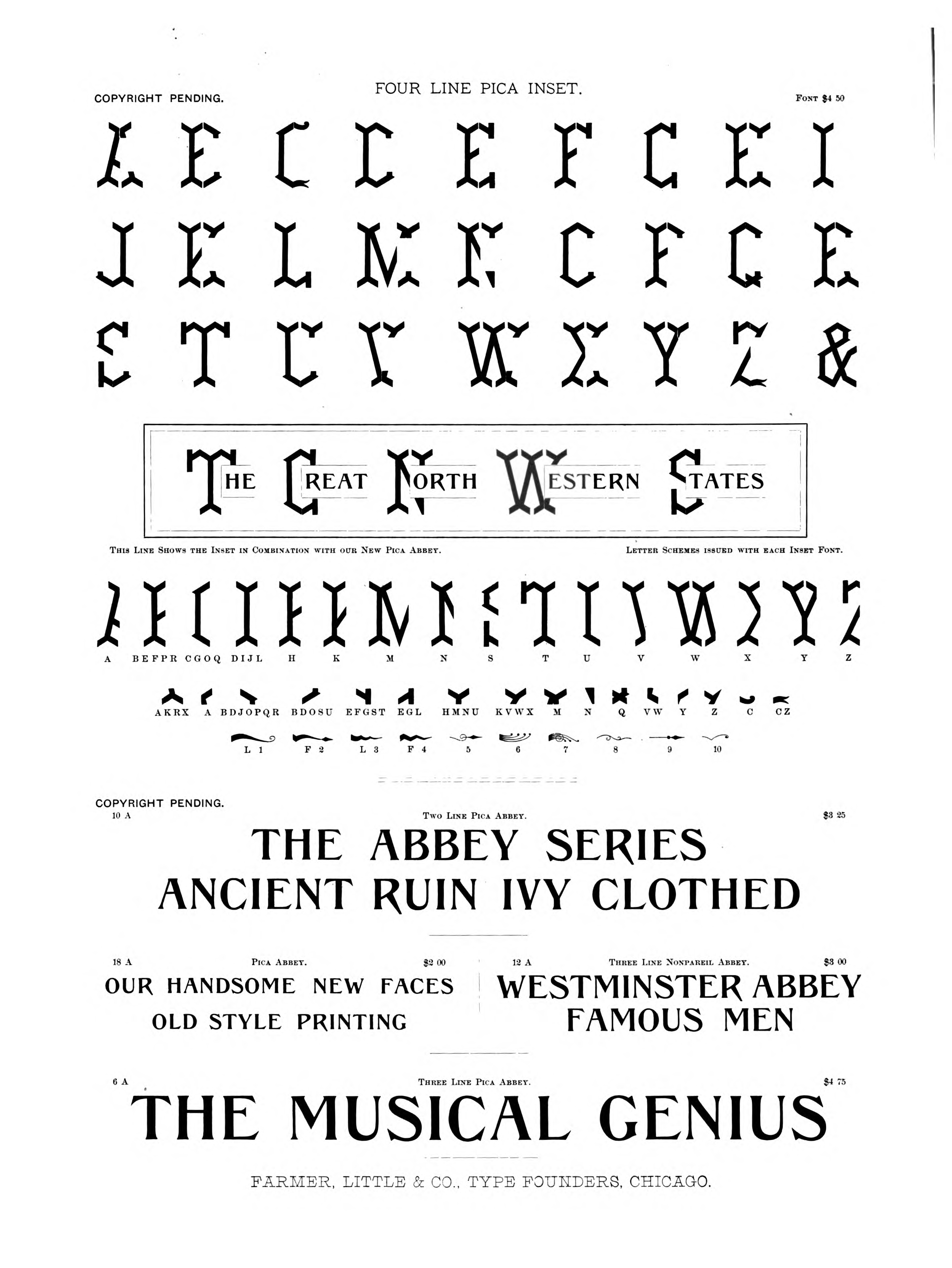
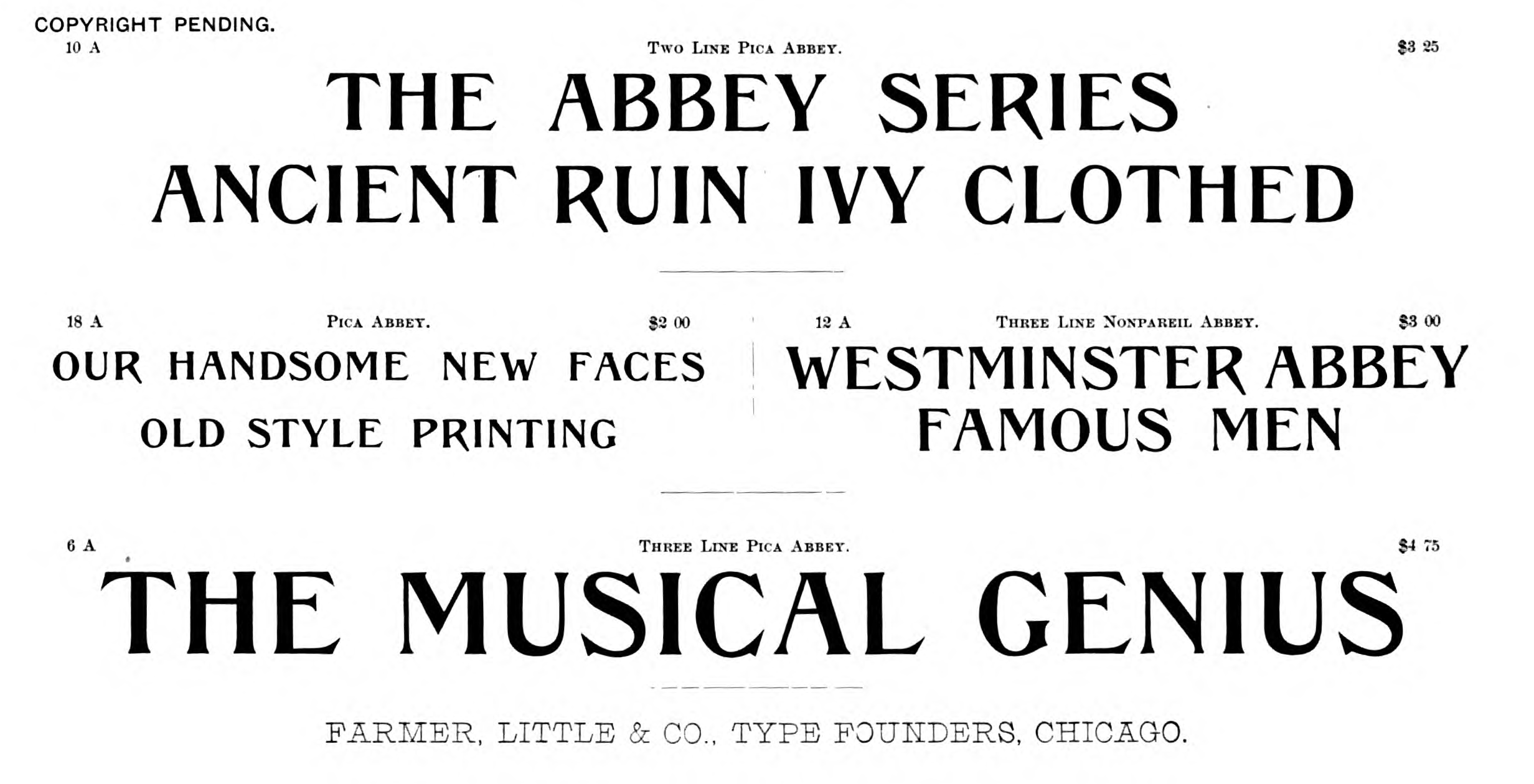
The first showing that I have discovered is from the Farmer, Little & Co. Specimens of Printing Types, Brass rules, Etc. of 1887 That specimen is unpaginated, but it appears on image 114 of the digitization:
Here's the entire page (below, left) along with a one-page showing from the 1889 Selected Type Faces (below, right):
Abbey was reviewed (unfavorably) in The American Bookmaker Vol. 12, No. 4 (1891-04): 99-101. It is a curiously ill-tempered review, worth quoting at length as an exmaple of how to construct an argument which is entirely wrong using almost-right factoids:
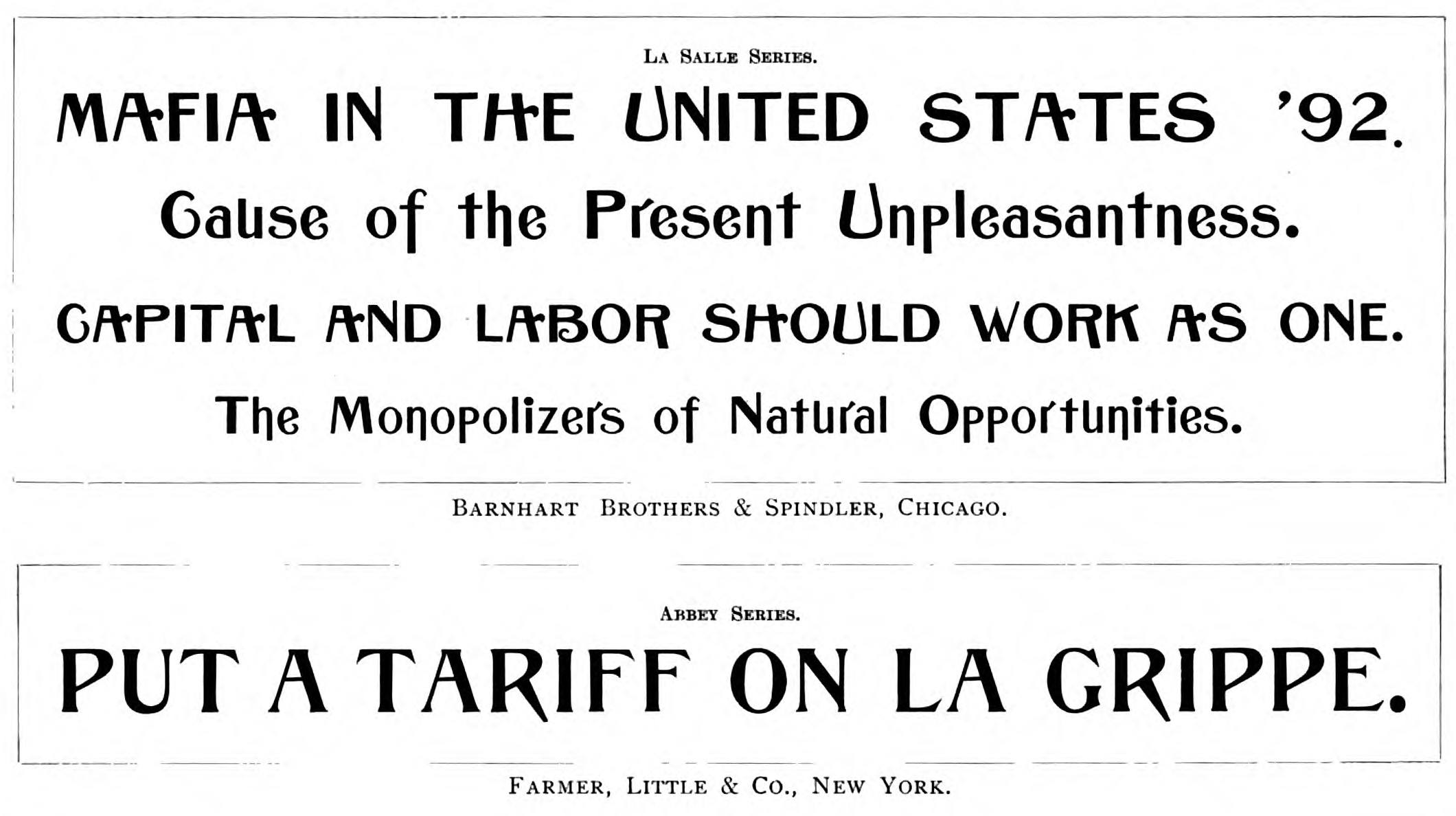
"Our type founders have been following in one rut for years. It took all the time from the date when printing was invented down to 1830 for one hundred faces to be invented [ok, so this remark isn't almost-right, but rather as wrong as it is ill-informed], but since then many thousand faces have been brought out. Of course, with the necessity of having some adherence to the original forms, very few original ideas could be evolved, so that there was a startling resemblance sometimes between two styles which came out in different places, by different firms and under different names. Three faces of sixteenth century old style were brought out simultaneously in Bostin, St. Louis and New York, and a design which originated in New York, where it proved a failure, was taken up in Germany and then copied by a Western founder. These are well-known instances. Recently, howver, there have been some examples of imitation, in which an idea devloped by one founder was speediily copied by another, and two variations on the same theme have been exhibited together in these columns. Not knowing which establishment claims priority or where the idea came from, it can only be said that the resemblance exists.
" Barnhart Brothers & Spindler, of Chicago, produce a face which they call La Salle. Farmer, LIttle & Co. have a style which they denominate Abbey. The reader can see them toether, the La Salle being represented in 24 and 18 point, and the Abbey by 24 point. Both are heavy faces and both irregular, and there is a lower case to the former, which the latter does not have; but in spite of the details in the finish and construction of the letters, which are many, the identity of thought is so great that in all display lines where one would answer the other would also. It is plain that one would never have been attempted had the other not existed, or something very close to it. The distinguishing feature of each is an old style form as a basis, and a great thickening of the body marks. The serifs are completely suppressed in one, and show very little in the other, yet the faces, in spite of their weight, carry no impression of a gothic to the mind. They are essentially Roman characters. The face from Barnhart Brothers is by far the most ornate. Each has a certain measure of value, although not of the highest. What need was there for intelligent type founders to inflict upon the printing public two such faces?
"But, as a matter of fact, was this idea original with either? Did not some of our founders bring out faces which had this motive? Were not the faces " Quaint" and " De Vinne" two of these from a " St. Louis house, and did not the " Dickinson foundry attempt another? Such speedy imitations or appropriations of motives show great paucity of ideas on the part of designers of type. If the type founders' trust comes, as most likely it will, it is hope that it will be able to prevent duplication of ideas this way, and that each style of type thereafter brought out shall have not only a new name but a new idea."
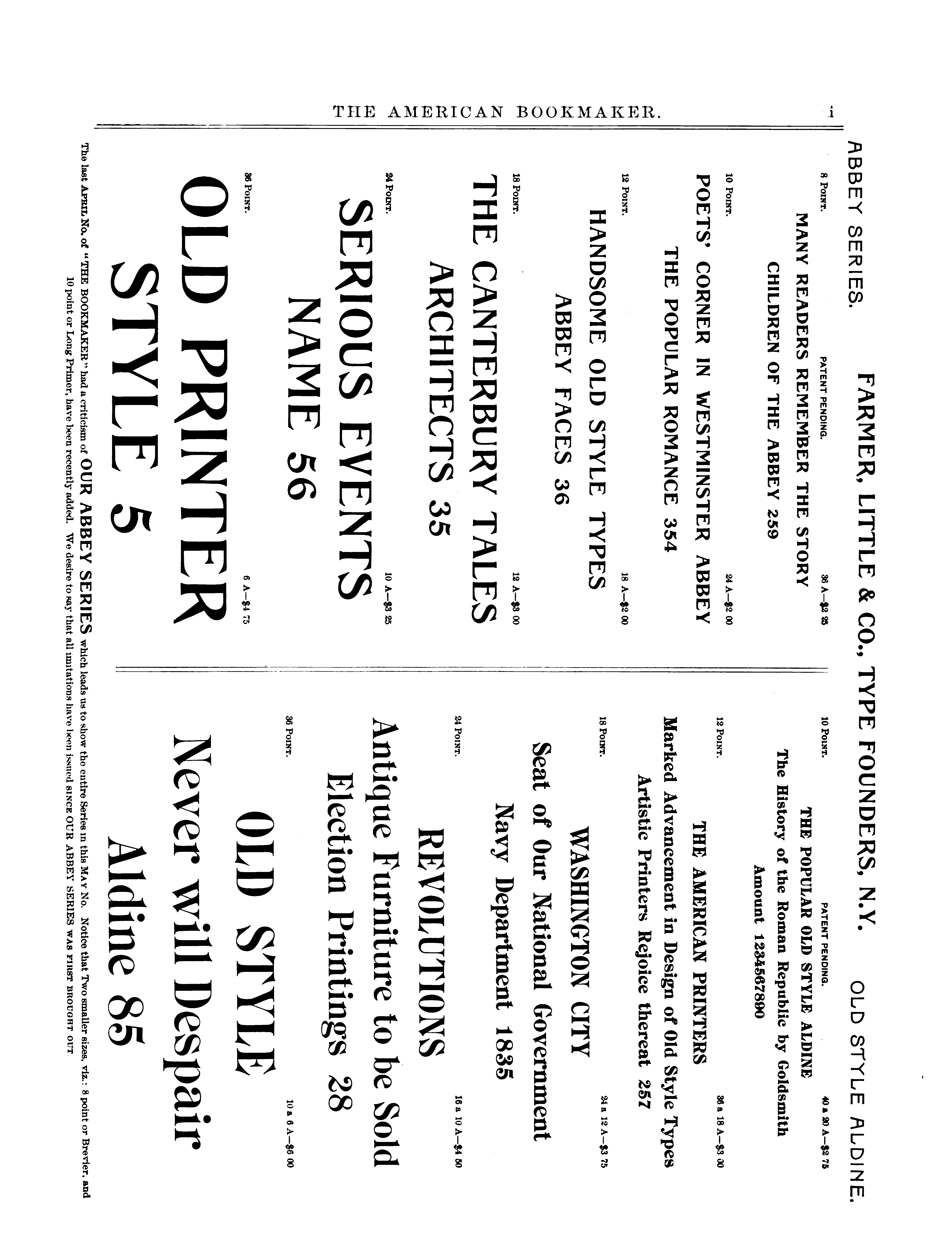
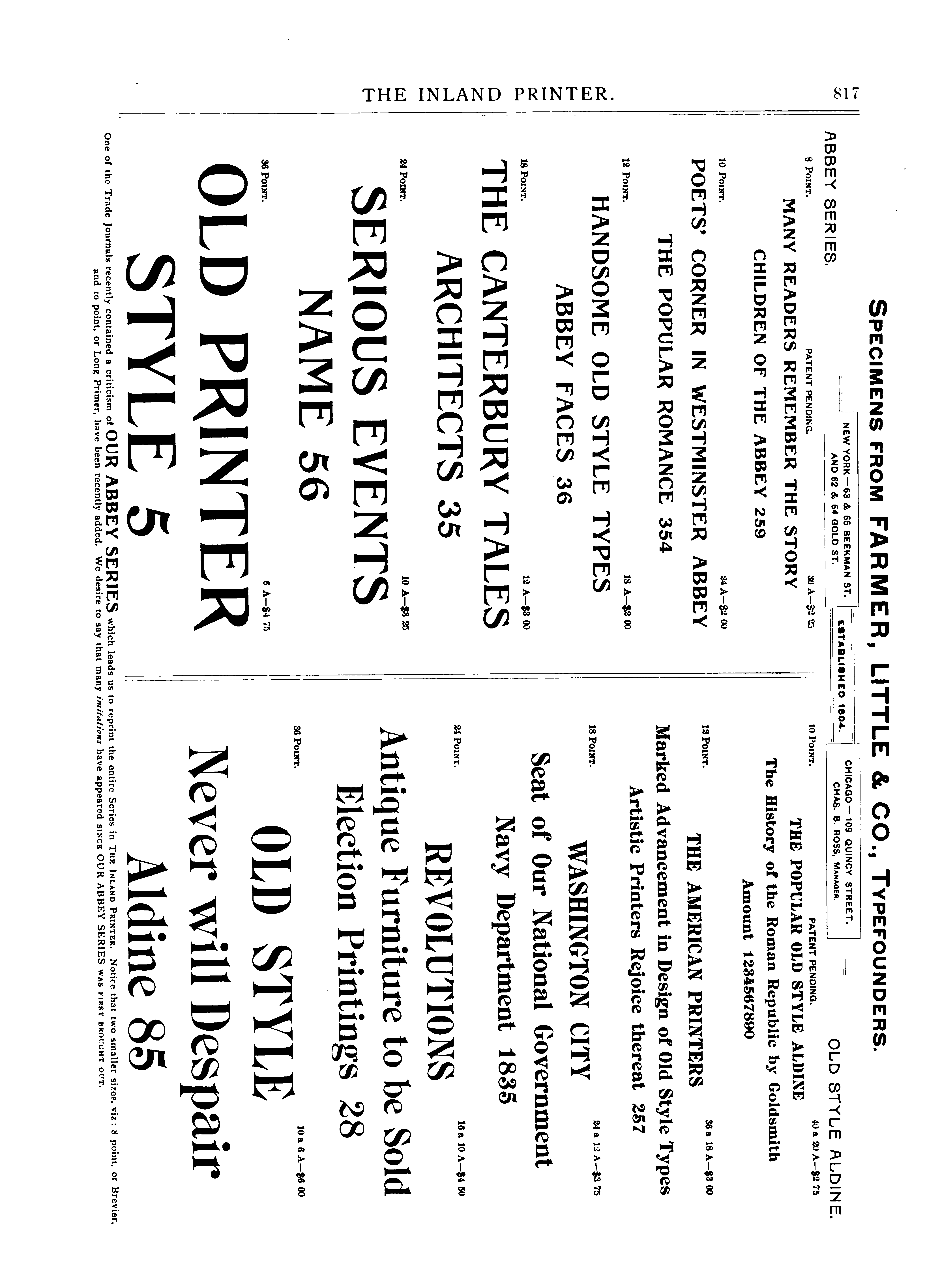
It was shown in The American Bookmaker Vol. 12, No. 5 (1891-05): p i (following p. 158; image 245 of the University of Michigan digitization). In this showing, Farmer observes: "The last april No. of "The Bookmaker" [sic] had a criticism of our Abbey series which leads us to show the entire Series in this May No. Notice that two smaller sizes, viz.: 8 point or Brevier, and 10 point or Long Primer, have been recently added. We desire to say that all imitations [by other typefounders] have been issued since OUR ABBEY SERIES was first brought out." Here is the showing:
This same showing appears in The Inland Printer The Inland Printer Vol. 8, No. 9 (1891-06) (p. 817 image 893 of the PDF of the University of Michigan digitization). In the discussion of the showings, on p. 840 (image 916 of the PDF of the UM digitization), the editors (responding, presumably, to The American Bookmaker) say that "The criticisms made on the Abbey series by one of our contemporaries recently were considered by the makers of this letter entirely uncalled for, as Farmer, Little & Co. were the first to produce the face or anything like it, and its enormous sale and the fact that all offices having the series use it constantly, goes to show that it is a most popular style of letter."
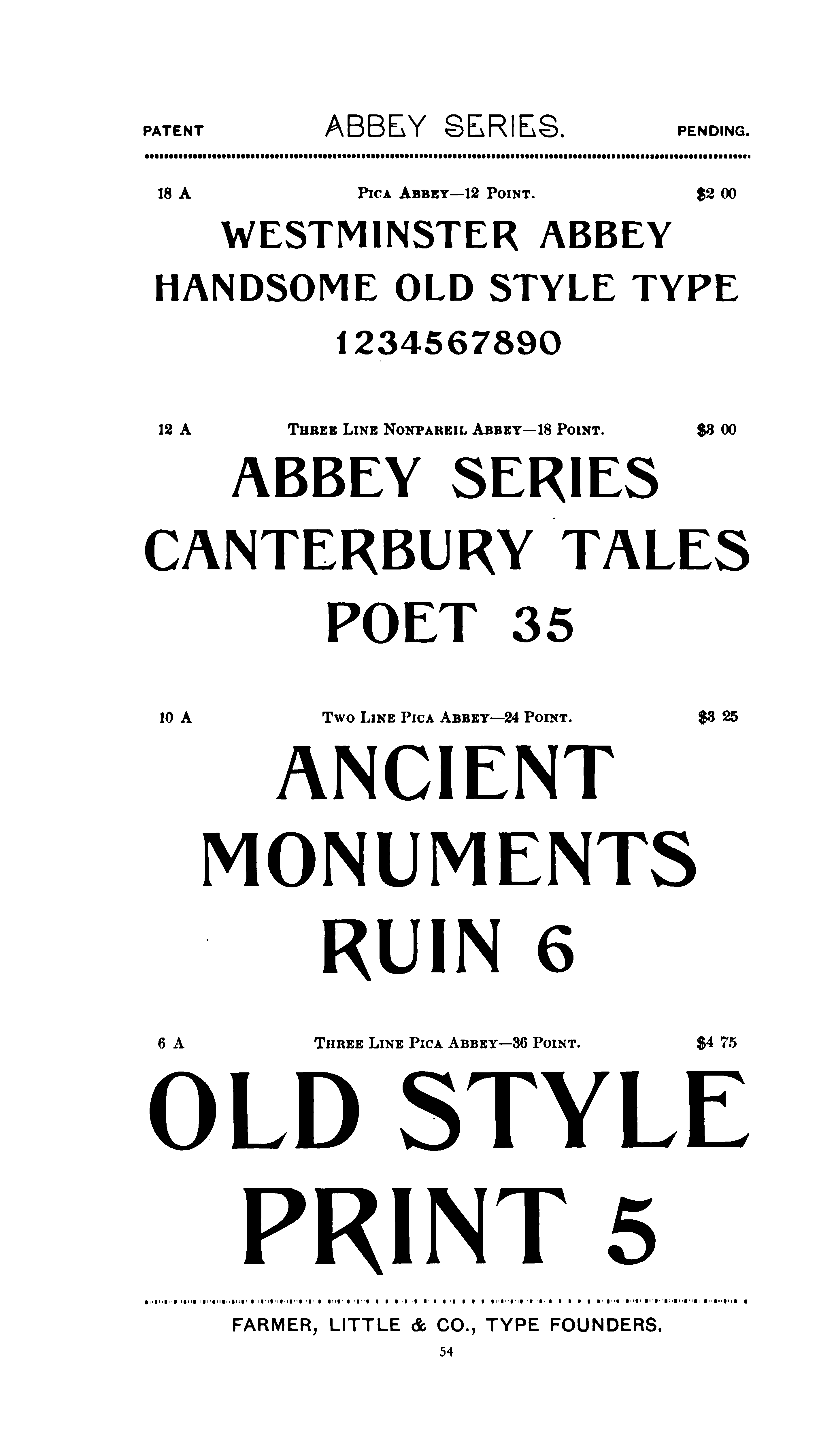
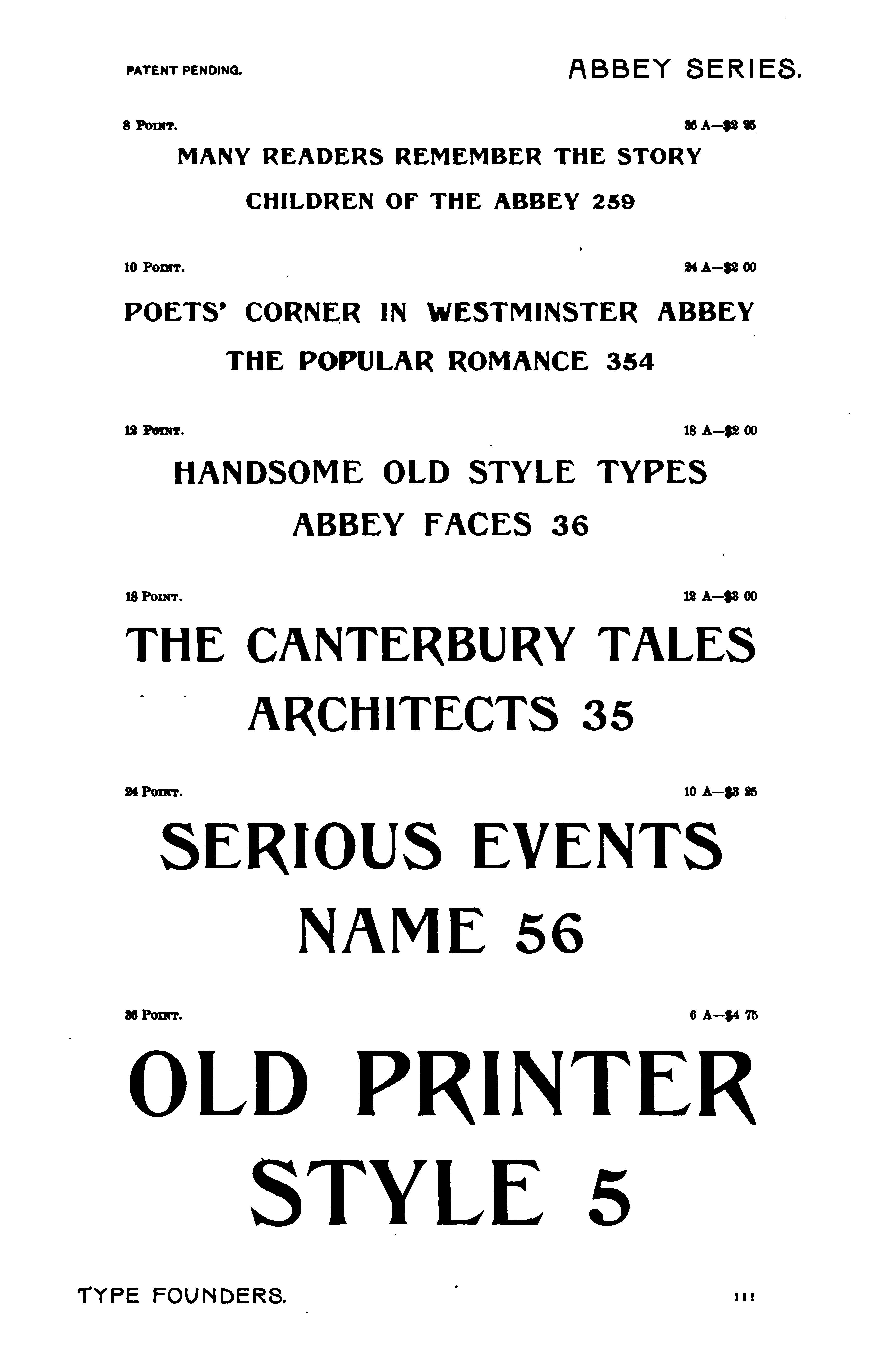
By the 1893 specimen book, Abbey appeared in the regular body of the book (p. 111) but Abbey No. 2 appeared in a supplement to the book (paginated continuously with it) of "Our New Specimens." The 1893 specimen book showing of Abbey is the same as that of the 1891 advertisements:
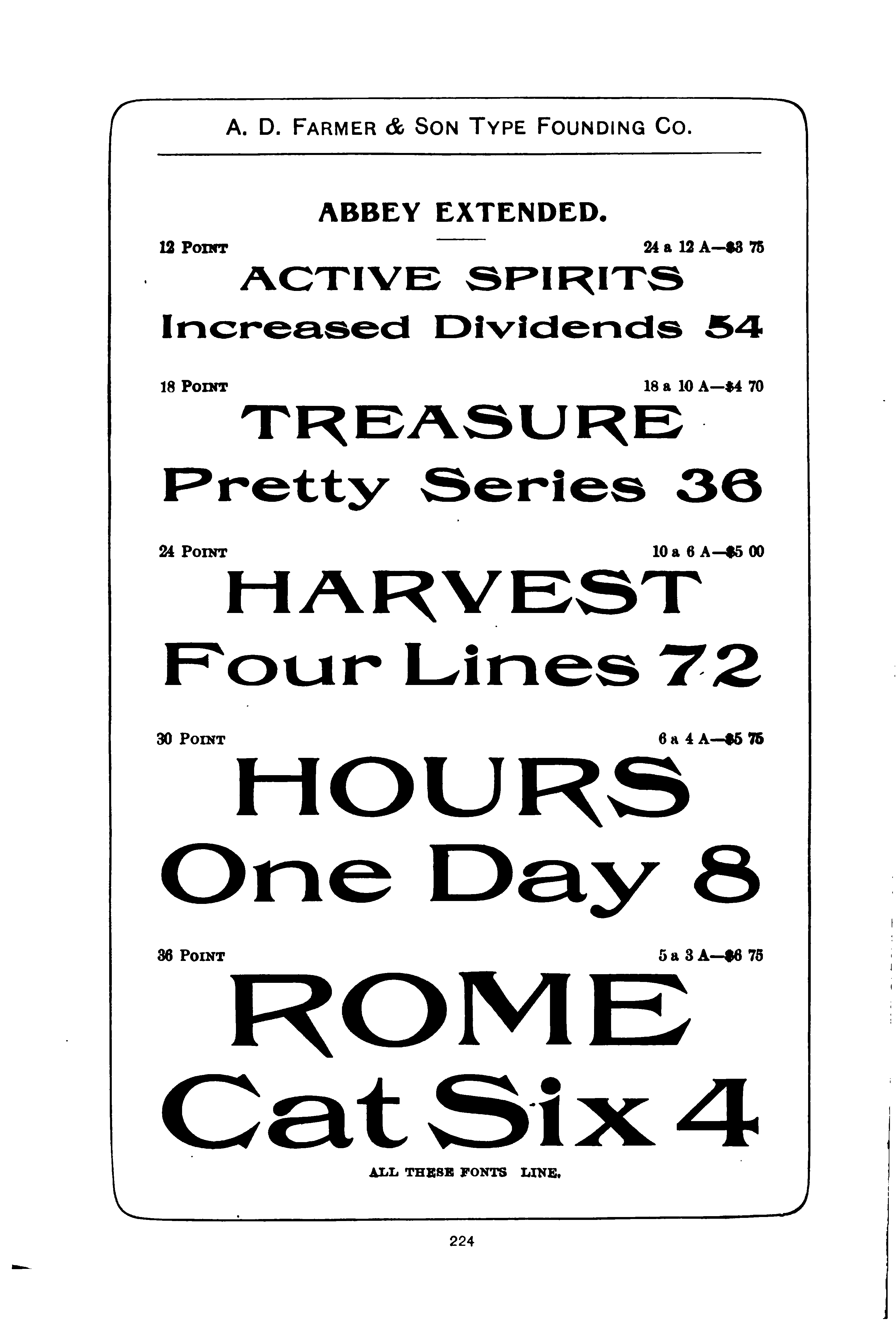
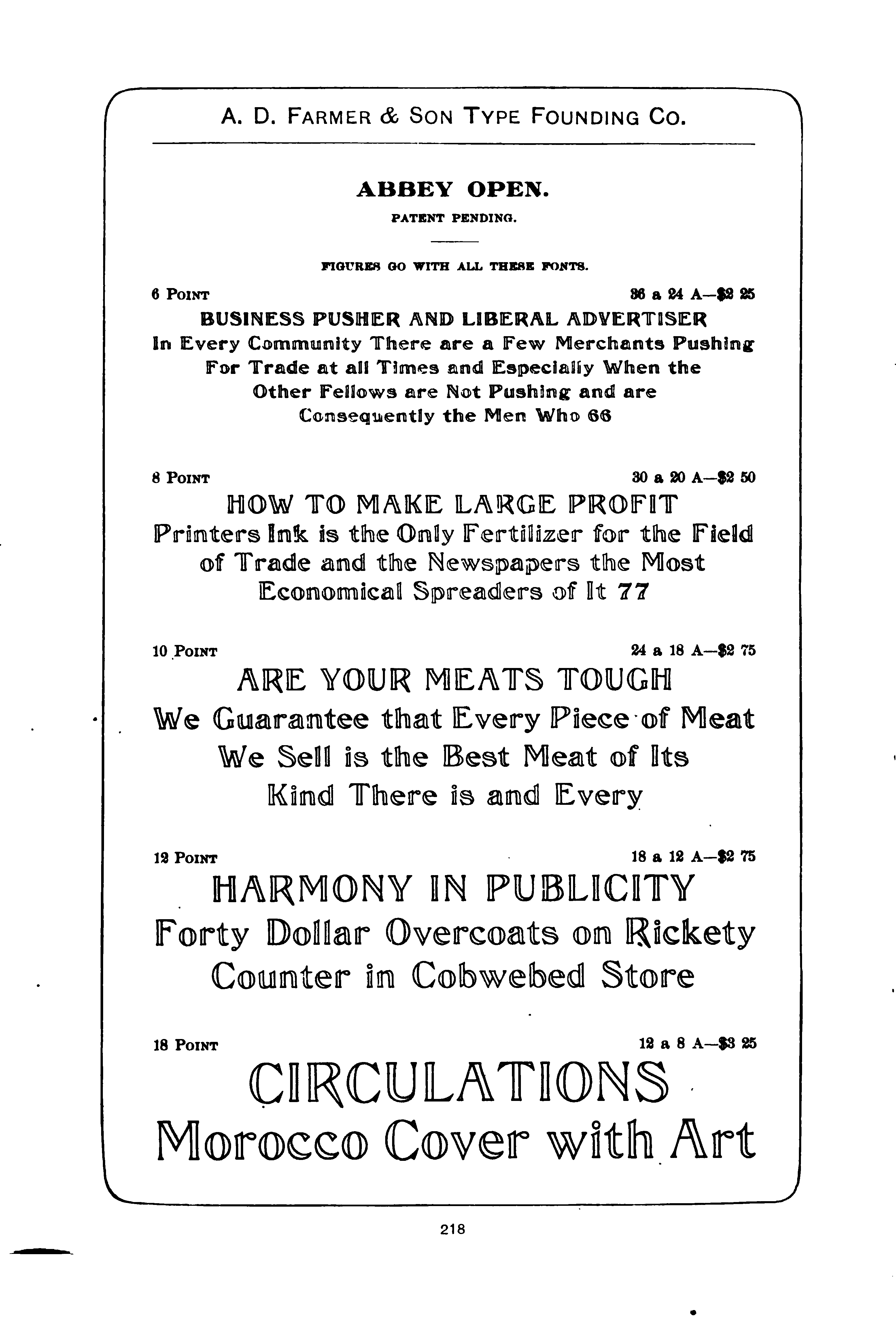
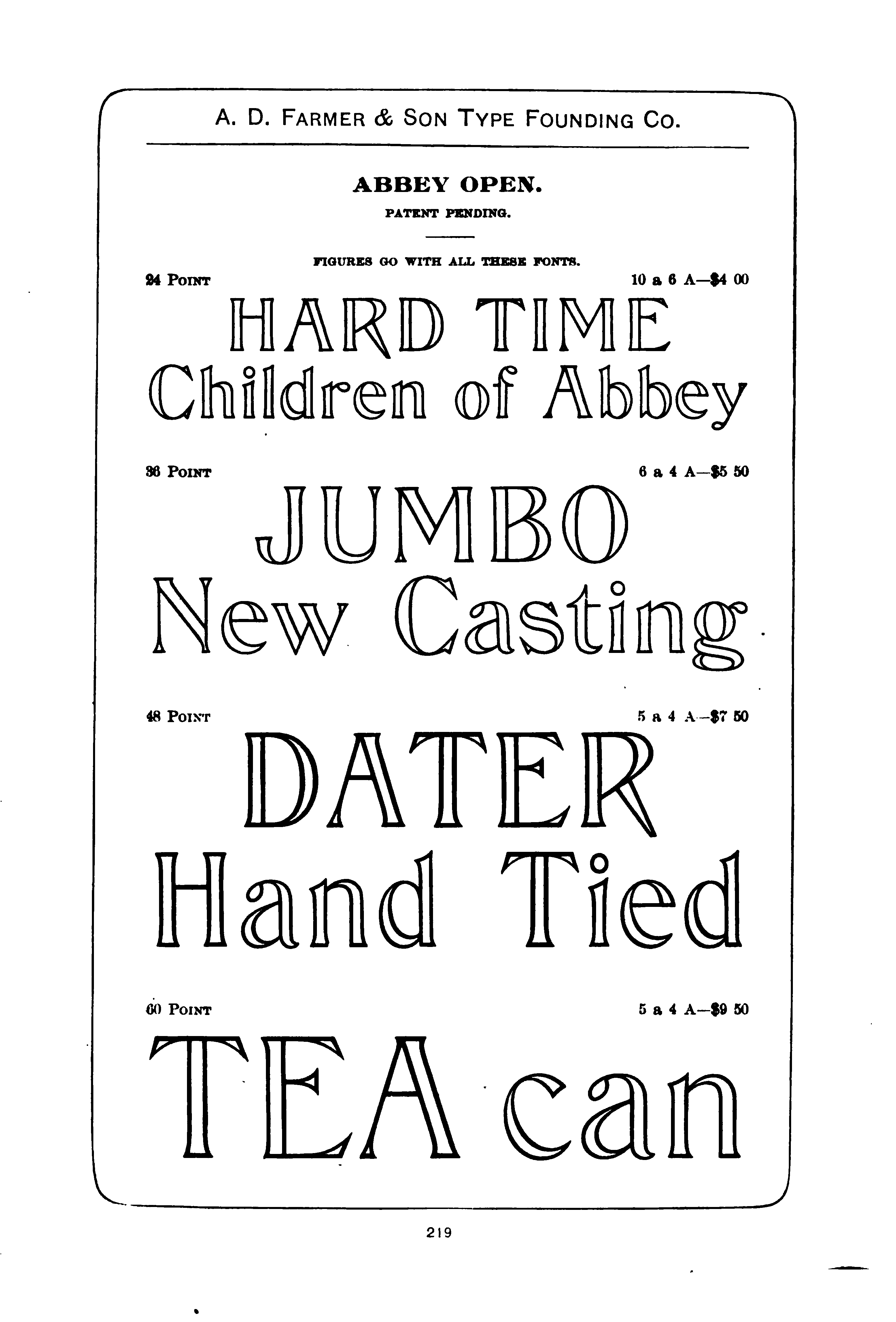
By the 1900 specimen book, the original Abbey disappears and only Abbey No. 2 remains (but with the addition of Condensed, Extended, Text, Text Italic, and Open variations).
Despite claims of "patent pending" (or 1887 claims of "copyright pending," which display only a shaky understanding of the nature of copyright), I have been unable to locate this face in the US patent record.
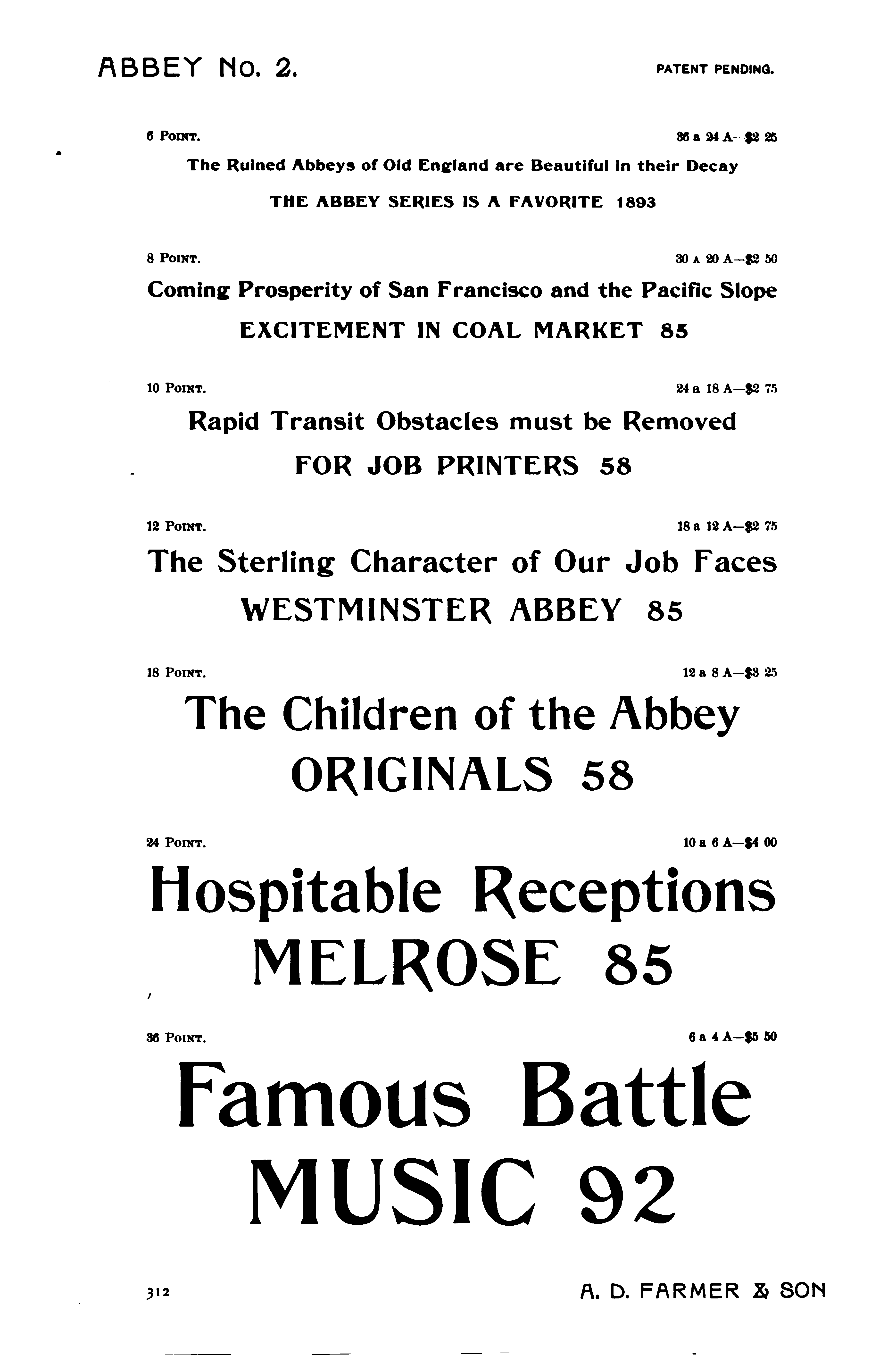
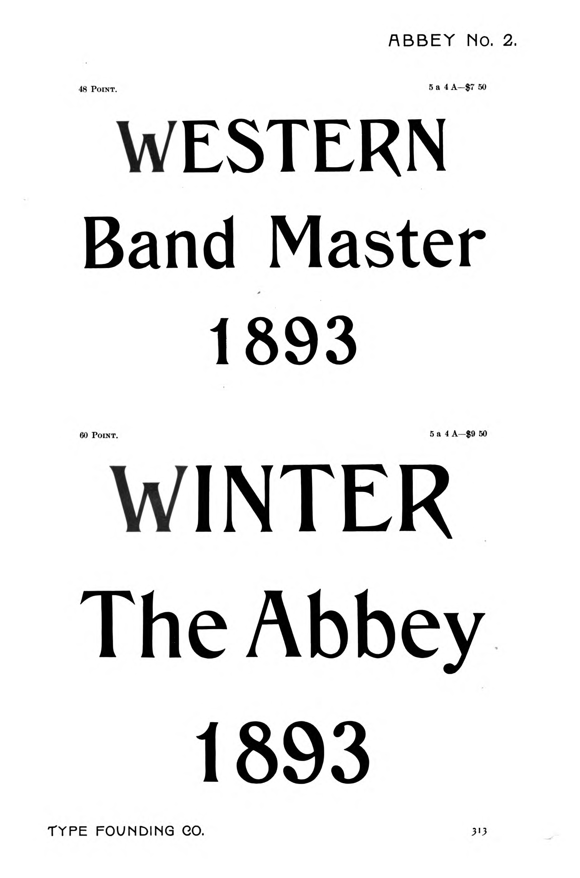
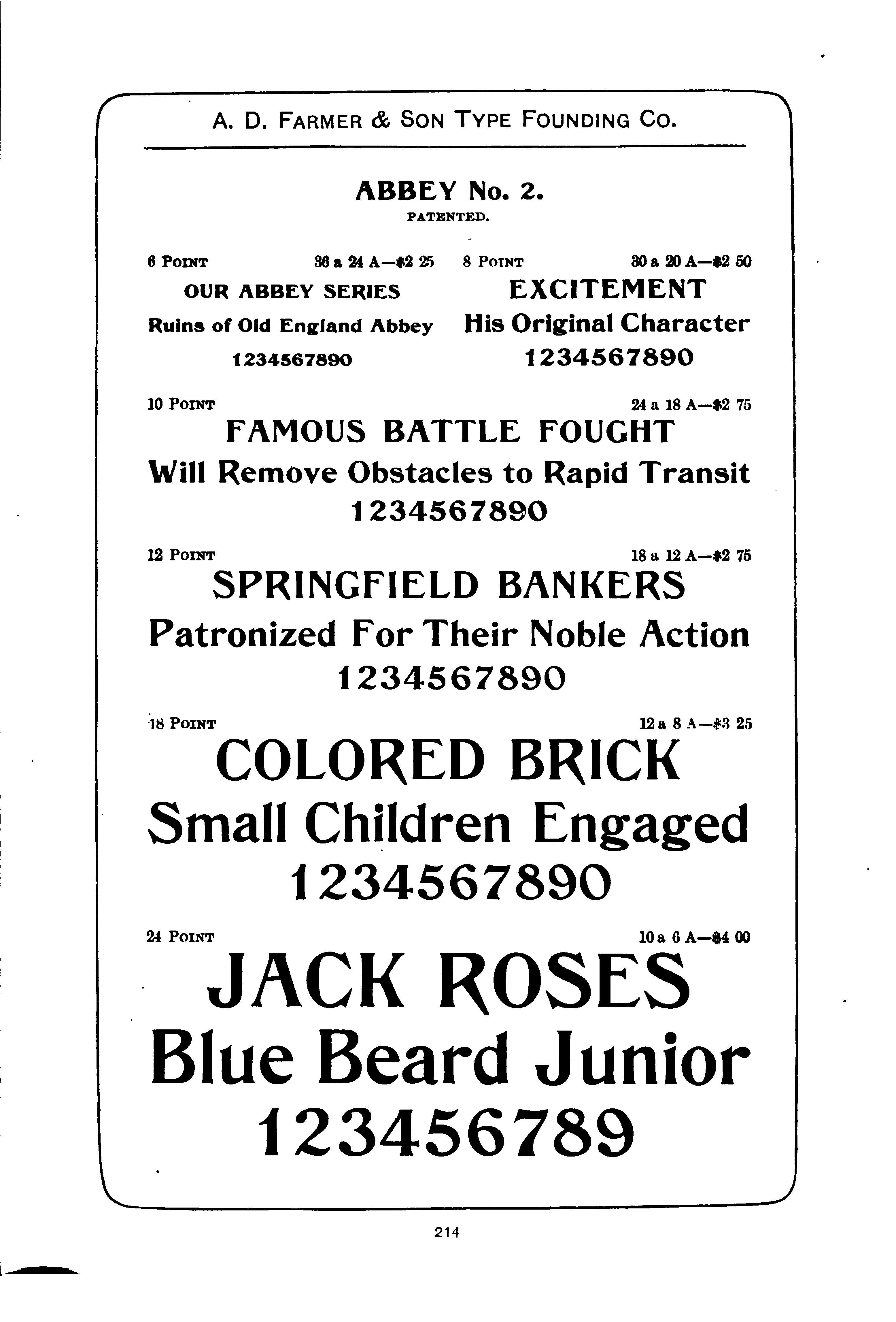
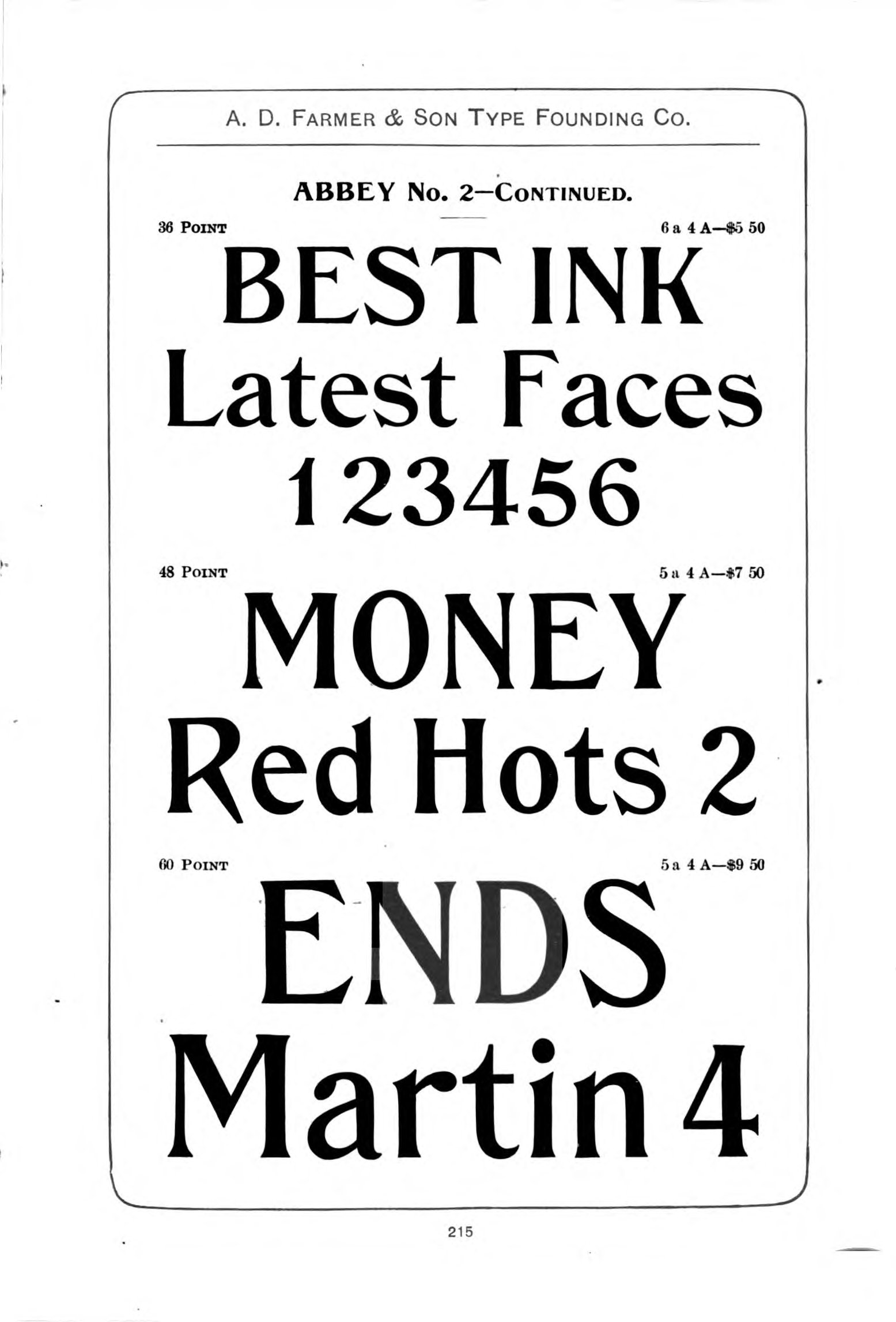
Abbey No. 2 (1893)
As noted above, the 1893 specimen book contains both the original Abbey in the main text and, in a supplement of "Our New Specimens," Abbey No. 2. It is very similar to Abbey, but note for example the capital 'W'.
Here it is in 1893 (pp. 312-313):
And in the 1900 specimen book (pp. 214-215):
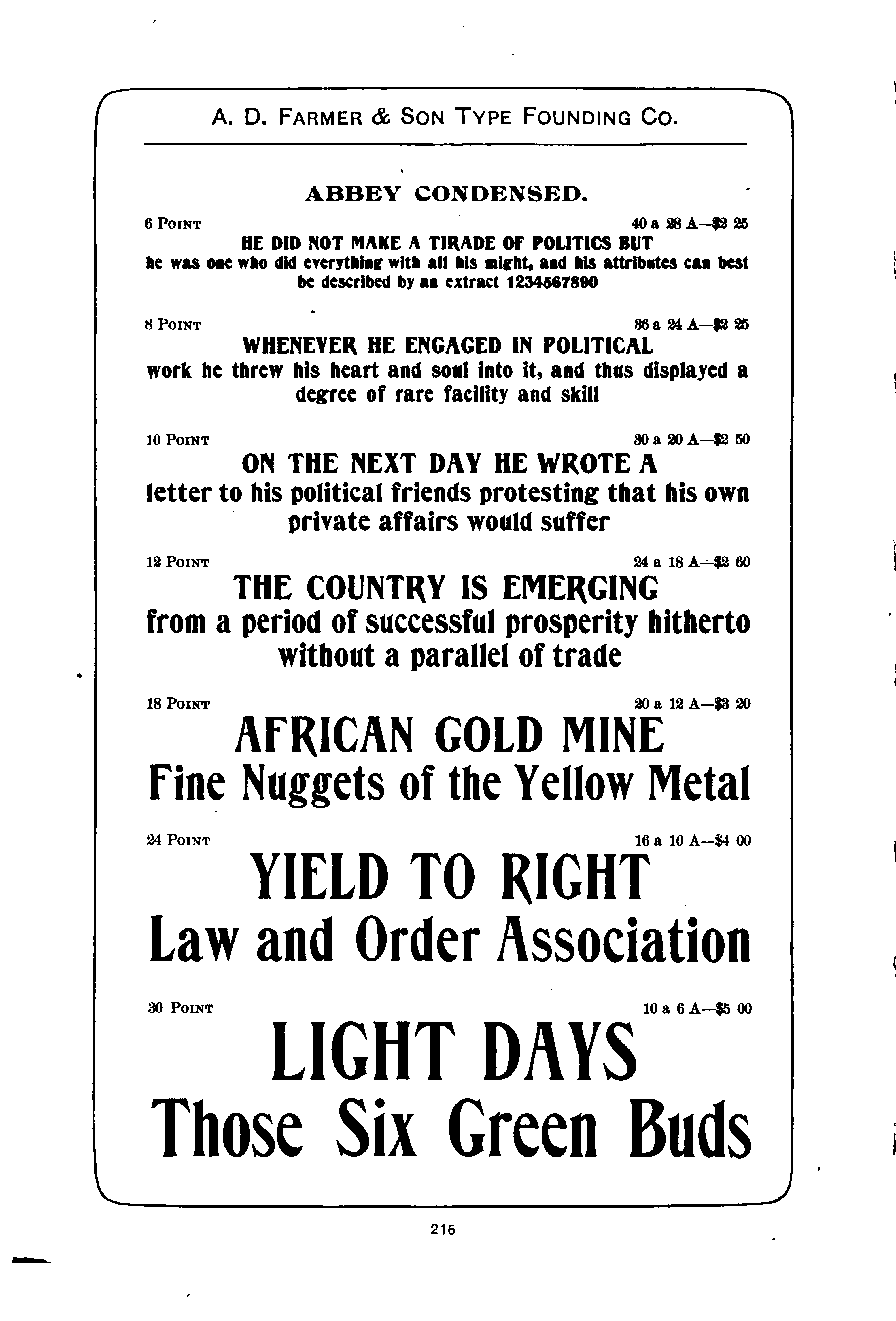
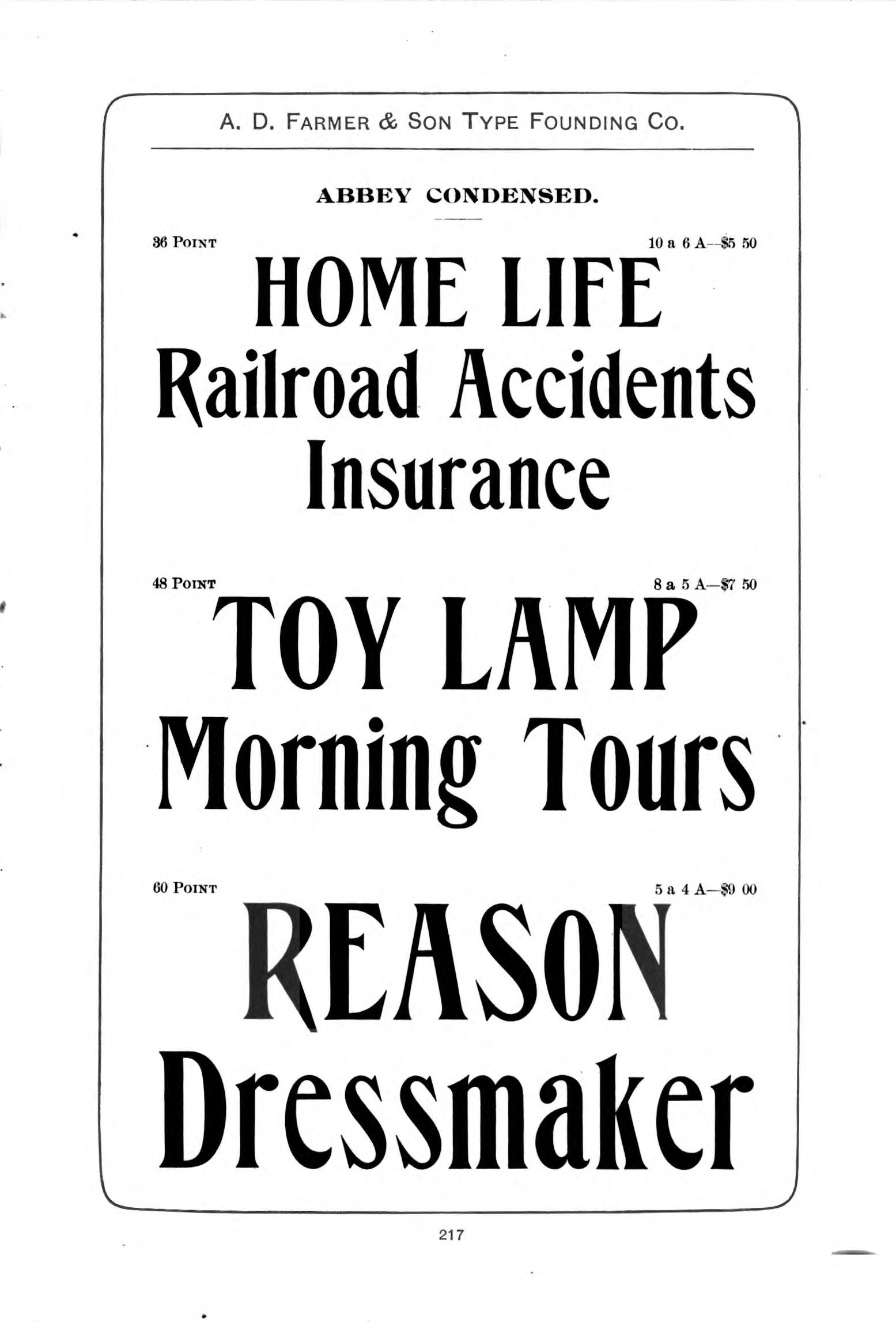
The matrices for Abbey Condensed were acquired by Kelsey. They renamed it Saunders Condensed. (Source: Briar Press posting, thread 31214, by David Jasmund on 2012-08-29.) It does not, however, appear in Kelsey specimens that I have examined from the post-WWII period. The matrices were then acquired by Hill and Dale Private Press and Typefoundry (Richard L. Hopkins), and then in the late 1990s went to the Pygmy Press & Type Foundry (Dan Jones) Pygmy cast them circa 1999 (the Pygmy prospectus for this casting calls the original face "Abbey Text Condensed," but in fact it is simply Abbey Condensed).
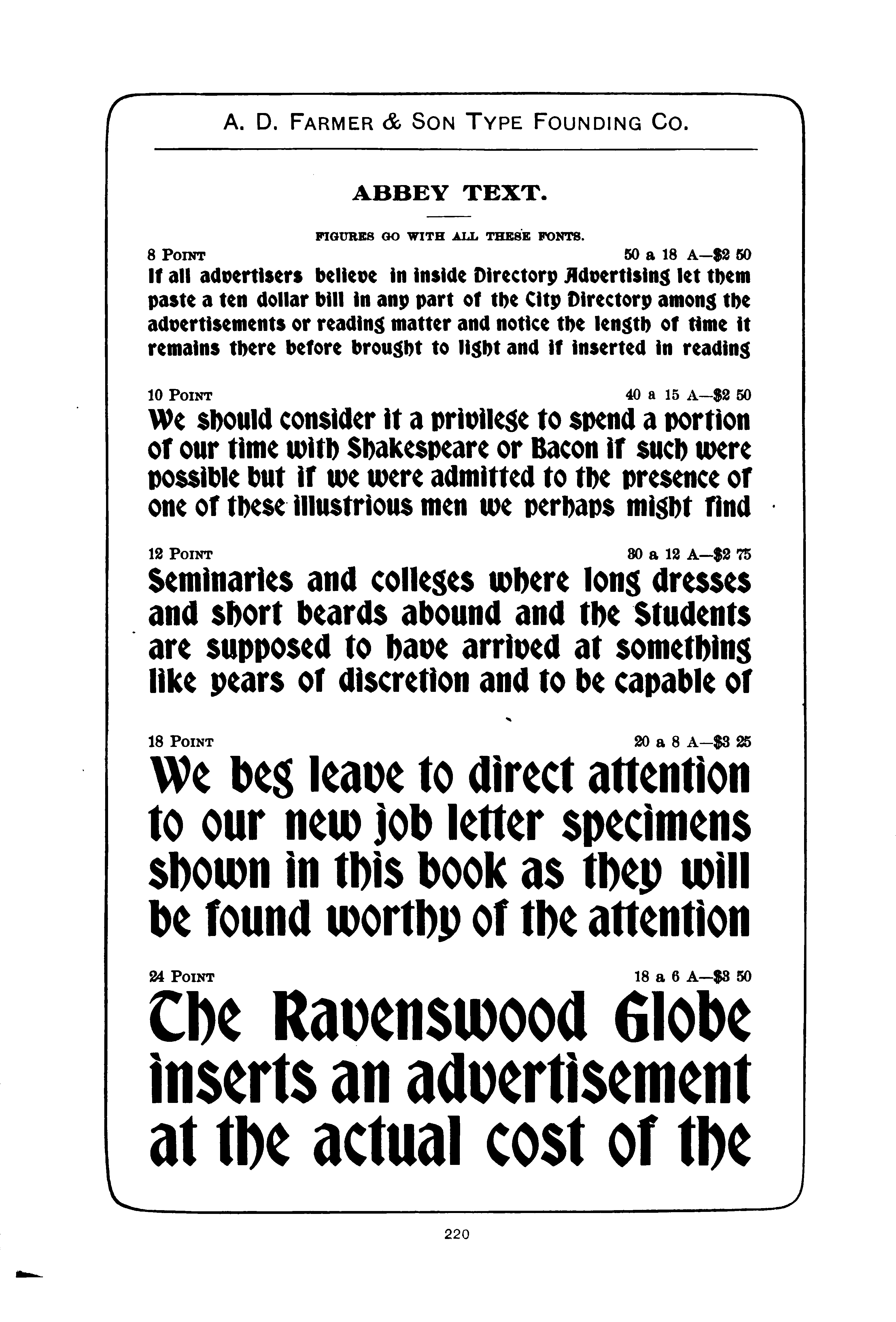
Abbey Text
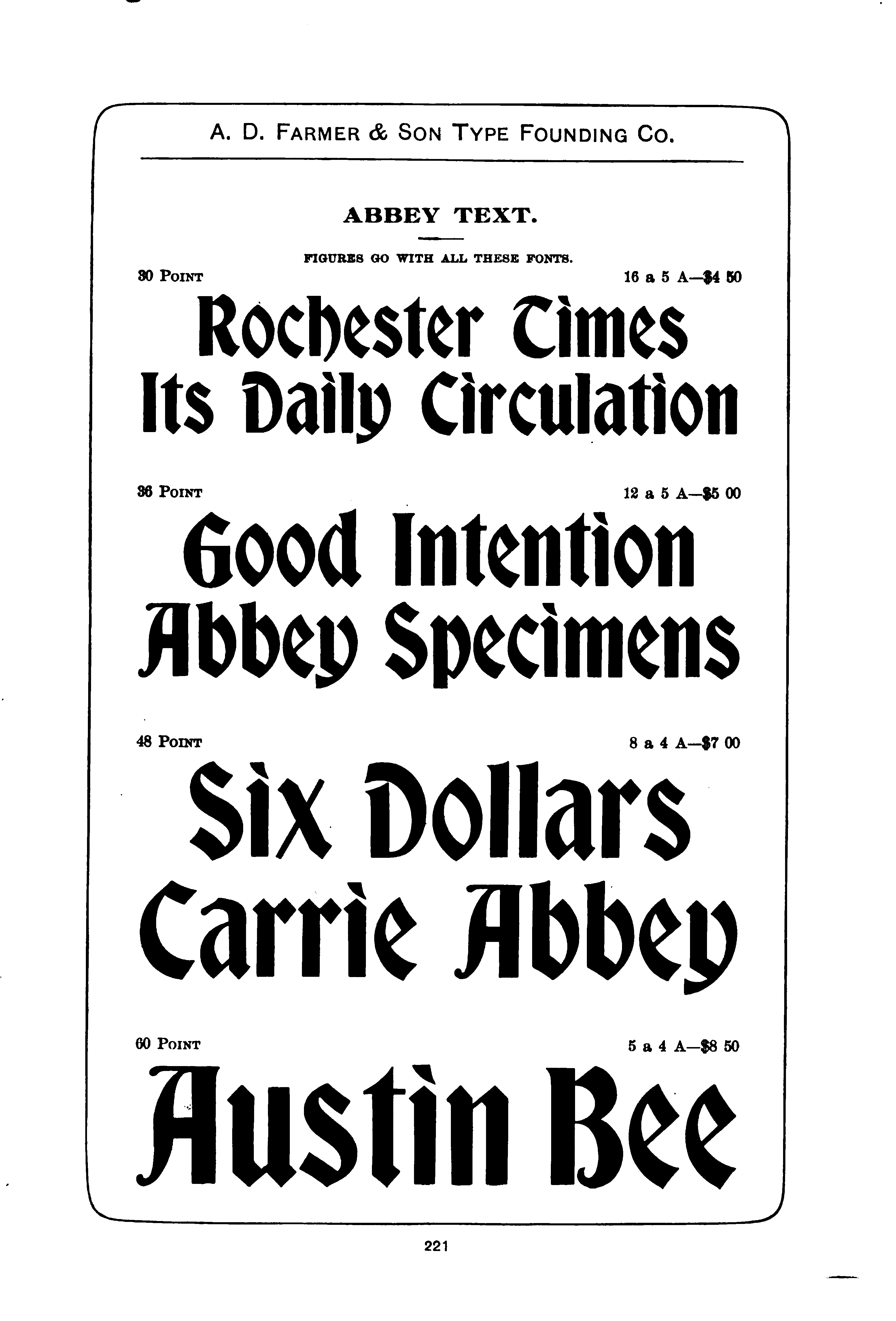
Shown in The Inland Printer, Vol. 15, No. 6 (September, 1895) 1900 A.D. Farmer & Son specimen book (pp. 220-221). Very similar to ATF's Bradley (aka Bradley Text), which was first shown on the very next page of this number of The Inland Printer. Similar to Inland Type Foundry's St. John (which was first shown in the preceeding number (August, 1895) of The Inland Printer).
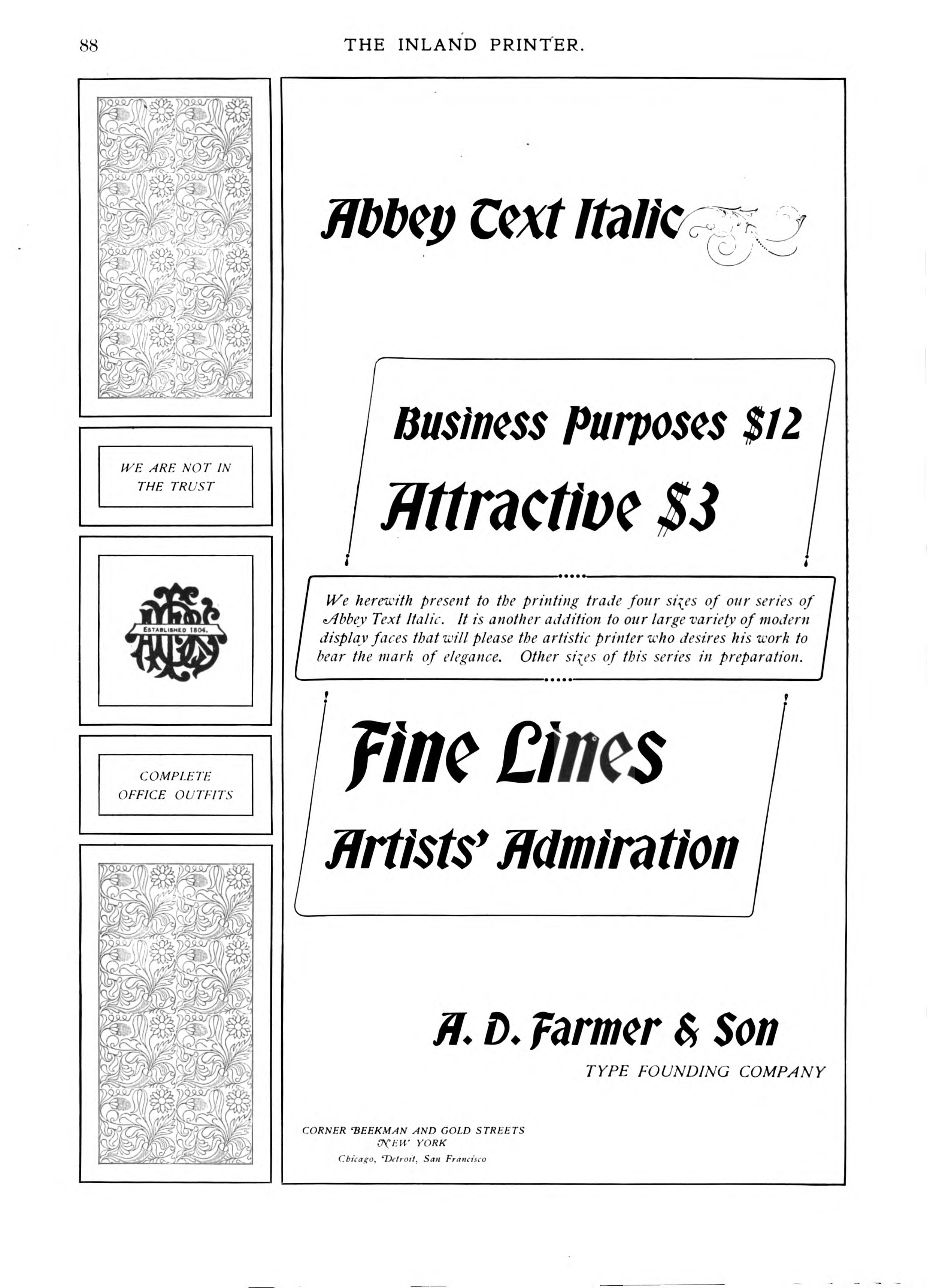
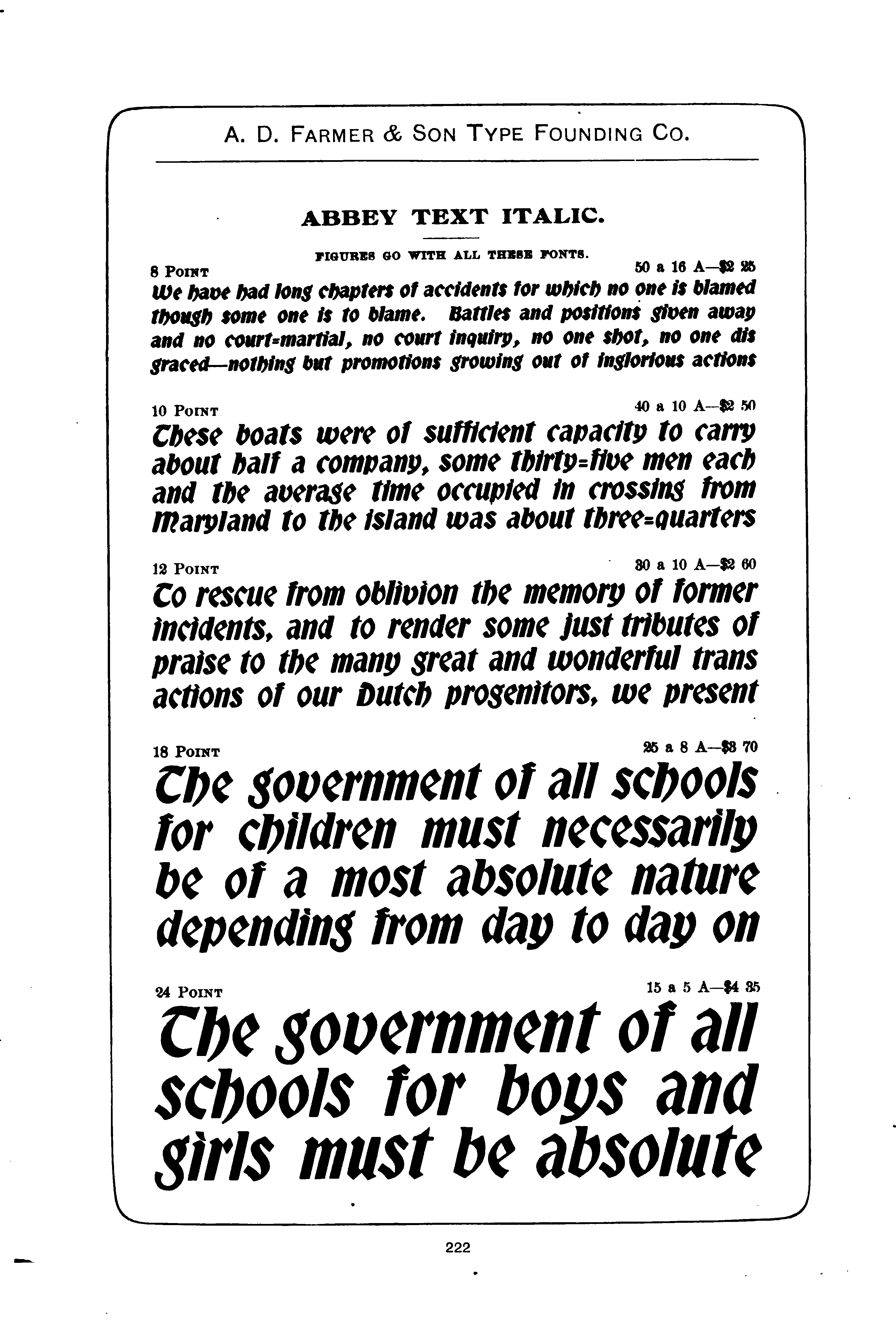
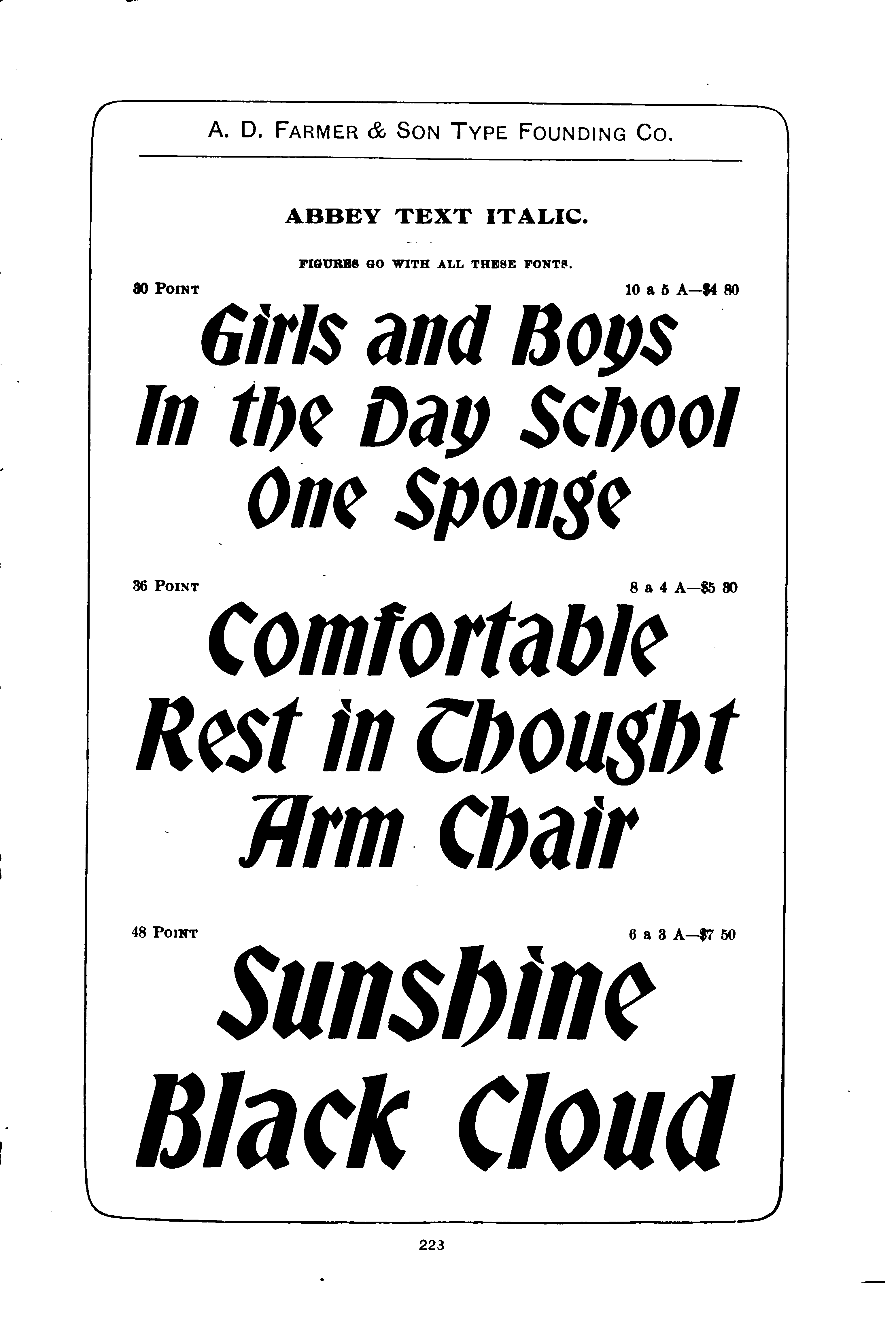
Abbey Text Italic
Shown in The Inland Printer, Vol. 24, No. 1 (October, 1899) Shown in the 1900 Farmer specimen book.
Here it is from The Inland Printer:
Here it is from the 1900 specimen book:
The notion that a "text" (textura) face, which would be essentially a blackletter face derived from late medieval and mostly northern European manuscript work, should necessarily have an "italic" variation (that is, a version based on the round handlettering of Renaissance Italian humanists) is historically absurd and yet a part of the crushing logic of anglo-american type theory. In any case, this italic is really just a slanted version of Abbey Text (not quite a true italic), and Abbey Text in turn isn't really much of a textura (just a roman face playing dress-up). All of this of course is after-the-fact theorizing which detracts not at all from the face in use, which has its capabilities.
All of the type specimen documents reproduced or extracted from here are in the public domain due to their publication without copyright notice when such notice was required, or the failure to renew copyright as was then required, or the expiration of all possible copyright. The reproductions of/from them here remain in the public domain.
All portions of this document not noted otherwise are Copyright © 2009-2011 by David M. MacMillan and Rollande Krandall.
Circuitous Root is a Registered Trademark of David M. MacMillan and Rollande Krandall.
This work is licensed under the Creative Commons "Attribution - ShareAlike" license. See http://creativecommons.org/licenses/by-sa/3.0/ for its terms.
Presented originally by Circuitous Root®
Select Resolution: 0 [other resolutions temporarily disabled due to lack of disk space]