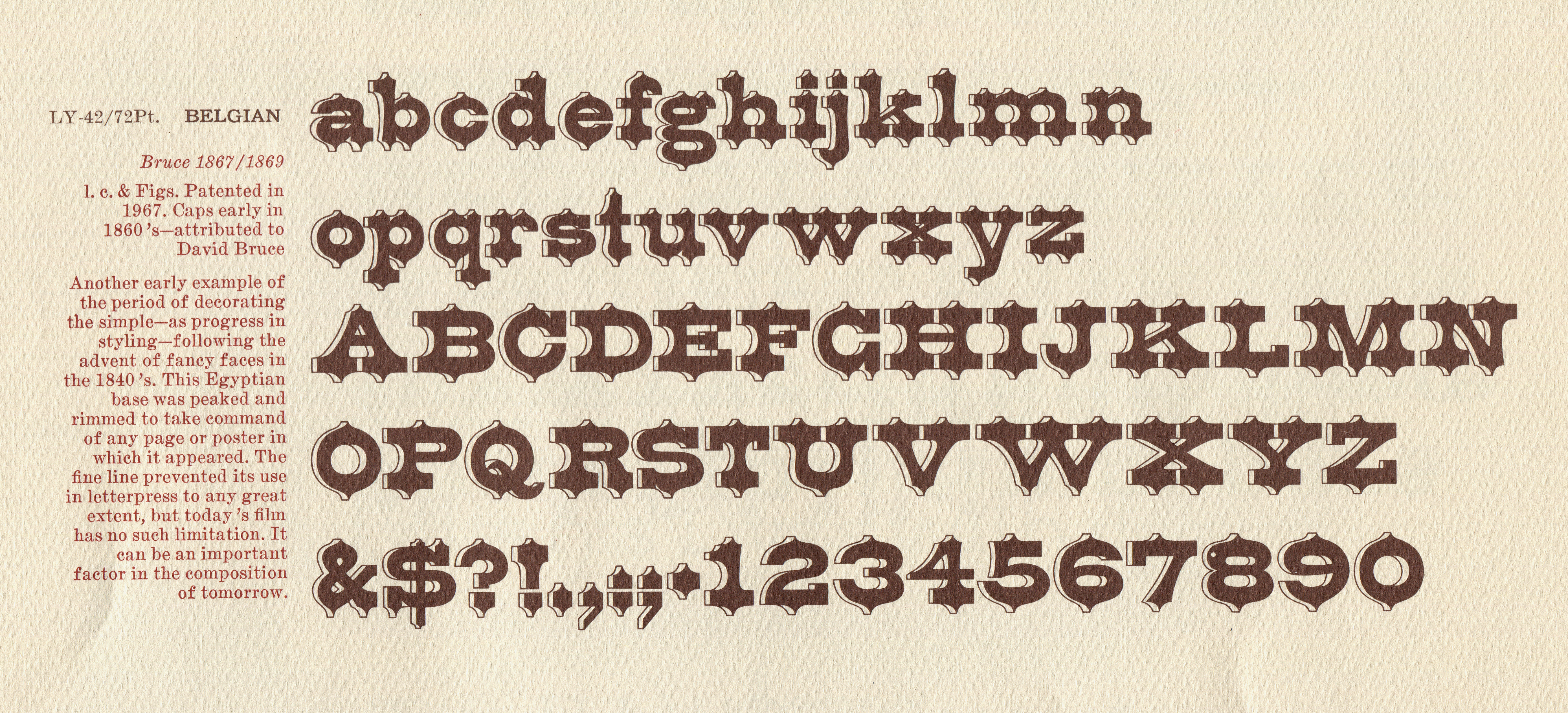
The typeface known generally in the 20th century as "Belgian" was originally Ornamented No. 1515 of Bruce's New-York Type-Foundry. This originated as a titling face cast by the Bruce foundry (by 1865) and also by Hagar & Co and Farmer, Little. Its lowercase was designed, and probably also cut, by Julius Herriet [Sr.] in 1867; the design of its uppercase is not certain. It is unrelated to Belgian Ornamented (Page), a wood type.
Bruce's Ornamented No. 1515 was made in lowercase and uppercase in at least six sizes (10, 12, 18, 24, 36, and 48 point) and earlier (before the adoption of the American Point System) in at least five sizes (Pica, Great-Primer, Double Pica, Double Great-Primer, and Four-Line Pica). It was also copied circa 1877 by the Marr Typefounding Co., Ltd. (Edinburgh & Dublin).
It has been revived several times, with a complex history, and has now been newly cast in metal in the 21st century.
In the 20th century, original fonts of Bruce Ornamented No. 1515 were held by T. J. Lyons, a prominent collector of type and an important participant in the 20th century revival of "antique" types. Lyons held the 12, 24, and 48 point sizes. He published these in his specimens, and used them in his printing services. (He developed a technique to preserve his irreplaceable types by making rubber copies of them for actual use in printing. See Al Gowan's TJ Lyons: A Biographical and Critical Essay (Boston: Society of Printers, 1987): 6-7.)
It is likely that it was Lyons who renamed this typeface "Belgian," although (if indeed he did so) it is not clear when he did. The earliest dated published reference I know of is from 1967 (Bill Thorniley's Specimens of Printing Types: 1700 to 1900 (my thanks to Stephen O. Saxe for that information)).
At some point the Jackson, Michigan based matrix maker and typefounder Andrew Dunker manufactured a new set of 12 point titling matrices for this type. He never made a corresponding lowercase.
Dunker electroformed his matrices from original Bruce type. (Dunker's matrices are superb.) Several questions about this remain open. I do not know when he did this (although David W. Peat thinks that it might have been as early as the late 1950s). Neither do I know where he obtained the original type from which he electroformed his matrices. David Peat is certain that it was not from either the Lyons or the Harnish Harnish collections (the latter collection he owns). Finally, I don't know if Dunker would have thought of this typeface as "Belgian" at the time when he made these mats. Paul Hayden Duensing (who later made a 24 point Belgian) referred to Dunker's matrices as "Belgian," but this was much later (1998).
Dunker cast and sold type from these matrices. It is not known how many fonts he sold. It is shown, for example, in a specimen book of The Pumphandle Press ( Herb Harnish) (my thanks to Stephen O. Saxe for that information). A font exists today in the collection of Stephen O. Saxe. Other fonts may exist in other collections.
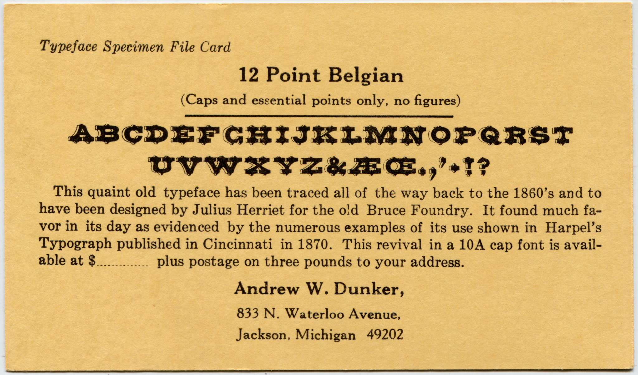
Here is a scan of an original font specimen card:
This card was printed for Dunker by Paul Hayden Duensing (Dunker was purely a typefounder and matrix maker, not a printer). The image above links to a 2048 pixel wide reduced resolution version (perfectly useful, though). Here is the full-resolution version (35 Megabytes): dunker-font-card-belgian-12pt-scanned-from-original-1200rgb.png
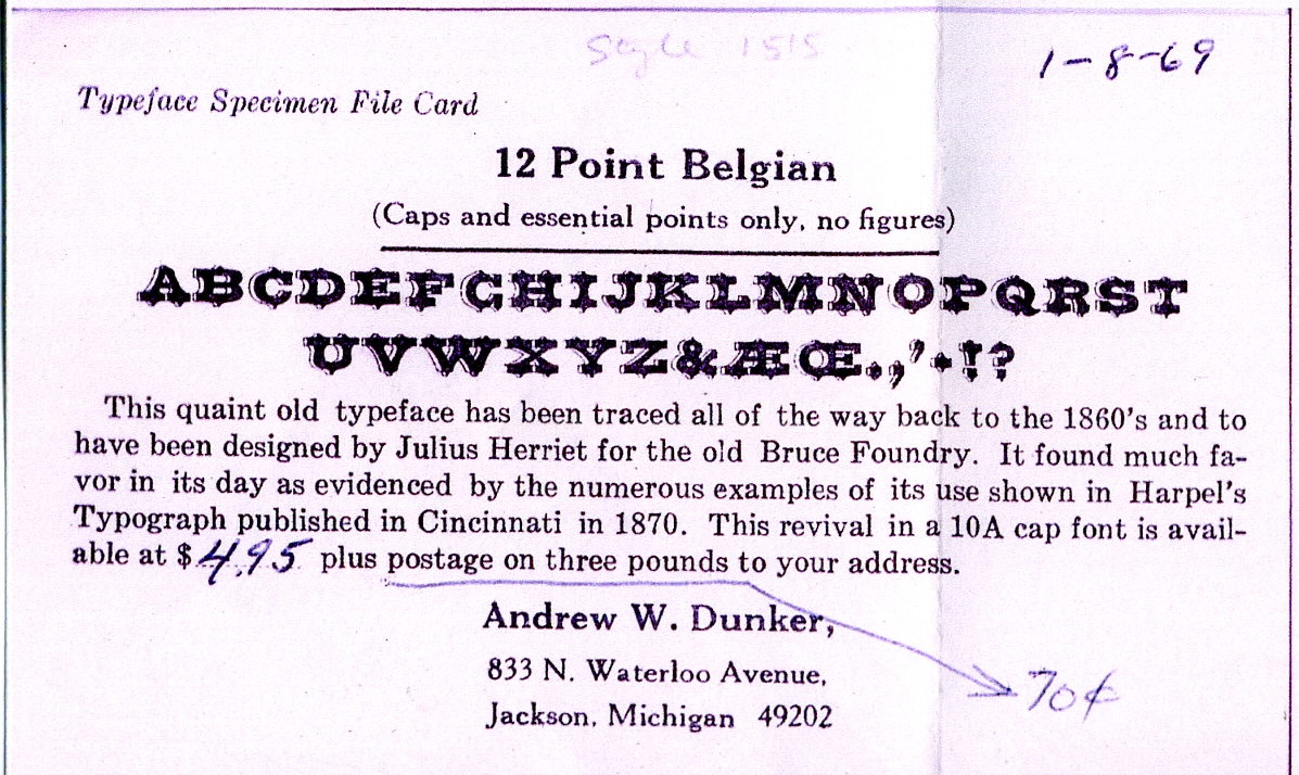
Here is another version of this same card with original annotations confirming a date by which this type must have been cast. A quick online calculation indicates that $4.95 from 1969 would be worth about $30 today - a great bargain.
Thanks are due to David Churchman for preserving these cards and for generously providing me with the first card and with a color photocopy of the second card.
At some point David Churchman's Sterling Type Foundry cast the Dunker 12 point matrices. David Jasmund confirms that he at his press a font of this type purchased in the late 1990s.
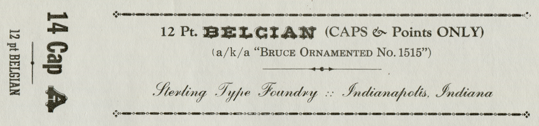
Here is a Sterling Type Foundry font package label:
The image above links to a 2048 pixel wide reduced resolution version (perfectly useful, though). Here is the full-resolution version (35 Megabytes): dunker-belgian-12pt-caps-sterling-scanned-from-original-1200rgb.png My thanks to David Churchman for providing the original of this label and permitting its reproduction here. (It is copyright by David C. Churchman and Sterling Type Foundry and may not be reproduced further without their permission.)
For an explanation of the anomalous 'A' in the "14 Cap A" font strength designation, see the discussion of the 24 point Duensing version, below.
In the late 1960s, Lyons licensed many of type types in his collection for use with the Photo-Typositor, a phototypesetting machine manufactured by Visual Graphics Corp. The first (of three) specimens of The T. J. Lyons Collection for Photo-Typositor was issued in 1967. The typeface known by then as "Belgian" was issued slightly later, in the third Lyons/Photo-Typositor collection ( Antique Type Samples: Twenty Selected Typefaces from the Distinguished T. J. Lyons Antique Type Collection Reproduced on Film by Visual Graphics Corporation for Use on the Photo Typositor, Volume III (Miami, FL: Visual Graphics Corp., n.d.))
It was my interest in the work of the late Paul Hayden Duensing, an important matrix maker, typefounder, and private press printer, which led me to take an interest in the history of "Belgian." The Duensing "Belgian" matrices are a relatively minor part of his work, but they are nonetheless interesting (and, like much of his work, they have now a continuing influence).
At some point (I do not yet know when), Duensing decided to make a 24 point matrix font to complement the 12-point matrix font made by his friend Andrew Dunker. But whereas Dunker made his matrices by electroforming from original Bruce types, Duensing did not. Also, Duensing's matrix font contains both uppercase and lowercase. So the Duensing 24 point Belgian is a work in its own right, complementary to Dunker's 12 point but not simply a 24 point version of Dunker's.
The only reference I have yet discovered to Duensing's matrices in the published literature is a brief remark in Duensing's chapter "Contemporary Private Types" in David Pankow, ed. American Proprietary Typefaces ([no location]: American Printing History Association, 1998). Duensing says "The 24-point Belgian was cut to complement the 12-point size held as matrices by Andrew W. Dunker (from whom I learned to electroplate matrices and gained a whole new perspective on what constitutes careful workmanship). This 24-point font has never been cast, a fact which carries the notion of a private type to the extreme." (174)
However, David W. Peat, a noted collector of type and a typefounder in his own right, has shed much light on this subject. Peat knew both Duensing and Dunker, and now holds both of these matrix fonts.
Duensing used as his ultimate source not types themselves but rather printed illustrations of these types.
A note by David W. Peat contained with the matrices indicates that as per information from Duensing on 1996-10-05 the patterns for these matrices were nylon photopolymer plates made from the original patent drawings. However, the only patent drawings that are presently known for this face are those by Julius Herriet [Sr.] for the lowercase (only) of Bruce Ornamented No. 1515. So unless Duensing was aware of a set of patent drawings for the earlier, titling, version then patent
From these illustrations, he made photographic enlargements to a size of 4 to 5 inches. Using these enlargements, he then cut, by hand, master patterns in binder's board.
This is the start of the method that had been developed by Goudy in the cutting of his own types and which was later used with great success by the late Jim Rimmer. I do not know for certain the details of Duensing's next steps, but if he followed this "Goudy/Rimmer" method ("Goudy/Duensing/Rimmer," more appropriately) then his next step would have been to engrave working patterns in soft metal (e.g., typemetal) plates using a pantograph engraver. He then would have used these working patterns in a second pantograph engraving step to engrave the actual matrices.
The pantograph engraver which he used for at least the first stage was in its form like a table (vs. a freestanding machine). It is likely that it was the ex-Ludlow ( Wiebking) pantograph that he owned. This machine later went to Rimmer.
Duensing made these matrices to a depth-of-drive of 0.050 inches, which is the standard for Lanston Monotype display matrices. However, he wished to cast them on Dunker's Thompson Type-Caster. This machine was set up with a mold appropriate for matrices with an 0.043 inch depth-of-drive (the standard for early Thompson matrices and also Linotype matrices). Duensing therefore sent his matrices out to be milled down to 0.043. Apparently Duensing was not satisfied with the results, and set these matrices aside without casting them.
It would appear that Duensing addressed the nontrivial issues of fitting the face of this type onto its body by making the face small enough to fit entirely on the body. In this way he avoided kerns, but the resulting type has a face size that David W. Peat characterizes as having the appearance of a 21 or 22 point face cast on a 24 point body. By way of contrast, the Bruce upper-and-lower-case version was kerned. For a discussion of the issues involved, see Titling and Kerning Technical Issues in the Notebook on Bruce Ornamented No. 1515.
Duensing's story that these matrices were never cast from is apparently a slight exaggeration. While I'm sure that it is the case that no complete casting was done, some, at least, of these mats were cast. David Churchman says that Duensing cast the 'A' and 'B' (which since these were now 0.043 drive mats I presume means that he had Dunker cast them on his Thompson) and provided him (Churchman) with examples. Churchman used the 24 point Duensing 'A' on his font labels for the font strength statement ("14 Cap A") of the Dunker 12 point. This lone 'A' was the only example (that I am aware of) of Duensing's 24 point Belgian published in his lifetime.
(A trial casting slip of a line of 'A' and a line of 'B' is preserved with the matrices.)
My thanks to David W. Peat for his very kind, and extensive, help with this research on Duensing's matrices.
At some point the 12-point Dunker matrices for Belgian were borrowed by the private typefounder Al Piccoli from David Churchman and cast. (Source: David C. Churchman, personal communication, 2012-09-12). I do not know of any specimen of this casting.
The 24-point Duensing matrices are now held by Peat and Son Typefoundry (P.A.S.T., David W. Peat). He has investigated them in greater practical detail, together with Bob Magill (Monumental Type Foundry, Union, Missouri). They have discovered that type cast from these matrices prints well, despite Duensing's doubts. Therefore, in early 2012 Monumental cast a few fonts of 24-point Belgian (Duensing) for P.A.S.T. I acquired a font of it from Dave Peat at the Midwest and Great Northern Printers' Fair in Mt. Pleasant, Iowa, 2012-09-22.
Belgian has been released digitally. This can be useful for those whose work is limited to the computer.
By 2008, a digital version by Michael Hagemann was release by FontMesa. His sources are unspecified, but as its advertising copy cites information published only in the Photo-Typositor version, it is likely that that is the source. This version includes several derivative series (Black, Open, Inline, and Waffle).
Stephen O. Saxe has confirmed that Belgian was not cast by Charles Broad's Typefounders, Inc. (of Phoenix). It is surprising that he did not, as it would have been a perfect fit for him.
My thanks to Stephen O. Saxe, David W. Peat, David Greer, David Jasmund, and David C. Churchman for their help with the research for this Notebook. All errors and misinterpretations which remain are, of course, my own.
With the exception of the Sterling Type Foundry font labels, all of the type specimen documents reproduced or extracted from here are in the public domain due to their publication without copyright notice when such notice was required, or the failure to renew copyright as was then required, or the expiration of all possible copyright. The reproductions of/from them here remain in the public domain.
The Sterling Type Foundry font labels are Copyright by David C. Churchman and Sterling Type Foundry. They are used here by permission, but may not be reproduced further without the permission of David C. Churchman. They are not licensed under the Creative Commons license which covers other portions of this page.
All portions of this document not noted otherwise are Copyright © 2012 by David M. MacMillan and Rollande Krandall.
Circuitous Root is a Registered Trademark of David M. MacMillan and Rollande Krandall.
This work is licensed under the Creative Commons "Attribution - ShareAlike" license. See http://creativecommons.org/licenses/by-sa/3.0/ for its terms.
Presented originally by Circuitous Root®
Select Resolution: 0 [other resolutions temporarily disabled due to lack of disk space]


