Designed and cut by William W. Jackson for Mackellar, Smiths & Jordan. Patented 1883. It is not mentioned by Loy, in his biographical sketch of Jackson, but it is illustrated by Stephen O. Saxe in the Johnston/Saxe edition of Loy, p.66, with patent identification.
Jackson had apprenticed under ex-MS&J punchcutter Edwin Ruthven and gone on to work at MS&J. He left their employ in 1873 and set up on his own, designing and cutting for several foundries and one matrix manufacturer.
Despite its name, Circular Script is not closely related to the "roundhand" of the 17th and 18th centuries (at least as shown in Bickham; note for example its use of a modern script 'r'). It seems to resemble, rather, the various business scripts in use in the 19th century, though I have not found one that it imitates exactly. It is a connecting script, and very well done. Such scripts are quite difficult and breaks can be seen even in MS&J's published specimens (see especially the 1886 Inland Printer showing).
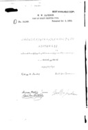
US Design Patent 14,340
US design patent 14,340. "Desgin for a Font of Script Printing-Type." Issued 1883-10-02 to William W. Jackson. Application filed 1883-08-23. Assigned to MacKellar, Smiths & Jordan.
MS&J showed Circular Script in The Inland Printer, Volume 3, No. 11 (August, 1886): 689. You just have to love the wit of Thomas MacKellar in these specimens. Note that the sizes shown here are pre-point system.
(Scan by DMM from the original.)
Here it is as shown in the 1892 MS&J Specimens of Printing Types in three sizes (12, 18, and 24 pt). Since it was the MS&J definition of the pica which prevailed in 1886, they may not have had to re-align and recast these types for the point system. They have, however, slightly revised the showings.
It continued to be shown (identically) through at least the 1900 ATF 1900 Desk Book of Type Specimens , but had disappeared by the ATF 1906 American Line Type Book .
In 1907 in The Inland Printer, Henry Lewis Bullen (writing as "Quadrat") called attention to the similarities between Circular Script and the Dickinson Type Foundry (Phelps, Dalton & Co.) typeface " Manuscript." It would appear, I think, that Bullen was writing without further motives and was not making any accusation of plagiarism. Here are the two faces as he showed them:
(This image is from the Hathi Trust presentation of the Google digitization of the University of Michigan copy of this volume, Hathi ID mdp.39015086781286. Page 357.)
"... There are many interesting instances of the almost simultaneous production of similar faces. At the time the Cleveland Type Foundry had popularized autograph scripts by introducing a facsimile of the handwriting of Mr. Carpenter, of Messrs. R. Hoe & Co., Mr. [Joseph Warren] Phinney [of the Dickinson Type Foundry] had an exact imitation of his own excellent handwriting cut and named it Manuscript. At the same time MacKellar, Smiths & Jordan cut their Circular Script. It was thought, erroneously, by some that a workman had communicated Mr. Phinney's idea to the Philadelphia firm [MS&J], so similar are the two designs in many details. For comparison they are shown in Group O." (p. 359).
{Quadrat [Henry Lewis Bullen], "Discursions of a Retired Printer." No. XI. The Inland Printer. Vol. 39, No. 3 (June, 1907): 353-359.}
What makes Bullen's remarks more interesting is the fact, unmentioned by him, that Joseph W. Jackson cut both faces. Loy, in his biographical sketch of Jackson, says:
"He [Jackson] cut for Phelps, Dalton & Co. [Dickinson Type Foundry] the Manuscript in two sizes, with two lower cases for each size (known in the trade as Phinney Script, from being an exact facsimile of the handwriting of the active partner in that foundry), ..."
{Loy, William E. "Designers and Engravers of Type." No. IX - William W. Jackson. The Inland Printer. Vol. 22, No. 1 (October 1898): 49.}
Certainly Bullen must have been familiar with Loy's series of biograhical sketches. But while Loy does identify Jackson as the one who cut Manuscript, he says nothing of Circular Script (it took the sharp eyes of Stephen O. Saxe in 2009 to spot Jackson's patent on Circular Script and add a showing of it to his edition of Loy).
Here is a copy of Bullen's entire article (extracted in this case from Google's own PDF of the same scan of the Univ. of Michigan copy): inland-printer-v039-1907-04-1907-09-google-umn-pp353-359-bullen-discursions-09.pdf
In looking at the two scripts side by side as Bullen shows them, it would seem to me that Jackson, simultaneously cutting two scripts for two competitive foundries, took due care to make them distinct. Their similarities are not so much to each other as to the carefully trained commercial handwriting of the 19th century.
I have not yet located a showing for Manuscript (or, indeed, a Dickinson specimen).
The 1886 Inland Printer showing is reproduced in Annenberg's Typographical Journey through the Inland Printer (Baltimore, MD: Maran Press, 1977), p. 125.
The typeface is shown in Doug Clouse's MacKellar, Smiths & Jordan: Typographical Tastemakers of the Late Nineteenth Century (New Castle, DE: Oak Knoll Press, 2008), p. 116. Clouse cites as his source the typographical patent documentation at Columbia University, but the showing he gives is identical to the 1886 Inland Printer advertisement, not the 1883 design patent.
As noted earlier, it is also shown by Stephen O. Saxe in the Johnston/Saxe edition of Loy, p.66. The showing there is the 18 point showing from the ca. 1892 to ca. 1900 specimens.
In the 20th century, foundry-style matrices for this typeface, in 12, 18, and 24 point, were manufactured for Charles Broad of Typefounders, Inc. (of Phoenix). It does not, however, appear in Phoenix or Los Angeles Type Founders specimens and it is not listed in the "antique revival" appendix in McGrew.
These matrices are currently held by Skyline Type Foundry.
All of the type specimen documents reproduced or extracted from here are in the public domain due to their publication without copyright notice when such notice was required, or the failure to renew copyright as was then required, or the expiration of all possible copyright. The reproductions of/from them here remain in the public domain.
All portions of this document not noted otherwise are Copyright © 2012 by David M. MacMillan and Rollande Krandall.
Circuitous Root is a Registered Trademark of David M. MacMillan and Rollande Krandall.
This work is licensed under the Creative Commons "Attribution - ShareAlike" license. See http://creativecommons.org/licenses/by-sa/3.0/ for its terms.
Presented originally by Circuitous Root®
Select Resolution: 0 [other resolutions temporarily disabled due to lack of disk space]


