The primary difference between a design drawing and a finished drawing is not the refinement of the letterforms but rather the presence of the information which turns lettering into type: vertical alignment relative to the type body (lining) and set width and horizontal alignment relative to the type body (fitting).
The published drawings which show Goudy's method of indicating lining information best are in Typologia : on p. 56 (University of California Italic) and p. 87 (Village No. 2 and Goethe). [1]
[I can't reprint them here; it really is worthwhile to look them up in Typologia.]
As he says in Typologia (pp. 92, 95), he drew on both his finished drawings and his master patterns a set of five parallel horizontal lines. The top and bottom lines indicate the top and bottom of the body of the type. (Note that this is not the same as the top of the ascenders and the bottom of the descenders .) He settled on 7 1/2 inches as the distance between these lines [2] to represent the type body size at the scale of his finished drawing and master pattern. These two lines are all he actually needs to establish the vertical relationship between the letterform he draws and the type (strictly speaking, only one is necessary, but two are convenient). The other three lines are merely design aids and are not relevant to aligning the type; they indicate cap-height, x-height, and baseline.
Bruckner, p. 19, reproduces part of a finished drawing for Deepdene. It is interesting both because it labels the "cap line" explicitly and because it is drawn to Goudy's early 9 inch (vs. 7 1/2 inch) size.
Goudy says he used a 9H hardness pencil for drawing these five lines.
He did not always take care to make them parallel to the edges of his sheet, as can be seen in the photograph of the finished drawing (not a pattern, as mistakenly captioned) for a capital 'M' from Friar as reproduced in Bruckner, p. 94.
Goudy's lining information can be seen in several other sources as well.
His master patterns were traced directly from his working drawings, and he added drawn information to them not strictly required by the pantograph. The master pattern in Typologia (p. 99) shows these five lines particularly well. [3]
In at least the example published in Typologia (p. 99) Goudy also cut these five lines into his actual metal working pattern. (And this, once again, is an excellent study of the difference between these five lines (two real ones defining the type body and three imaginary ones) and the faces of the letterforms themselves.)
The drawings on p. 115 of Boone's 1942. Popular Science article are also useful. The two top drawings ("QUS" and "ages") are finished drawings, but as reproduced show the lining information only faintly. The lower right drawing, however, is a finished drawing (of 'E') which shows the five lines very clearly.
At time 2:04 [4] in the Kellerman film The Creation of a Printing Type , Goudy is seen refining a finished drawing for 'M', 'Q', and 'N' in the italic of Saks-Goudy. [5] His five lines are clearly present.
Goudy indicated the set width of each character, and its horizontal alignment relative to the left and right sides of the type body, on the finished drawing. He did this in a quite natural way, with vertical lines. How he determined this fitting information is not yet known. The published accounts are silent on this subject, and suggest that Goudy simply knew intuitively. I'm not at all sure I believe this; generally fit must be determined by a lengthy, iterative process of trial castings and revisions.
In the lower right photograph on p. 115 in the Boone article, the right vertical line for the 'E' can be seen (Goudy's hand obscures the location of the presumed left vertical line).
In lower left photograph on the same page Goudy is shown using a parallel ruler to draw fitting information.
Goudy would at times also ink his finished drawings. He is shown doing this at 2:40 in the Kellerman film It is also apparent in the finished drawing for National Old Style (design no. 29). [6] This step is not mentioned, however, in either the Boone article or in Typologia.
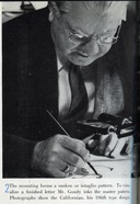
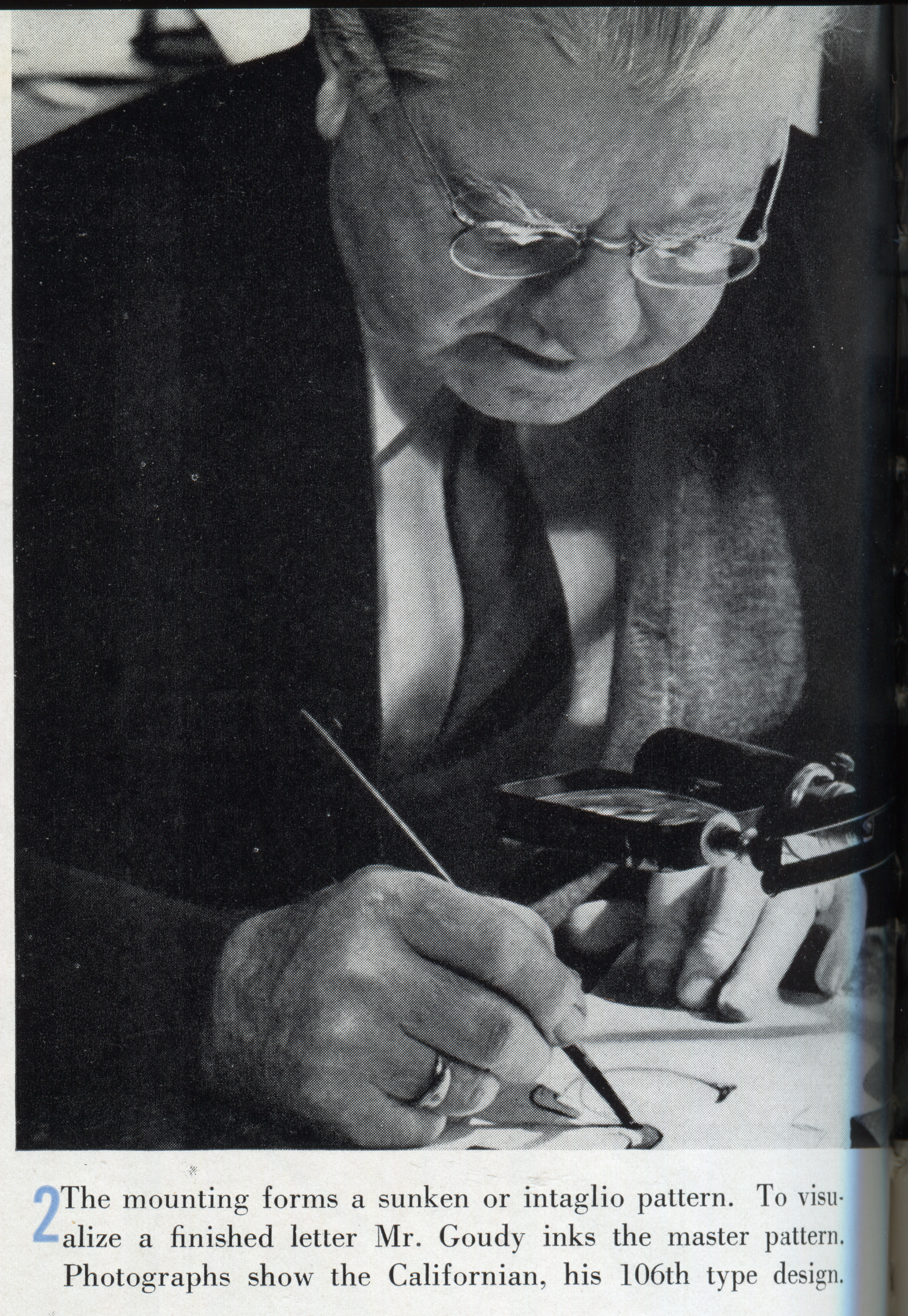
It is, however, shown in the 1939 photo essay in Advertising and Selling:
(From Advertising and Selling (May 1939) . Note that the caption is incorrect; this is a finished drawing, not a cut away (intaglio) master pattern.
The finished drawings for Goudy Medieval in "On Designing a Type-Face" ( The Dolphin, No. 1, 1933) , Fig. 13 on p. 12 (confusingly captioned "working drawings") illustrate a slightly earlier stage of (or perhaps just a variation of) Goudy's practices. A close examination of them reveals that each does contain five lines, but that for the lowercase the middle line indicates x-height while for the uppercase it indicates cap height (cap height and ascender height differ in this typeface). The illustrations in his Dolphin article include not only these finished drawings but also design drawings, master patterns, and working patterns
Goudy's finished drawings are right-reading and planographic. They have a height of 7 1/2 inches between the lines indicating the top and bottom of the type body, and they indicate both lining and fitting information. They are drawn in 9H pencil and may be inked.
For convenient reference, here is a list of all published Goudy type design drawings, finished drawings, and master patterns (that are known to me):
1. Anyone who still thinks that baseline is a natural property of type would do well to study these drawings.
2. Earlier he used 9 inches, as noted in Typologia p. 87 and in "On Designing a Type-Face" (The Dolphin, No. 1, 1933).
3. It has other issues, however, which I find make it difficult for me to use. It must be a trick of the way in which it was photographed, but I can never read this image correctly. It not a finished drawing but a cut-out master pattern on/in thick paper - yet to my eye the letters always seem raised above the sheet rather than cut into it.
4. The time reference is to the copy included with the Making Faces DVD , not the online version on TypeCulture.
5. Curiously, the drawings say No. 72, but Saks Goudy is his design No. 91 (No. 72 is Advertiser's Modern).
6. I have an ozalid process copy of this drawing made by the late Paul Hayden Duensing, through the courtesy of Stephen O. Saxe. Since the original is probably owned by Scripps College, I cannot reproduce it here.
7. The late Paul Hayden Duensing was present at the time these were rediscovered at Scripps and was provided with copies of several of them (some of these are rather nice ozalid/diazo copies). He passed these on to Stephen O. Saxe in 2001, and in 2012 Saxe very kindly passed them on to me.
8. Five images of these are online on the Scripps College Press website, at http://www.scrippscollege.edu/campus/press/scripps-font.php Unfortunately, the preparation of these images for the web crops important reference information from some of them.
The 1939 volume of Advertising and Selling is in the public domain. The images from it reprinted here remain in the public domain.
All portions of this document not noted otherwise are Copyright © 2012-2013 by David M. MacMillan and Rollande Krandall.
Circuitous Root is a Registered Trademark of David M. MacMillan and Rollande Krandall.
This work is licensed under the Creative Commons "Attribution - ShareAlike" license. See http://creativecommons.org/licenses/by-sa/3.0/ for its terms.
Presented originally by Circuitous Root®
Select Resolution: 0 [other resolutions temporarily disabled due to lack of disk space]