ABSTRACT: When Harry Carter introduced the concept of "the optical scale in typefounding" in 1937, what he meant by it was the antithesis of what "optical scaling" means today. This Notebook attempts to trace how we came to misunderstand him.
NOTE: This matter of optical scale vs. optical scaling is integral to the more general issue of why the modern concept of "typeface" is inapplicable to the first 400 years of type-making , discussed elsewhere.
A " scale" is a generally one-dimensional system by which we categorize things. It can be mathematical in form. Thus, we can ask "rate this on a scale of 1 to 10" and receive "3.5" as an answer. However, a scale need not be mathematical. Thus, we could say that a bacterium is something "microscopic" in scale, while a bungalow is "human" in scale and a hospital is "institutional" in scale. A scale may be continuous (the "3.5" above) but it need not be (there may be nothing halfway between "human" and "institutional").
" Scaling" is the process transforming something from one scale to another. It can of course be mathematical, and therefore something which can be automated by a machine or a computer. It can also be qualitative, and therefore probably not automatable. (A computer program to scale up a bungalow to something half as big as a hospital in an attempt to produce a hospital which doesn't feel quite so institutional is likely to fail; it is possible that a human architect might succeed.)
It is important to realize that when scale is neither mathematical nor in some way strictly quantifiable, then automatic scaling is, in principle, impossible (and scaling by humans will be subject to interpretation and disagreement). The existence of a scale does not imply the ability to do scaling.
This is just a quick summary and a plea to understand how the technologies actually worked. Almost every account of them in even otherwise sophisticated technical literature on type gets it wrong.
The standard account runs something like this: Making type was done by hand punchcutting from Gutenberg until Linn Boyd Benton invented the pantograph. (Some accounts will say he invented it to cut punches, some say matrices.) The hand punchcutters did optical scaling intuitively, but Benton's pantograph was able to do the same thing much faster. Optical scaling is now done in digital type (at least in its more sophisticated versions), mathematically.
The matrices for casting metal type were made using the techniques of hand punchcutting (with or without counterpunches) from the 15th century through the late 1840s. [note 1] From the 1840s on, hand punchcutting declined in use, though it is still practiced (in a very small way) today.
From 1845, the introduction of electroformed matrices allowed the cutting of pattern types (patrices) in typemetal from which matrices could be made by electroforming. This was an easier process than hand punchcutting in steel. Together with the near-simultaneous introduction of the Bruce (aka "pivotal") type casting machine, which employed a force pump to cast type under pressure, this provided the technical basis for the proliferation of ornamented display types in the 19th century.
The first use of a pantograph in the making of metal type in America was by the Central Type Foundry in 1882, using a horizontal pantograph that had been imported from Germany in 1880. It was used for the direct cutting of matrices.
At some time around 1883, L. B. Benton developed a pantograph for cutting patrices in typemetal.
In July 1884, a note appeared in The Inland Printer to the effect that Benton, Waldo & Co. could cut punches in steel with their machine.
(Aside: This was probably the first major version of the Benton vertical "pantograph," which was adapted to cut patrices and punches. A single-arm vertical pantograph such as this is not actually a true pantograph; the true pantograph, as invented by Christoph Scheiner in 1653, is a four-bar linkage. The single-arm "pantograph" traces its history back to the medallion copying lathes of the 17th and 18th centuries (which, coincidentally, enjoyed a resurgance in the 1890s as the Janvier machines for engraving coining dies). When employed in engraving flat work, a single-arm pantograph introduces distortions not present in the four-bar pantograph. The St. Louis typefounder Nicholas J. Werner, who was at Central in the 1880s and later founded the first independent matrix engraving firm, was well aware of this. Presumably Benton was as well. (Interestingly, Theo Rehak reports that Benton referred to the precise adjustment of his pantograph as "controlling a distortion" ( Cost, 281))
Werner does credit Benton with having cut the first Roman typeface. This presumably would have been in the mid to late 1880s.
In 1888/1889, Werner and the engraver Schroeder left Central and, with the Central machine and another of Schroeder's design, set up the first independent matrix engraving firm. They cut a number of faces by 1891. In that year their partnership dissolved as Schroeder wished to move to California; both continued working as independent matrix engravers, although Werner later joined the Inland Type Foundry. Schroeder & Werner began, and Werner completed, the full range of DeVinne.
In the 1890s, Robert Wiebking and Henry Hardinge set up as independent typographical engravers with horizontal pantographs of their own design. Wiebking is best known today for having cut many of Goudy's early types. They also supplied the Ludlow Typograph Company with pantographs and expertise, and thus on a pound-for-pound basis were responsible for the punch and matrix technology for the production of most display type of the hot metal era.
At some point around 1899, Benton reversed the kinematics of his vertical pantograph and adapted it for the direct cutting of matrices. Both patrix engraving for electroforming and direct matrix engraving continued for a short time at ATF, before direct matrix engraving came to dominate at that foundry.
At about the same time Benton developed an unusual horizontal pantograph for drawing development which employed both an optical tracer and the actual modification of letterforms by optical methods. Too little is now known of this remarkable machine; when conventional histories speak of "the Benton pantograph," they are not talking about it.
The account here is slightly simplified. The history is actually a bit more complicated than this even in the 19th century, and becomes considerably more complex in the 20th. The point to be taken from it is that while Benton was indeed a genius, and while the two Benton vertical pantograph designs are extraordinarily sophisticated machines, he was not a god, and these machines are not magical. Other pantographs, of independent design and construction, were being employed by other type-makers at the same time to produce work of equal sophistication.
To the best of my knowledge, the term "optical scale" (later to become "optical scaling") entered the vocabulary of type making in 1937, in the article "The Optical Scale in Typefounding" by Harry Carter. Carter was perhaps the finest historian of type in the 20th century, and his words carry unusual weight.
Carter's article is still the basic text cited in the more scholarly discussions of "optical scaling," but I wonder how many people citing it have actually read it. It is in copyright (so I can't reprint it here) and I don't believe that it's ever been reprinted. To read it, you need to track down an original copy of the 1937 journal in which it appeared.
Carter argues that types work well in particular sizes, and poorly in other sizes. The "optical scale" in type is a "scale" in the sense described earlier: a way of judging how something looks at a particular size. "Typographers accept this situation," he writes, "and show their skill by calling for this or that type as the best design for the scale at which they are working." (2)
Good typographers will simply decline to use types at sizes in which they do not work, if typefounders are "wasteful" enough to cut them at those sizes. Formerly, typefounders were not so un-economical. "In the days when punches were hand-cut and the production of type was slower and more expensive it was common to reproduce a type only on large bodies or small ones [that is, on sizes for which the types were suitable]. (2) [note 2]
But Carter observes that "Nowadays, if a typefounder puts a new design of type on the market, he reproduces it in a big range of sizes, and the composing-machine makers are willing to oblige a customer by cutting any size of a given face at short notice." (2)
Carter was fully aware, I think, of the capabilities of Benton, Wiebking, and others in sophisticated nonlinear scaling of types on their pantographs. He is not arguing that we should bring this nonlinear scaling (what we now would call "optical scaling") to type. Rather, he is arguing that the nature of type is such that we should not do this scaling at all. Period.
As he puts it: "There has been too much of a tendency to design the face for setting the pages of a book, and then to make larger and smaller sizes by mechanical enlargement and diminution. The design must have beauty enough for the large sizes and legibility enough for the small ones; and these qualities must be stressed in the appropriate degree for each size. Types which lack either good quality should only be cut in the sizes for which they are suitable." (6)
I have not been able to find any occurances of the terms "optical scale" and "optical scaling" with reference to type in the period between Carter's 1937 article and the late 1980s. However, the idea that what we now term "optical scaling" was a necessary aspect of the refinement of good type was established during this period. Carter's "optical scale," which denies the wisdom of this, was forgotten. [note 3]
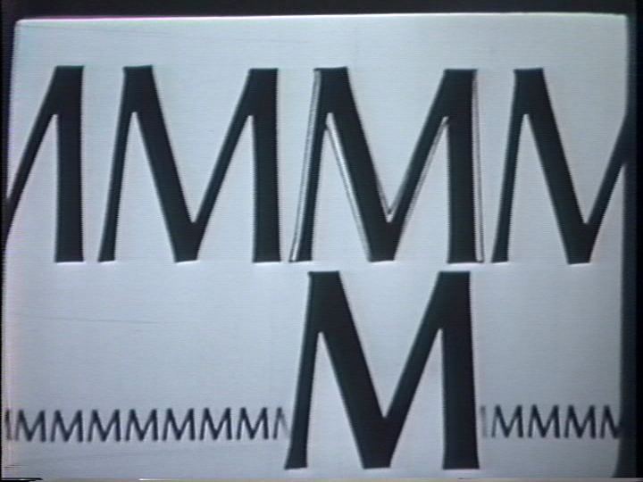
In the 1948 film Type Speaks! by American Type Founders, a well-done animated sequence illustrates what we would now term "optical scaling" with attention to several aspects of the nonlinear scaling of type (not just stroke width). Here is a still from that film at the end of this sequence:
At the end of this animated sequence, just as the scene shifts to show a Benton vertical engraving machine being set up, the narrator attributes this achievement to L. B. Benton:
"That the vagaries of human vision can be compensated for by merely adjusting the leverage on the Benton machine thus changing the relation between the traveler of the follower and that of the engraving tool testifies to the genius of the machine's inventor."
(Actually, there's more too it than that. Cutter and tracer geometry are equally important, but things must be simplified for popular films.)
The purchaser of metal type, or of matrices for hot metal typecasting and linecasting machines, has no need to know how that type or those matrices were made. That's the business of the typefounder or matrix maker. All the printer needs is well designed type to use. This changed with the advent of phototypesetting
The phototypesetting era is, regrettably, the least well documented major technology type-making. We know more about how type was made in 1600 than 1960. Phototypesetting has a prehistory before the Second World War, and an early history from the late 1940s (with, e.g., fascinating transitional machines such as the Intertype Fotosetter). It reached a high point in the 1960s and 1970s, with the rise of offset printing techniques which suited it well. By the late 1970s it had merged with the typographical computing and telecommunications technology that had begun, in a separate historical thread, with the Teletypesetter in the late 1920s. It died more or less instantly in the early 1980s with the advent of Postscript.
Phototypesetting, for the first time, gave the end user (the printer) the ability to vary the size of type. Indeed, in most systems it required it. Some systems provided many photographic master types and allowed only small variations. Other systems, however, provided only a single master which was scaled, using optics, over the full range from fine print to headline.
While I haven't searched exhaustively (and while technical information on many phototypesetting systems is already lost) I have been unable to find an example of a system which scaled other than linearly (except for the optical special effects which made the typesetting of the 1970s so distinctive). Even the systems which offered typefaces in master fonts at multiple sizes scaled linearly from those sizes.
The concept of optical scaling (modern sense) is a subset Prof. Donald Knuth's concept of a meta-font. Knuth doesn't discuss "optical scaling" as such because it's simply subsumed within his more advanced approach, and not worth talking about on its own. [note 4]
See also Richard Southall's discussion of "the problem of parameterization" in his "Designing New Type Faces with METAFONT" (1985) (pp. 28-29)
There were at least some attempts to take this further. See, for example, Ghosh & Bigelow's work on applying transformational grammars to letterform design
Charles Bigelow wrote several pieces (especially for The Seybold Report) in the 1981/82 timeframe. It is quite possible that these contain references to either the optical scale or optical scaling. These are, however, quite difficult to find now, and I have not yet read them.
I'm also in the process of obtaining Seybold's books from the period on photocomposition and digital typesetting.
One of the earliest references I've been able to find to "optical scaling" comes from an interview with Brian Reid which appeared in Unix Review, Vol. 5 (July 1987): 55. It is interesting because as Reid used the term it has yet another meaning!
This is a difficult item to find today. I've cobbled together what I believe to be an accurate rendition based on two different Google Books snippets together with an extract quoted in a posting to the "TeXhax" mailing list on 1987-07-17 by Hal Peterson (from TexHax Digest, http://ftp.math.utah.edu/pub//tex/pub/texhax/texhax87.057 I believe that what Reid wrote was:
"Speaking of 'visionary,' there's certainly no question but that PostScript's font-scaling technology is the strongest, most innovative feature the language has to offer. But some typographers I trust tell me you can't scale fonts as you would other types of graphics — that you really have to scale ... Essentially all current manufacturers of high-quality phototypesetting equipment use optical scaling on their fonts." Off the top of my head, I can't think of any typesetter manufacturer in the United States that offers more than two versions of a font in a given size and style. Most, in fact, use just one. Although it's true that some little, old, gray-haired men with tweezers - if left to their own devices - would set half a dozen different styles in hot type depending on the magnitude and image they were trying to create, the fact is that technology has simply swept away that sort of thing. The people in the typesetting industry right now, independently of the laser printer market, have stopped using typeface variations across different sizes."
Naturally, I think that Reid is in error in his first point (though full disclosure requires that I note that I am not tall, not young, have gray hair, and own tweezers). His second point, though, is probably just the exaggeration of a basically sound position: most photographic type was linearly scaled.
What is interesting about Reid's remark is that it indicates that the (re-)introduction of the term "optical scaling" into type did not proceed in a smooth or obvious manner.
By the late 1980s, the term "optical scaling" starts to appear with greater frequency. Perhaps the most interesting case is an M.S. thesis devoted to it in 1987, by Bridget Lynn Johnson at the (former) School of Printing Management and Science at the Rochester Institute of Technology: "A Model for Automatic Optical Scaling of Type Designs for Conventional and Digital Technology."
There are a number of points to be made about Johnson's work in the context of the history of "optical scaling" which are interesting, I think, because her work is a pivotal point in the evolution of these concepts. I intend my remarks here not to be critical, but to try to show just how unstable the concepts were at that time.
First, there is an interesting lexicographical error in the thesis. In a footnote on page 7, she cites Carter's article correctly as "Optical Scale in Typefounding." But in her Bibliography (p. 101) she cites it as "Optical Scaling in Typefounding." I don't know of any clearer way to illustrate the instability of the terms "optical scale" and "optical scaling" than this!
Johnson's work is primarily an engineering study in generating mathematical methods for accomplishing "optical scaling" (in the modern sense), working from type from hand-cut matrices. She does, though, provide significant historical background.
She starts from hand cut punches, as Carter did, but with a perspective which differs from Carter's. Where the "optical scale" for Carter calls for cutting types only at the scales at which they work to the eye, Johnson presumes that "With original handcut fonts, designers performed optical scaling (scaling by eye) that varied the proportions of letterform features over a range of sizes in a nonlinear manner." (1)
To this, she contrasts "the use of the lens, as well as computational and other technologies [which have] allowed letterforms to be scaled automatically from a reference character, a simple proportional enlargement or reduction." (1)
Johnson does not give appropriate credit to Benton and his subtle use of the pantograph to do "optical scaling" (and doesn't even acknowledge Wiebking or others), but this is not surprising. In 1987, ATF was nearing its final demise, the linecasting and typecasting manufacturers were gone, and knowledge of mechanical punch/patrix/matrix making was at a low ebb.
What is important about Johnson's thesis is that (1) it uses "optical scaling" in a modern sense (neither Carter's nor Reid's), meaning scaling over a wide range of sizes in such a way that pleases the eye, and (2) it presumes that it is necessary to demonstrate that this can in fact be automated. In other words, it is not "obvious" (as many might think today) that "optical scaling" (modern sense) can be automated mathematically. In 1987, it was sufficiently un-obvious that it made a suitable subject for graduate level research.
Since Johnson's 1987 thesis, the concept of "optical scaling" has proliferated. A Google Books search for "optical scaling" and "font" up to 1986 produces no results. From 1987 to 2013 there are over 100, and that's just printed books that Google has scanned. The same search over Google as a whole turns up 7,540 hits.
A random survey of these uses indicates that they all subscribe to the view of "optical scaling" as the (desirable) nonlinear scaling of types over a range of size. That is, they do not use the term as Reid used it (where it meant linear scaling by means of optics) or as Carter used the "optical scale." Indeed, while Carter seems well cited (about 20 times), what he said has been forgotten.
The only differences in the use of the term "optical scaling" at present seem to be between various minor nuances:
With regard to Benton, he is seen either as:
Of the many people responsible for the revolution in matrix production from the 1880s, Benton alone is remembered. Wiebking, Werner, Schroeder, Schokmiller, Pierpont, Barr, and others even less known have disappeared from the history of type.
Of Harry Carter's "optical scale" in typefounding, nothing remains.
American Type Founders. Type Speaks! Elizabeth, NJ: American Type Founders Sales Co., 1948.
Produced by Loucks & Norling Studios in collaboration with G. M. Basford Co. for American Type Founders Sales Corp. 16mm, sound, color, 25 minutes. (Information from the film and from the 1948 copyright registration for this film. The date of 1946 in Rehak's Practical Typecasting is incorrect. The title is "Type Speaks!", not "The Type Speaks!" as reported in some other sources.) Narrated by Ben Grauer.
Carter, Harry. "The Optical Scale in Typefounding." Typography, No. 4 (Autumn, 1937): 2-6.
Cost, Patricia. The Bentons: How an American Father and Son Changed the Printing Industry . Rochester, NY: R.I.T. Cary Graphic Arts Press, 2011.
This includes, in its Appendix A, very interesting material by Raph Levien and Theo Rehak on the Benton vertical pantographs.
Ghosh, Pijush and Charles A. Bigelow. "A Formal Approach to Lettershape Description for Type Design." Report No. STAN-CS-83-966. Stanford, CA: Stanford University Department of Computer Science, 1983.
Online at: ftp://reports.stanford.edu/pub/cstr/reports/cs/tr/83/966/
Johnson, Bridget Lynn. A Model for Automatic Optical Scaling of Type Designs for Conventional and Digital Technology . M.S. Thesis, May 1987. Rochester, NY: Rochester Institute of Technology, 1987.
This thesis is available online at, and its canonical location is, the R.I.T. Digital Media Library Repository at: https://ritdml.rit.edu/handle/1850/11567 It is also licensed for distribution under the Creative Commons Attribution - NonCommercial - NoDerivatives license. So here's a local copy of it, in its entirety, as a 3.1 Megabyte PDF: BJohnsonThesis05-1987.pdf
Knuth, Donald E. "The Concept of a Meta-Font." Visible Language, Vol. 16, No. 1 (Winter, 1982): 3-27.
This has been reprinted in Knuth's book Digital Typography. Sanford, CA: CSLI Publications, 1999.
Levien, Raph. [See Cost]
Phillips, Arthur H. Computer Peripherals & Typesetting. London: Her Majesty's Stationery Office, 1968.
This is a comprehensive survey of the state of the art through 1968, when the industry was just turning from purely photographic to photodigital methods. It is particularly useful in the present context because it surveys all of the phototypesetting machines then produced and (pp. 575-582) presents a summary table of their characteristics which includes an entry for each for the number of master fonts used.
Phinney, Thomas. "A Brief History of Type." (1995)
This was originally published in an online posting. This in turn was archived on a site at London Metropolitan University which no longer exists (the site, not the University!): http://learning.north.londonmet.ac.uk/ epoc/typhis.htm You can find it by plugging that URL into "The Wayback Machine" at The Internet Archive ( http://www.archive.org/). That can get a bit involved, though, and Phinney licensed it for noncommercial reprint, so here is a local copy of Version 1.10 of 1995-07-26: typhis.htm
A hyperlinked version is also online at The Graphic Design and Publishing Center website, at http://www.graphic-design.com/Type/history/
Ruggles, Lynn. "Letterform Design Systems" Report No. STAN-CS-83-971. Stanford, CA: Stanford University Department of Computer Science, 1983.
An good, brief, survey of early digital lettering systems from 1967 through 1983. Online at: ftp://reports.stanford.edu/pub/cstr/reports/cs/tr/83/971/
Southall, Richard. "Designing New Typefaces with Metafont." Report No. STAN-CS-85-1074. Stanford, CA: Stanford University Department of Computer Science, 1985.
Southall has an interesting perspective on the nature of design as an activity in relation to the various historical technologies of type production. Online at: ftp://reports.stanford.edu/pub/cstr/reports/cs/tr/85/1074/
1. This is not entirely true. See the chapter on Early Methods for Large Matrices in Making Matrices .
2. Carter, ever the careful scholar, notes that in the 16th through 18th centuries it would appear that most typefounders did offer a complete range of sizes, but this does not refute his point because "they did not set themselves such a rigid standard of uniformity in design as the present-day typefounders. ... Caslon went so far as to buy an existing type, cut 50 years before his time, for his Canon size; moreover, by modern standards we should hardly judge his 14-point and his 18-point to be members of one family." (2-3) Elsewhere I will argue that this is due to our attempt to impose a modern concept, that of the "typeface," upon an older practice that was much less constrained.
3. Significantly, neither "optical scale" nor "optical scaling" appear in Cyril Burt's A Psychological Study of Typography (Cambridge, UK: Cambridge Univ. Press, 1959), which does discuss, briefly, the suitability of types at particular sizes (p. 24, note 1.)
4. It is a great shame that the line of research represented by Knuth's METAFONT, and the other early letterform design systems (see, e.g., the 1983 summary in Ruggles) has died. It represented a genuine attempt to come to terms with the underlying structures of letterforms. From the advent of Postcript through the present this approach has been discarded in favor fancier interfaces to promote the labor-intensive (vs. mind-intensive) process of drawing pictures of letters on a screen.
ATF's Type Speaks! is in the public domain due to the failure to renew copyright, as then required. The still from it reproduced here remains in the public domain.
R.I.T. has licensed Bridget Johnson's thesis under the Creative Commons Attribution - NonCommercial - NoDerivatives 3.0 Unported license. It is reprinted here under the terms of that license, not the license of the rest of this page.
Thomas Phinney has licensed his "A Brief History of Type" for noncommercial distribution. It is reprinted here under the terms of that license, not the license of the rest of this page.
All portions of this document not noted otherwise are Copyright © 2013 by David M. MacMillan and Rollande Krandall.
Circuitous Root is a Registered Trademark of David M. MacMillan and Rollande Krandall.
This work is licensed under the Creative Commons "Attribution - ShareAlike" license. See http://creativecommons.org/licenses/by-sa/3.0/ for its terms.
Presented originally by Circuitous Root®
Select Resolution: 0 [other resolutions temporarily disabled due to lack of disk space]