NOTE: This "Gallery" is (very) incomplete, and at present does not yet illustrate several important punchcutter's tools.
(If you just came here and are wondering what this page is about, click here for an orientation.)
The tools of the maker of matrices are often very beautiful. This is a gallery of photographs of the specialized tools of the hand punchcutter in steel, the hand patrix cutter in soft metal, and the matrix justifier, along with a few workbench setups. It is indended more to whet your appetite for this area than to provide detailed information. Some of these tools are antique, some are modern commercially available items. Many of them, however, were made by Stan Nelson to traditional designs.
Quite illogically, this gallery does not (or at least does not yet) cover tools specific to the matrix electroformer (the process which bears the same relatioship to patrix cutting as striking the punch bears to punch cutting). By intent it excludes tools specific to direct matrix engraving by machine.
Two remarks regarding the quantity of tools might be in order.
First, while there are many tools shown here, this gallery does not show all of the tools of these crafts. You're going to need a hacksaw, for example, and probably a propane torch, and other common tools.
On the other hand, don't let the beauty and obscurity of some of these tools intimidate you. There are more tools shown here than you need, especially to get started. Moreover, there are often simple substitutes. For example, as Stan Nelson has shown (by having us use them in class), a machinist's V-block can serve as an excellent substitute for a Facer.
My thanks, first and foremost, to Stan Nelson for teaching his class "Understanding the Typographical Punch" at Wells College's Wells Book Arts Center Summer Institute in 2016. Most of these photographs were taken at this class.
Thanks also to Paul Aken of The Platen Press museum of printing and to David W. Peat.
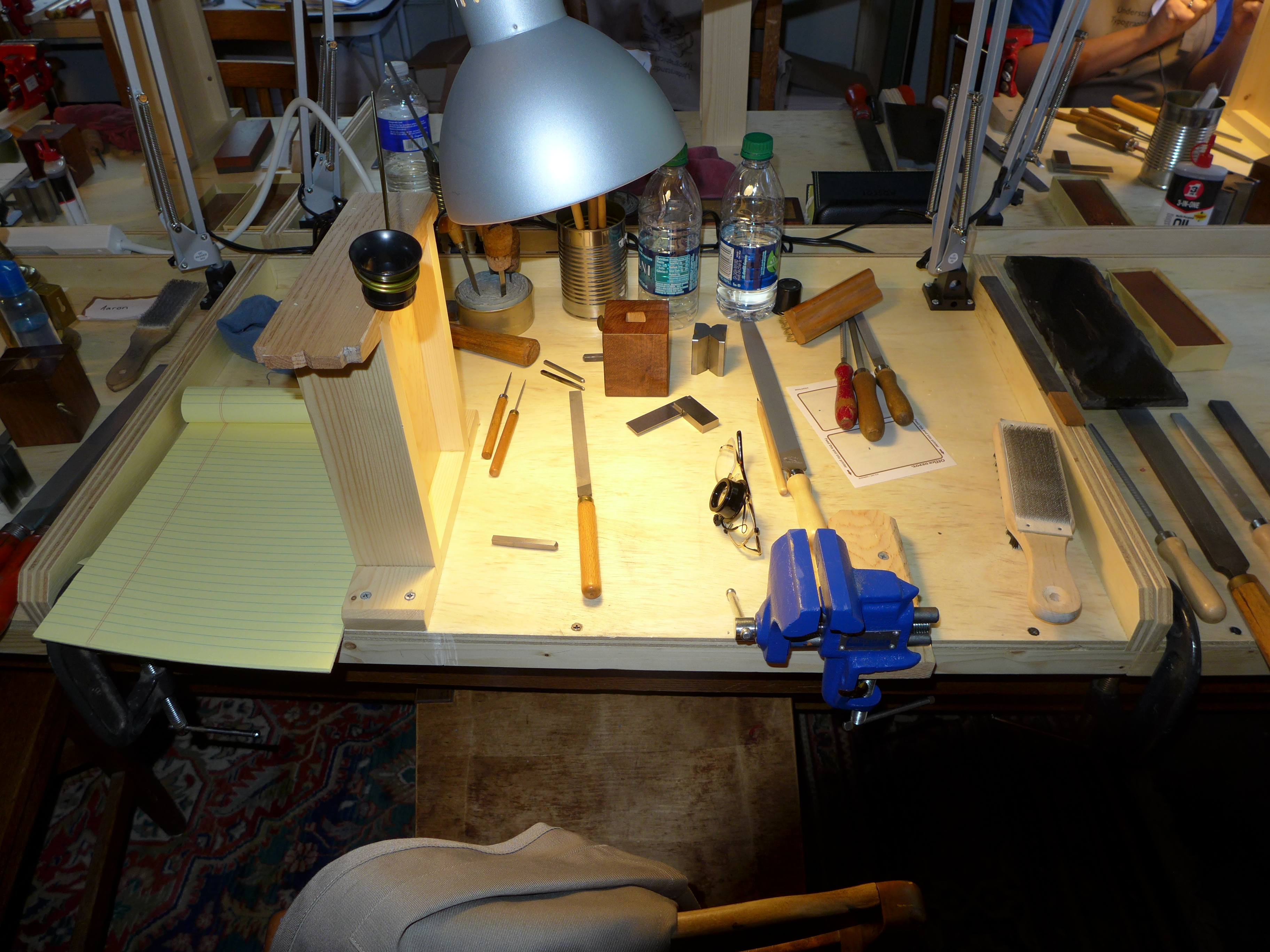
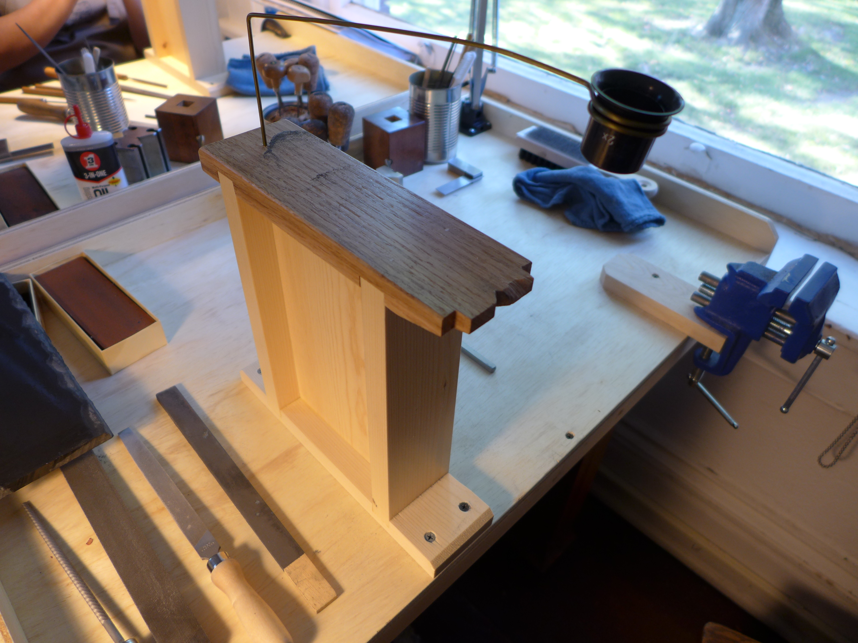
Stan Nelson's "Understanding the Typographical Punch" class was taught in an ordinary (well, a rather nice old) conference room in the Wells Book Arts Center building (Morgan Hall, 1879). Stan constructed a set of self-contained workstations, one per student, which provided an entirely sufficient punchcutting workspace. It is useful to realize how little space and equipment is really necessary. Here are two views the workstation that I occupied in the class, taken one evening with no particular arrangement to the tools.
The bench pin in these workstations is taller than many you might see in other pictures. This is because Stan had to assume that these workstations would be used on ordinary tables with ordinary-height chairs. A punchcutter's workbench is typically much higher than a regular table, and/or the punchcutter's chair is lower. The bench pin must be at a height where you can work on it within the very small working distances of your loupe without being hunched over.
One of the standard items attached to an ordinary jewelers' bench is a "bench pin" (or just "pin"). This is simply a small piece of wood sticking out from the bench, usually with a V-groove cut into it. On a jeweler's bench, it is at bench level (about elbow-level; a jeweler's bench is lower than a punchcutter's bench) and is used for holding workpieces by hand for cutting with the piercing saw (and many other operations).
Here's a cheap version of the ordinary jeweler's bench pin (shown here attached to a board rather than a real workbench because my actual jeweler's bench is, like everything else in my shop, in a state of transition).
The punchcutter does not use a bench pin in this exact form, but does rely upon a similar device which may be called the punchcutter's bench pin. It is an elevated version of the jeweler's bench pin, raised up so that it is nearly at eye level. This is necessary because the working distance for a loupe is very small, and you don't want to work hunched over. The punchcutter's bench pin usually has smaller cutouts than the jeweler's version, and may have multiple cutouts of 'V' and square shape. It is an essential piece of equipment; you cannot really do punchcutting without it.
Moxon called this device the "tach."
The patrix cutter in soft metal (often called a "letter cutter") in the Anglo-American and German traditions (at least) may use the pin, but often instead uses an engraver's shot bag set directly on the bench. So if you're looking at an old illustration and the person at work is using a shot bag, you know that they're a letter cutter. But if they're using a pin they may be either a punchcutter or a letter cutter; you have to look for other signs to figure out which. (And in a more complicated case that I still do not understand, in the short film The Last Punchcutter, Signor Bracchione, head of punchcutting for Nebiolo, is shown at work cutting a punch in steel using an engraver's shot bag on top of a punchcutter's bench pin.)
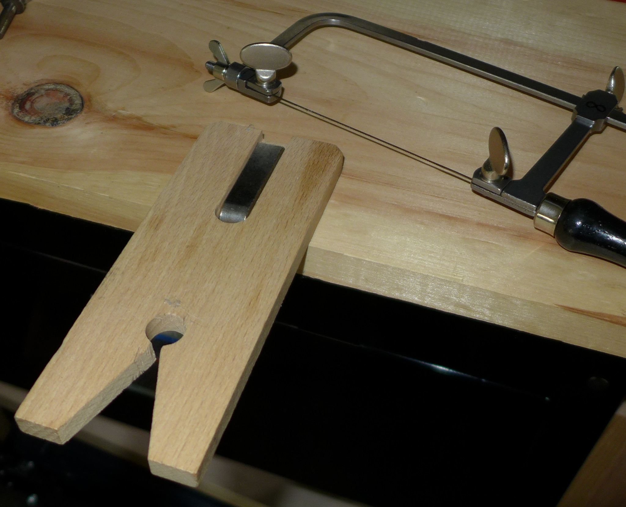
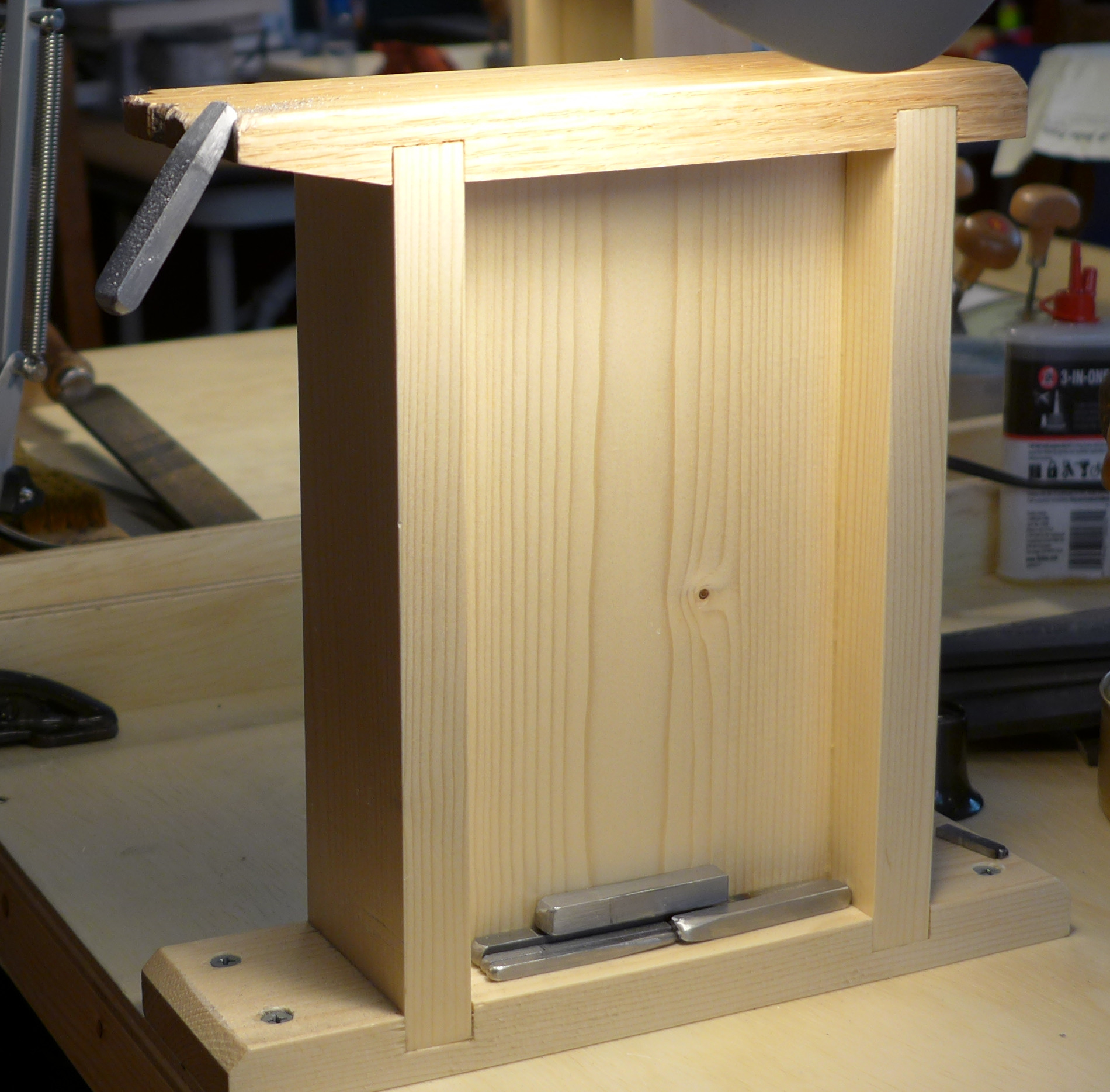
Here are two views of the simple, practical punchcutter's bench pin that Stan Nelson built for his portable teaching workstations: from the side showing the general construction and from the top showing the notches (smaller than those conventionally used in a jeweler's bench pin). As you can see, he used softwood for the body of the pin and hardwood for the top working surface.
And a view (shown earlier as well) of the pin as mounted at the workstation showing also the attachment of a simple wire loupe-holder.
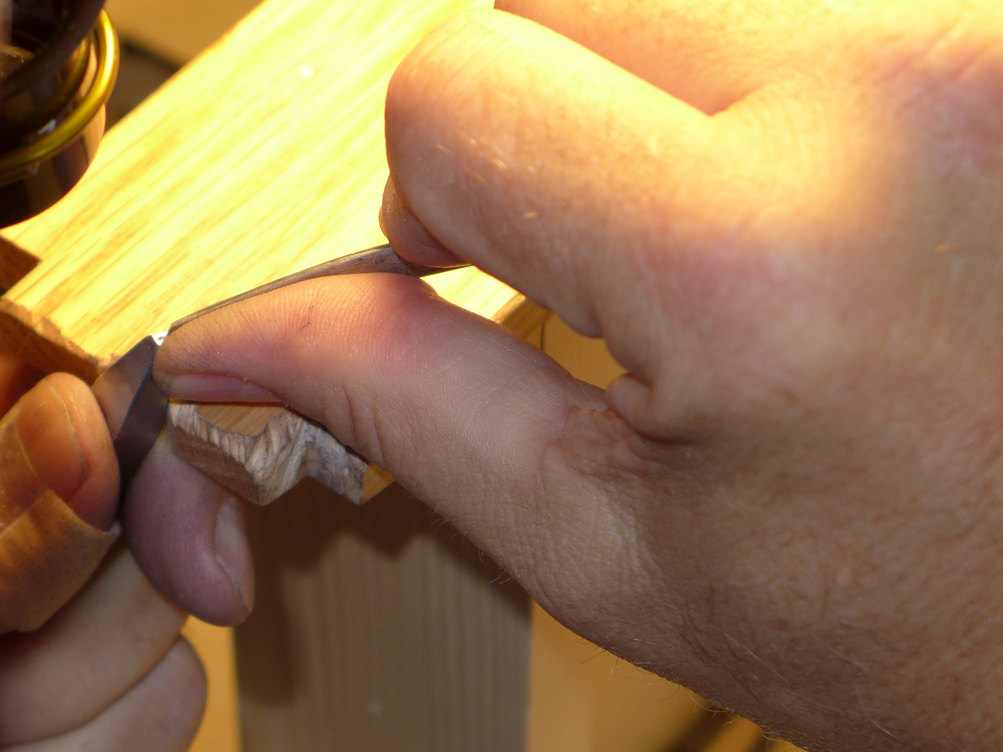
Here's another view of one of these bench pins in the class. Here a punch was accidentally wedged into the pin while it was being filed. This provided a great photo opportunity to show the punch in working position without being obscured by the punchcutter's hands.
Here are two views of a bench pin in use. On the left a punch is being filed. (The file in use is a medium-sized file, and the "long slope" of the punch is being worked on. Often the punchcutter's files are the much smaller needle files and "escapement" files.) On the right a punch is being carved using a graver. In both cases, the hands are those of Stan Nelson; the photos were taken at his 2016 Wells College class.)
The "Facer" is used to make the working end of the punch blank flat and square with the body, and to smooth both the blank and, later, the punch as worked to a high state of polish.
The Facer is one of those tools that I find theoretically annoying. It is designed so that it will wear itself out. But I have no real grounds for my discontent. In practice the facer has served punchcutters well for centuries; it works.
This tool has had many names. It is called a "Flat Gauge" by Moxon (who used it against a large file, not an abrasive stone). Fournier calls it the "Equerre à polir," which would translate literally as something like "square for polishing" - a nicely descriptive name. Carter translates Fournier's term into blunt English as "Facer." In the circa 1919 Williams Engineering catalogue of typefounders' tools it is called a "Jointer" (presumably by a rather stretched analogy to the jointer plane in woodworking, which does flatten things, but in an entirely different way). Otto Furhmann, translating Paul Koch for an article in The Dolphin in 1933, calls it a "Facing Square." I don't know its names in German or Dutch. I do not yet know of an 18th century source which says what Bodoni called his, but in De Pasquale's La fucina dei caratteri di Giambattista Bodoni (Parma: Monte Università Parma, 2010) two are illustrated and are called "squadre per appianare i punzoni" (squares for smoothing the punches). I first heard it called a "Facing Gauge," but I cannot find the term "Facing Gauge" attested in the literature. Since the punchcutter has so many other "gauges" which really are gauges, I'll just follow Harry Carter's lead and call it a "Facer."
Here I'll show some traditional forms of Facer and then a simple and effective modern substitute (the machinist's V-block). After that I'll do something a bit unusual for this Gallery and propose that we need to consider a different style of Facer entirely.
First, here is the oldest illustration of this tool, Moxon's "Flat Gauge," from 1683.
(This image is from the 1901 reprint by Caxton's Magazine of a part of Volume II of Moxon (the volume on Printing) as scanned from the Wellcome Library copy and available via The Internet Archive at: https://archive.org/details/b24865400 )
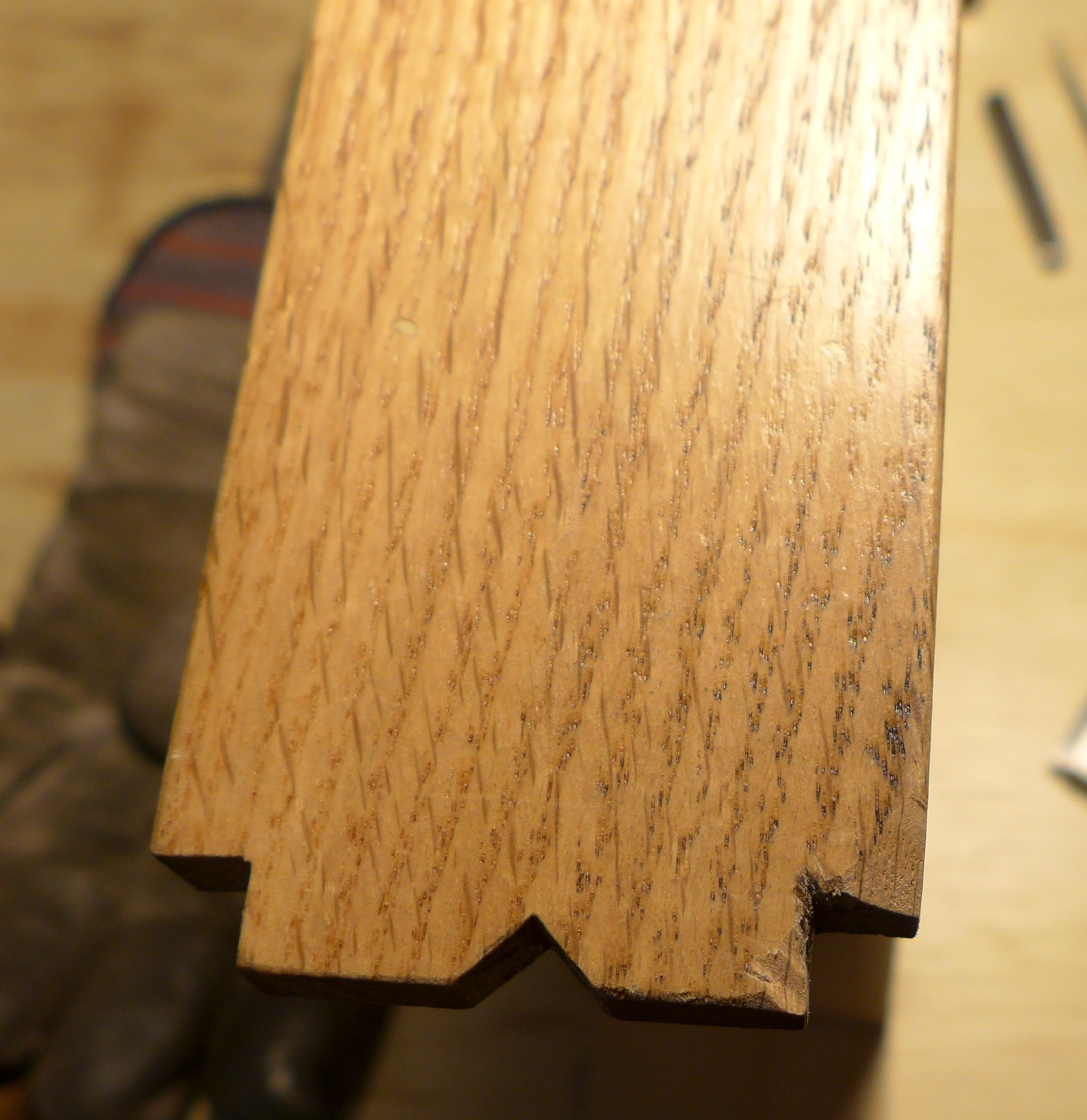
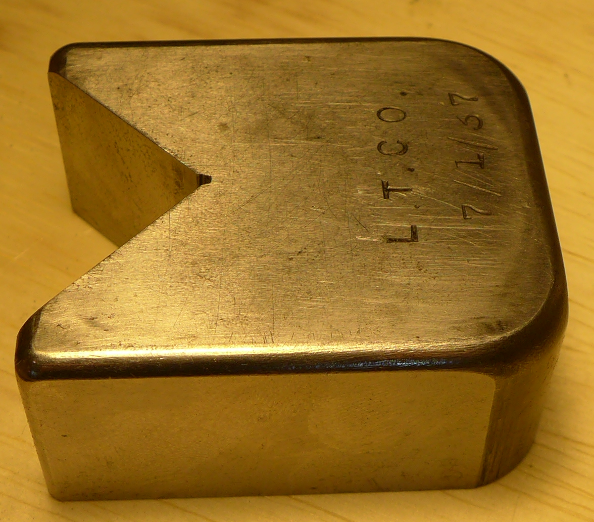
Now, just to show how little things change, here is one dated 1937 (254 years later) which, aside from a difference in its overall external shape, is functionally identical.
The Facer shown above is owned by Stan Nelson and was photographed at his 2016 Wells College class. The identity of "L.T.CO" is not known. (It isn't Lanston, as they were the Lanston Monotype Machine Co. It isn't Linotype, as they were the Mergenthaler Linotype Co. and always used "MLC".)
Returning to the 18th century, here is the Equerre à polir from the Encyclopédie (in the first part of the second volume of plates, 1763).
(Extracted from the scans done by the ARTFL Encyclopédie Project of the University of Chicago.)
Here's an antique Facer that I happen to own. It's actually rather small for normal punchcutting. The group of tools with which I acquired it was owned by an engraver, and it may have been used for some other purpose. But, functionally, it is a punchcutter's facing tool.
Here it is shown as it would be used on a stone (a 3 inch wide single-grit Norton Fine India stone). The punch shown in it is relatively small, but of normal length (it's a counterpunch, actually).
Here (below) is a larger Facer of similar form. This one is owned by Stan Nelson (and I presume he made it, too) and was made after a drawing by the late Henk Drost (punchcutter at Enschedé). I photographed it at his 2016 Wells College class. It isn't entirely clear in the photographs, but the square hole in the base is set slightly back from the vertical pieces so as not to interfere with them.
A Modern Commercial Substitute
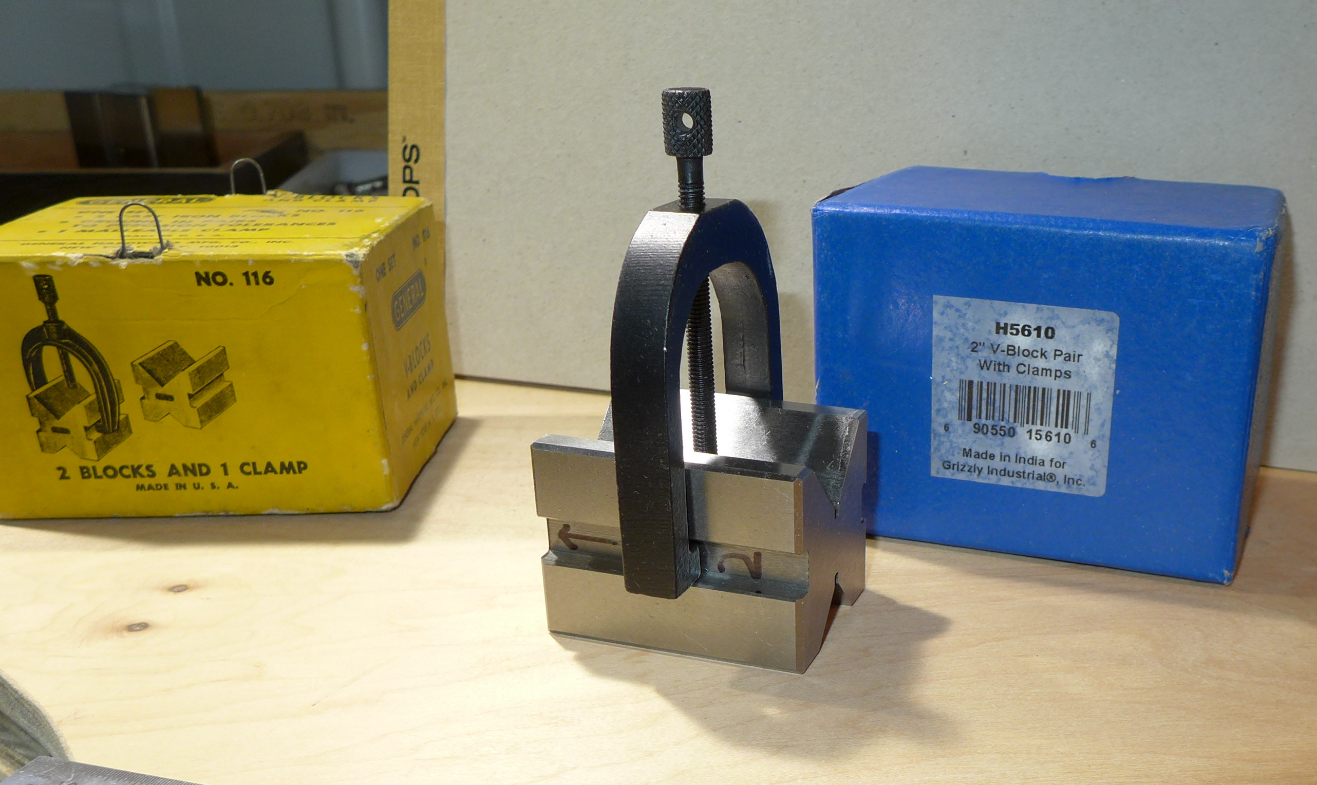
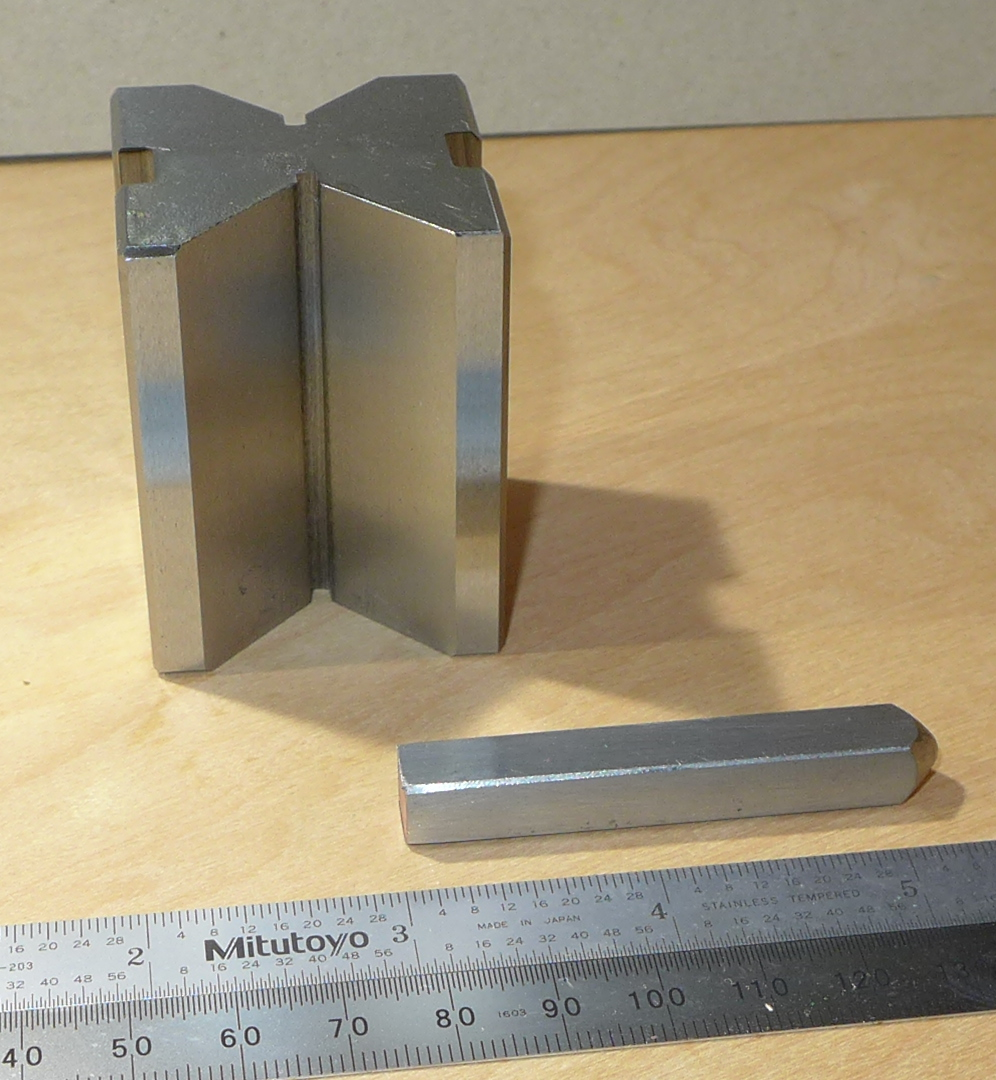
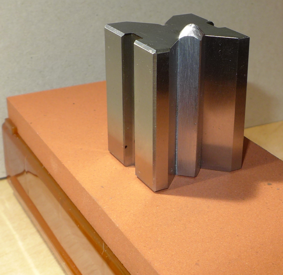
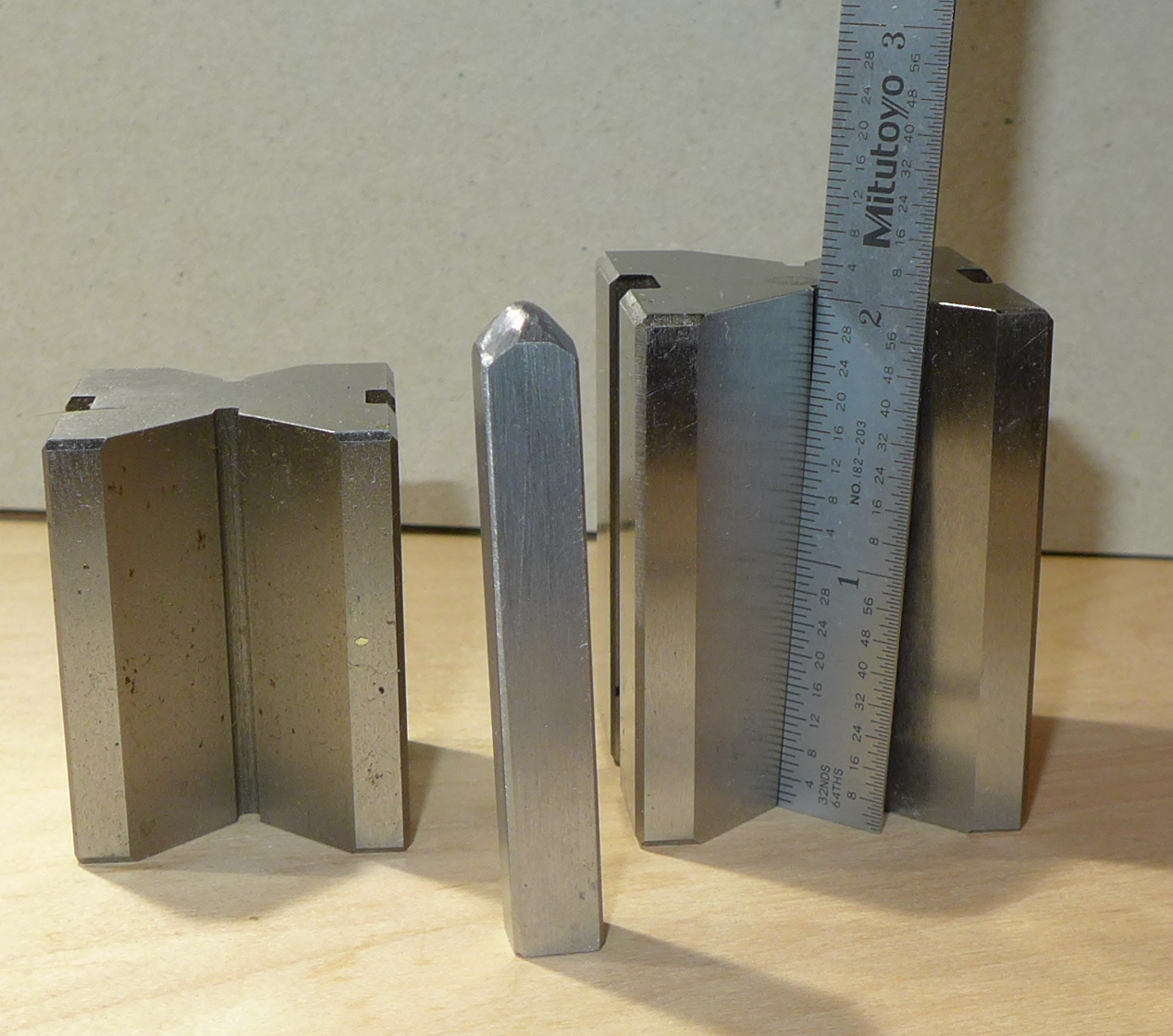
Stan Nelson suggests that a standard machinist's "V-block" may serve as an excellent, easily available, substitute for the Facer. We used them in his 2016 Wells College class. Here are some photographs of ordinary machinist's V-blocks photographed later, in my own shop.
The block as you buy it is furnished with a clamp and is normally used by machinists in the orientation shown to clamp round parts in machining setups (though of course it has an unlimited number of uses). In Stan's class we didn't use the clamp.
(The box on the left above is a box for a vintage set of "General" brand V-blocks. This was once a reputable brand, but is now a trade name applied to particularly poor quality products. Fortunately, they no longer make V-blocks. The box on the right contained a set including the block shown. It is sold by Grizzly (a US importer of medium-quality machine tools) and, despite a rather low price, is extremely precise.)
Below left is a V-block shown standing on end in the orientation you'd use it in as a Facer. In front of it is a punch blank with the hammer-end (on the right) finished. Below right the same V-block and punch blank are shown in position on a 3-inch wide single-grit Norton Fine India stone.
V-blocks come in various sizes. Because many punch blanks for common sizes, if measured in inches, are often about 2 1/4 inches long, the V-blocks called out in US catalogs as "2 inch" usually work well. But smaller ones will work, too. For comparison, the block on the left (below) is 1 5/8" and the one on the right is 2".
(Don't look too closely at the finish on the hammer end of the punch.)
Because I'm a bit obsessive, I did measure this inexpensive Grizzly import V-block using a dial test indicator on a surface plate. Its variation in height (when standing on end) was only a few 'tenths (a few ten-thousandths of an inch). This is very impressive, but also well within limits easily achievable by ordinary surface grinders.
The Facer is an extremely simple tool with no moving parts. These are characteristics very much in its favor. But it is necessarily worn away in use. It doesn't wear away fast enough to be a problem, and it may be resurfaced (this can be done easily in any machine shop with the machine tool known as the "surface grinder," but in any case the machinist's the V-block is cheap enough that it may simply be discarded or put to some other use). So the Facer has been a practical tool of the punchcutter for centuries. This argues against its improvement; it isn't broken, so don't fix it.
But still its necessary wearing-down bothers me, because I think that there must be a better approach. I haven't yet tried it, but I would suggest that the following style of tool might work well.
In the antiquarian fine mechanical field known generally as "ornamental turning" (with its sub-fields devoted to rose engine work, guilloche, etc.) it is necessary to sharpen cutting tools to very precise angles. The tool used for this in the 19th century was called a "goniostat" (related devices are used in gem cutting). The version traditional in ornamental turning sits on three legs. Two of them are part of the goniostat and move over the table, while the third is the tip of the cutting tool itself. It moves on a sharpening stone. Since the goniostat itself never touches the stone, it is never worn away by it.
(There are also modern fixtures for sharpening based on this principle, though typically they're only adjustable for a single angle.)
Here are two similar versions of an ornamental turning goniostat, as shown in the third volume of Charles Holtzapffel's Turning and Mechanical Manipulation (First edition, London, 1850): 1162, 1159.
(Images from the scan of the Univ. of Toronto copy, available via The Internet Archive at: http://archive.org/details/turningmechanica03holtuoft)
In punchcutting we need only one angle: 90 degrees in both planes. If you had an ornamental turner's goniostat, you could just set both scales to 90 and face your punch. Or you could (and I should... too many projects!) build a simplified tool based on this which was set permanently to right angles.
(For more on the Holtzapffels' magnificent five-volume work, which is one of the basic texts that should be on the bookshelf of anyone interested in older technology, see the CircuitousRoot Notebook on the Holtzapffels, which is a part of the more general Notebook on the literature of ornamental or complex turning .)
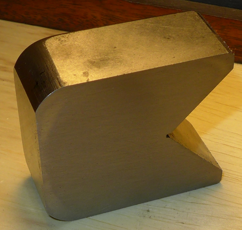
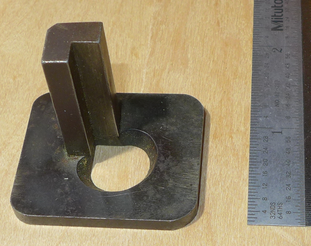
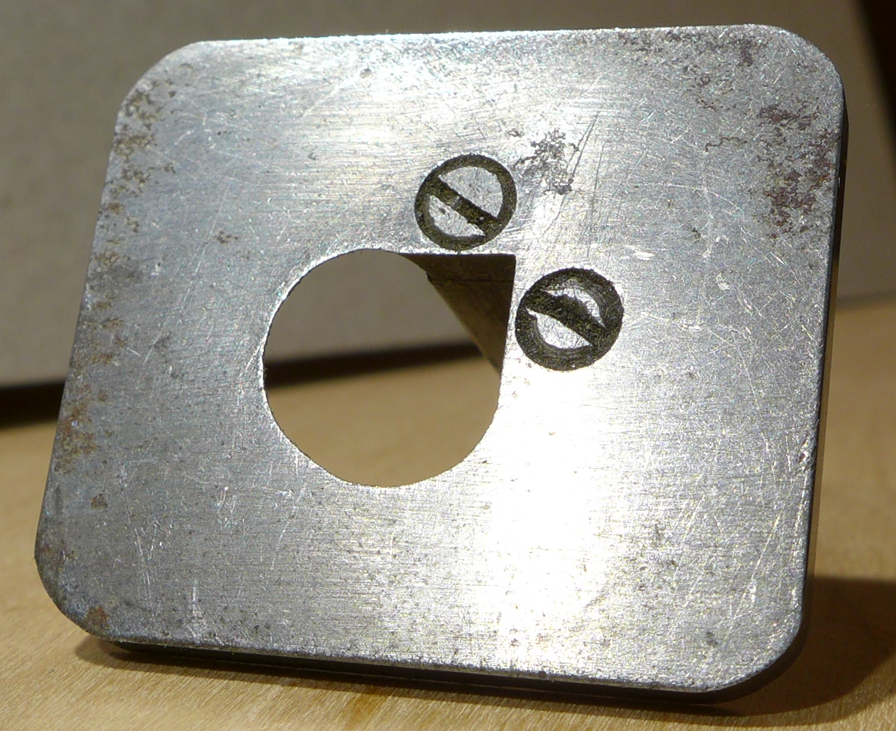
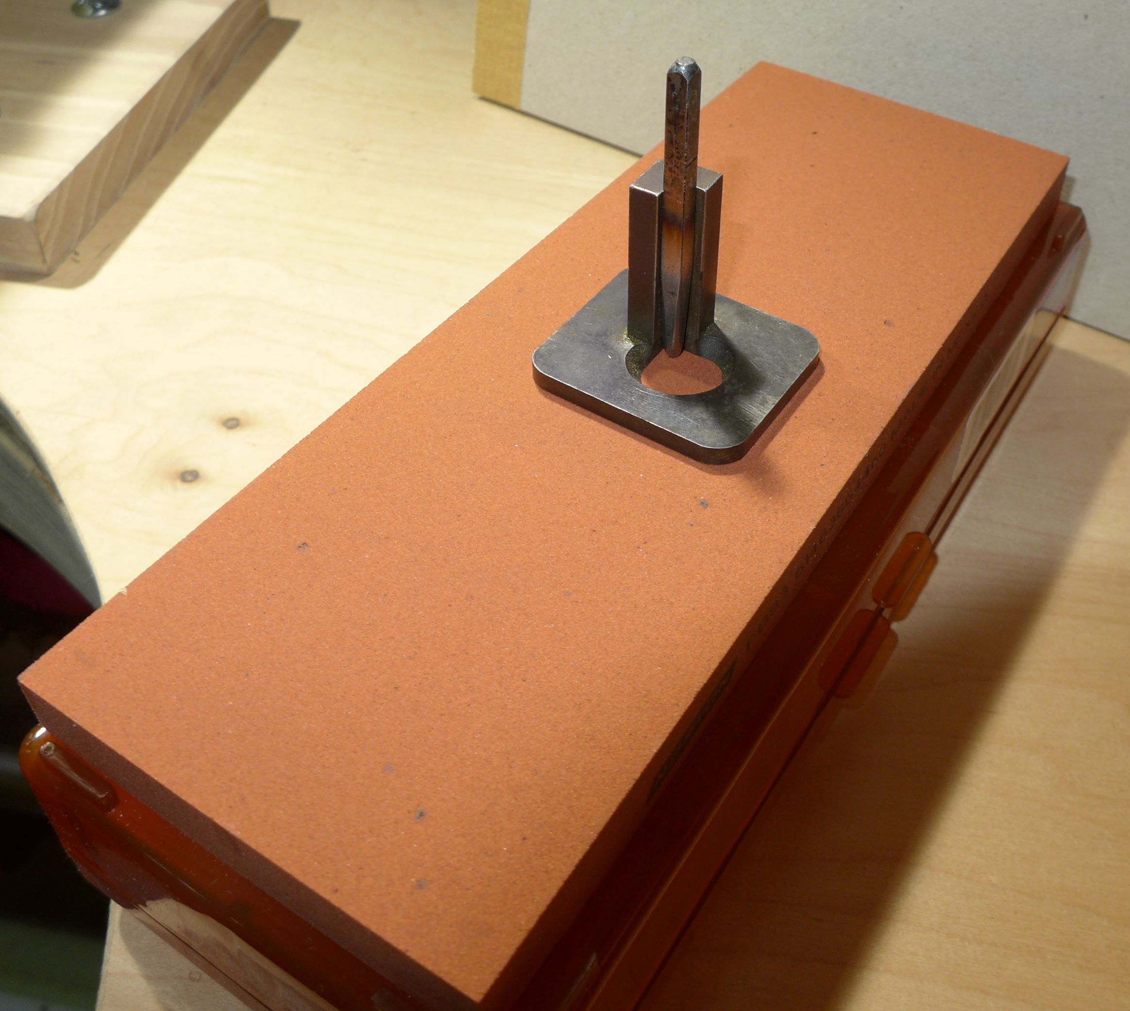
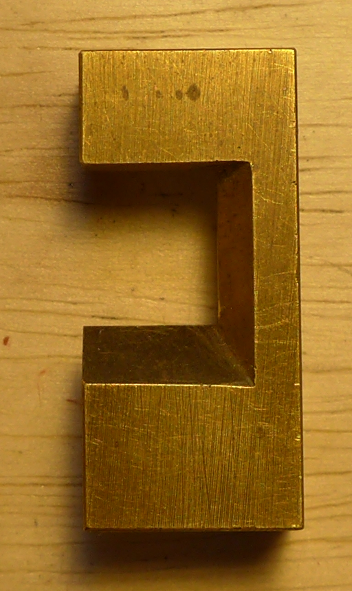
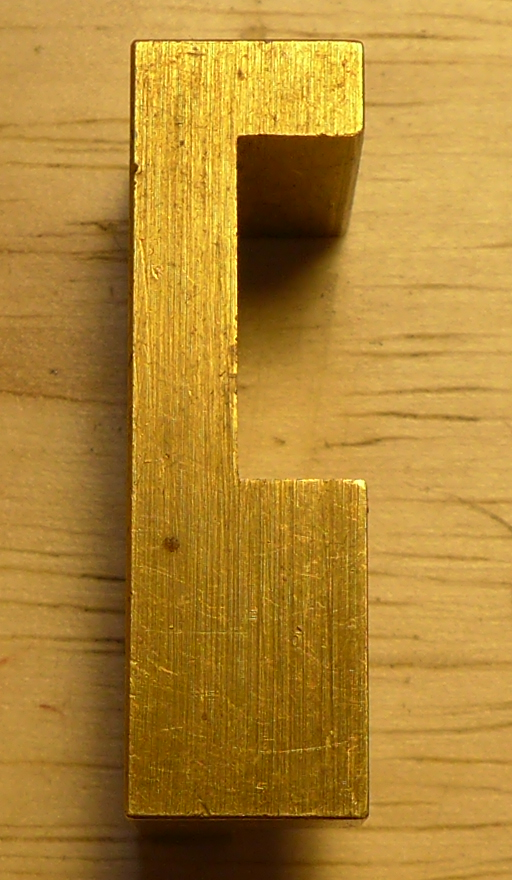
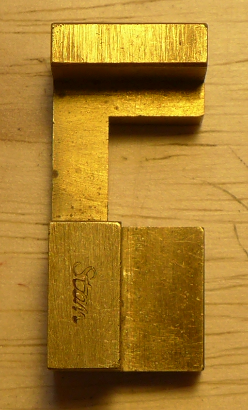
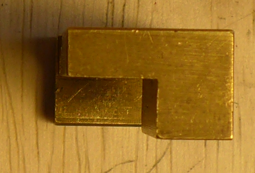
This is one of the cleverest specialized tools I've seen. It is just a jig which you hold against the punch blank (or hold the punch blank in it, depending on how you think about it) which allows you easily to scribe a line for the signature on the punch. (You would then deepen this scribed line with a file into the actual signature line.) I don't know the history of this device, or even its real name ("signature jig" is just a name I came up with to describe it here). I don't recall ever seeing it in the literature. This one was made by Stan Nelson.
This is not an essential tool. You can use an ordinary machinist's square instead. But it can be awkward to hold a machinist's square against a punch. This tool is the perfect one for this job.
Here it is with a punch blank in it. But please note an error in the second photograph. I took these photos at Stan's 2016 Wells College class, but before I really understood what this jig was. So the punch blank in the second photo is being held with its hammer-end down. This is upside down; the signature line should be closer to the hammer-end, so the hammer end should be up.
(So to use this jig, you put the punch blank in it, with the finished hammer-end up. Then scribe a line across the punch blank at the beveled part of the opening in the jig.)
Here are six orthogonal views of it, in case you should want to make one.
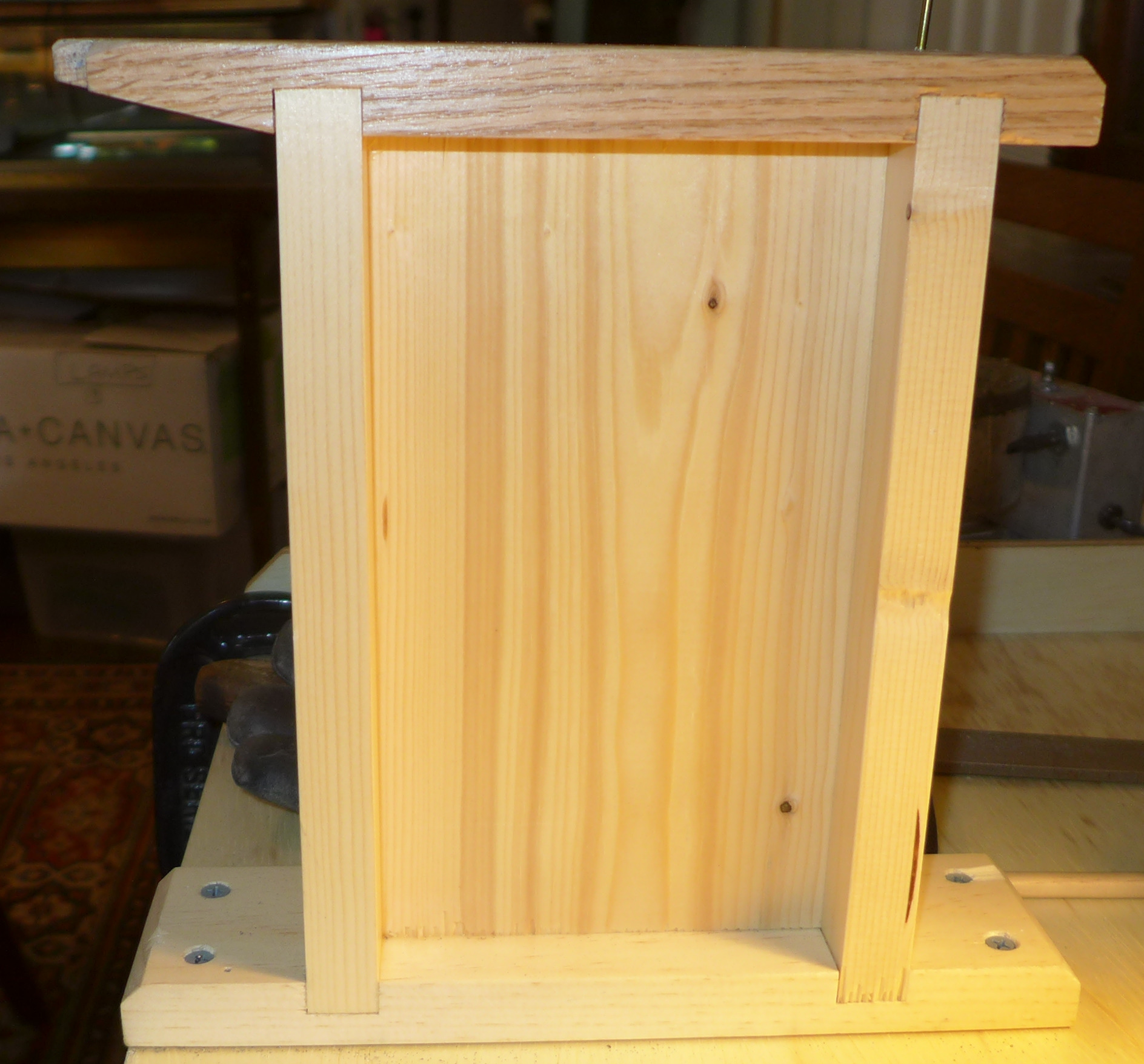
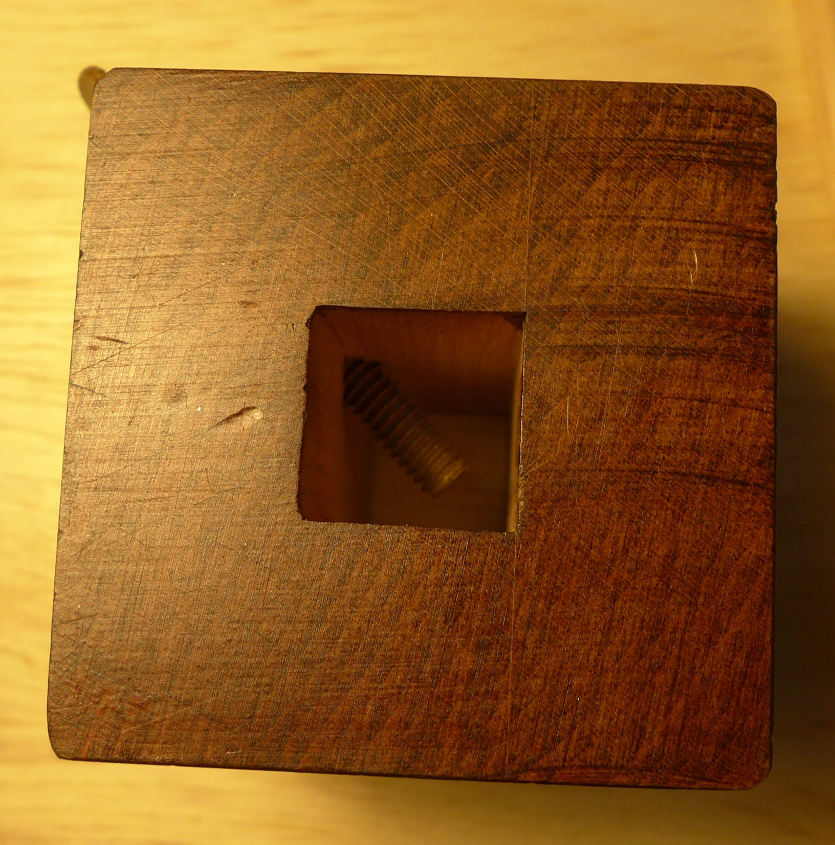
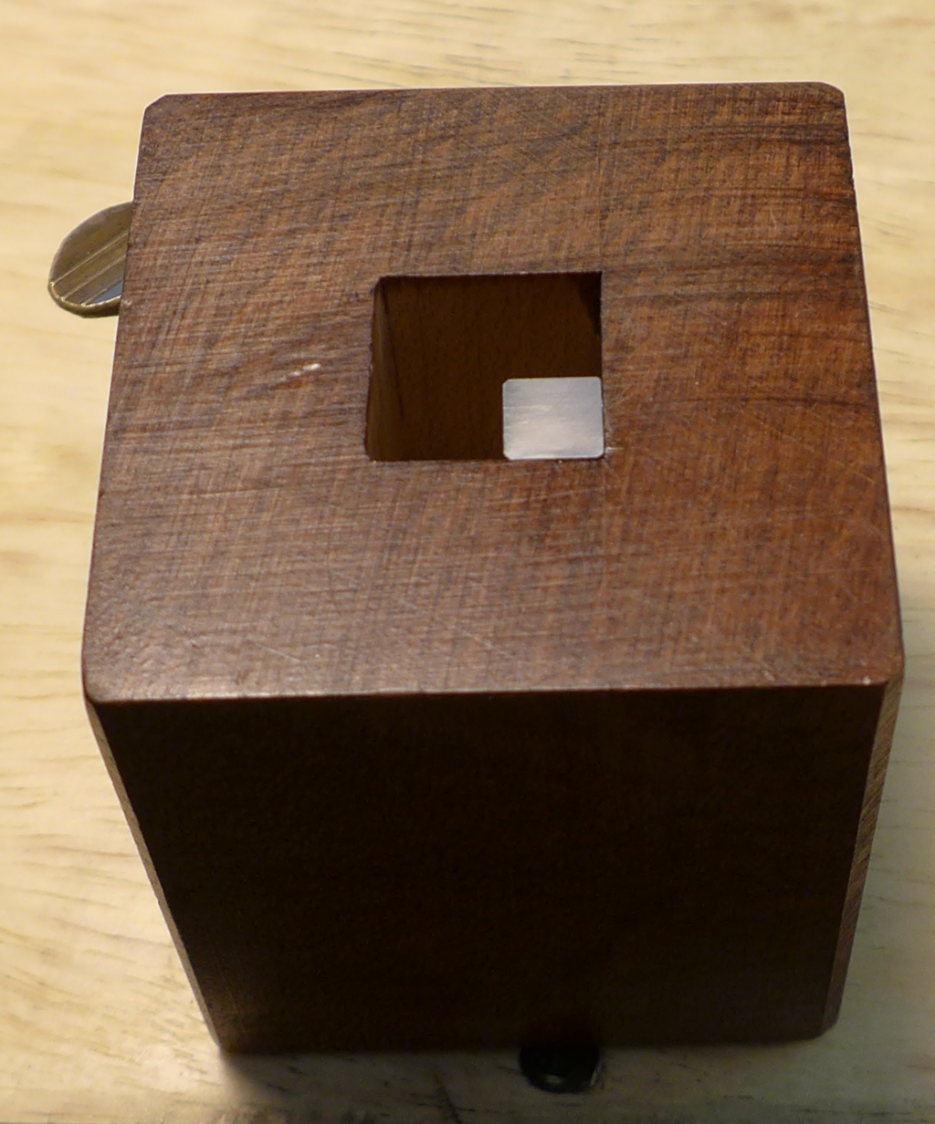
One of the most basic tools of the punchcutter (though I never would have thought of it before Stan's class) is simply a fixture to hold the punch while you draw or otherwise apply the design to its working face. This is called a "Drawing Box."
Traditional Drawing Boxes are lovely works in brass and steel (shown later). An effective substitute may be more easily made from wood.
Here's a top view and a view of one holding a punch blank. It is easier to make these from two parts glued together than it is to drill a square hole. I didn't measure this one (which was one of several made by Stan Nelson and used in his 2016 Wells class), but in terms of dimensions it must be tall enough to accomodate the entire length of your punch, the hole must be large enough for your punch (obviously), and the wall should be thick enough that it is easy to place a sheet on top of it. (In addition to drawing per se, the Drawing Box is also used to hold the punch blank while the image is transferred to it.
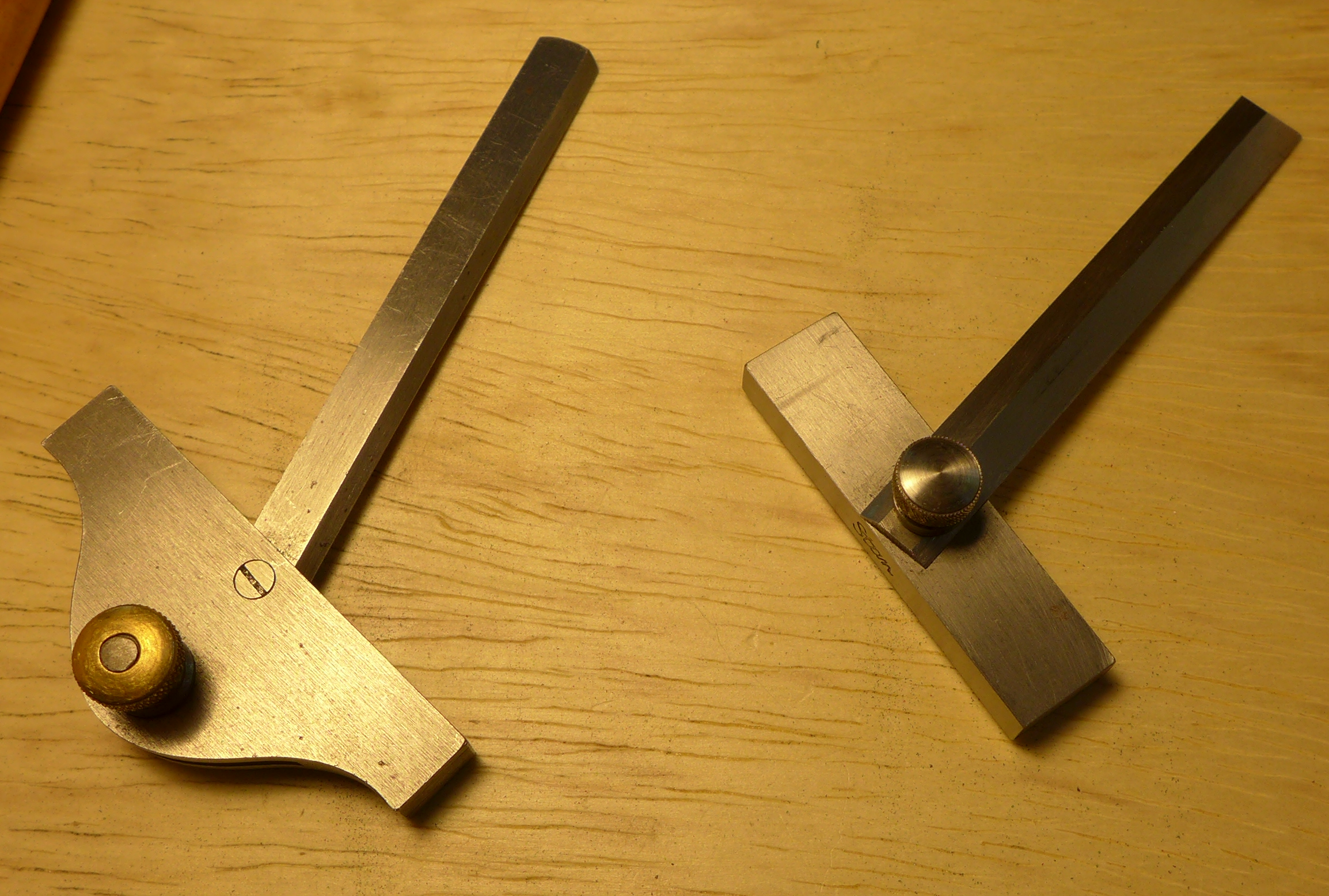
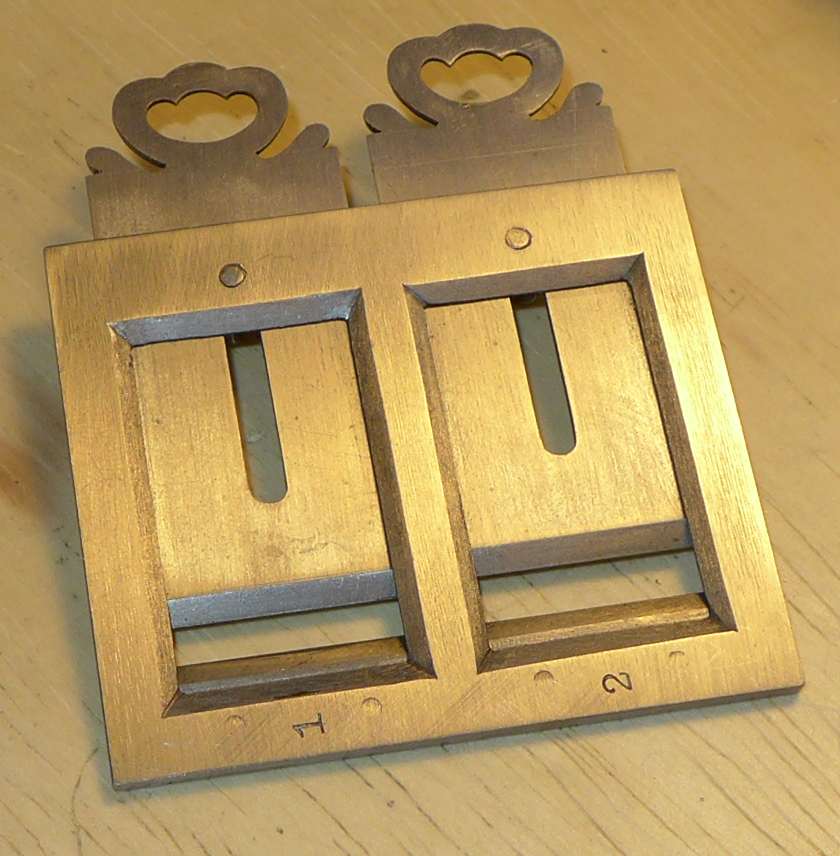
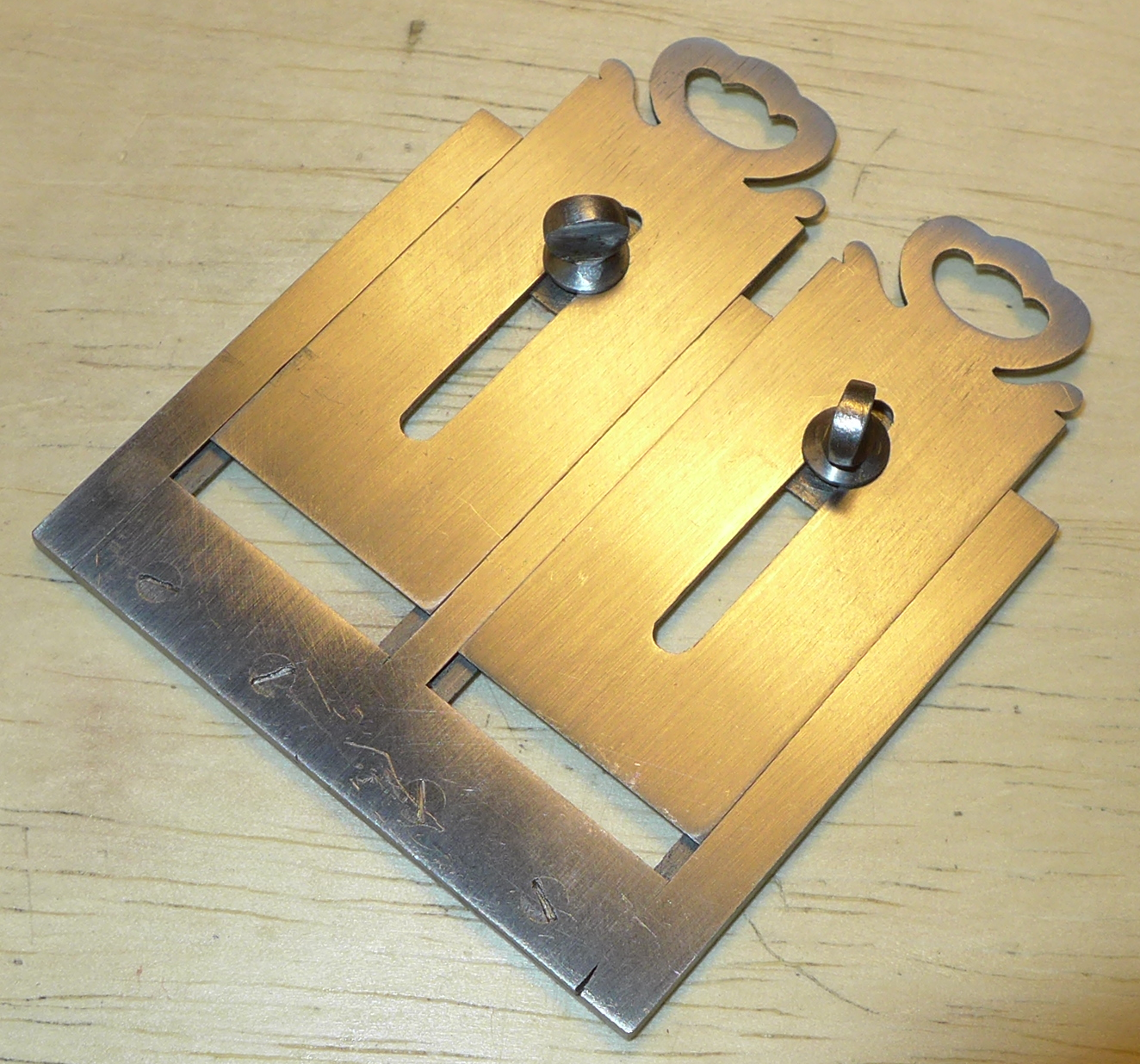
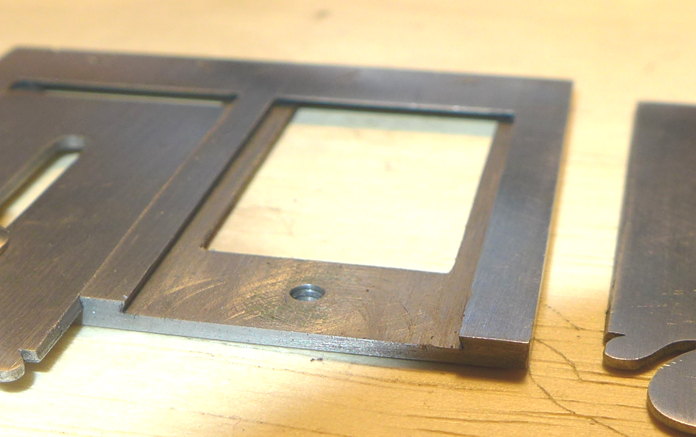
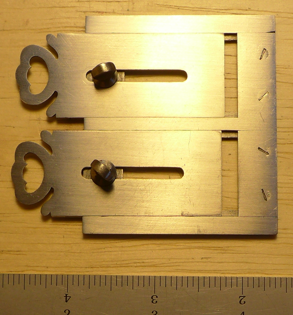
Here are two adjustable angle gauges. Both were made by Stan Nelson. (If you zoom in on the full-resolution version of the first image below and look at the gauge on the right, you'll see Stan's signature punched into it.)
These are un-graduated gauges which can be used to transfer angles from one piece to another (and also to scribe lines at an angle). It's clear that the gauge on the right (the simpler of the two) uses the thumbscrew to allow you to tighten the gauge to some angle. I'm not sure if this is the case with the gauge on the left.
Here's a view of the left gauge showing the head a little better. The beam (or whatever it's called) of the gauge does actually meet the head of the gauge on-center. It's just that the combination of the head being at an angle to the beam and the whole gauge being tilted in this photo makes it look off-center.
This tool is illustrated and its use is described in Paput's La Lettre, but I could never understand it. The problem was in my own approach: I was making things too complicated.
The "calibre" is a simple transfer gauge. If you have a dimension on one piece (say, an original 18th century punch at l'Imprimerie nationale) that you wish to transfer to another piece (such as a new copy of that punch), you set the calibre to match the dimension of the one and use it to reproduce that dimension on the other.
The name "calibre" simply means measure. It's the same basic word from which we get (in English) the "calibre" of a gun (the measurement of its size) or the "caliper" used by a machinist to make a measurement.
The calibre is not an essential tool. If you are doing new work from drawings, you might never use it at all. (We never used it during our class.) But if you're reproducing existing punch or type, or working to match the style of an existing piece, I would think that it would be very useful.
The advantages that I can see in the "Calibre" as used by the I.N. and by Stan Nelson over other kinds of calipers/gauges are (1) because it is flat it sits easily on the face of a punch or type, and (2) because it is sharp-edged it can be set very precisely. The measuring edges are sharp knife edges, but they are ground with an bevel/angle on one side only. So they more closely resemble the sharp edges of a woodworker's plane (by way of contrast, most knives are ground with bevels on both sides).
If you look at photographs of the workbenches at the I.N. you will see Calibres in both single and double forms.
Here is a double Calibre made by Stan Nelson after the ones at the I.N. The photographs are not properly balanced for color: it is made of steel. This first view is actually the top of the instrument as you would use it (even though the heads of the thumbscrews used to fix the blades in place are therefore on the bottom). This is the side you look at, while the perfectly flat (bottom) side is the side you apply to the thing being measured.
The bottom side, which goes against the thing being measured:
A close-up showing the dovetail slides for the long blades:
Here's a straight-on view of the bottom of the Calibre shwn with a scale (the scale is in inches).
Some close-up views, showing the geometry of the bevels of the frame, dovetails and the blades...
and one of the blade-setting screws.
If you're thinking of making one of these, note that as constructed at the I.N. a double Calibre has eleven parts:
Making the short blades as separate pieces is much easier from a constructional point of view.
A double Calibre similar to the one shown above, but with an additional angle gauge attached to one of the short blades, is offered for sale in the 1905 catalogue of A. Foucher.
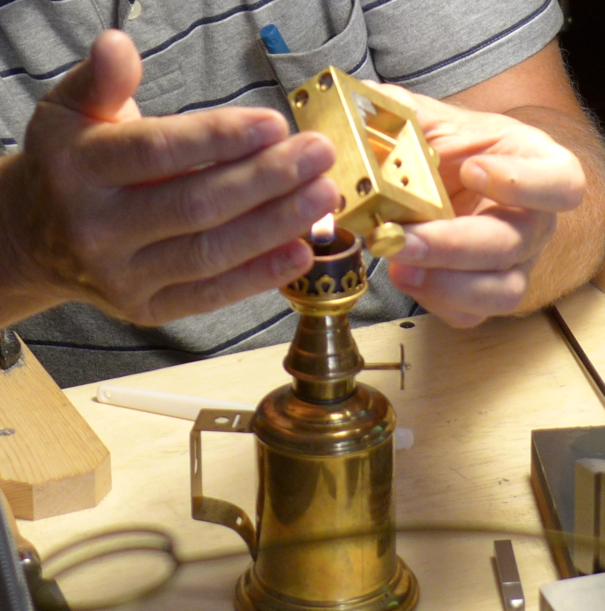
Soot from a flame is needed in at least one, and sometimes two, operations in punch and patrix cutting. The better known of these occurs later in the process: making "smoke proofs" of the work in progress. But soot may also be used to transfer a design from an existing type (for example) to the blank.
If you look at the workbenches at l'Imprimerie nationale or at Stan Nelson's Atelier Press and Letterfoundry you will see a particularly nice looking lamp used for this purpose.
For example, in the photograph below left Stan is using such a lamp to deposit soot on the face of a piece of type held in the brass fixture in his hands. (This soot image will then be transferred to a piece of mylar film which has been made slightly oily, and then to the face of a punch blank (also made slightly oily, in both cases by dabbing with plasticene modeling clay). In the photograph below right Stan is depositing soot on the end of a punch to take a "smoke proof" from it.
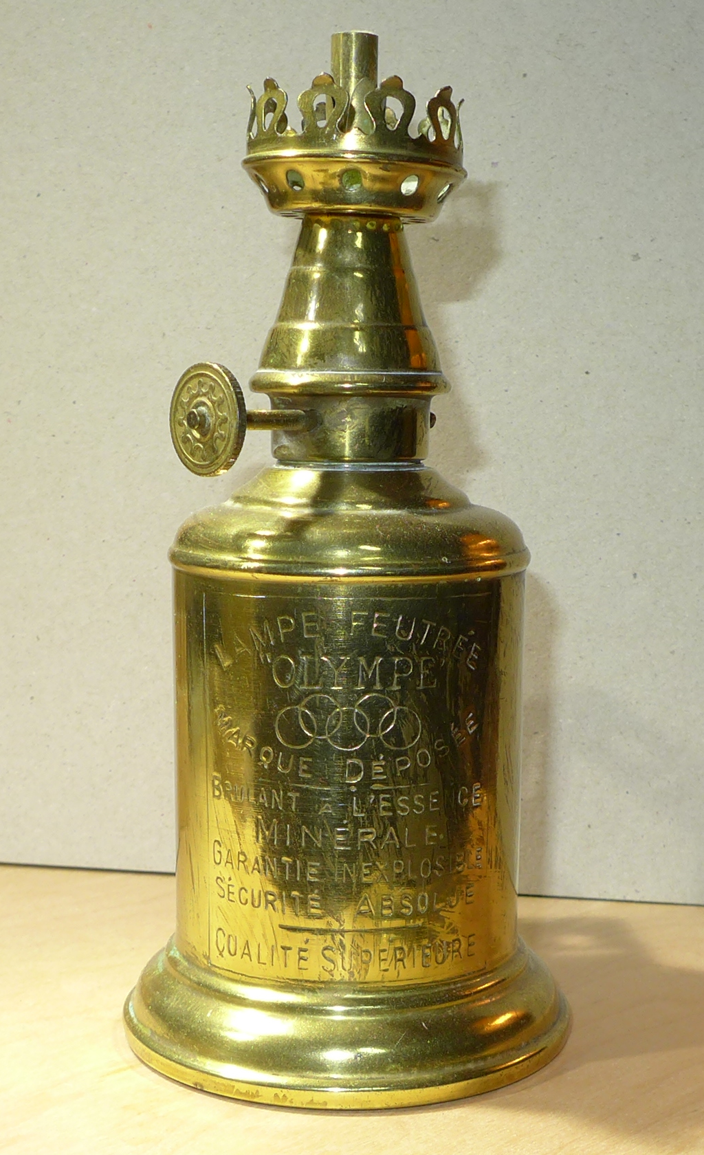
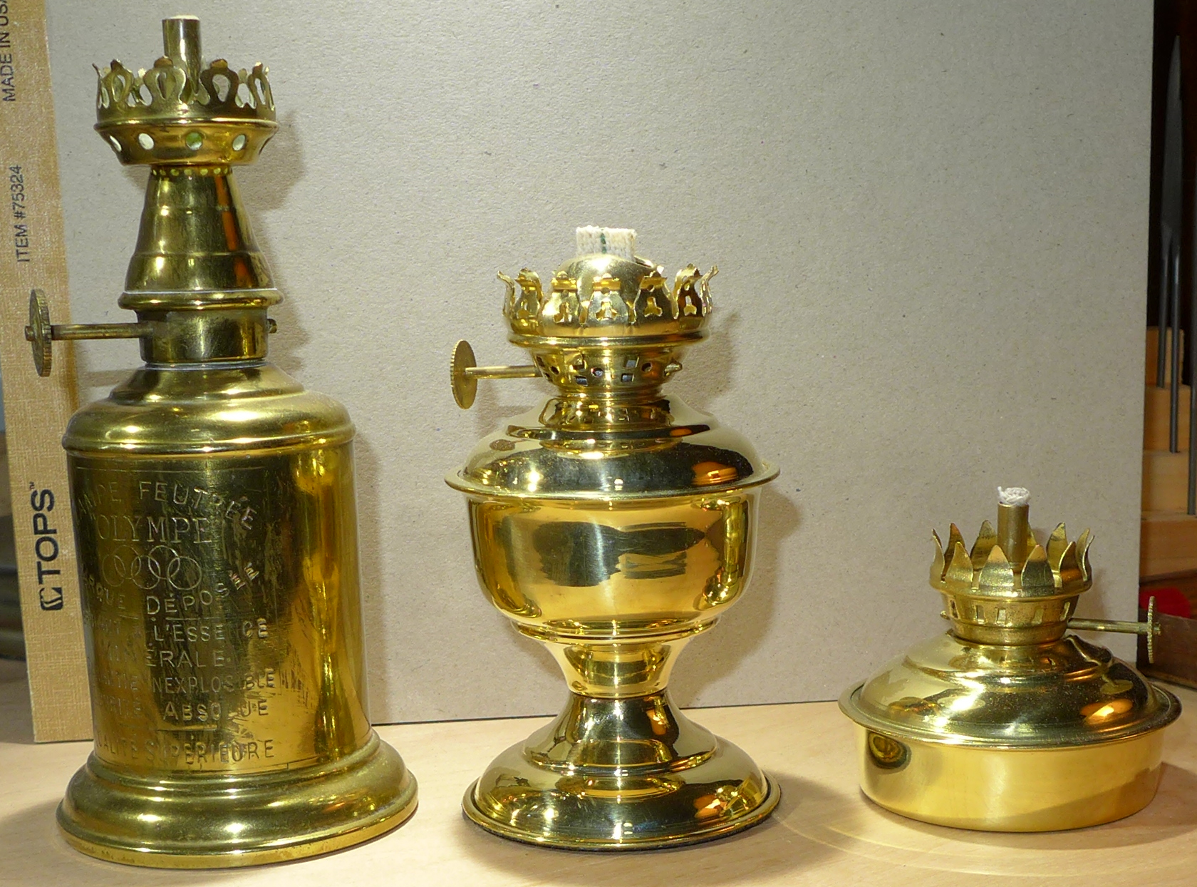
The lamp Stan used in class was of the "Olympe" brand (note the five Olympic rings in on its label in the photos below). Here are two views of one in my shop (no, it wasn't there before I took Stan's class - I went looking for one immediately after I came back home).
First, a couple of functional points: The lamp as manufactured comes with a glass chimney. That isn't used in this application. If you're buying one secondhand, this can help - they're cheaper without the chimney. Second, where the glass chimney would normally go, Stan has inserted a short length of ordinary iron/steel pipe to help control drafts. I haven't yet made this for mine.
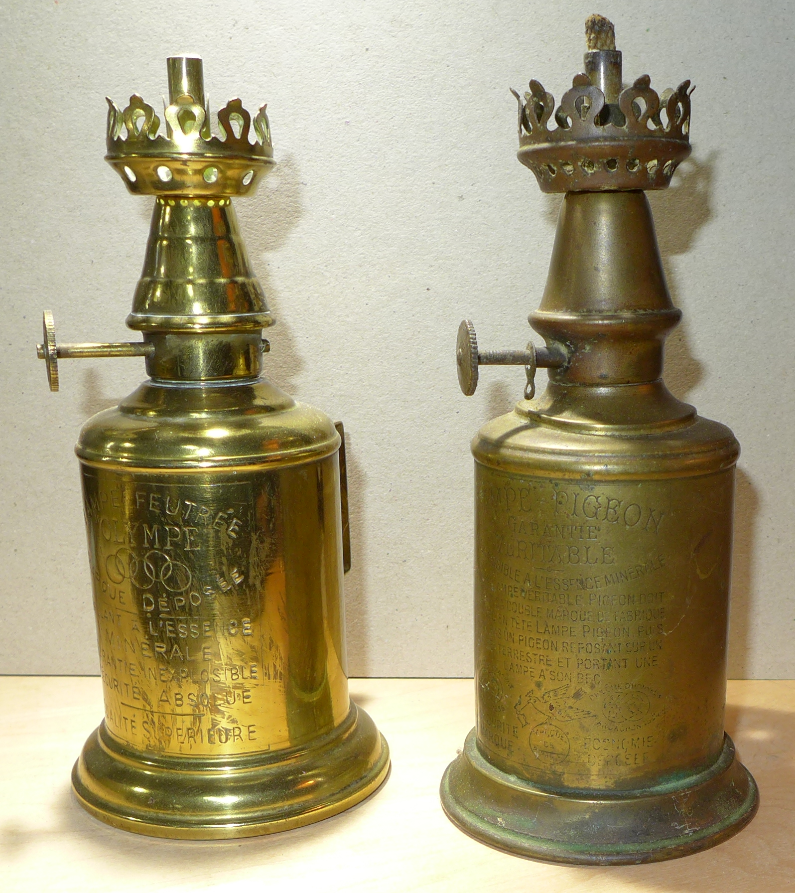
But the "Lampe Olympe" is not the original version of this lamp. It derives from one style of the Lampe Pigeon, invented in the 1880s by Charles Pigeon. See the French-language Wikipedia article on it at: http://fr.wikipedia.org/wiki/Lampe_Pigeon
Here is a Lampe Olympe (left) and a Lampe Pigeon (right):
Here are closer shots of the "label" of each:
The form shown here was not the only style of Lampe Pigeon. Even a quick look at collectors' websites reveals a diverse production (see for example lampespigeon.chez.com; there are several collectors' books as well).
All of mine are secondhand, but you can still buy a brand new "Lampe Olympe (Lampe Pigeon)" from Gaudard A. & P. in France: www.gaudard.com They also sell parts, though of course their parts would only be guaranteed to fit their current production lamps. I've found that one of the best places to look for secondhand examples is Etsy
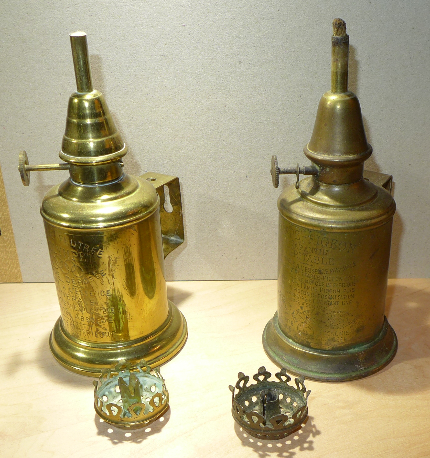
A complete lamp in this style will have a glass chimney and, at least in most antique ones, a small cap on a chain used to cover the wick/tube when not in use to prevent evaporation of the fuel. None of mine have these.
A complete lamp implementing the principles of the Lampe Pigeon will, further, have its body packed with felt.
The crown-shaped piece is removable, and is sometimes missing from secondhand examples. You can get it as a single replacement part from Gaudard. In their catalog it is called a "galerie" and is part Réf. GA1. Here it is shown removed from the same two lamps:
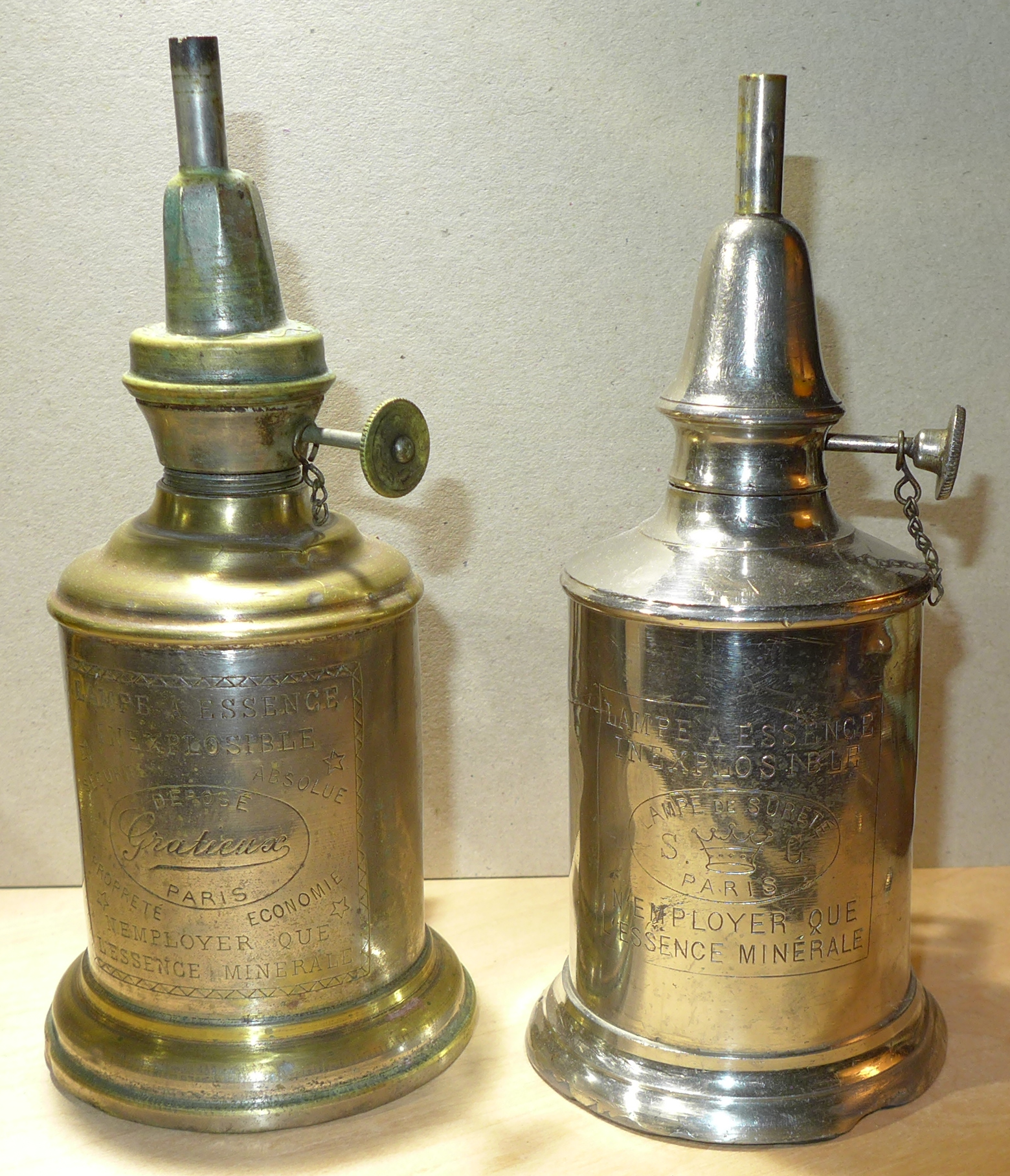
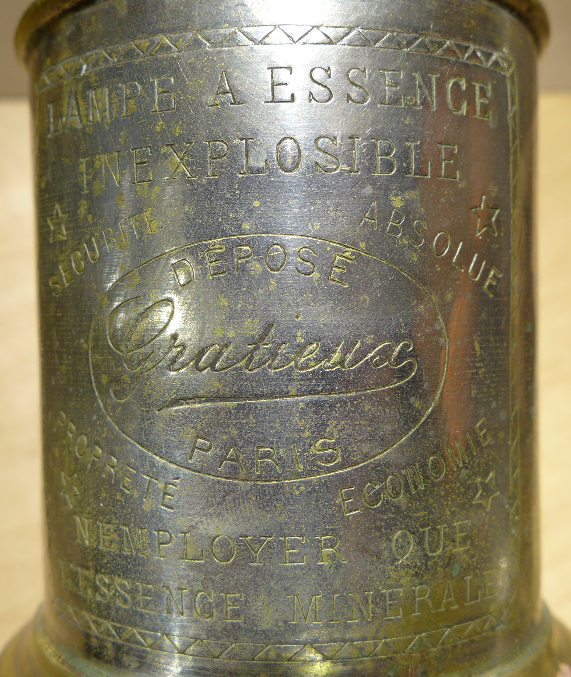
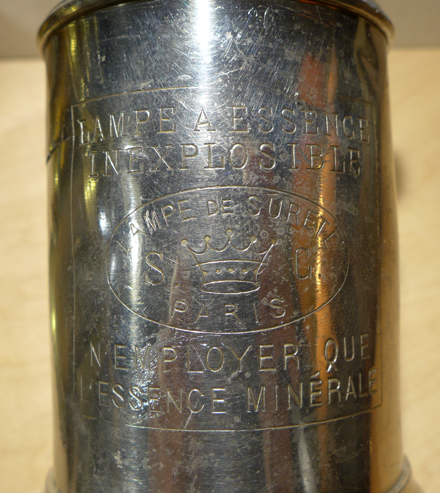
There were other brands as well. Here is a Lampe Gratieux and a "Lampe de Surete S. C.":
Any time you see something which says, in big letters right on the label, "GARANTIE VERITABLE INEXPLOSIBLE" you should start asking questions. The problem is that the Lampe Pigeon was designed to use gasoline (petrol), which in the 1880s was a cheap and often wasted by-product of the young petroleum industry. It didn't use gasoline/petrol because it was a better fuel for the job, but because it was cheaper.
Gasoline is something that I will never allow in my shop. Why? Because some years ago a neighbor down the street was siphoning gasoline out of his car inside his closed garage. He survived the explosion. We knew that he'd returned home from rehab nearly a year later when they installed the chairlift on the front porch for his wheelchair.
The flashpoint of a fuel is the temperature at which it will ignite given a source of ignition (e.g., a spark). Most fuels behave in a way that you might expect. For example, the flashpoint of diesel fuel is 126 degrees Fahrenheit or higher (depending on which variety of diesel you have). The flashpoint of kerosene is in the 100 to 162 degree F. range. The flashpoint of most lamp oils is in the 140 degre F. range. So usually the ambient air temperature is below their flashpoint. But gasoline is very different - unexpectedly different. The flashpoint of gasoline is negative 45 degrees F. Unless you're in the polar regions, any gasoline you've ever seen has been well over its flashpoint. The Lampe Pigeon tried to handle this by filling the fuel chamber with felt, but that doesn't change the chemistry of gasoline.
I have a workshop full of dangerous things. I melt metal for fun. But I won't have gasoline in my shop. It's just too dangerous.
So what to do if you want to smoke proof a punch in all the style of l'Imprimerie nationale?
Or you can use a regular oil lamp with commercial lamp oil. Below is a photograph of my Lampe Olympe together with two cheap modern shiny brass oil lamps (made in India) as sold by Vermont Lanterns; there are certainly many other vendors/sources as well. Both of the modern oil lamps shown work just fine. (The taller one has a large, wide wick which produces much more flame than necessary, but it works.)
Here is an example of a smoke proof taken using one of the two oil lamps with ordinary "lamp oil". It works fine. The other smoke proof, to the right on the paper, was done with the same punch using the Lampe Olympe and kerosene. (This is also an example of using a machinist's V-block as a smoke proofing fixture.)
Or use a candle. It was good enough for Garamont.
Finally, if you are using fire in the shop, you need a fire extinguisher.
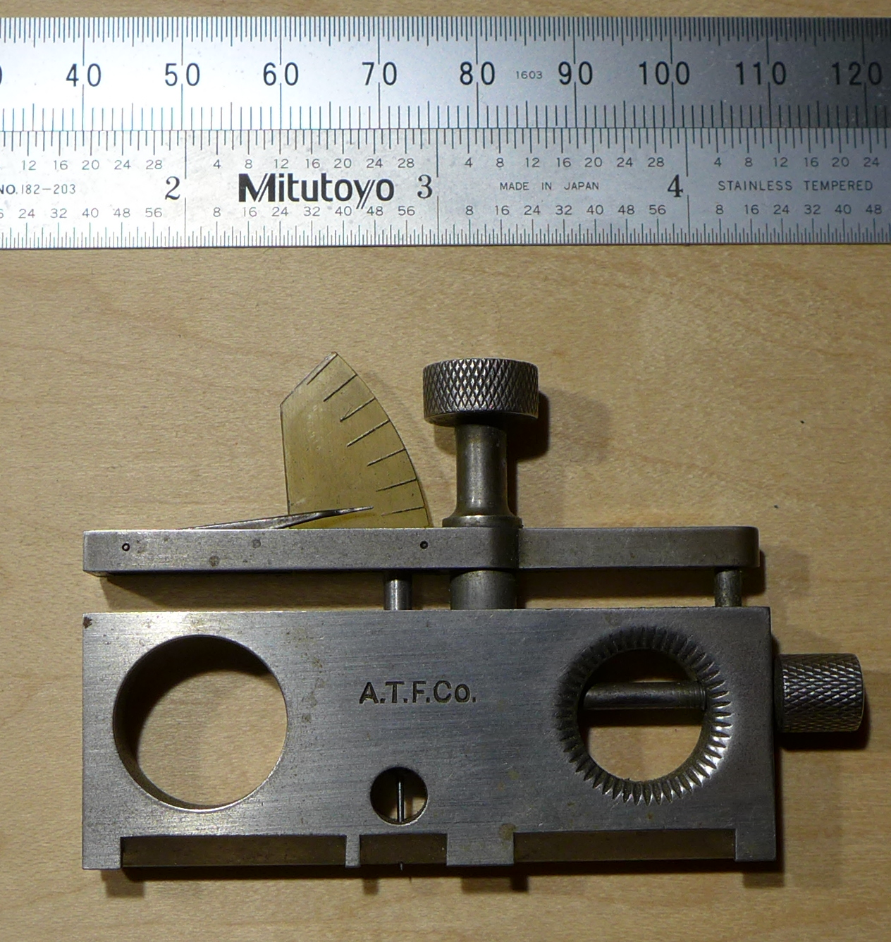
This is a specialized form of a square which allows you to check the squareness of the a type's face relative to its body. It is used by the matrix justifier with test casts to see if the casting face of the type cavity in the matrix is parallel with the reference surface of the matrix (and therefore square to the body of the type).
It resembles the "Sliding Jaw Type Height Gauge ('F'-shaped) type height gauge (q.v.) , which may also be used to check face squareness. But the pure Face Squarenss Gauge as shown here cannot be used to check type height.
Here's a close-up of one Face Squareness Gauge, owned by Stan Nelson (and almost certainly constructed by him). It is shown with a type in place, but just sitting on the table. In use, it would be held up to the light and you would sight in two directions through the gap behind the face of the type.
The requirements of counterpunching and matrix punching differ. While you can in principle just put many a matrix planchet (matrix blank) down on a bench and whack a punch into it, the long slender shape of a punch blank implies that it must be held in some way in order to counterpunch its face.
The simplest approach is just to clamp the punch blank in a vise and hold the counterpunch by hand. This is attested, but seem to me to be problematic.
It seems a better practice to put the punch blank in some kind of fixture which keeps it vertical yet allows the force of the blow to be transferred to a solid anvil or other surface below it.
There are several styles of these fixtures for hand counterpunching: some of them hold only the punch blank (you hold the counterpunch by hand) while others hold both both the punch blank and the counterpunch and allow mechanical adjustment of their relative positions.
There are illustrations, especially in the tradition of Rudolf Koch, of the punch blank simply being clamped into a bench vise to do this. But this leaves the punch blank unsupported from below, which is where the force of the blow is directed. Moreover, the illustrations for Koch show this being done with an ordinary machinist's bench vise, not a blacksmith's leg vise (the leg vise has a leg extending all the way to the ground to take the force of blows).
Here is this method as illsutrated by Fritz Kredel for an article with Rudolf Koch and Warren Chappell, "On Punch Cutting & Wood Cutting." in The Colophon [original series], Part Ten (1932).
(Scanned by DMM from my copy of the original.)
While I'm sure that Rudolf Koch must have done it this way, and while it was the case that this was done in industrial punch production in early traditions (see below), it just seems wrong to me. It is worth remembering that Rudolf Koch (and his son Paul Koch, and Victor Hammer, and Warren Chappell) were artists who came to punchcutting in a romantic endeavor to re-create past technologies. They were not industrial punchcutters trained in a living tradition.
But for all my doubts, this practice is indeed well attested, and from our earliest sources at that. Moxon (1683) says this " Of Sinking the Counter-Punches":
"... he Screws the Punch upgright, and hard into the Vice: And setting the Face of his Counter-Punch as exactly as he can, on the middle of the Face of his Punch, he, with an Hammer suitable to the Size of his Counter-Punch, strikes upon the end of the Counter-Punch till he have driven the Face of it about two Thin Spaces deep into the Face of the Punch. So shall the Counter-Punch have done its Office." (p. 109 of the Davis & Carter edition, 2nd ed.)
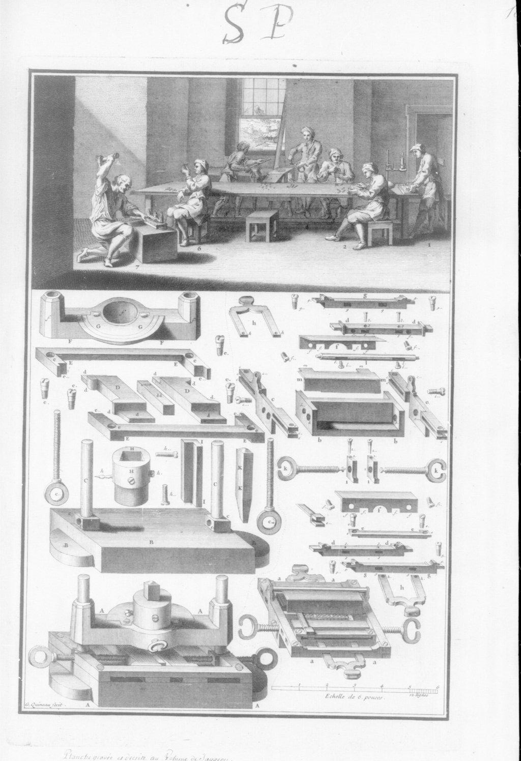
Our second early-and-complete source illustrates this. The plate showing counterpunches which accompanied Jaugeon's manuscript for "the Bignon committee" for l'Académie Royale in the 1690s (MS. finished 1704) shows a worker striking a counterpunch into a punch blank which is held in a vise. It is, however, held in a leg vise, which is a little bit better for this purpose than Rudolf Koch's bench vise.
(The note on the image above says "click image to view larger." It should read "to view original," since the version you see here has actually been upscaled from the original image. This is from the Gallica/BNF digitization of the Jaugeon manuscript, MS 9158. See the entry on The Académie Royale (1690s) / Jaugeon / The Bignon Committee / [etc] in the Notebook of General Literature on Making Printing Matrices and Types for further information.)
The digital version from which the image above was taken is low-resolution and it is hard to make out details. But the operation is identified firmly as counterpunching by James Mosley in his 1991 publication of these plates in Matrix No. 11 (where they are reproduced at a much better resolution).
The simplest counterpunching fixture just holds the punch blank; the counterpunch is held by the fingers of the non-dominant hand of the punchcutter (so if you're right-handed, hold the counterpunch with the thumb and two fingers of your left hand and strike it with a hammer held in your right hand).
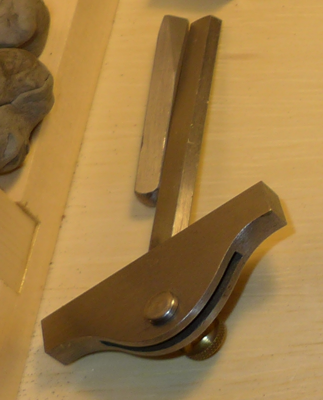
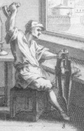
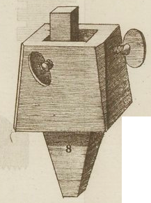
Fournier shows two fixtures in this style. One has a spike projecting from its lower part so that it may be fixed into a stump of wood. This is shown in his Plate III, Fig. 8. A similar fixture is also shown in use in one of the frontispieces which appears in some copies of Vol. 1 and other copies of Vol. 2 of the Manuel Typographique. In the image below right one of the putti is striking a counterpunch using a fixture set into a block of wood while another, on the floor, is using a facer on a stone.
(The first image above is from the Gallica/BNF digitization of Fournier's Manuel Typographique, available online at: gallica.bnf.fr/ark:/12148/bpt6k1070584h. This digitization is licensed by Gallica for noncommercial use only, and is so used here. The second image is from the Google Books digitization of the University of Oxford's copy of the same work, Google Books ID: -f0BAAAAQAAJ)
The only counterpunching fixture shown in Diderot and d'Alambert's Encyclopèdie is of this style.
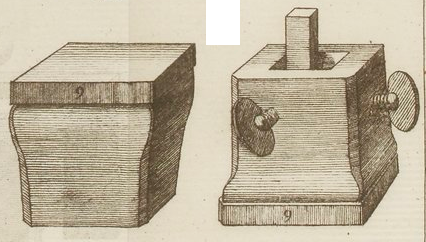
The other style of counterpunching fixture shown in Fournier, Fig. 9 of his Plate III, is intended to sit flat on a bench. It's also a dual-purpose tool: turn it over and you have a convient metal working surface (what jewelers today would call a "bench block.")
(This image is from the Gallica/BNF digitization of Fournier's Manuel Typographique, available online at: gallica.bnf.fr/ark:/12148/bpt6k1070584h. This digitization is licensed by Gallica for noncommercial use only, and is so used here.)
Here is a counterpunching fixture of this second style made by Stan Nelson out of cast iron. It is shown in use by Stan during his 2016 Wells College punchcutting class. It is a relatively simple box (with some nice decorative touches) which has two screws to locate the punch blank. As Fournier directs, this fixture is constructed with a solid bottom so that it may be turned over for use as a bench block. This means that the punch blank rests on the inside bottom of the fixture. (By way of contrast, the bottom part of the two-part fixture described later has a hole all the way through and the punch blank rests on the anvil below the fixture.)
(Apologies for the rather washed-out picture below; I had to tweak the brightness up to make the screws visible.)
Below left Stan is putting a punch blank into the punch. Actually, the punch blank he's working with here has already been partially counterpunched, and he's re-positioning it to give it another go. Striking both counterpunches and matrices requires a lot more hammering than the old books might lead you to believe. Then, below right, he's positioning the counterpunch against the punch. When he strikes it, it will be perfectly vertical.
Next, Stan is striking the counterpunch into the punch blank. The hammer being used is of 48 ounce weight (3 pounds, or about 1.4 kilograms). He's using three fingers (two fingers and the thumb) to hold the counterpunch itself, as is traditional and convenient.
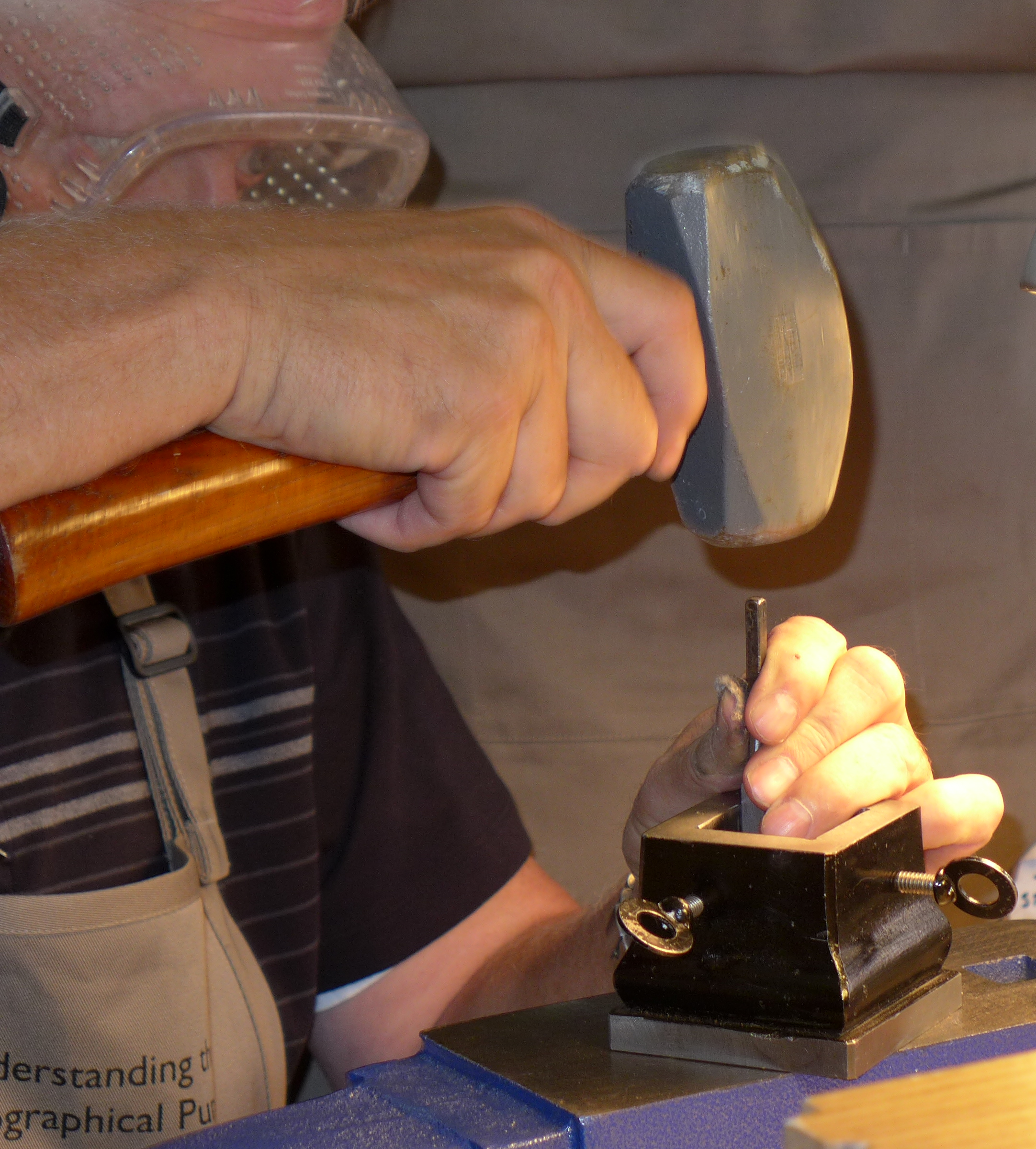
Note that in the photograph below Stan is wearing safety googles. ALWAYS WEAR SAFETY GOOGLES or good side-shield safety glasses whenever you are counterpunching or punching. Counterpunches and punches will shatter in use (a couple of them did in class).
Here, finally, is the counterpunched punch, still in the fixture.
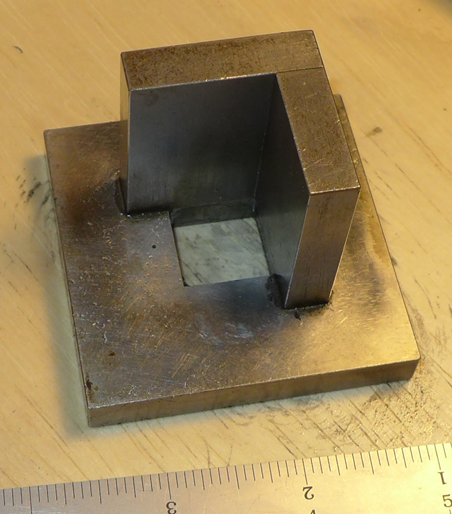
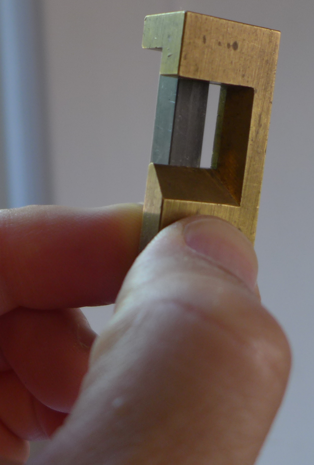
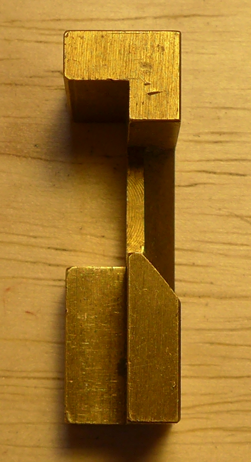
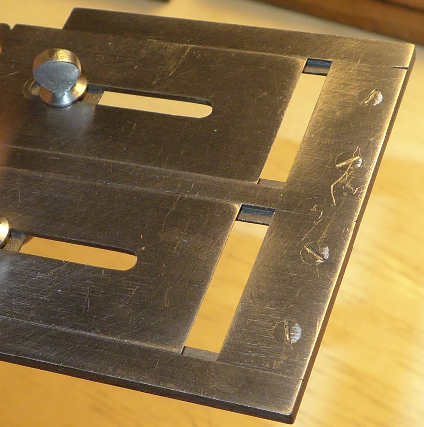
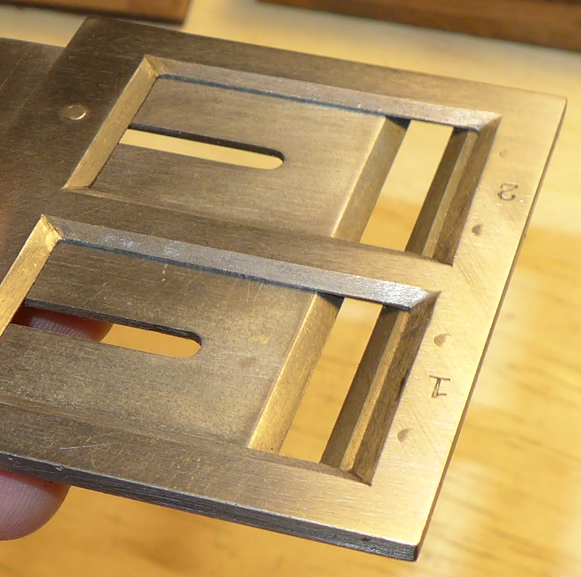
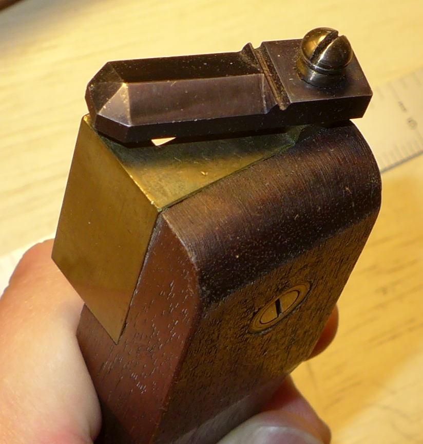
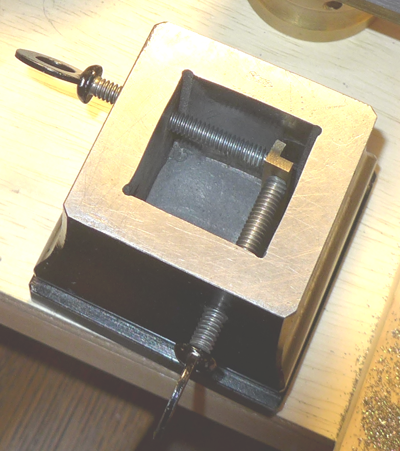
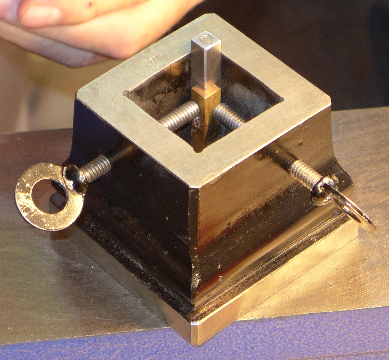
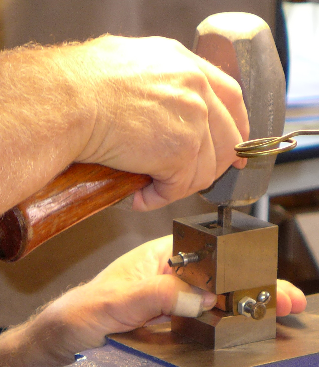
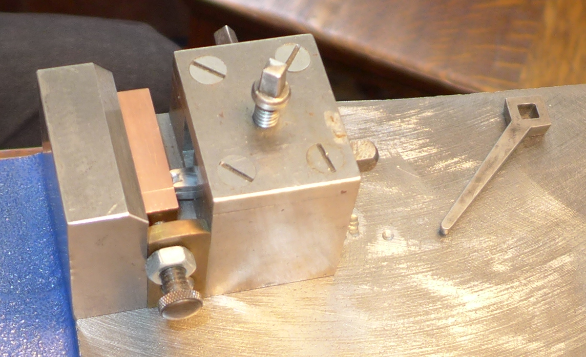
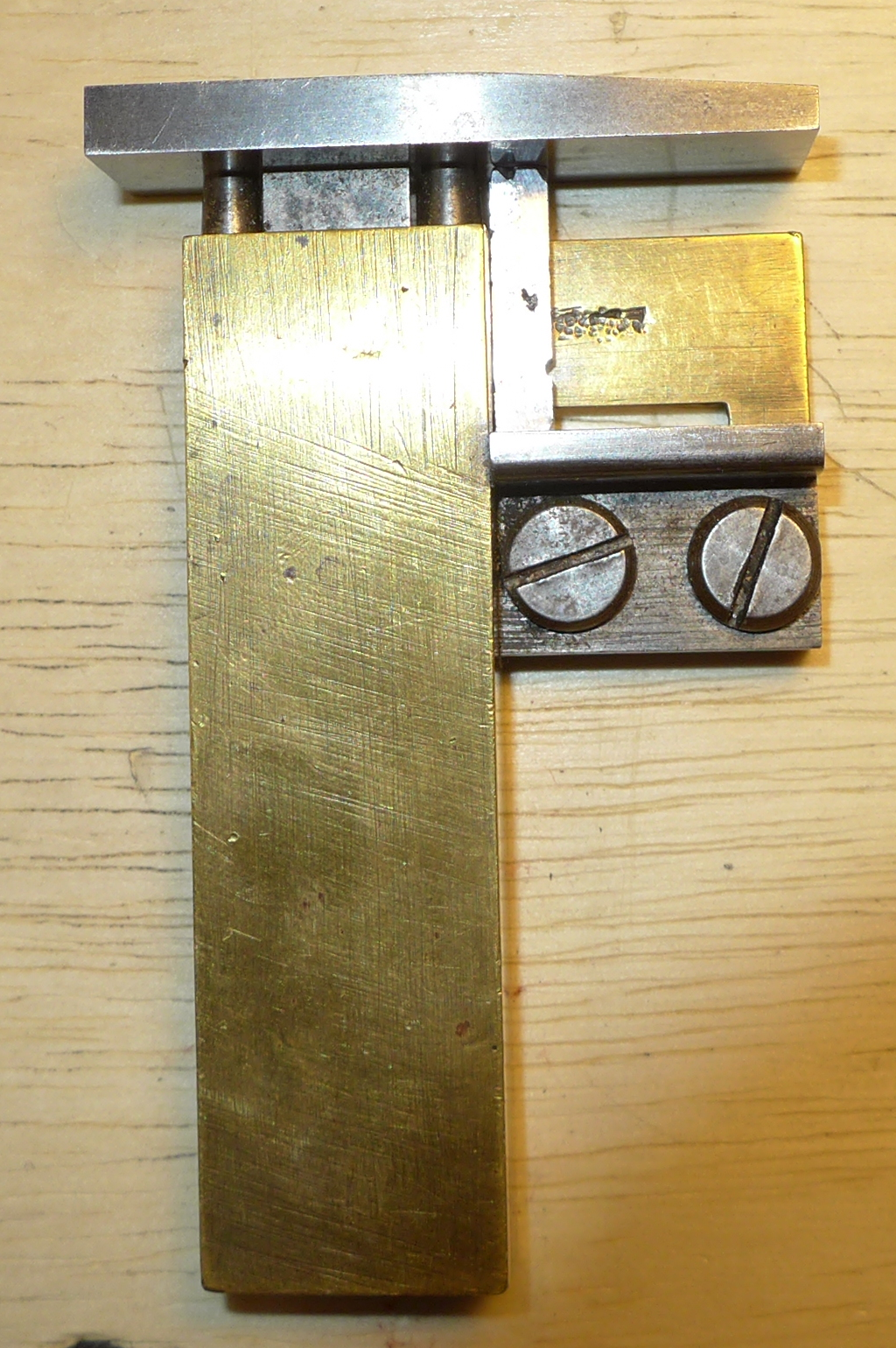
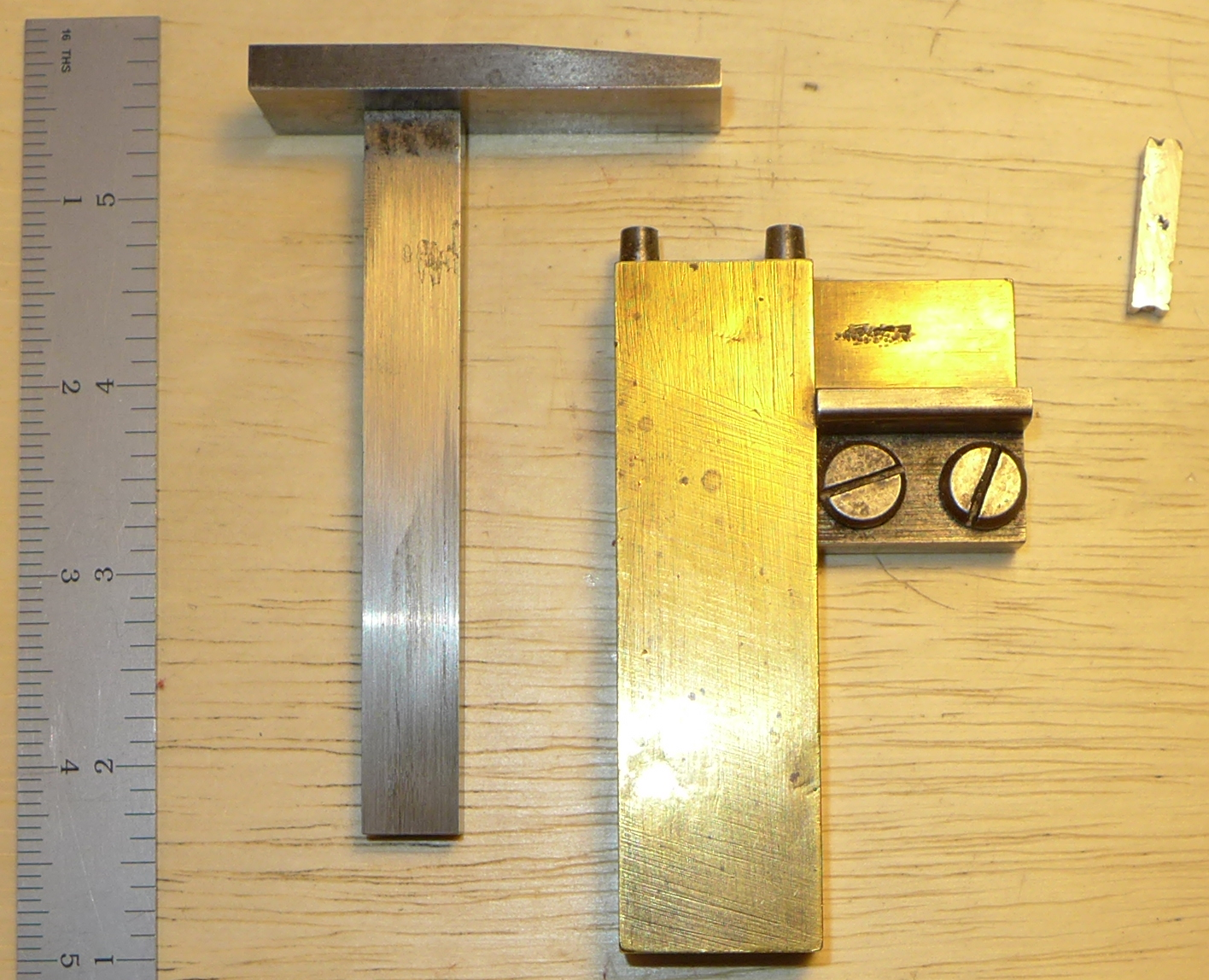
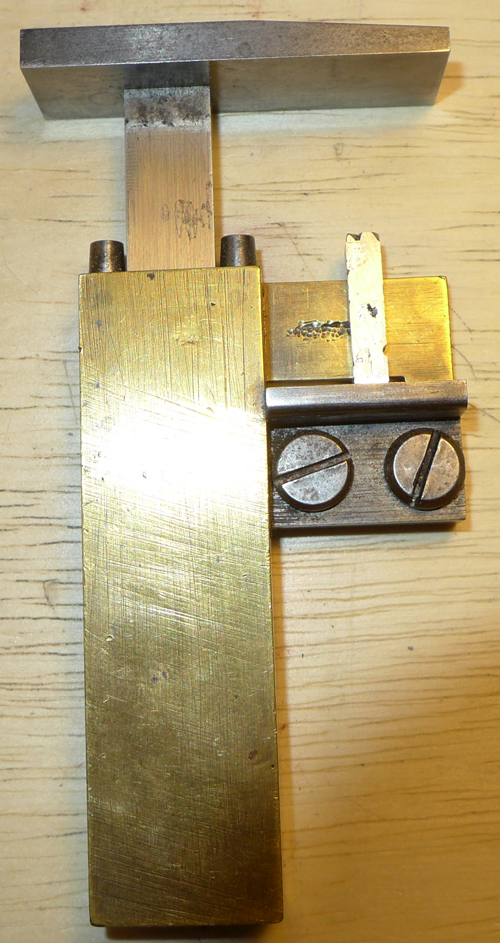
This is a fixture for holding a counterpunch (facing down) in precise relationship to the face of a punch blank (facing up) for striking the counterpunch into the punch.
A photograph exists of Edward Philip Prince, the English punchcutter famed for having cut, inter alia William Morris' types and the Doves type, using a fixture functionally equivalent (but not identical) to the one shown here. This photograph is reproduced as the frontispiece of F. C. Avis' biography, Edward Philip Prince: Type Punchcutter (London: [for the author], 1967).
The one shown here was made by Stan Nelson. We used it in his 2016 Wells College class. While I'm sure that in the hands of someone who used this fixture on a daily basis it could be of great service, in our inexperienced hands in the class it proved to be troublesome. (It is worth realizing that statements to the effect that either counterpunches or punches are struck with a couple of swift blows are words written by someone who has never done it. Both operations take many heavy blows, and avoiding "double strikes" is difficult. A fixture such as this makes it harder to see what you're doing.)
Note that some of the photographs below show this fixture show it sitting on a bench pin. In use, it should be placed on the most solid surface available - a blacksmith's anvil is the best, though in a pinch a cheap cast-iron "anvil-shaped object" will do.
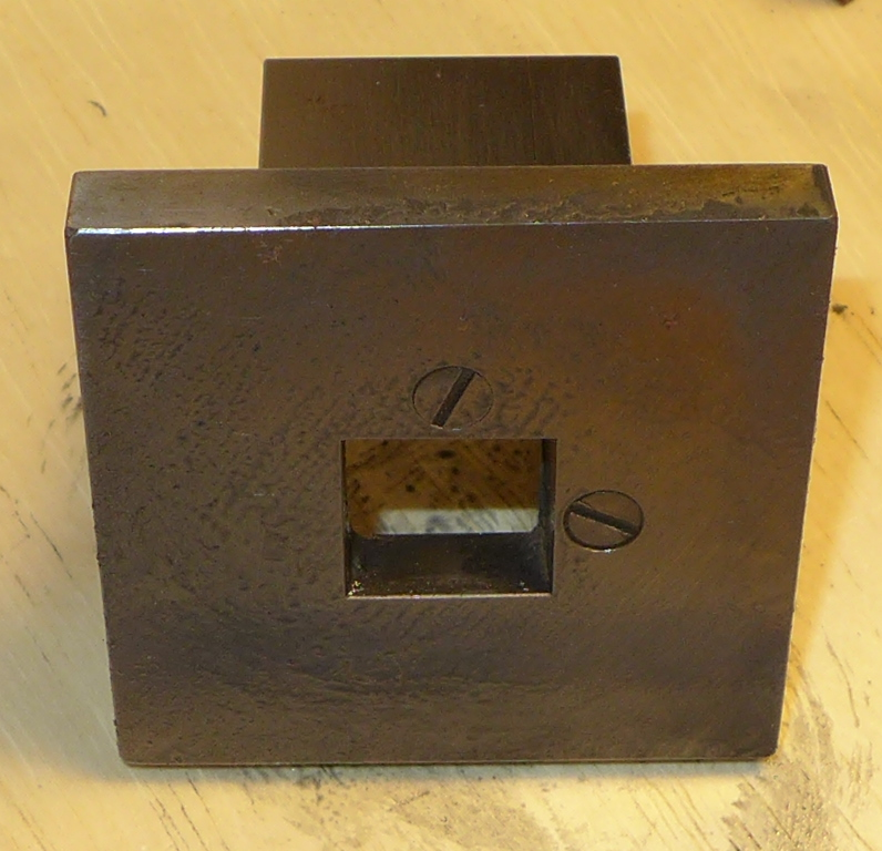
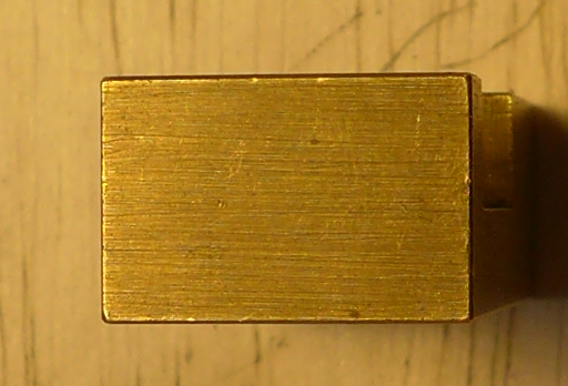
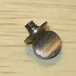
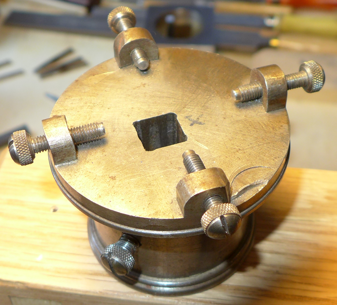
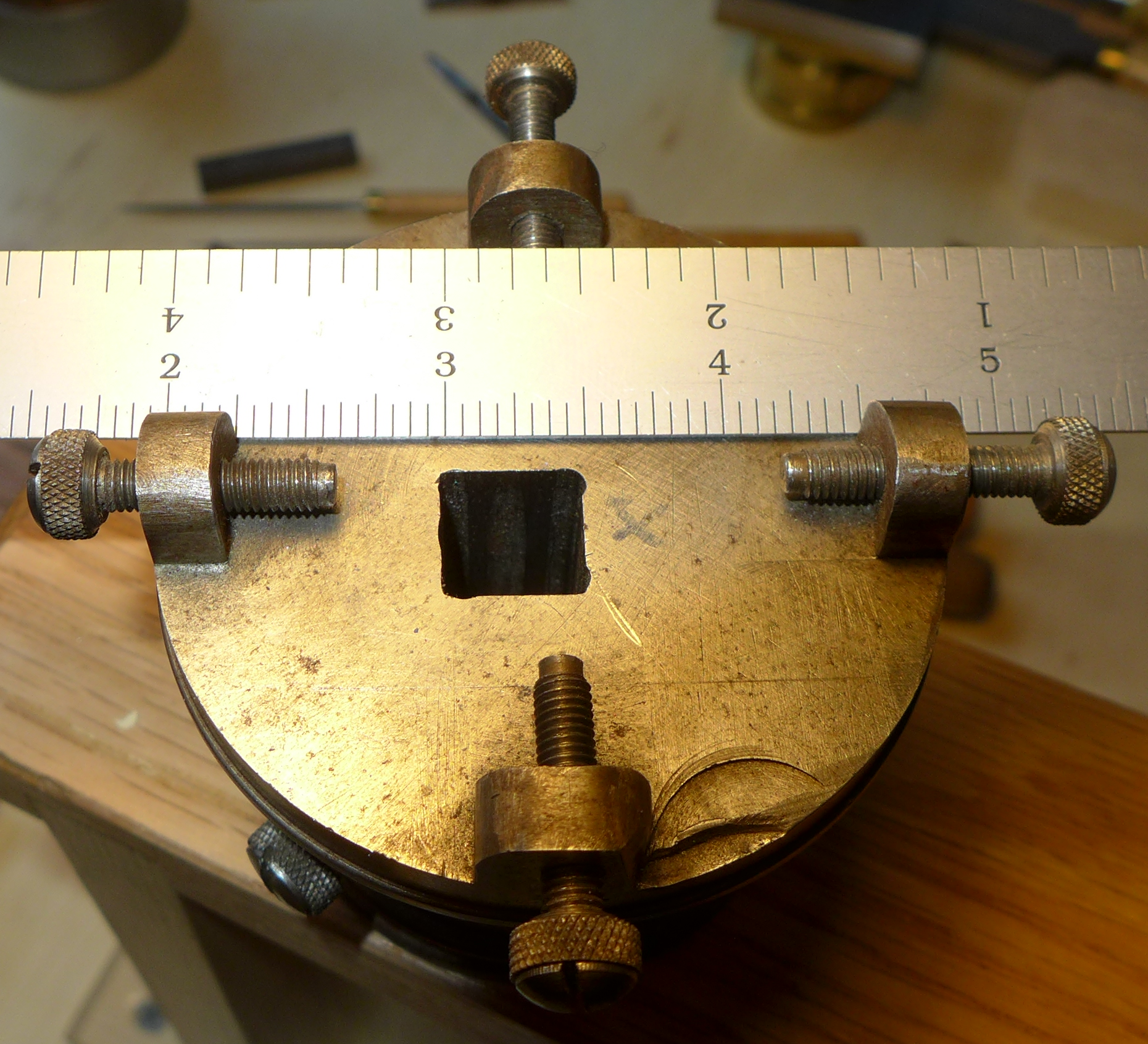
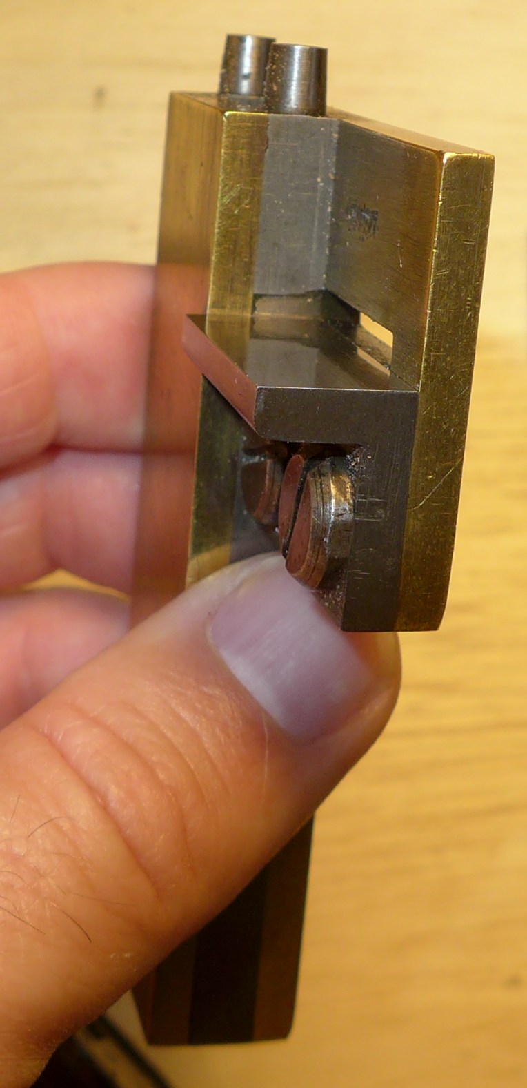
Here's the lower portion by itself. It is a solid block of cast iron or steel with a square hole broached completely through it (or in this case, I believe, drilled and filed) to accomodate the punch blank. There is a screw in the round base to hold the punch blank in place and four screws at the top to position the counterpunch-holder. (To judge by the conchoidal fractures on this instrument, caused by mis-directed hammer blows, its base is probably cast iron rather than steel.) Note that the square hole for the punch blank is off-center, in the direction of the punch-blank-clamping screw, in order to position the punch blank itself more centrally. The scale in the second photograph is in inches.
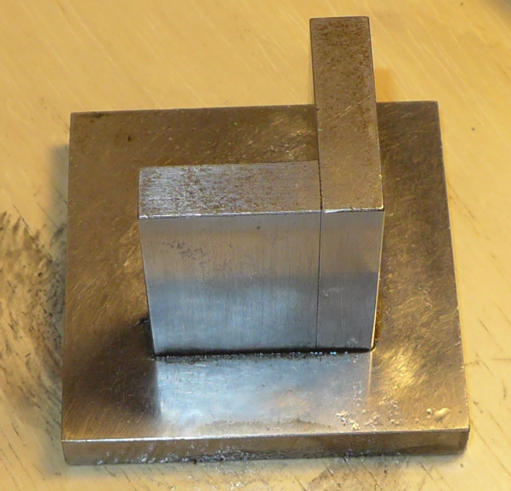
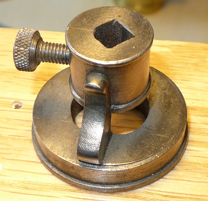
Here's the upper unit, which holds the counterpunch. It simply holds the counterpunch (face-down) with a sliding fit against the screw. There is no adjustment of the counterpunch within this piece; the position of the counterpunch is adjusted by moving the entire upper unit.
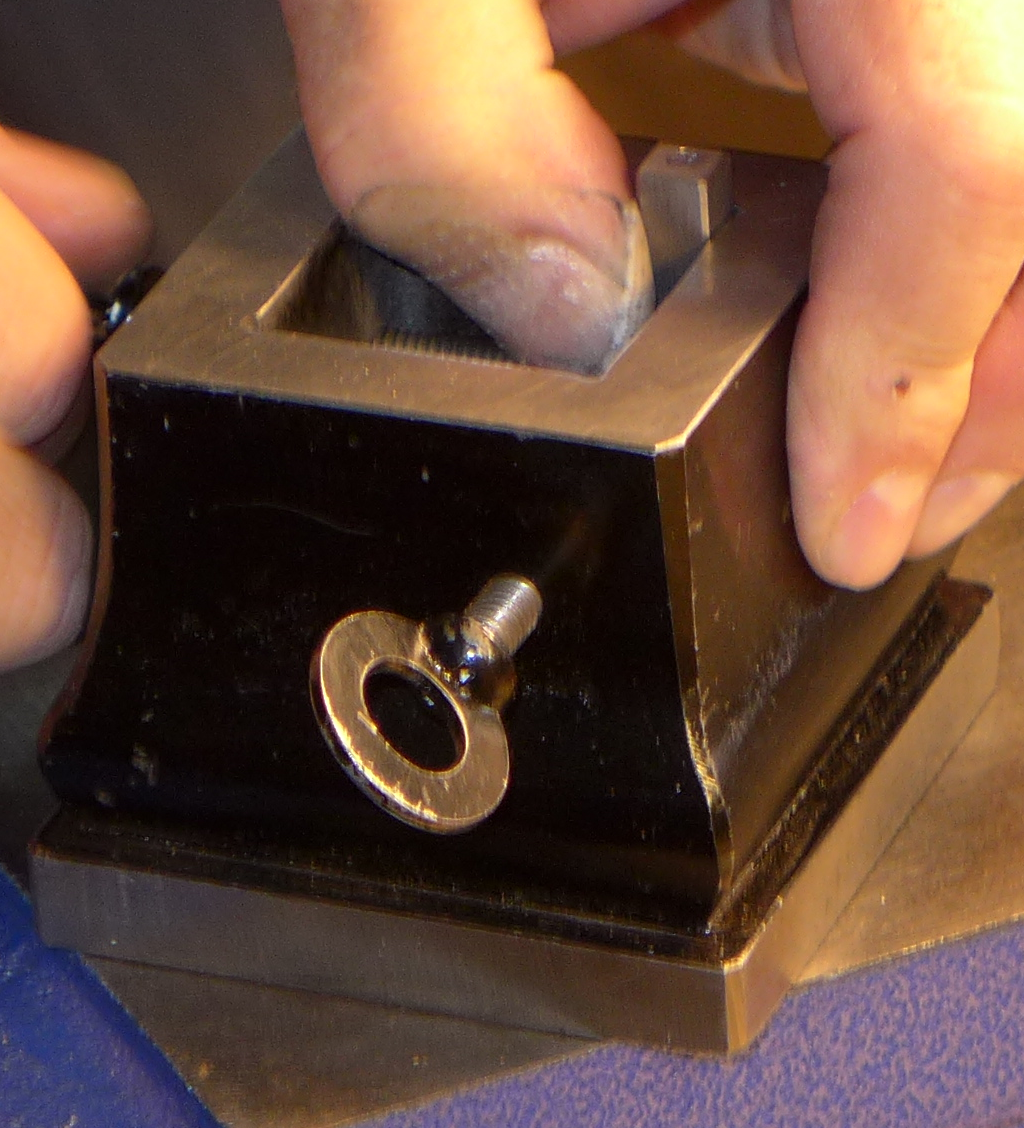
Here is the fixture in use. First, a punch blank is put face-up in the lower part and tightened in. Although you cannot see it, the hammer-end of the punch is resting on the anvil below the fixture.
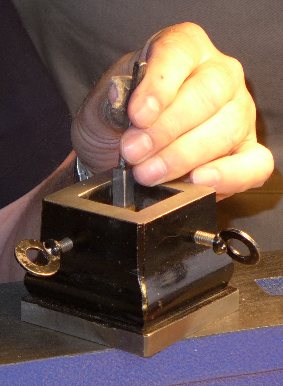
Then the top part is put on, the counterpunch is put in it, and the counterpunch/top-part are adjusted to the desired position of the counterpunch on the punch blank face. The hands in the photos below are those of Stan Nelson.
Then you hammer in the counterpunch. In the photo below this is being done by one of the students in the class. The hammer in use is of 48 ounce weight (3 pounds, or about 1.4 kilograms).
In their 1933 Article for The Dolphin , Paul Koch and his illustrator, Fritz Kredel, show a two-part counterpunching fixture very similar to the one after Prince shown above. But while the "Prince" fixture rests on an anvil, Koch's fixture has a lower part which is shorter than the punch blank. So the entire fixture must be held/balanced in the non-dominant hand with only the bottom end (hammer-end) of the punch blank resting on the anvil.
Here is Fritz Kredel's illustration of it, from the 1933 article:
(Scanned by DMM from my copy of the original. Note that the copyright on The Dolphin was renewed and it remains in copyright in the US. The use of this image here to identify an otherwise unknown device is, I believe, within the limits of "Fair Use" under US copyright law.)
This same fixture is shown, less clearly (or at least more awkwardly proportioned) in Kredel's illustrations for the Klingspor specimen book for Jessen Schrift (ca. 1934). A version almost identical to the one in the Jessen Schrift specimen is shown in the Klingspor Type Foundry "Lehrtafel" [teaching posters], No. 3, "Herstellung eines gepunzten Stempels" [making the counterpunched punches]. But note: In the fixture shown in the Dolphin article, the punch blank is, sensibly, pushed against one side of the square hole in the lower portion of the fixture. In the fixture shown in the Jessen Schrift specimen, no punch blank is shown so you can't tell where it was. But in the version shown in Lehrtafel No. 3 the punch blank is shown in the middle of the hole, supported only by the adjusting screws. This is almost certainly an error on the part of the illustrator.
A version of the Jessen Schrift specimen illustration also appears in the chapter on type-making in Warren Chappell's A Short History of the Printed Word (NY: Alfred A. Knopf, 1970): 44. Chappell studied with Rudolf Koch and collaborated with Paul Koch.
This sketch appears in Warren Chappell's booklet Let's Make a B for Bennett ([no location]: Friends of Paul Bennett, 1953). See the Notebook on the Literature of Punchcutting for a reprint. Although Chappell studied with Rudolf and Paul Koch, this fixture differs from those employed by Paul Koch.
Moxon employs no special fixture for holding the matrix or punch while the matrix is being struck. He simply lays the matrix blank (planchet) down on a stake (effectively a small anvil), holds the punch by hand, and hammers it.
But the second-earliest comprehensive source, Jaugeon, does illustrate a complex matrix-striking fixture. He attributes its design to Grandjean.
However the other great 18th century authority, Fournier, speaks with contempt of Jaugeon's (Grandjean's) fixture and prefers to use only the three fingers of his left hand (see p. 11 of Carter's translation of Fournier, and also Mosley's remarks on Jaugeon's plate in Matrix No. 11 (1991), p. 70a and p. 80 n 39.)
Neither is there any matrix-striking fixture shown in Diderot and d'Alambert's Encyclopédie, which relies to a great extent on Fournier.
At some point by the middle of the 19th century the use of a press to drive the matrix supplanted the practice of striking them by hand. So later sources such as Bohadti do not show any equipment for striking by hand. The aspiring punchcutter would do well to consider a press. At the I.N., for example, they cut punches by hand but drive them with a press.
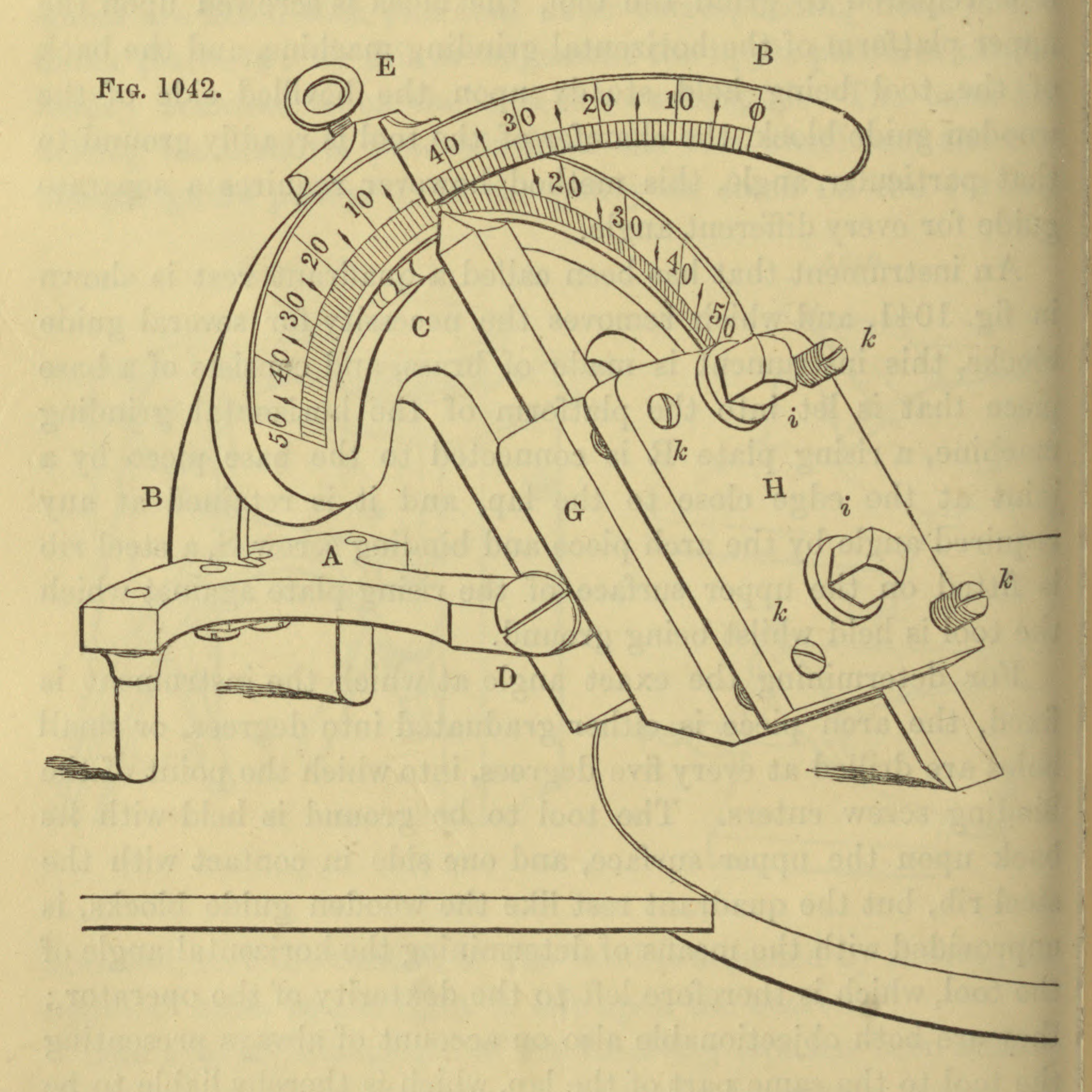
I don't yet fully understand the construction of the fixture illustrated in the plate accompanying Jaugeon's manuscript, so I'll just reproduce the plate in full. It shows on the left (in the lower portion of detail views) the matrix-striking fixture and on the right the grand justificateur.
In his commentary on these plates in Matrix No. 11 (1991), Mosley identifies this fixture as a " matricière". Mosley says further that Jaugeon attributes the invention of this device to Grandjean and that the first one was made "by a metal-worker ( armurier) called Gosselin." (p. 70a).
(This is from the Gallica/BNF digitization of the Jaugeon manuscript, MS 9158. See the entry on The Académie Royale (1690s) / Jaugeon / The Bignon Committee / [etc] in the Notebook of General Literature on Making Printing Matrices and Types for further information.)
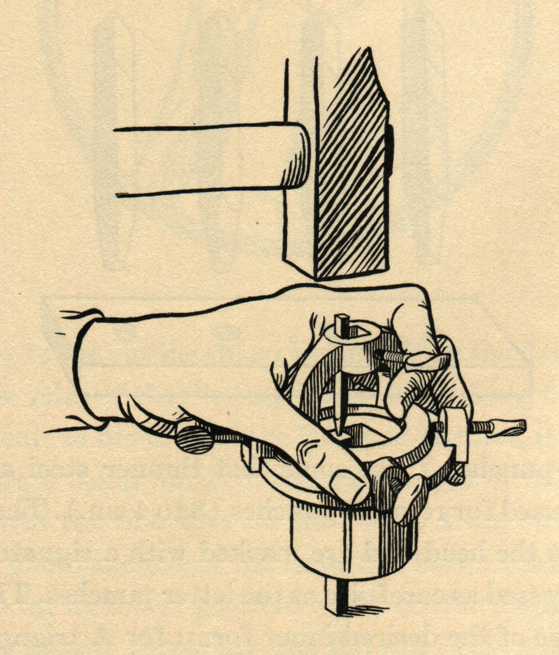
In their 1933 Article for The Dolphin , Paul Koch and his illustrator, Fritz Kredel, show a curous two-part matrix-striking fixture. The matrix is placed in the bottom part and held in place by "brass or lead strips of varying thicknesses" placed against it on two sides. So the position of the matrix side-to-side is controlled by these brass and (presumably typemetal) shims. In the other direction, top-to-bottom, the matrix can slide. In this way X-Y positioning of the matrix can be achieved. The top part of the fixture holds the punch, but the punch is fixed in X-Y position within it, and the top part itself is fixed in X-Y position relative to the bottom part. The top part is located by two fixed pins against the bottom part. All in all, it seems much more primitive than Koch's counterpunching fixture.
(Scanned by DMM from my copy of the original. Note that the copyright on The Dolphin was renewed and it remains in copyright in the US. The use of this image here to identify an otherwise unknown device is, I believe, within the limits of "Fair Use" under US copyright law.)
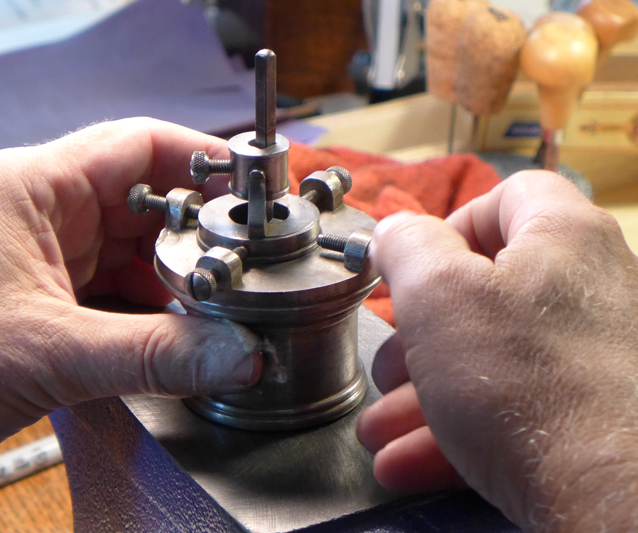
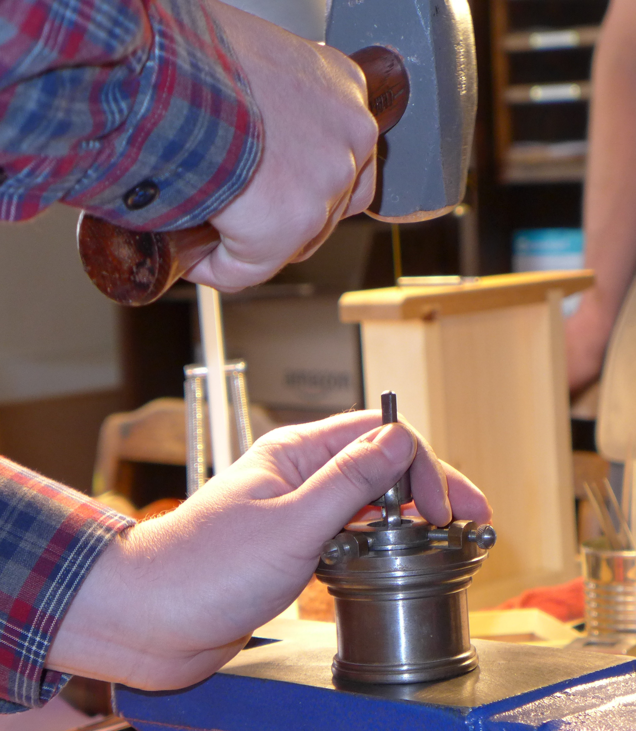
Stan Nelson uses a very compact fixture which holds both the matrix blank and the punch. It allows fine screw adjustment for the head bearing (vertical position of the virtual type body on the matrix) but has a fixed side bearing (horizontal position of the virtual type body on the matrix).
I do not know the origin of this fixture. Stan was using it at least as early as 1985 in his film From Punch to Printing Type (NY: Columbia University School of Library Service, 1985; now available from the Book Arts Press of the Rare Book School of the University of Virginia.
Here Stan is using this fixture in his 2016 Wells College punchcutting class.
There is no mechanism for adjusting the side bearing, other than shimming the punch or matrix. There is, however, a relief milled into the side of the matrix channel to accomodate the swelling of the matrix around the place where the punch is struck.
The Davis/Carter edition of Moxon has a footnote which says:
"The invention of an adjustable needle-gauge for testing the depth of strike was credited to WIlhelm Haas, the elder, of Basle (1741-1800): G. Mori, Das Schriftgiesser-Gewerbe in Süddeutschland, &c., Stuttgart, 1924, p. 19." (2nd ed. (1962), p. 155, note.)
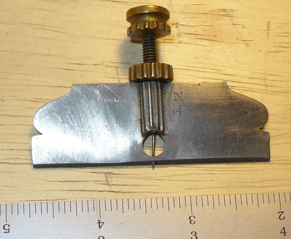
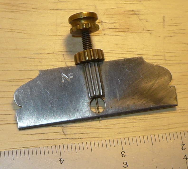
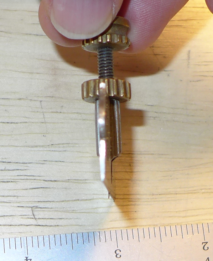
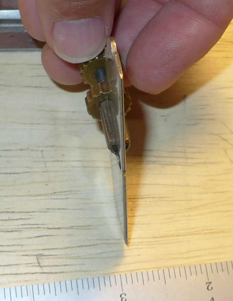
Here is a traditional style screw/needle depth gauge belonging to Stan Nelson. Photo taken at his 2016 class.
Note that the needle runs through the center of the blade-like straightedge.
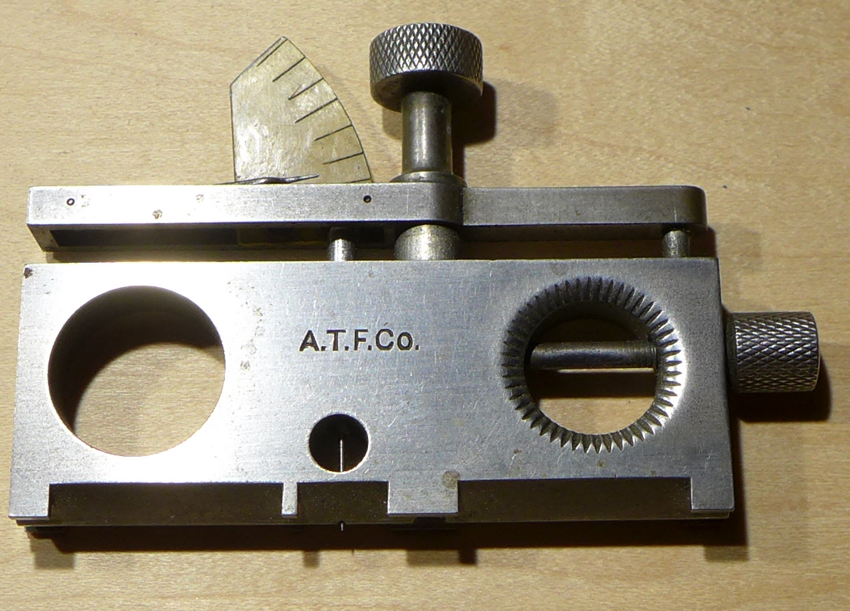
The Benton lever depth gauge is probably my favorite of the type-maker's tools. I consider myself very fortunate to be the custodian of this particular example for future generations.
The Benton gauge is a relative gauge, not an absolute one, intended to show differences in the depth of a matrix.
Note/promise: One of my (many) future projects is to measure this gauge, illustrate its components, and construct a CAD model and engineering drawings of it so that it may be replicated.
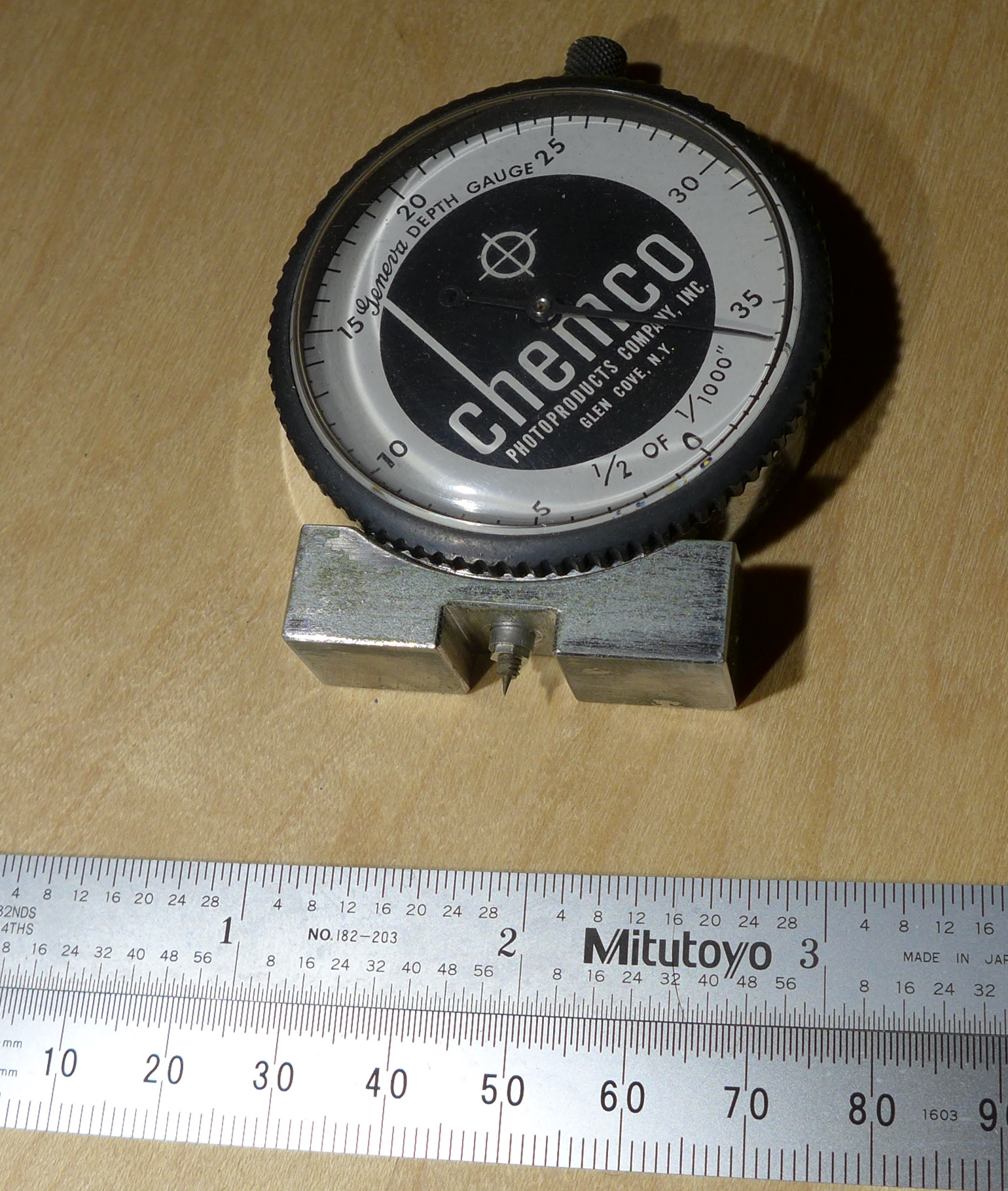
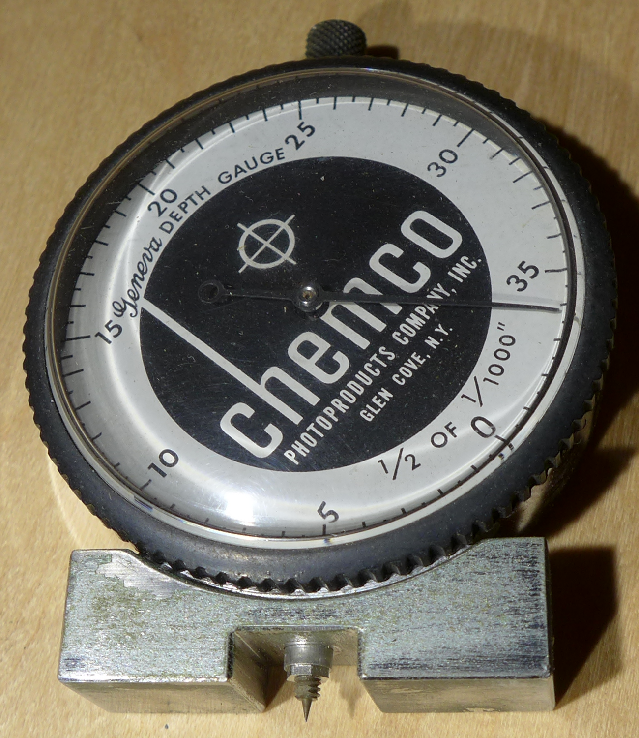
This is a commercial dial indicator fitted out as a depth gauge. Yes, I only paid $13 for it; I got lucky. It is an absolute-reading device. For matrix depths in excess of 0.040, it would have to be zeroed on a test piece which was below the reference surface.
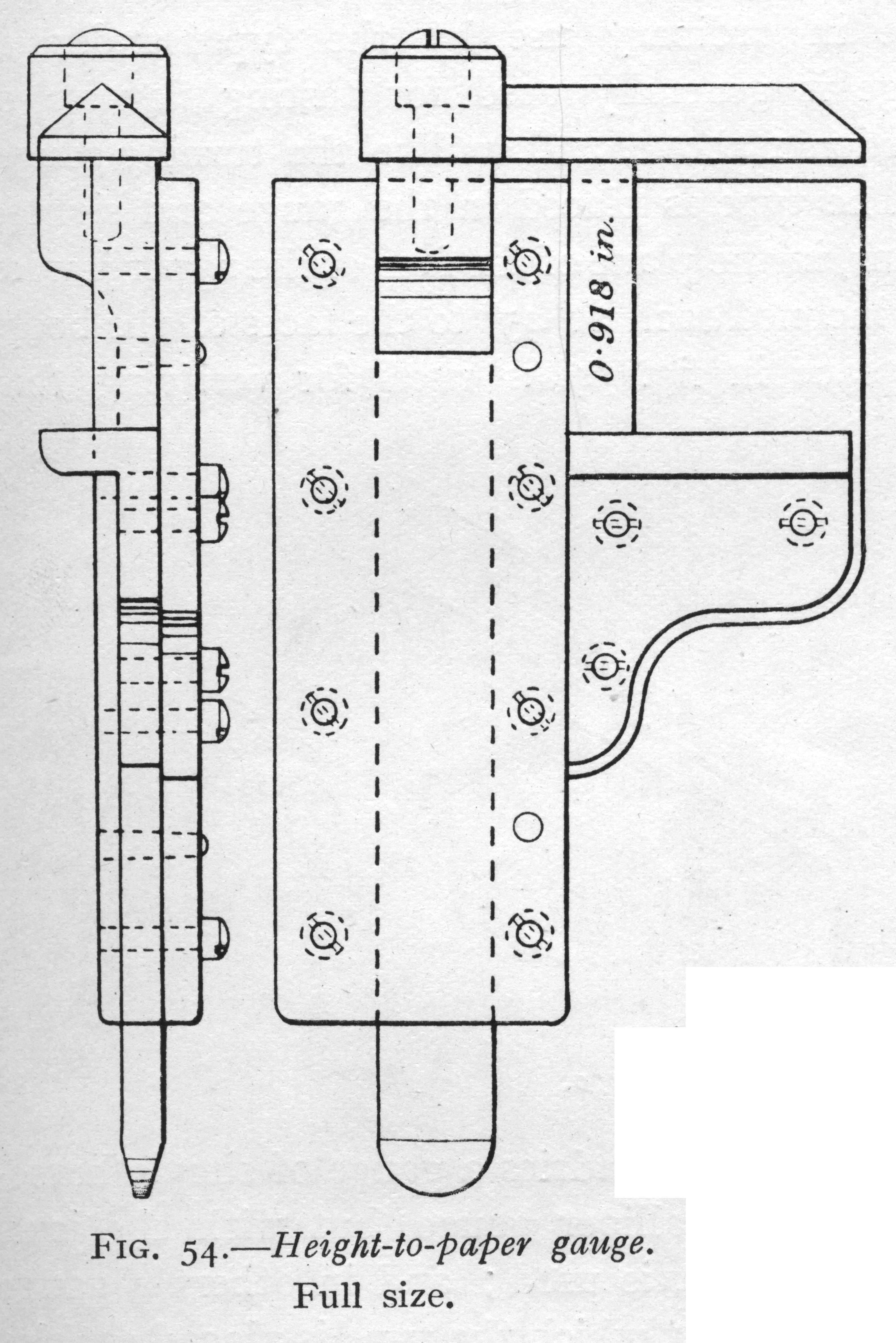
A Type Height gauge measures the height of the type from its feet to its printing face. In 1886 in the U.S. this height was set to 35 cm / 15 = 0.9186 inch, but in practice this was almost immediately truncated (not rounded) to 0.918 inch. Great Britain adopted 0.918 by the early 20th century ( not without some grumbling); type height elsewhere differs.
The type height gauge is used by the matrix justifier to test the depth of drive of a matrix. (Given a mold known to be correct for an intended depth of drive, you cast a test type, measure it, and correct the matrix if necessary.) This gauge is also used by typefounders in production to ensure that type of correct height is being cast. (Typically type height is fixed by the mold's construction and is not an adjustable setting on the type casting machine. But various operational issues may cause type of improper height to be cast (for example, typemetal stuck to the reference/registration surface of the matrix may cause over-height type).
Also called a "height-to-paper gauge." Also a "type-high" gauge.
In common practice today an ordinary micrometer is used, but the older gauges were more convenient because they were specialized for their purpose.
Other references: Several gauges generally similar to the "fixed channel-style" gauges shown below (but with interesting differences) are pictured on a page by the former Dale Guild Type Foundry which dates to at least 2006. As of 2017, it was still online at: http://www.daleguild.com/Artifacts.html but at some point it will disappear. It has been archived by the Wayback Machine at The Internet Archive.
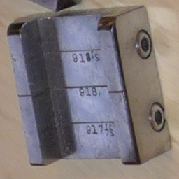
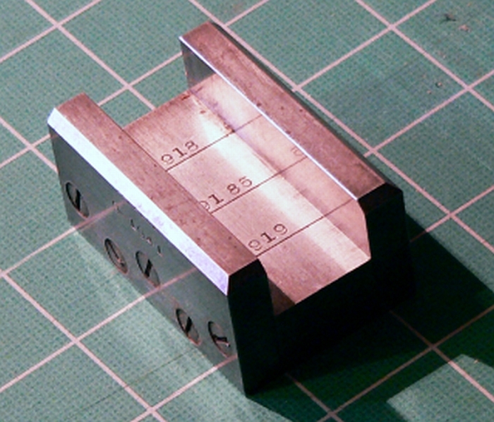
This style of gauge consists of a channel the width of which tapers very slightly. One point along the taper (often, but not always, in the middle) is exactly type-high.
The gauge shown below left belongs to Stan Nelson. I photographed it by accident in a collection of lovely tools on a table during his 2016 Wells College class. I wish now that I'd taken more and closer photographs. If it looks in the picture as if it's falling over, that's because I took the photo from an odd angle and then had to rotate it by 90 degrees to get the numbers to read right-side-up. This gauge must be a later one, or must have been repaired later, because it uses socket head cap screws rather than the more traditional "cheese head" slotted screws.
The photograph below right appears courtesy of Stephen O. Saxe, the noted type specimen collector and now the preeminent published authority on the pivotal type caster and its influence on type design. He tells me that it is ex-ATF. It's interesting to note that its central line is at 0.9185, not 0.9180.
(The image above right is copyright by Stephen O. Saxe and should not be used further without his permission.)
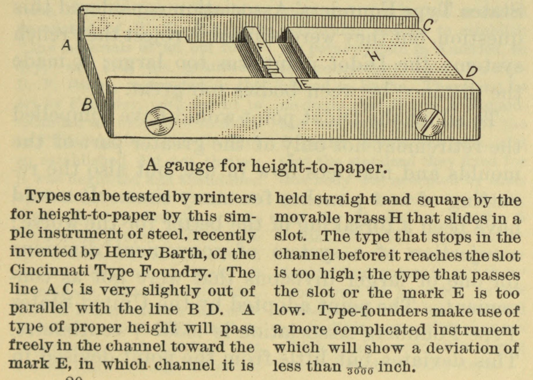
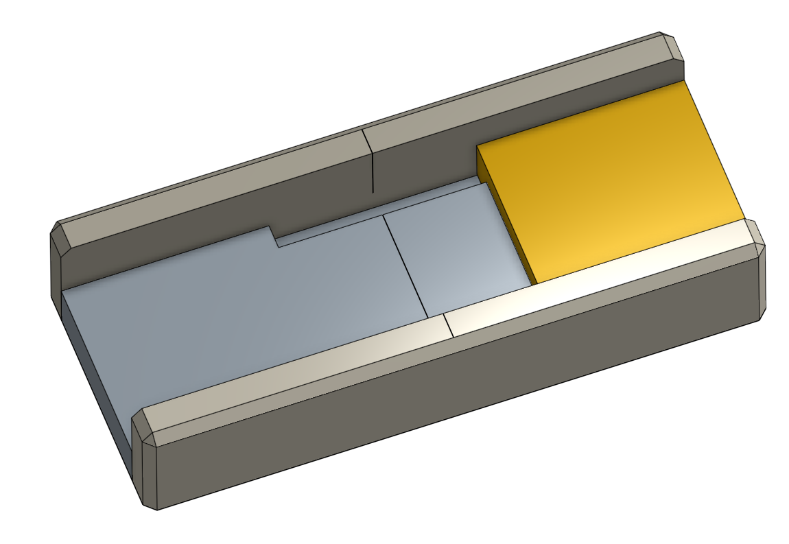
DeVinne, in The Practice of Typographey ... Plain Printing Types (NY: The Century Co., 1900), p. 153, illustrates a version of the fixed style of gauge which has, additionally, a moving piece within the channel to ensure that the type is square. But his illustration does not show the "slot" in which this moving piece moves, and it has a puzzling feature (look at its back wall, on the side near 'A'). DeVinne's text is always impressively accurate, but his illustrations sometimes have errors. (His illustration of the Barth type caster, for example, has had the pump mechanism above the pot cut off.) DeVinne attributes this gauge to Henry Barth. Legros & Grant (1916) note that this gauge is "little used" in England (p. 76).
I do not yet know of any surviving gauges of this style, so our access to it is through DeVinne's illustration. To understand this illustration, you must go either to the original printed volume or to one of the two higher-quality digitizations available at The Internet Archive (by the Univ. of Toronto and the Univ. of California). The Google Books PDFs are of such poor quality that the details which show the actual structure are reduced to black blobs; you can barely make it out in Google's online version (not the same as the PDFs they let you download!), but only if you know what you're looking for. Here it is from the Univ. of California copy at the Internet Archive:
The Practice of Typography: a Treatise on the Processes of Type-making, the Point System, the Names, Sizes, Styles and Prices of Plain Printing Types. NY: The Century Co., 1900. Page 153 (digital image 159).
Digitized in 2007 by The Internet Archive from a University of California copy. Available at http://www.archive.org/details/practiceoftypogr00devirich
The drawing in DeVinne, even well-digitized, is inherently confusing. To clarify this gauge in my own mind, I built a CAD model of a functionally equivalent gauge (simplifying and leaving the screws out). Here it is in two views, the second from the "back" showing the slot through a translucent back plate:
Legros & Grant (1916), p. 76, say that "In some foundries a gauge of simple horseshoe form, like the engineers' outside-caliper gauge, but with the jaws arranged at a small angle to each other is used." They do not illustrate this gauge.
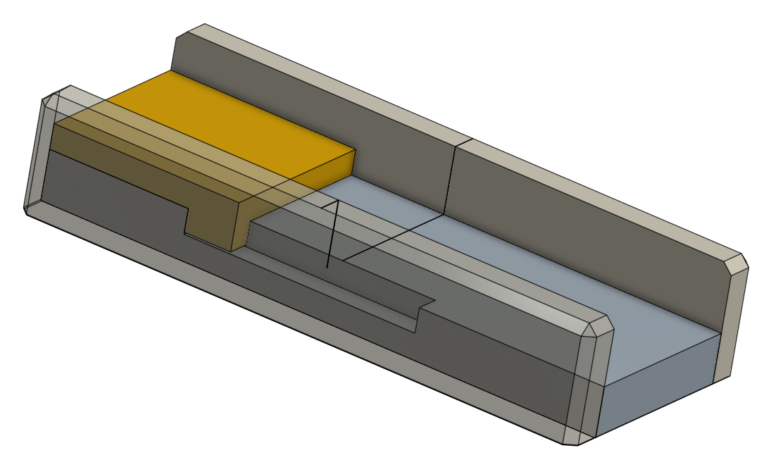
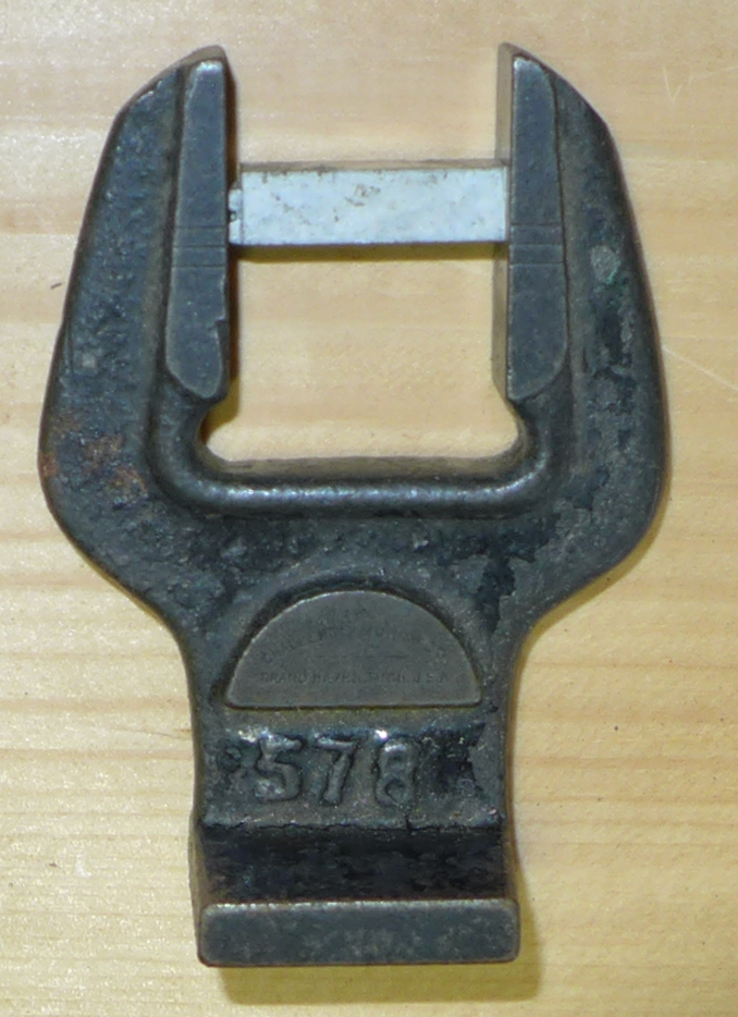
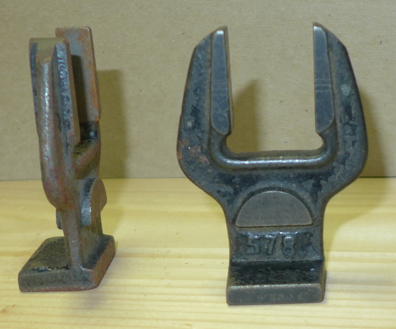
I presume that the gauges shown below are what Legros and Grant were referring to. These are ordinary type height gauges as used by printers. These two in particular were manufactured by the Challenge Machinery Co. in the 20th century. The number on them must be their Challenge part number; they measure 0.918 height. This is the distance at the middle of the set of three reference lines on each side of the gauge (you will probably have to click on the images to view them full-size to see this clearly).
The type shown being measured is just one that I picked out of the cold pot. I had to dress its foot by hand on a file. By an accurate modern Mitutoyo brand 0-1" micrometer it is just under 0.918 on one side and just over 0.918 on the opposite side. So this old Challenge gauge is doing a pretty good job. (To give you an idea of what these gauges have been through, when I acquired them their previous owner handed them to me and said, in absolute seriousness, "and here are a couple of wrenches for you.")
This style of gauge is illustrated and described on pp. 75-76 of Legros & Grant (1916). They show an an 'F' shaped sliding-jaw caliper (the top jaw of the caliper is the one that slides, which is unlike conventional calipers). It has no provision for fixing the sliding jaw in one position. It is used by placing a type-high standard in the caliper and placing the type to be tested next to it.
As described in Legros & Grant, this style of caliper may also be used to check the squareness of the type's face, sighting in two directions through the open space below the top jaw. Their illustration (from p. 76) is reproduced below, left.
The gauge shown above right is one owned by Stan Nelson (photographed rather poorly by me at his 2016 Wells College course) I do not know its provenance. It is very similar to the gauge L&G describe, but has two differences. I didn't fully disassemble it to photograph all of its pieces, and I didn't myself use it, so while I'll attempt to describe it correctly here, please note that I may be in error.
The first difference is that the "shelf" (I don't know its correct name) of the fixed jaw appears to be slightly adjustable (note the two large screws). The jaw also has a slot cut in its lower side. I presume that this slot serves the same purpose as similar slots on body and face gauges going back to Fournier: to provide clearance for any unevenness or flash around the foot of the type. (Though to be honest I've always been slightly puzzled by this slot, even on Fournier's gauges. As I was taught typefounding at Skyline Type Foundry, you never even attempt to measure or gauge a type until you have properly dressed it at least in every way which could affect the measurement.)
Second, Stan's gauge has two round metal stops on top of the body. These limit the downward travel of the top jaw and, together with the setting of the "shelf" on the fixed jaw determine the type-high setting of the gauge. So it is not necessary to employ a type-high standard with this gauge, but it is necessary to ensure beforehand that it is calibrated to type height. These round stops are shown more clearly in the photographs below.
Note: A sliding-jaw style type height gauge, which may be used as well to check face squareness, is very similar to a face squareness gauge (q.v.) But a simple face squareness gauge cannot be used to check type height.
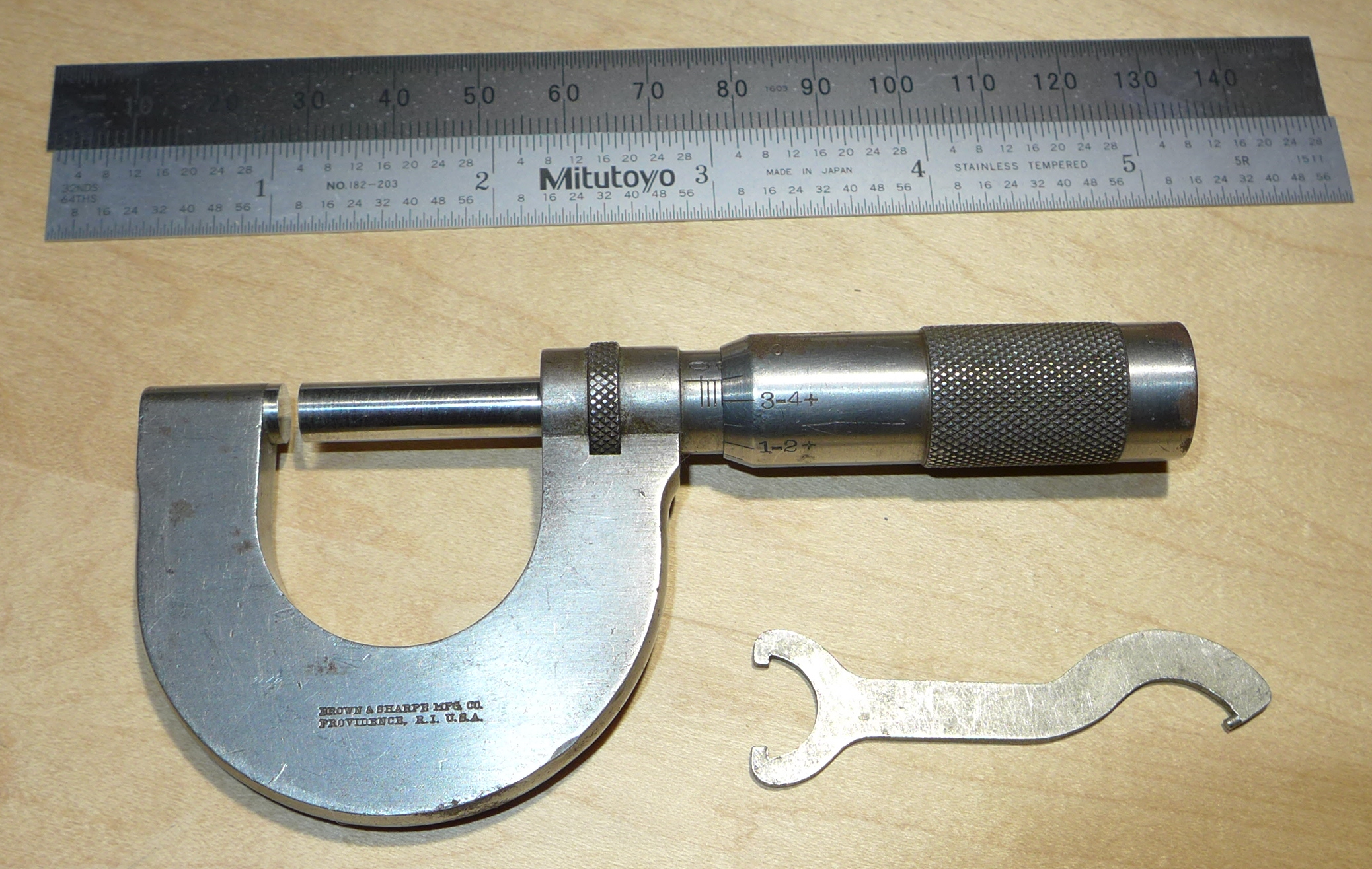
The point micrometer may be used both by the matrix maker (perhaps more the matrix justifier than the punchcutter) and the typecaster. But it is now a scarce enough item that it is rarely used at all. (I have one - the one shown here - but I keep it in a glass case as a historic instrument and in the rougher environment of the type foundry use a modern commercially available micrometer and a conversion chart. If you don't have an inch-to-point/pica conversion chart, here are several printable ones: Point and Pica Conversion Tables )
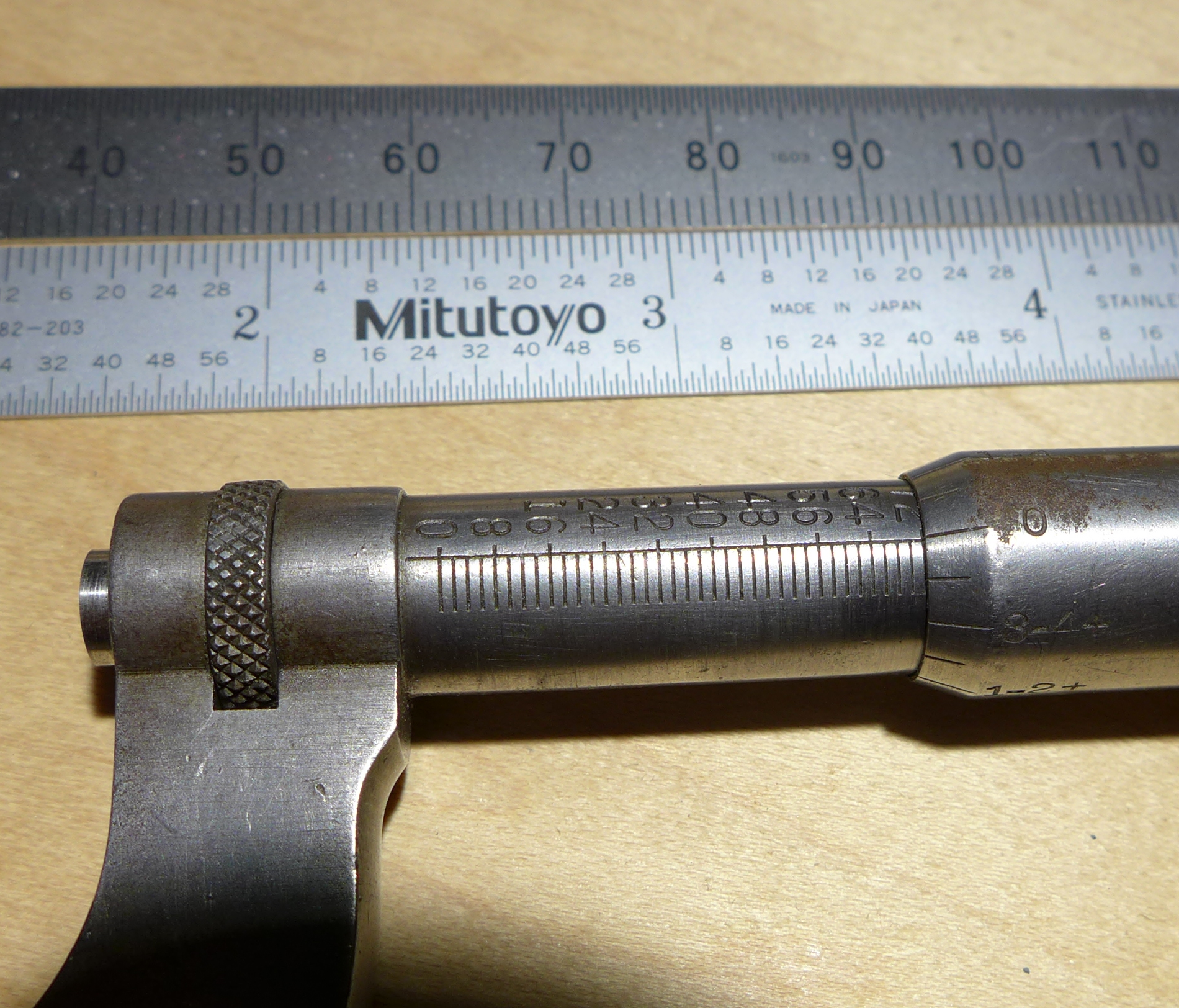
The micrometer reads from 0 to 72 points (it actually can be extended a couple of points beyond 72). The graduations which run linearly along the barrel are at every 2 points (they are numbered every 4 graduations, which is to say every 8 points: 8, 16, 24, 32, 40, 48, 56, 64, 72). This means that the micrometer's thread is 36 threads per 72 points, or 35.847 TPI.
One complete turn of the thimble is two points.
The calibrations which run radially around the thimble are spaced every 1/8 point and span 2 points. They are labeled every other graduation (every 1/4 point): 0, 1-4 [meaning 1/4], 1-2, 3-4, 1, and then 1-4+, 1-2+, 3-4+, and back to the 0 mark.
In the image below left it is reading 1 1/4 points. Below right it is reading 72 points.
This particular point micrometer was manufactured by Brown & Sharpe and was probably originally owned by American Type Founders Company (although it is not stamped A.T.F.Co. as was commonly their practice, so it may not have been).
Orientation: If you just came here from some other part of the Web and are wondering what is going on... This is a small part of a series of pages describing my own experiences in making typographical punches by hand (to be used in the process of making printing type for traditional letterpress printing). This present page is a part of a sequence on Tools of the Hand Punchcutter in Steel. This is part of a larger online "book" (of a kind) devoted to Making Matrices. For a list of all of the places on CircuitousRoot where typographical punchcutting is discussed, including an extensively annotated bibliography, see Hand Punchcutting in Steel.
The images from Holtzapffel from the scan of the University of Toronto copy available via the Internet Archive are in the public domain.
The images from the ARTFL scans of the Encyclopédie are in the public domain.
The image of an ex-ATF type height gauge by Stephen O. Saxe is copyright by him. It should not be used further without his permission.
The 1932 Koch/Kredel/Chappell Colophon article and Chappell's Let's Make a B for Bennett are in the public domain. My scans from my copies of them presented here remain in the public domain.
The 1933 Koch/Kredel Dolphin article remains in copyright. The use a few illustrations from it here to identify otherwise unknown devices is within the limits of "fair use" under US copyright law.
All portions of this document not noted otherwise are Copyright © 2017 by David M. MacMillan.
Circuitous Root is a Registered Trademark of David M. MacMillan and Rollande Krandall.
This work is licensed under the Creative Commons "Attribution - ShareAlike" license. See http://creativecommons.org/licenses/by-sa/3.0/ for its terms.
Presented originally by Circuitous Root®