This Notebook contains general literature about making printing matrices and types. For works devoted entirely to a single aspect (such as punchcutting or matrix electroforming), go up one level. (In particular, see the bibliography of Typographical Punchcutting in Steel by Hand.)
For a bibliographical survey of the typefounder's hand mold, see ../../../ Hand Casting -> The Typefounder's Hand Mold.
Some of the works on this present page are in fact reprinted by CircuitousRoot. Others are copies stored here of public domain works which have been digitized elsewhere. Still others are "here" only as links to their locations elsewhere. A few items are just bibliographic references.
This began as a collection of more or less technical works on matrix making and typefounding (e.g., Fournier), but it has expanded to include historical matters in typefounding (e.g., Loy's series on "Typefounders and Typefounding") because history and technology are inseparable.
See also: Views of Type Foundries.
See also ../../../ Noncomposing Typecasters -> General Literature about Machine Typecasting.
My own attempt at documenting this field is in the unfinished "book" Making Matrices .
Contents of this present Notebook:
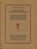
Duensing's Syllabus of Typographic Taxonomy
Duensing, Paul Hayden. Proposed Draft for A Syllabus of Typographic Taxonomy. (Vicksburg, MI: The Private Press and Typefoundry of Paul Hayden Duensing, 1980). This work was presented at the second biennial conference of the American Typecasting Fellowship (called the "Second National Conference on Hot-Metal Typecasting and Design" on its cover).
This work is much more important than it might first appear. It is "just" an outline, true. But you can't understand a field until you have an outline of the entire field, and this is the first (and still the most extensive) such outline. It is enlightening especially because it covers every method of type-making without prejudice, including historically important methods now almost always forgotten. By way of contrast, many other treatments of the subject cover only one method and presume that it is the only method.
The digital reprint presented here is one done by CircuitousRoot with the kind permission of Ginger Duensing. The original text is in the public domain (as is this reprint), but Ginger Duensing asks that Paul Hayden Duensing always be identified as the author of this document. Please respect this.
The icon above left links to a presentation of this digital reprint at The Internet Archive, which has versions suitable for reading online. Here are three local versions:
See also Duensing's Matlas: An Atlas of Matrices for an extensive survey of styles of matrices (and their dimensions).
What Harry Carter calls "the earliest trustworthy account of the making of type" ({ Carter 1969, pp. 5-10) occurs more than a century after type was first made, in a children's encyclopedia issued by Plantin's press in Antwerp (and presumably by Christophe Plantin). The description is for the most part correct (though Carter notes that its specification of the metal used is wrong), but it is very brief. Unless you already knew the technologies of matrix making and type casting you could not reconstruct them from this account.
La premier, et la seconde partie des dialogues françois, pour les iunes enfans . Antwerp, Spanish Netherlands: de l'imprimerie de Christophe Plantin, 1567.
To the best of my knowledge, no digital version of this is available online.
La premier, et la seconde partie des dialogues françois, pour les junes enfans . Brussels, Belgium: Plantin, 1939.
Nash, Ray, ed. Calligraphy and Printing in the Sixteenth Century: Dialogue Attributed to Christopher Plantin, in French and Flemish Facsimile Antwerp, Belgium and Lunenberg, VT: Plantin-Moretus Museum and Stinehour Press, 1964.
Note: For a suvey of the early literature of the typefounder's hand mold, see the Notebook on The Typefounder's Hand Mold: Literature in the set of Notebooks on ../../../ Hand Casting. One image (Van der Hayden) and one brief text (Biringuccio) predate Plantin.
Historically, Moxon is the most important source on type-making in English.
For a more complete bibliographic account of Moxon, including the extremely confusing publication history of "Volume 1" (on Smithing, etc.), see the Notebook on Moxon in the Circuitous Root Notebooks on the Literature of Ornamental Turning.
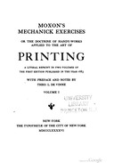
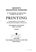
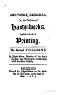
The bibliographic identification of Moxon's works is confusing, however. He began in 1678 (1677 Old Style) by publishing, serially, "Mechanick Exercises" on several subjects related to the industrial crafts (smithing, joinery, turning, etc.) These were collected by 1680. A composite of reprinted and new old stock gatherings were published as Volume 1 along with the newly completed Volume 2 by 1684. There were subsequent editions of Volume 1 (alone) in 1694 (New Style) and 1701. A 1703 version of the third edition, which was printed together with an earlier treatise on Mechanick Dyalling (sundial making) is perhaps the most common today (in reprints). Old tool enthusiasts and studenst of the history of technology generally refer to this volume as "Moxon," as if he wrote nothing else. This isn't surprising, as it is the root of all technical writing in English and one of the most important historical texts on technology ever published. Volume 1 of Moxon is not of interest to the printer, but it is of great interest to the punchcutter because it includes Smithing, and punchcutting in Moxon's view is properly "a branch of the Smith's trade."
But Moxon was himself a punchcutter, typefounder, and printer. So in 1683 he began the publication of a second volume of "Mechanick Exercises" devoted to all of these arts. Davis & Carter indicate (p. xlix) that this work was complete by the summer of 1684, but (as will be seen in the facsimile and reprints below) it is important to remember that even this second volume was published serially. Old printing and typefounding enthusiasts generally refer to this second volume as "Moxon," as if he wrote nothing else. As Davis & Carter say, "He was the first writer on printing [in English], and though he had a dignified following, he was probably the best of all."
Both volumes (v. 1 on Smithing, etc. and v.2 on Printing, etc.) were published together only once, in 1684. In all subsequent reprints and editions they are printed separately - and to a casual reader each as if the other didn't exist.
Although always well known to more scholarly printers (and presumably to all typefounders), Moxon (in either volume) remained out of print for the two centuries from 1703 to 1896 (save for one condensed extract published in 1750). Since then there have been various facsimiles, resettings, or new editions. In particular, the 1958/1962 edition by Davis & Carter is one of the finest examples of scholarship in the history of printing. Unfortunately, it, too, is now out of print.
The entries below are quick links to the freely redistributable online versions of Volume 2 (on type-making and printing). But please don't stop with them. You need the Davis & Carter edition. As I've said elsewhere, the person without this edition in their library and on their bench is no typographer.
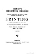
Moxon. Printing. (1683, 1896 Vol. 1, Columbia)
Moxon, Joseph. Theo. L. DeVinne, ed. Moxon's Mechanick Exercises, Or the Doctrine of Handy-Works Applied to the Art of Printing . 1683. NY: The Typothetæ of the City of New York, 1896. Volume 1 of 2. This is a local copy of the Google Books digitization of the Columbia University copy of this volume (No. 27 of 450).
Moxon. Printing. (1683, 1896 Vol. 1, Princeton)
Moxon, Joseph. Theo. L. DeVinne, ed. Moxon's Mechanick Exercises, Or the Doctrine of Handy-Works Applied to the Art of Printing . 1683. NY: The Typothetæ of the City of New York, 1896. Volume 1 of 2. This is a local copy of the Google Books digitization of the Princeton University copy of this volume (No. 166 of 450).
Moxon. Printing. (1683, 1896 Vol. 1, Virginia)
Moxon, Joseph. Theo. L. DeVinne, ed. Moxon's Mechanick Exercises, Or the Doctrine of Handy-Works Applied to the Art of Printing . 1683. NY: The Typothetæ of the City of New York, 1896. Volume 1 of 2. This is a local copy of the Google Books digitization of the University of Virginia copy of this volume (No. 157 of 450, late of the library of Edward L. Stone, Printer).
Moxon. Printing. (1683, 1896 Vol. 2, Harvard)
Moxon, Joseph. Theo. L. DeVinne, ed. Moxon's Mechanick Exercises, Or the Doctrine of Handy-Works Applied to the Art of Printing . 1683. NY: The Typothetæ of the City of New York, 1896. Volume 2 of 2. This is a local copy of the Google Books digitization of the Harvard University copy of this volume.
A condensed extract on punchcutting and hand casting was published in 1750 in the Universal Magazine and reprinted, with a new introduction, by Fred Anthoensen in 1939. See the section below on the Caslon Foundry / Moxon ( Universal Magazine 1750 & Anthoensen 1939).
Jaugeon / The Bignon Committee
The work of "the Bignon committee" for l'Académie Royale in the 1690s and early 1700s. The manuscript of Jaugeon and the plates on typefounding engraved by Simonneau, Quineau, and others. Their contexts in the older "Cabinet du Roi," the Descriptions des Arts et Métiers (for which they were the first research), and the then more immediate project of the first "designed" typeface (or typeface family), the Romain du Roi.
This work is at the same time one of the most important documents in our present knowledge of the history of type-making technology and one of the most frustrating. Briefly, Jaugeon's 1704 manuscript and the eight plates engraved to accompany it (a part of a much larger undertaking) constitute a comprehensive treatise on all aspects of punchcutting, matrix making, mold making, and hand casting, Researched and written at the close of the 17th century and the first years of the 18th (1693 - 1704), it is our second-oldest comprehensive work on the subject. Its creation was intertwined with an important event in the history of type: the creation of the Romain du Roi, which Mosley has identified as "the first example of a type design, in which the form of the letter can be seen to have been conceived independently of the artisan who would fix it in metal." {Mosley 1991}, p. 63. Yet this work was not published, and even today no proper edition has appeared in any language.
The good news for the 21st century reader is that portions and versions of it are now available, some on paper and some online, and although it remains a difficult source it is no longer an impossible one (as it was through even the late 20th century).
Given the obscure and confusing publication history (or non-publication history) of this work, the best thing to do is to identify each stage in turn. Click on the icon above left for this Notebook. This account may be hard to understand with this much detail. Take comfort in the fact that it is impossible to understand with any less detail.
Gessner (1740ff)
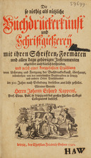
Gessner, Christian Friedrich. Die so nöthig als nützliche Buchdruckerkunst und Schriftgiessereÿ mit ihren Schriften, Formaten und allen dazu gehörigen Instrumenten abgebildet auch klȧrl ich beschrieben, ... 4 vols. (Leipzig, Electorate of Saxony: C. F Gessner, 1740, 1740, 1741, 1745.)
This is a substantial technical and historical overview of printing and typefounding, in four volumes. The beginning of its long title might be translated loosely as "Printing and Typefounding, which are as Necessary (nöthig) as they are Useful (nützliche)."
These four volumes have been scanned several times, at greater or lesser levels of quality. One particularly good and cleanly public domain scan is that done by the Wellcome Library which is hosted at The Internet Archive. The icon above left links to Volume 1 in that scan (which contains the material on typefounding). Here are links to all four volumes (which contain the original JP2 format scanned images), together with links (for convenience) to local copies of the PDFs of each.
It has also been digitized by the Deutsches Textarchiv. While these scans are not bulk-downloadable, this version has the advantage of having been transcribed (with Text Encoding Initiative (TEI) encoding). Here are links to these four digitizations:
The material on typefounding is in Volume 1. Its pagination can be confusing, because the arabic page numbering restarts midway through the volume. It begins with section I, "Kurtzer jedoch grŭndlicher Entwurf von Erfindung der edlen Buchdruckerkunst" (roughly: "shorter but thorough draft of the invention of the noble art of printing"), which runs from p. 1 through p. 140 (page images 37 through 218 in the Wellcome PDF). Then section II begins but the page numbering restarts at 1. The section "Bericht von dem Schriftgießen..." ("report on typefounding") begins on p. 130 of the second run of the arabic numeral pagination (page image 376 in the Wellcome PDF). The plate illustrating typefounding is bound after p. 130.
A PNG rendering of the plate on typefouding (Tab. IV), from the JP2 source image of the Wellcome digitization, is reproduced below left. 22 Megabytes. In the late 20th century, the late Paul Hayden Duensing employed photographic techniques to create a reproduction of this image (for a publication that was never completed). Through the courtesy of Richard L. Hopkins, who now owns Duensing's materials for this, and Ginger Duensing (who has given permission for its reproduction) it appears below, right. Ginger Duensing has requested that Paul Hayden Duensing always be acknowledged in the reproduction of his work. This is a 600dpi RGB scan. 32 Megabytes.
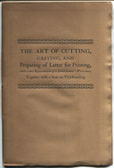
Universal Magazine (1750)
Moxon, Joseph [communicated by "A.B."] "The Art of Cutting, Casting, and Preparing of Letter for Printing, with a neat Representation of a Letter-founder's Work-house." The Universal Magazine. Vol. 6, No. 6 (June 1750): 274-278.
Although this is signed "A.B." it is in fact a condensed extract from Moxon's description of punchcutting and typefounding. It is illustrated with a cut of a gauge (from Moxon) and a plate of the Caslon foundry (not, of course, from Moxon).
This has been scanned by Google from the University of Michigan copy. Unfortunately, as always, they did not fold out the plate and so it is nearly useless. Fortunately, I have a copy of this plate from a 1920 history of the Caslon foundry, [McRae, John Findlay.] Two Centuries of Typefounding. (London: George W. Jones, 1920.) The image at left links to a PDF of an extract of the article, from the Google scan, supplemented with a scan from the 1920 reprint of this plate (reduced in scale to fit the low-resolution Google scan). For a high-resolution (600dpi) version of the plate, see the image below.
(Scanned by DMM from the 1920 McRae reprint. Here it is as a PDF: caslon-two-centuries-of-typefounding-1920-1200rgb-004-hand-casting-rot90ccw-scale-50pct-jpg.pdf )
Anthoensen (1939)
Moxon, Joseph and Fred Anthoensen. The Art of Cutting, Casting, and Preparing of Letter for Printing, with a Neat Representation of a Letter-founder's Work-house, Together with a Note on Typefounding by Fred Anthoensen. Portland, Maine: The Southworth-Anthoensen Press, 1939.
Anthoensen's "A Note on Typefounding" which accompanies this reprint of the 1750 Universal Magazine article attributes it to Moxon (as the 1750 publication did not). It's a good introduction, but typical of its era. It repeats the assertion that English printing of the 17th century had fallen to "depths" from which Caslon revived it (for a more general discussion of this issue, see the Notebook Not So Bad After All). It also indicates a complete lack of awareness of the role of patrix cutting in 19th (and 20th) century types, claiming (incorrectly) that "The steel punch engraved by hand was the vital feature in all typefounding until the engraving machine was invented." (See the The Issue of Patrix Cutting in Soft Metal.
The icon above left links to a 300dpi digital version, as a PDF of JPEGs (67 Megabytes). Here is a 600dpi version (225 Megabytes): moxon-1750-anthoensen-1939-art-of-cutting-0600rgbjpg.pdf
Diderot & d'Alembert on Typefounding
Although the subject of typefounding is treated in the Encyclopédie of Denis Diderot and Jean le Rond d'Alembert, the state of the availability of this material to the anglophone typefounder is unsatisfactory. In part this is due to the way in which the subject was addressed in the original text, but primarily it is due to issues in the way that the Encyclopédie has been reprinted and translated in both the print and digital eras. The Notebook linked here (click on the icon at left) is an attempt to lay out for the English-speaking typefounder what is presently available.
Hallens [Halle], Werkstäte der Heutigen Kunste (1762)
Hallens [Halle], Johann Samuel, Werkstäte der Heutigen Kunste, oder die Neue Kunsthistorie. Volume 2. (Brandenburg an der Havel, Margraviate of Brandenburg and Leipzig, Electorate of Saxony: Johann Wendelin Halle and Johann Samuel Halle, 1762.) The icon at left links to a digitization of this volume by the Getty Research Institute, as presented at The Internet Archive (which includes the original image files). Here is a local copy of the PDF from that digitization: johannsamuelhall02hall.pdf
This work has also been digitized by the Bayerische StaatsBibliothek and the Münchener DigitalisierungsZentrum. This may be viewed on their site at: https://opacplus.bsb-muenchen.de/title/BV011215394 Here is a local copy of this digitization (urn:nbn:de:bvb:12-bsb-10910685-7): halle-1762-werkstate-der-heutigen-kunste-oder-die-neue-kunsthistorie-v2-includes-der-schriftgiesser-bsb10910685.pdf
Note: Several modern sources, including the Getty Research Insitute in their digitization of this work (at the Internet Archive and Hathi Trust) and Dan Reynolds in his introduction to a reprint of it (see below), cite the author's surname as "Halle" in their bibliographic metadata. Other modern sources, including the Bayerische StaatsBibliothek and the Münchener DigitalisierungsZentrum in their digitization of this work and the inter-library bibliographic database worldcat.org, cite it as "Hallens." It appears as "Hallens" on the title page of the work as originally printed in 1762.
This work has been translated into English by Dan Reynolds and reprinted (in German and English) in the occasional journal and typographical specimen book Cast it, #3 (Milan, Italy: Lazy Dog Press srl, 2019) under the title "An Essay on Typefounding." ISBN: 978-88-98030-27-9. ISSN: 2531-765. This reprint does not include the plates of the original.
Reynolds' translation includes an excellent introduction, in English, which identifies several things not necessarily apparent from the source text itself. He identifies the specific city (Brandenburg an der Havel) referred to simply as "Brandenburg" on the title page. He notes that the publishers were unrelated to the author, despite the great similarity of their names. He also identifies the primary source texts used by Hallens (who was not a trained typefounder or printer). One of these is Christian Friedrich Geßner's Die so nöthig als nützliche Buchdruckerkunst und Schriftgiessereÿ mit ihren Schriften (1740). For more on this, see the entry on Geßner, above, . The other is the the anonymous Kurtze, doch nützliche Anleitung von Form- und Stahl-Schneiden [Short, but Useful Guide to Wood and Steel (punch) Cutting] sometimes attributed to Johann Michael Funcke ([City of] Erfurt, Electorate of Mainz: Johann Michael Funcke, 1740.) For more on this text, including a digitization, see the entry on it in the Notebook on Typographical Punchcutting in Steel by Hand . Hallens' reliance on two sources shows in his text, which basically discusses punchcutting twice, in slightly different terms each time.
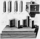
Hallens illustrates type making in two plates. The first shows a view of typecasters at work. The second shows details of the furnace and the hand mold. It is clearly recognizable as having been derived from Geßner. Here are these plates as extracted from the Getty digitization.
Here are the original page images, first as JP2 image files as distributed, and then rendered (and losslessly rotated 90 degrees) as PNG images:
The first volume of the Manuel Typographique (1764) by Pierre-Simon Fournier (known as Fournier le jeune, and sometimes, confusingly, cited as Simon Pierre Fournier) is probably the most important work in the history of typefounding in the hand-casting era. Where Moxon was self-taught, Fournier was professionally trained. His book presents sufficient information, with illustrations, to allow anyone to reproduce this technology.
The original volumes of Fournier (1764, 1766) are now scarce and expensive antiquarian books which have sold for at least $12,000 on occasion (an early 21st century auction at Christie's).
To the best of my knowledge, Fournier in the original French version has been reprinted in book form (vs. digital) only once:
Fournier, Pierre-Simon and James Mosley, Ed. The Manual Typographique of Pierre-Simon Fournier le jeune: Together with Fournier on Typefounding, an English Translation of the Text by Harry Carter. Three volumes. Darmstadt, Germany: Technische Hochschule Darmstadt, 1995.
The first two volumes are a facimile reprint of the 1764 and 1766 originals. The third volume is a reprint of Carter's 1930 translation (for more on that translation, see below).
1c. BNF/Gallica Digital Reprints
The Bibliothèque nationale de France has scanned both volumes. These are available via its "Gallica" digital library:
Fournier. Manuel Typographique Tome I. (1764) [Gallica]
Fournier [le jeune], Pierre Simon [aka Simon Pierre]. Manuel Typographique, Tome I. Paris: Imprimé par l'Auteur, M.DCC.LXIV. This copy lacks its frontispiece (present in the Oxford copy as digitized by Google (see below) and identical to the frontispiece present in Vol. 2 as digitized by both Gallica and Google) and differs in its order of binding from the Oxford copy (in the Gallica copy, the censor's approval page, and statement of Privilege du Roi appear at the end of the volume, and the plates are bound at the very end). The BNF/Gallica digitization is, however, far superior in quality - especially as regards the plates.
The icon here links to the presentation of this work in Gallica, the digital library of the Bibliothèque nationale de France, where it can be read online or downloaded. Here is a local copy of the Gallica PDF. Please note that it is licensed by the BNF for noncommercial use only (and is so used here). This licensing is in this way more restrictive than the Creative Commons license used for much of the rest of this Notebook: fournier-v1-1764-manuel-typographique-bnf-gallica-bpt6k1070584h.pdf
Fournier. Manuel Typographique Tome II (1766) [Gallica]
Fournier [le jeune], Pierre Simon [aka Simon Pierre]. Manuel Typographique, Tome II. Paris: Imprimé par l'Auteur, M.DCC.LXVI. This volume does contain its frontispiece (which is identical in both volumes), which illustrates the use of child labor and the lack of appropriate personal protective equipment.
Volume 2 of Fournier isn't really about typefounding, but contains showings of his typefaces.
The icon here links to the presentation of this work in Gallica, the digital library of the Bibliothèque nationale de France, where it can be read online or downloaded. Here is a local copy of the Gallica PDF. Please note that it is licensed by the BNF for noncommercial use only (and is so used here). This licensing is in this way more restrictive than the Creative Commons license used for much of the rest of this Notebook: fournier-v2-1766-manuel-typographique-bnf-gallica-bpt6k1070586b.pdf
Jacques Andre has prepared an edited facsimile which is available at: http://jacques-andre.fr/faqtypo/BiViTy/Fournier-Manuel.html (a part of his general collection of typographical material at http://jacques-andre.fr/ed/index.html ).
Both volumes of Fournier have also been digitized by Google. Here are local copies of the Google Books digitizations of the Oxford University copy of this work (Google Books IDs: -f0BAAAAQAAJ, FP4BAAAAQAAJ):
The situation of Fournier in English tranlsation is frustrating. Volume 1 was translated in 1930 by Harry Carter, and to the best of my knowledge has not been translated again. Carter's translation and critical apparatus are excellent; if this volume was only available, there would be no need for any other English language version.
The original publication of Carter's translation was:
Fournier [le jeune], Pierre Simon, trans. & ed. Harry Carter. Fournier on Typefounding: The Text of the Manuel Typographique (1964-1768) translated into English by Harry Carter. London: The Soncino Press, 1930.
200 copies for sale in England and 60 copies sold in the U.S. by Random House.
Note that while the title says that this is "the text" of Fournier, it does also include reproductions of the illlustrations.
Carter's translation has always been in copyight in England under both the 50-year rule (pre-1996) and the 70-year rule (Harry Carter died in 1982). Under the 70-year rule, it will remain in copyright in England until 2052. As I write this in 2015, a copy of Carter's original volume is listed by an online bookseller for nearly $500.
In the US, Carter's translation was in the public domain from 1930 (due to lack of copyright formalities) to 1995. In 1996 it was placed in copyright due to the US implementation of the Uruguay Round of GATT, and will remain in copyright in the US until 2025 (1930 + 95).
Carter's translation was reprinted once during his lifetime. Presumably this was done with his permission, since he wrote a new and useful introduction to it and provided additional bibliography:
Fournier [le jeune], Pierre Simon, trans. & ed. Harry Carter. Fournier on Typefounding: The Text of the Manuel Typographique (1964-1768) translated into English by Harry Carter. NY: Burt Franklin, 1973.
"Burt Franklin: Bibliography and Reference Series 468" and "[Burt Franklin:] Art History and Reference Series 41"
The new material in the Burt Franklin edition is in copyright in the US through 2068 (1973 + 95), and in England through 2052.
As noted earlier, Carter's 1930 translation was also reprinted in facsimile in 1995, with notes by James Mosley:
Fournier, Pierre-Simon and James Mosley, Ed. The Manual Typographique of Pierre-Simon [sic] Fournier le jeune: Together with Fournier on Typefounding, an English Translation of the Text by Harry Carter. Three volumes. Darmstadt, Germany: Technische Hochschule Darmstadt, 1995.
The first two volumes are a facimile reprint of the 1764 and 1766 originals. The third volume is a reprint of Carter's 1930 translation, with notes by Mosley. All three volumes contain additional information by Mosley.
In short, until 2025 in the US or 2052 in England access to Carter's translation for the English-speaking typefounder requires either (a) a good university library which has a copy, or (b) ample funds.
[My knowledge of the literature of typefounding in German is seriously incomplete. There may be other versions/editions that I have missed.]
Two chapters from Volume 1 of the Manuel Typographique were published in German translation in 1993:
Fournier, Pierre Simon, Le Jeune. Die ganze kunst des stempelscheiders [The whole art of the punchcutters]: zwei Kapitel aus dem Manuel Typographique, Paris 1764. Hamburg: Maximilian-Gesellschaft, 1993 [but set and printed at the Technischen Hochschule Darmstadt] ISBN: 3-921743-39-7.
The chapters reprinted/translated are "Der Stempelschnitt" and "Vom Matrizenmachen." No plates are reproduced.
A selection of twelve two-page spreads of specimens from Volume 2 of the Manuel Typographique (the specimen book) was published in 1968 by Berthold. It contains a single page biographical note in German about Fournier. Confusingly, it bears the title " Manuel Typographique" as if it were the whole work. I'm listing it here primarily to identify it and avoid confusion.
Fournier, Pierre Simon. Manual Typographique von Pierre Simon Fournier le Jeune. Berlin & Stuttgart, West Germany: H. Berthold AG.
Fassadoni, Dizionario delle Arti e de' Mestieri (1769)
(Also Macquer, Dictionnaire Portatif des Arts et Métiers (1766/67))
Fassadoni. Dizionario... (1769)
Griselini, Francesco (original editor) and Marco Fassadoni (editor of this volume). Dizionario delle Arti de' Mestieri. Vol. 6 ("E-F") Venice, Republic of Venice: Modesto Fenzo, 1769.
The icon at left links to the digitization of this volume done by the Getty Research Institute and presented at The Internet Archive. This includes the original JP2 format images. Here is a local copy of the PDF version: dizionariodellea06gris.pdf. Here is an extract of just the section on letter founding (beginnng "Fonditore di Caratteri da Stampa"): dizionariodellea06gris-extract-punchcutting-typefounding.pdf.
Excerpts from the sections on punchcutting and typefounding were reprinted in Italian, but with a forward in English by James Clough, in the occasional journal Cast it, #1 (Milan, Italy: Lazy Dog Press srl, 2016). This publication notes that Fassadoni's text, while derivative, was the first published text on punchcutting and typefounding in Italian. It does not reproduce the six plates (Tav. VI - XI) of the original text.
A glance at the plates is enough to show that this work owes much to Diderot & d'Alambert's Encyclopédie (1752 & 1763; see above), Clough also notes that another scholar, Conor Fahy, identifies the article "Imprimeur" in volume two of Philippe Macquer's Dictionnaire portatif des arts et Métiers (Paris: 1766, Yverdon 1 : 1767) as a source. For this Clough cites: Fahy, Conor. "La descrizione del torchio tipografico nei Dizionario delle arti e de' mestieri di Francesco Griselini," in Libri, Typografi, Biblioteche Vol. 1 (Florence, Italy: Olschki, 1997): 277-291. The portion of Macquer's entry on printing which concerns typefounding is very brief and general (and without illustrations). Scans of it may be found at the Internet Archive:
Here are full-resolution page images of the plates, from the Getty digitization. Note that Tav. XII, while bound together with Tav. VI - XI, is actually a part of a later, nontypographical, section, "Fornajo," on p. 298 (it is not shown here).
The small images above link to PNG presentations of cropped versions of the original JP2 format page images. Here are the original JP2 image:
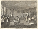
The Penny Magazine (1833)
"The Commercial History of a Penny Magazine, No. II: Wood-Cutting and Type-Founding." Monthly Supplement of The Penny Magazine of the Society for the Diffusion of Useful Knowledge . Vol. II, Whole No. 101 (Oct. 26, 1833): 417-424. This is a very brief popular account which includes illustrations of a hand mold (closed) and a type foundry. It is notable in part because it appeared at the very end of the period of hand typefounding, just before the introduction of the pivotal caster.
The Penny Magazine was published in a series of issues each of which bore a unique number. It was published weekly, with occasional supplements. These supplements were numbered sequentially with the regular issues. Pages were numbered sequentially through regular and supplemental issues. At the end of each year, the entire run of regular issues and supplements for that year was considered a volume and the page numbers were restarted. Thus, Volume II of 1833 consists of whole numbers 49 through 112, pp. 1 through 512. To add to this complexity, the mastheads for the Supplements give the dates for an entire month (e.g., Aug. 31 to Sept. 30, 1833) but the pages themselves bear the date of issue (Sept. 28).
This article appeared in a four-part series entitled "The Commercial History of a Penny Magazine" in the Supplements. It has been digitized by Google from copies at the Bodleian Library and the Koninklijke Bibliotheek. The icon above left links to an extract of the article from the Google version from the Bodleian copy. It is a poor digitization, but it is complete (the blank on p. 418 is present in the original) and small (2.8 Megabytes). Because of its general interest, I have also scanned all four parts of this article from my original printed version of this volume. Here are links to both extracts from the Google digitizations (small files, low-resolution) and my own scans (large files, higher-resolution) of the four parts:
In 1995/1996, Laurie Dickinson and Sarah Wadsworth published an online version of "The Commercial History of a Penny Magazine." Their scans, while low-resolution, are in color and exceed the quality of the Google scans done nearly two decades later. As of 2014 their edition is still online at: http://english.cla.umn.edu/PM/commmenu.html
Here's the View of the Type-Foundry scanned separately from my own printed original. The version below links to a 2048 pixel wide JPEG reduction of this scan.
Here's a 1200 dpi RGB PNG version of the same image (7528x5684 pixels, 77 Megabytes): penny-magazine-v02-wn101-1833-10-26-p424-type-foundry-1200rgb-08bit-xsane.png Should you have a need for a higher-resolution version, I do have 2400 and 3200 dpi scans, but they're too large to put online at present (and don't really show any more detail).
Finally (and just because it's interesting), here is the "Ancient View of a Dutch Printing Office" which appears in part 3 of this series, scanned separately in the same manner as the previous image. This View is a new (that is, 1833) wood cut or engraving copied from Plate 4 of a late 16th century series of engravings (copper, I presume) by Theodor Galle (Flemish, 1571-1633), after Jan van der Straet (called Stradanus, Netherlandish, 1523-1605), published as Nova Reperta. See for example the citation and copy of this work at the Metropolitan Museum of Art (NY) at: http://www.metmuseum.org/toah/works-of-art/34.30(5) (March 2014).
1200dpi RGB PNG (90 Megabytes): penny-magazine-v02-wn107-1833-11-30-1200rgb-0465-dutch-printing-office.png
Bruce for the Patent Office (1850)
Bruce, George, "Type Founding," in the Report of the Commissioner of Patents for the Year 1850 (Washington, DC: Office of Printers to the House of Representatives, 1851): 398-403.
An account of typefounding in America as of 1850 by the co-founder of what became Bruce's New York Type Foundry (and the uncle of the inventor of the pivotal type caster, David Bruce, Jr.)
This report is particularly significant in understanding 19th century matrix production because it may be evidence for the extensive use of electroformed matrices from patrices at a very early date. See the CircuitousRoot Notebook on The Issue of Patrix Cutting in Soft Metal for a more extensive discussion of this generally misunderstood topic.
This Report has been digitized by The Internet Archive from a wretched (but still legible) microfilm copy: https://archive.org/details/annualreport1850unit The icon here links to an extract of Bruce's report.
In 1867, J. H. Bachmann published a long series of articles distributed throughout the first half of that year's volume of Archiv für Buchdruckerkunst. These articles are especially interesting as they show some equipment of the typefounder which is not always shown elsewhere (such as standalone melting pots for hand casting). Bachmann also shows a lever hand mold (of the style seen first in Prechtl).
Bachmann. "Die Schriftgießerei." (1867)
Bachmann, J.H. "Die Schriftgießerei" [a series of articles in] Archiv für Buchdruckerkunst, Vol. 4 (1867). Ed. Alexander Waldow. Leipzig, Kingdom of Saxony: Waldow Buch & Kunst Druckerei, 1867.
This volume has been digitized by Google from the Princeton University copy. Rather than extracting Bachmann's articles, I've simply reprinted the entire volume (only 26 Megabytes). The icon above left links to a local copy of this reprint. Note that on its title page the word "Archiv" is missing. This is a digital error. Google splits pages up after digitizing and stores the individual parts separately. Here, their software failed to include the image containing this word. This may of course have happened in other places where it cannot be detected. Google's digitizations, while useful, cannot be trusted for reliable research.
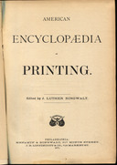
Ringwalt (1871)
Ringwalt, J. Luther, ed. American Encyclopædia of Printing. Philadelphia: Menamin & Ringwalt, 1871.
The cover and titlepage illustrations in the icons at left are scans from my own copy. They link, however, to a local PDF copy of the Google digitization of the Harvard University copy (Google ID: ztQoAAAAYAAJ).
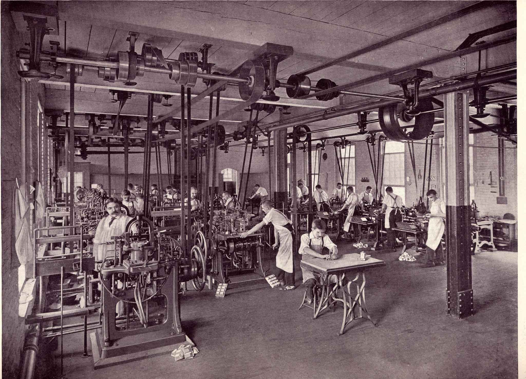
Ringwalt contains an interesting composite view of the typefoundry:
The image above links to a 2048 pixel wide JPEG version. For the obsessive, here is a 2400 dpi (26201 x 16608 pixel) JPEG (99 Megabytes): ringwalt-1871-american-encyclopaedia-of-printing-2400rgb-0472ff-typefoundry.jpg (The original PNG is 638 Megabytes, which just isn't practical to transmit at this point in history.)
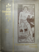
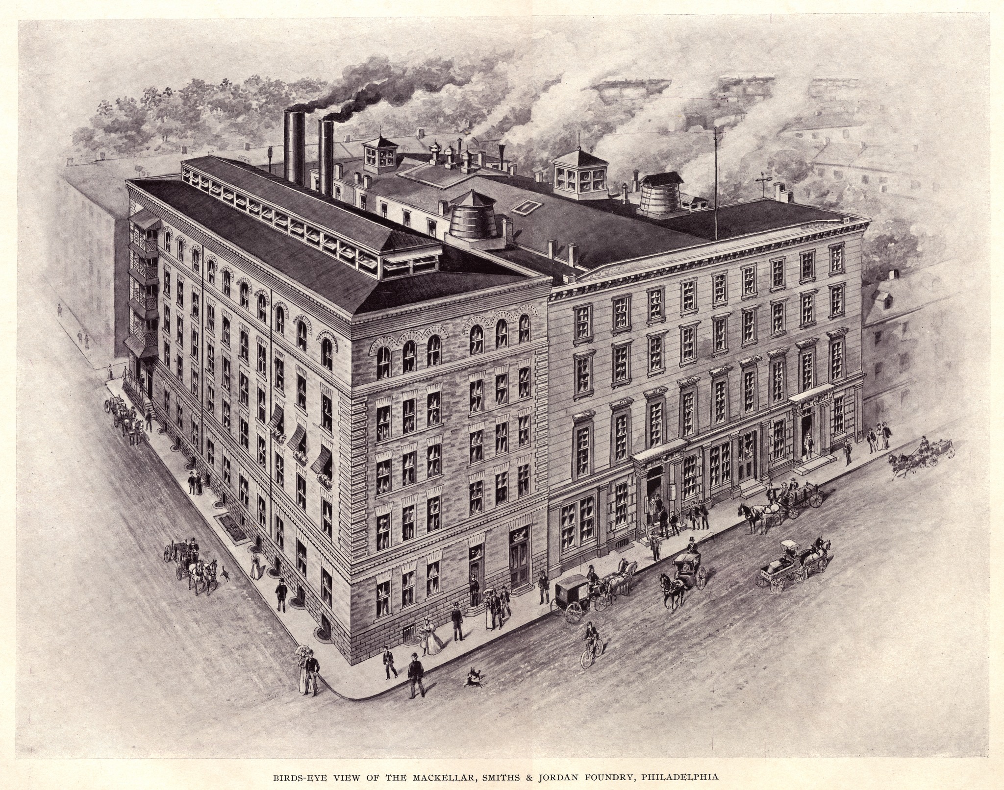
One Hundred Years (1896)
One Hundred Years. Philadelphia, PA: MacKellar, Smiths and Jordan [at that time legally the Philadelphia branch of American Type Founders Company], 1896.
This is a commemorative volume issued at the 100th anniversary of the 1796 startup of Binny & Ronaldson, the earliest predecessor of MacKellar, Smiths & Jordan. By 1896, the MS&J type foundry was a part of American Type Founders, but the surviving major foundries of the company had not yet been integrated into a single operation, and this book is written with minimal reference to ATF.
A good high-resolution digitization of this book is not yet online (the original is an oversize volume luxuriously printed). The icon here links to an extract of just the sections on type metal, matrix making, mold making, and type casting (23 Megabytes). But since book is large and difficult to scan, this extract was done from simple photographs of it, rather than from scans.
Google has done a complete, but low-resolution, scan of the entire volume from the Pennsylvania State University copy. It hardly does justice to the original book, but it's much better than nothing at all. It is not available via Google Books, but is online at The Hathi Trust (Hathi ID: pst.000015538079). A copy assembled from the Hathi images is available on CircuitousRoot in the American Type Founders Co. Notebook
Some of the material from One Hundred Years was used by Donald Wylie in his 1902 article "A Study of Modern Typefounding" ( see below).
The distinctive cover art of this volume has been identified by Stephen O. Saxe as an early work of John Sloan, later of the American "Ashcan School" of painting. Needless to say, it does not depict safe working attire for the handling of molten metal.
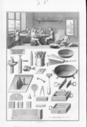
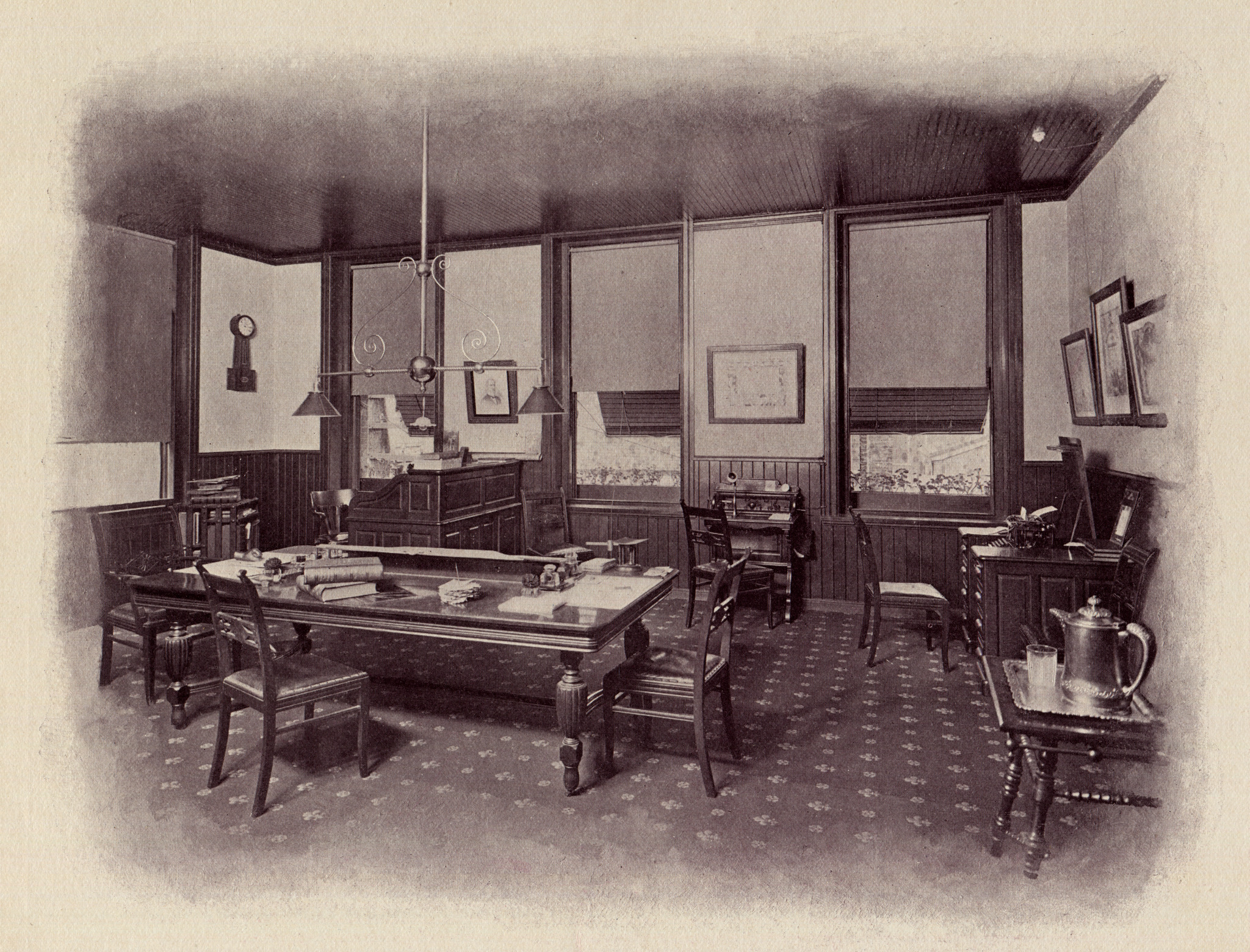
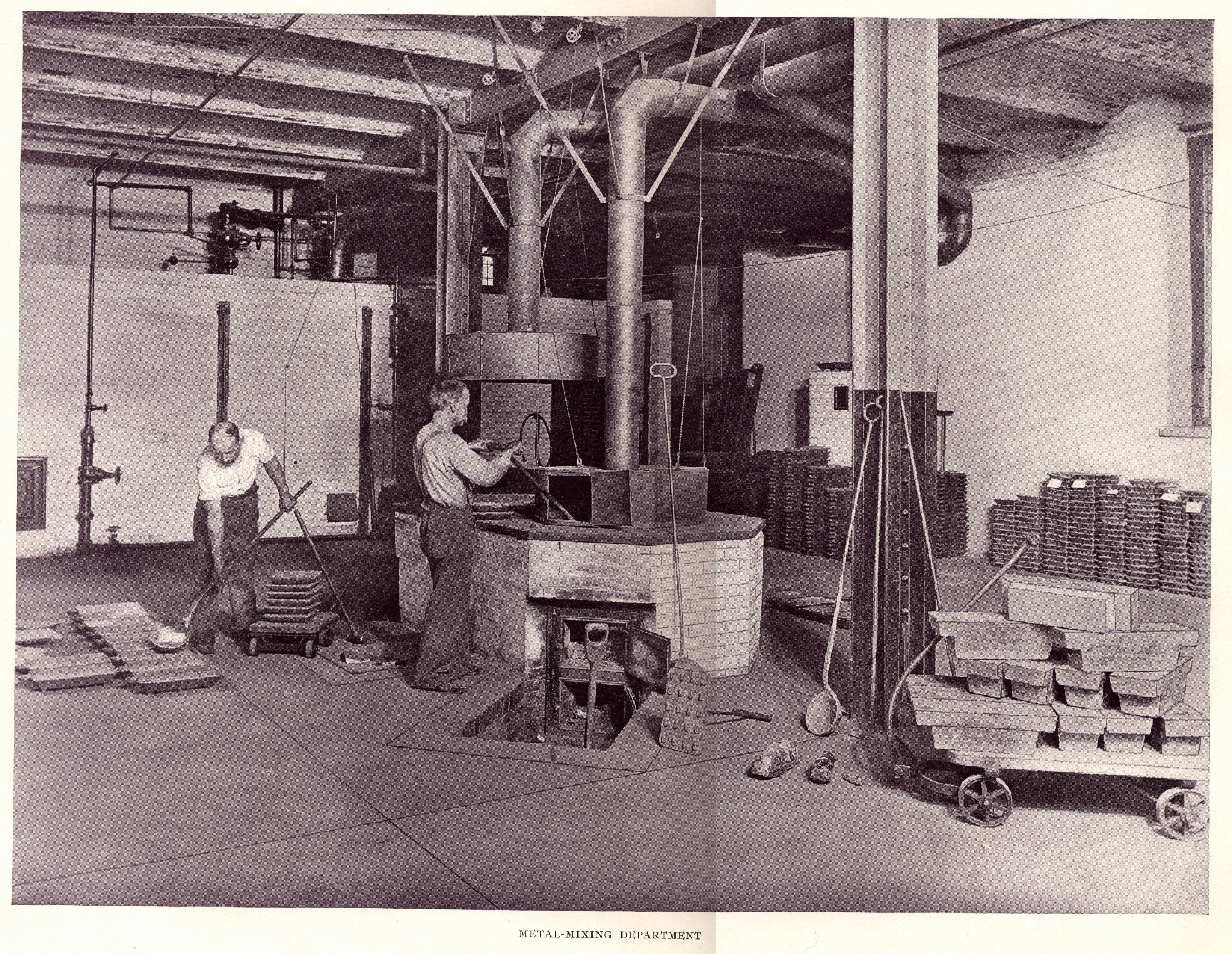
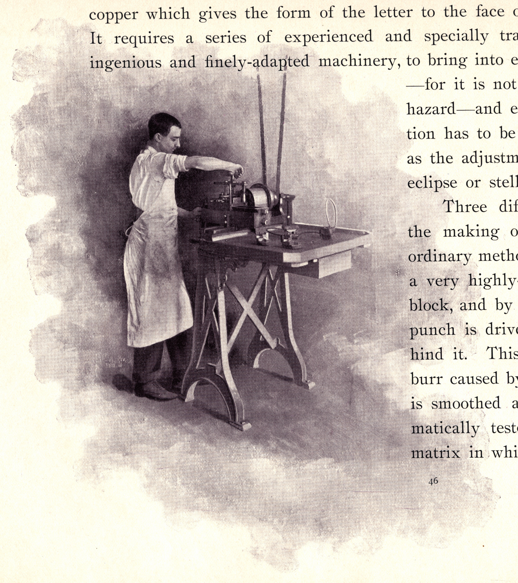
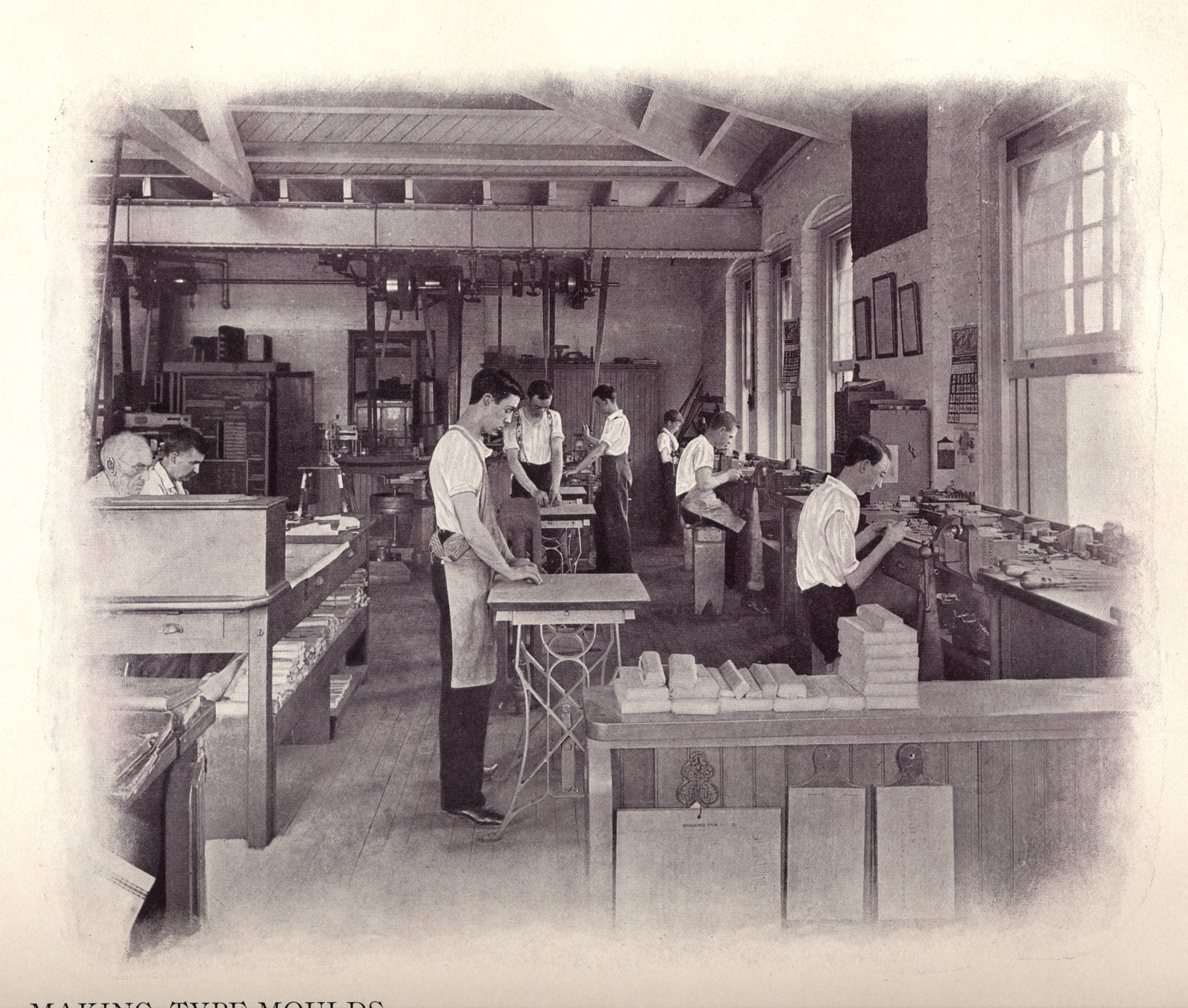
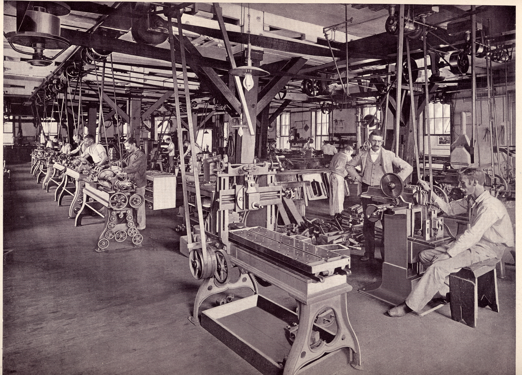
Much of the value of this book for the practical type-maker is in its illustrations. They give an unusual photographic tour of the technical operations of a major type foundry of 1896. Here are the images from this section as higher-resolution scans. In each case clicking on the image leads to a 2048 pixel wide JPEG version of the image (regardless of original size). In the caption for each image there is, additionally, a link to a 1200dpi RGB JPEG version. These can be large files.
|
|
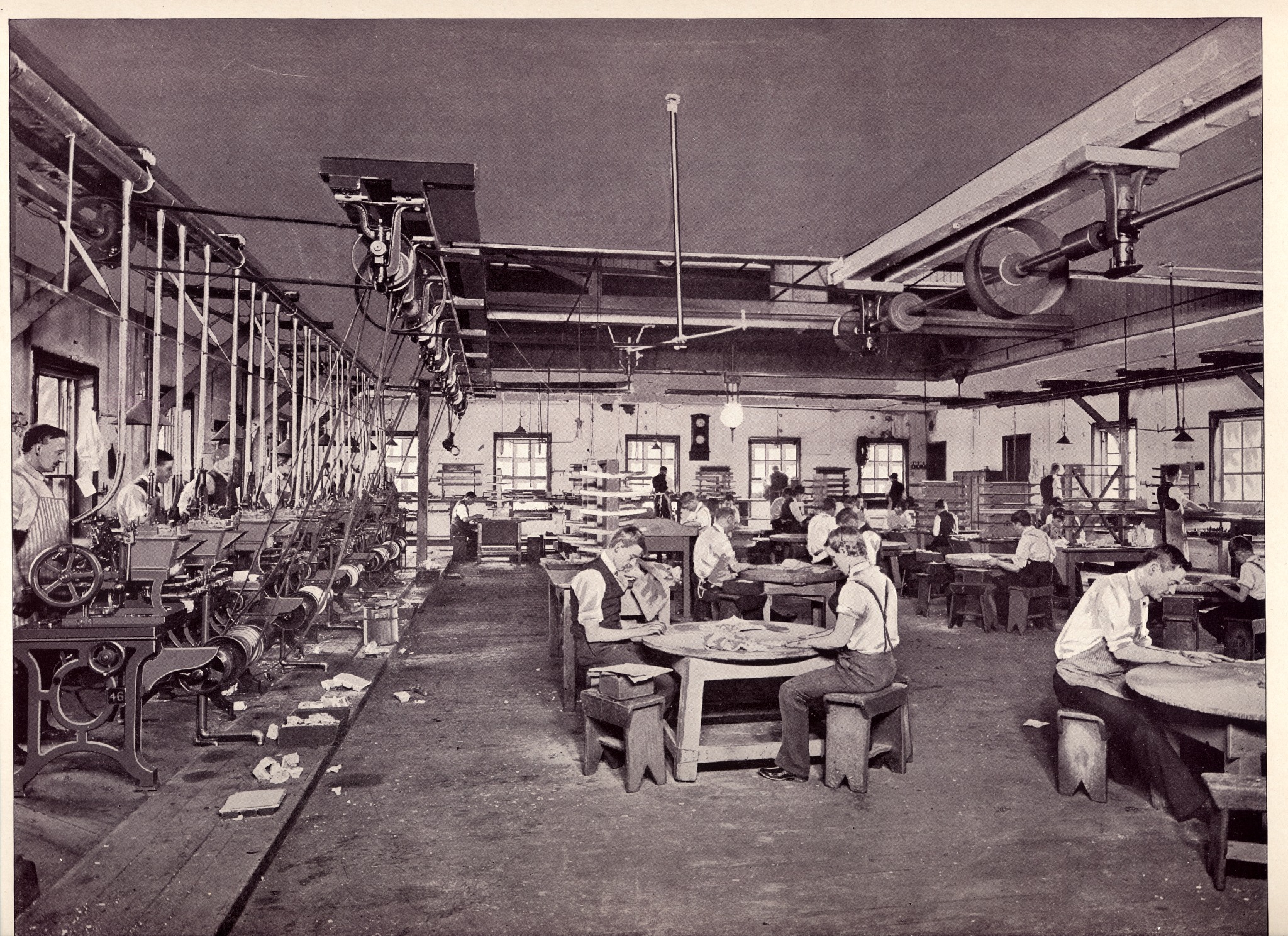
| (p. 42) A general view of the type foundry. 1200 dpi version | (p. 43) There was a time when I felt that showing a large and well-appointed office in a typefoundry was a waste of space. Now I want one. 1200 dpi version |
|

|
| (p. 44) Metal-Mixing Department. 1200 dpi version | (p. 45) Engraving. It is my opinion that the man on the left is engraving patrices, not punches (patrices can be seen in both of the inclined wooden galleys next to him, and on the bench to his right). If so, then this is the only illustration of which I am aware from the 19th century showing the engraving of patrices. This photograph is further significant because the man at the right appears to be working at a single-arm vertical pantograph engraving machine of some kind. This is not referred to in the text, except by omission (the text says that three methods are used in matrix making, but discusses only two). If indeed it is a pantograph engraver, it is the only evidence I have been able to discover of one in use at MS&J before their plant was consolidated into the main ATF plant. 1200 dpi version |

|
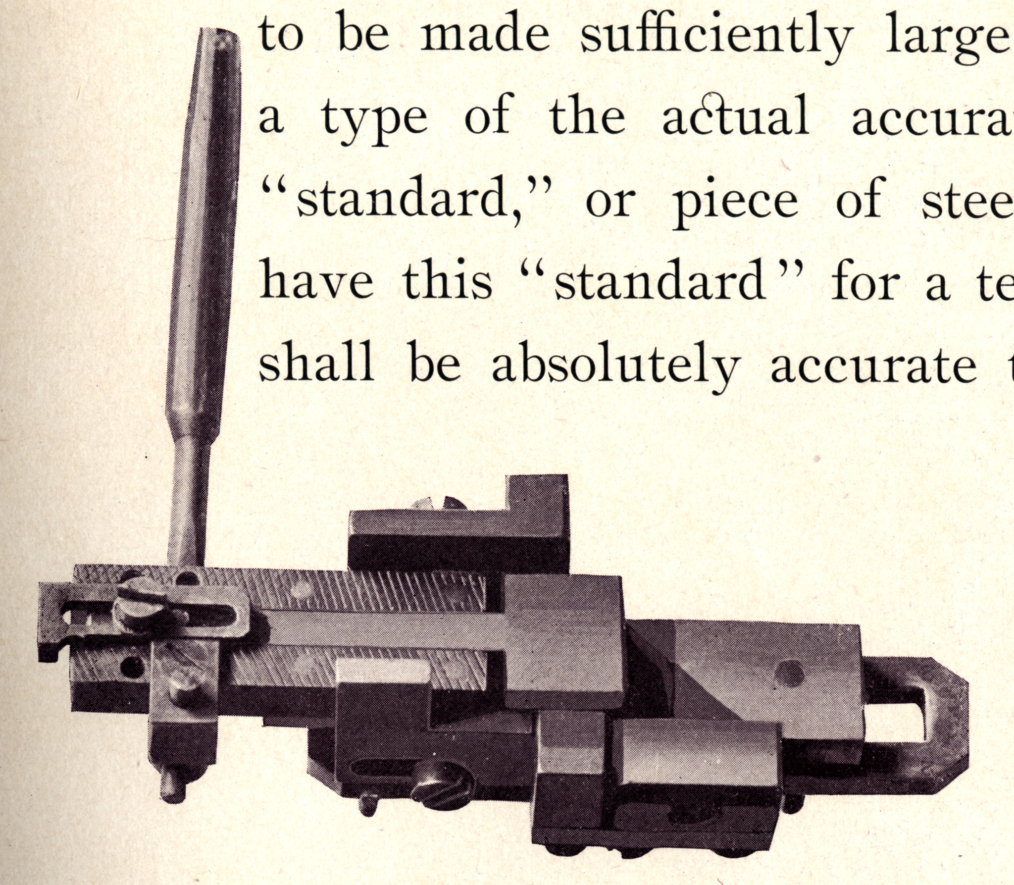
|
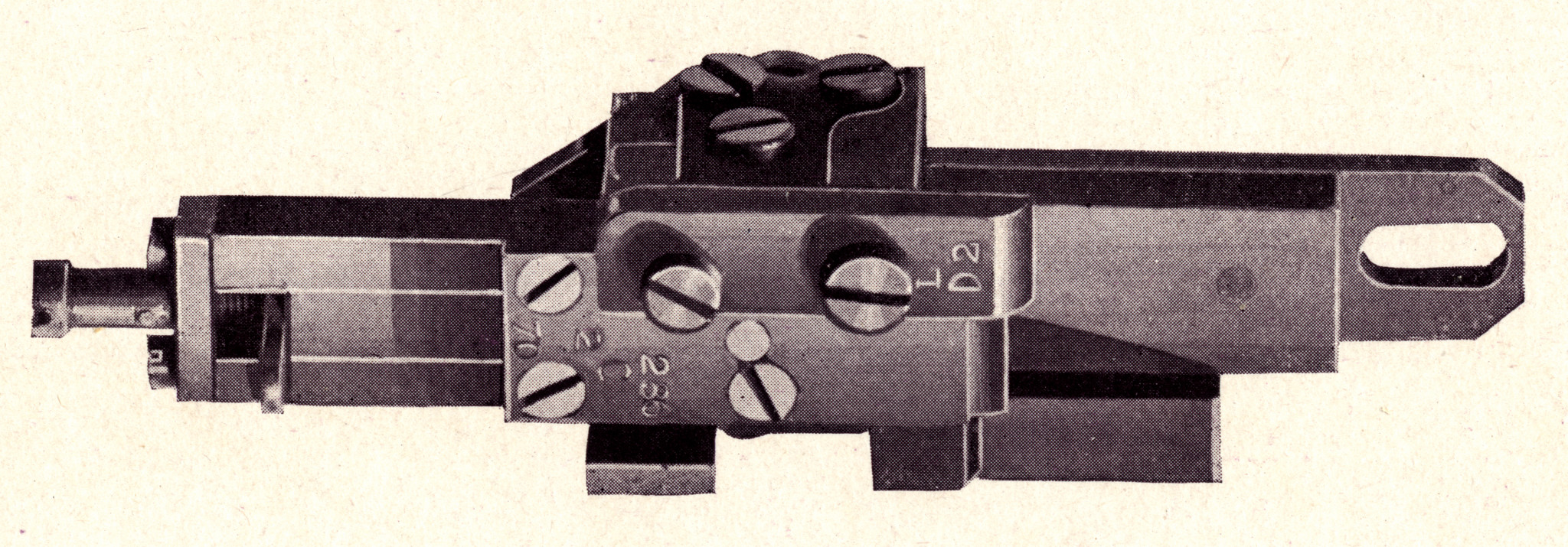
| (p. 46) These tools are effectively mis-identified in the text. It implies that they are matrix making tools, but in fact they are typecaster's tools. The tool on the left (holding the "Height Stand[ard]") is a Height-to-Paper Gauge (see Legros & Grant (1916), p. 75). The tool in the middle is a lining gauge. In use it is held upright with the knob at the bottom. Types are placed horizontally on its shelf (which is shown as vertical in the illustration), and the movable knife-edge (shown merged solid into the body; it does move) is used to compare vertical alignment between them. The tool on the right is a Turning-Gauge. It is used to measure body height and set width (and is well-described in (L&G, p. 75)). 1200 dpi version | (p. 47) This machine is not identified in the text. It is a small, special-purpose milling machine. While it is possible that it is for making matrix planchets, its location in the text and the presence of matrix fitter's hand molds on its table make it more likely, I think, that it is a matrix fitting machine. 1200 dpi version |
|
|
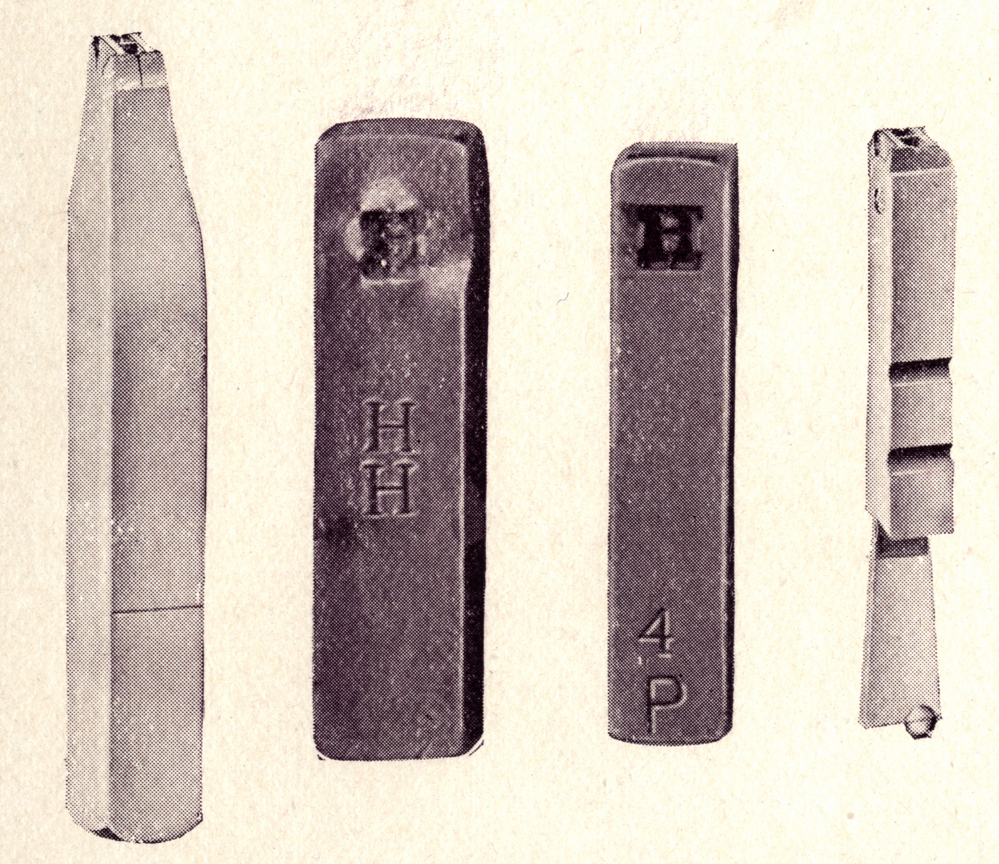
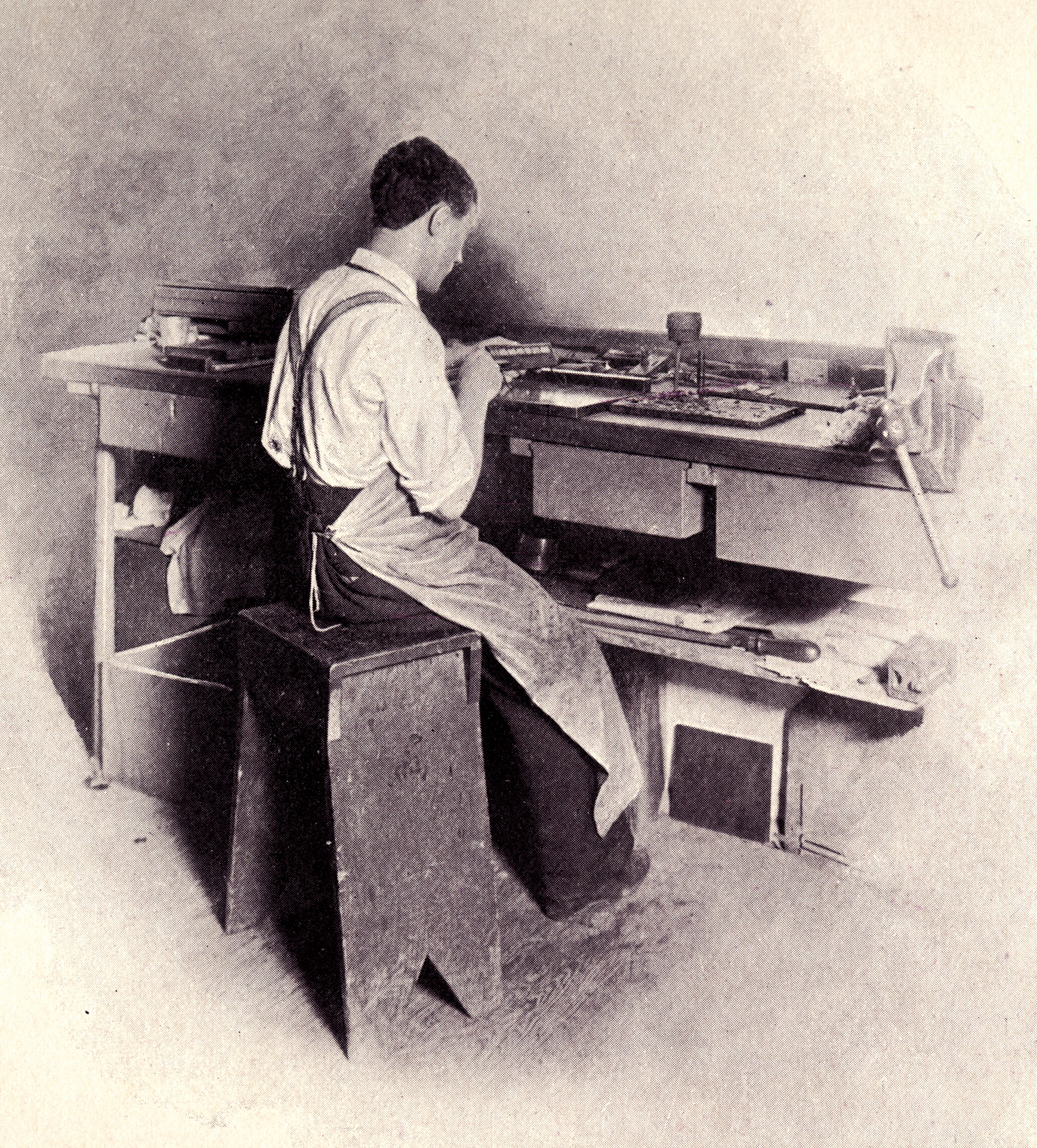
| (p. 47) A punch cut in steel, a driven but not yet justified strike, a justified matrix, and an unfinished type cast on a pivotal type caster in as-cast condition (you can tell it was cast on a pivotal because it has a pin mark). 1200 dpi version | (p. 47) Finishing electroformed matrices. 1200 dpi version |
|
|
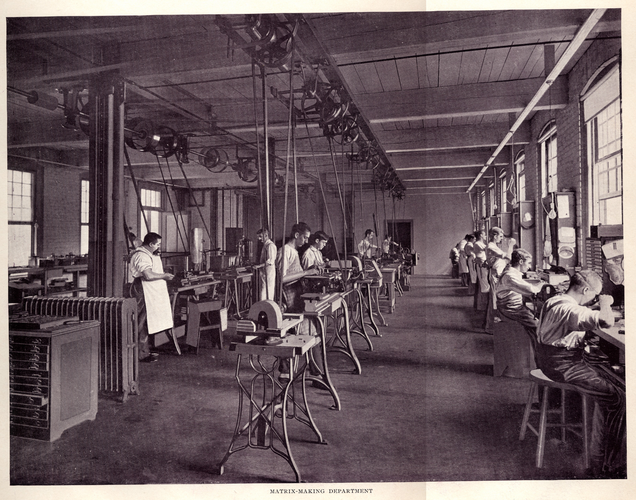
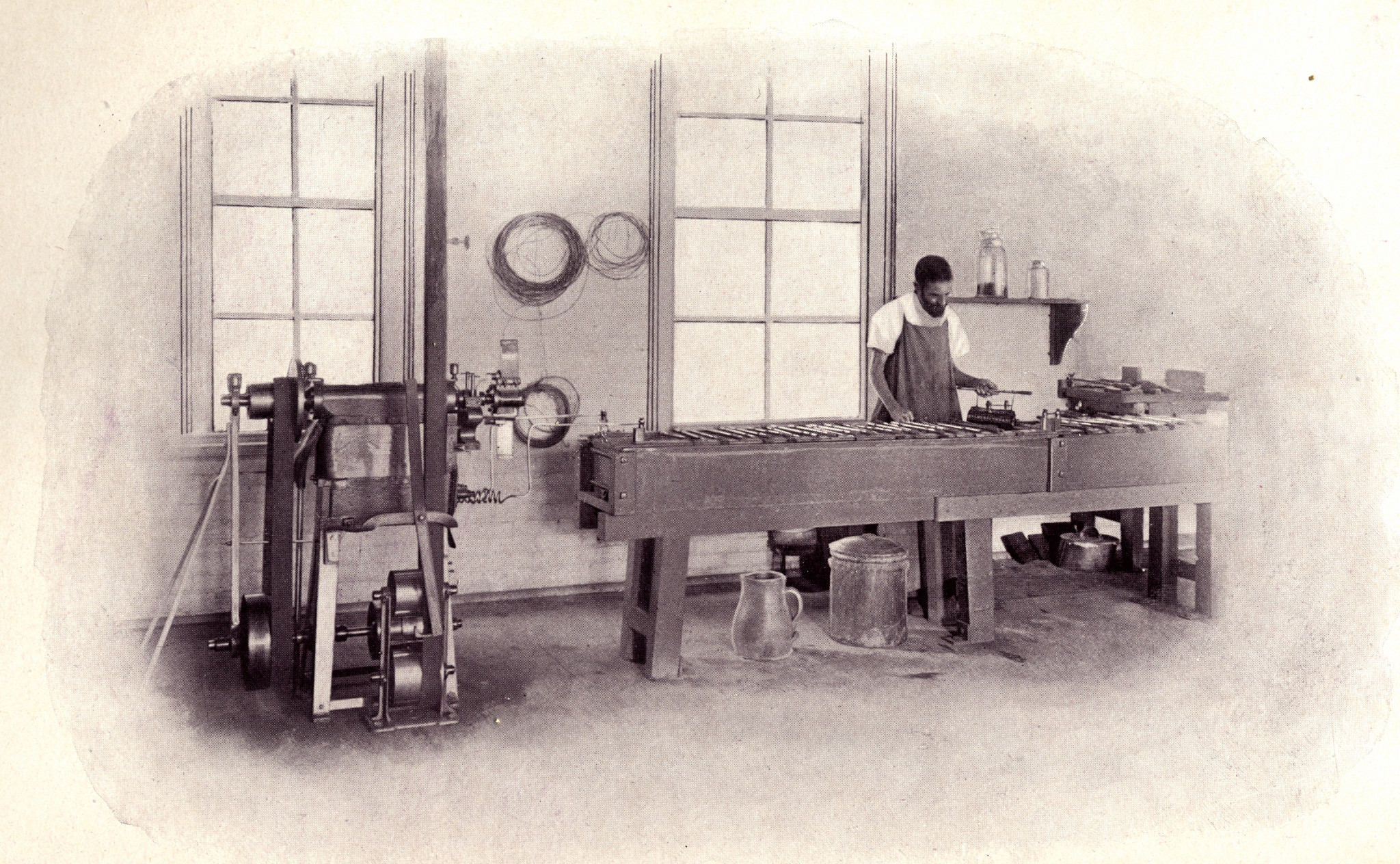
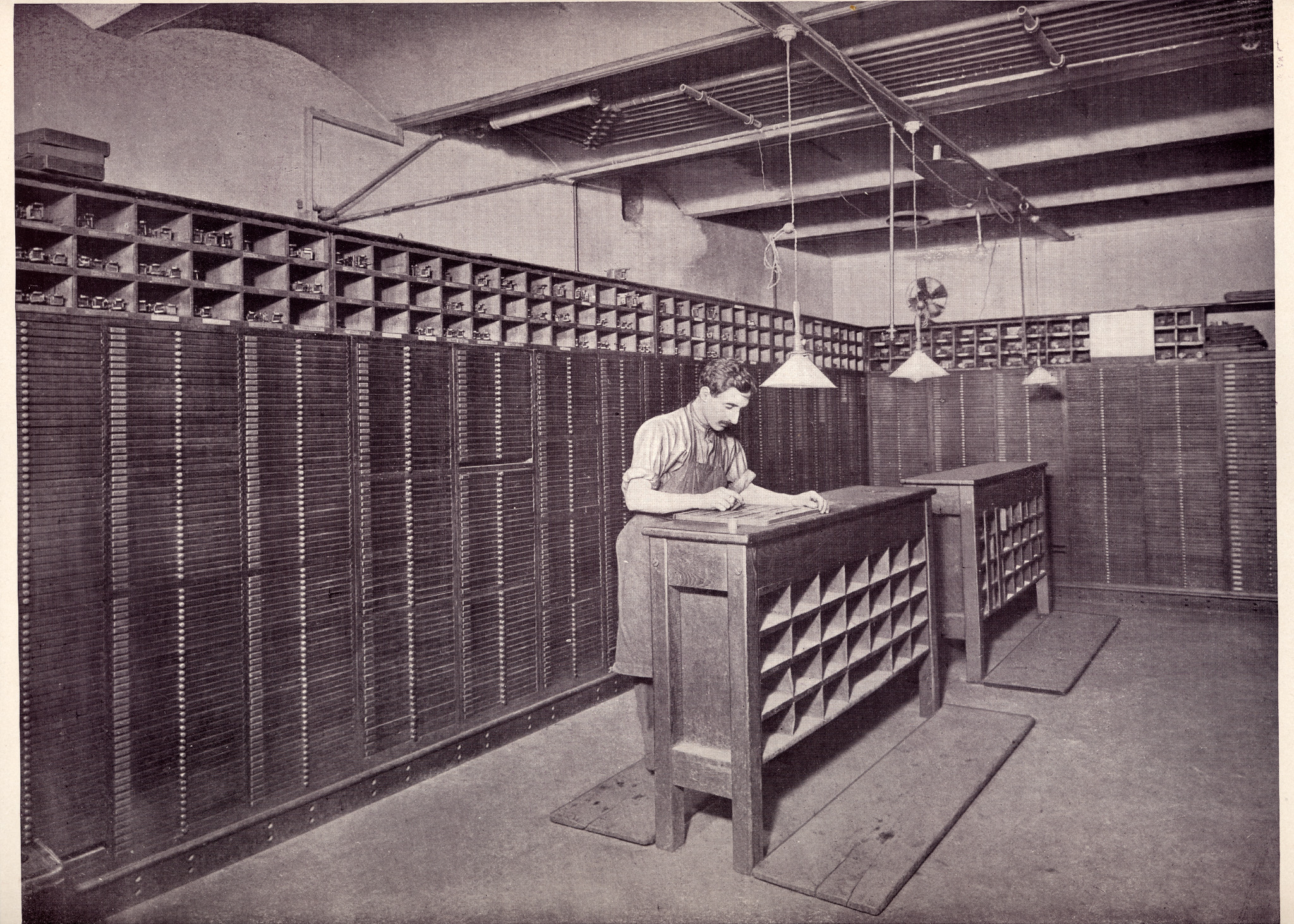
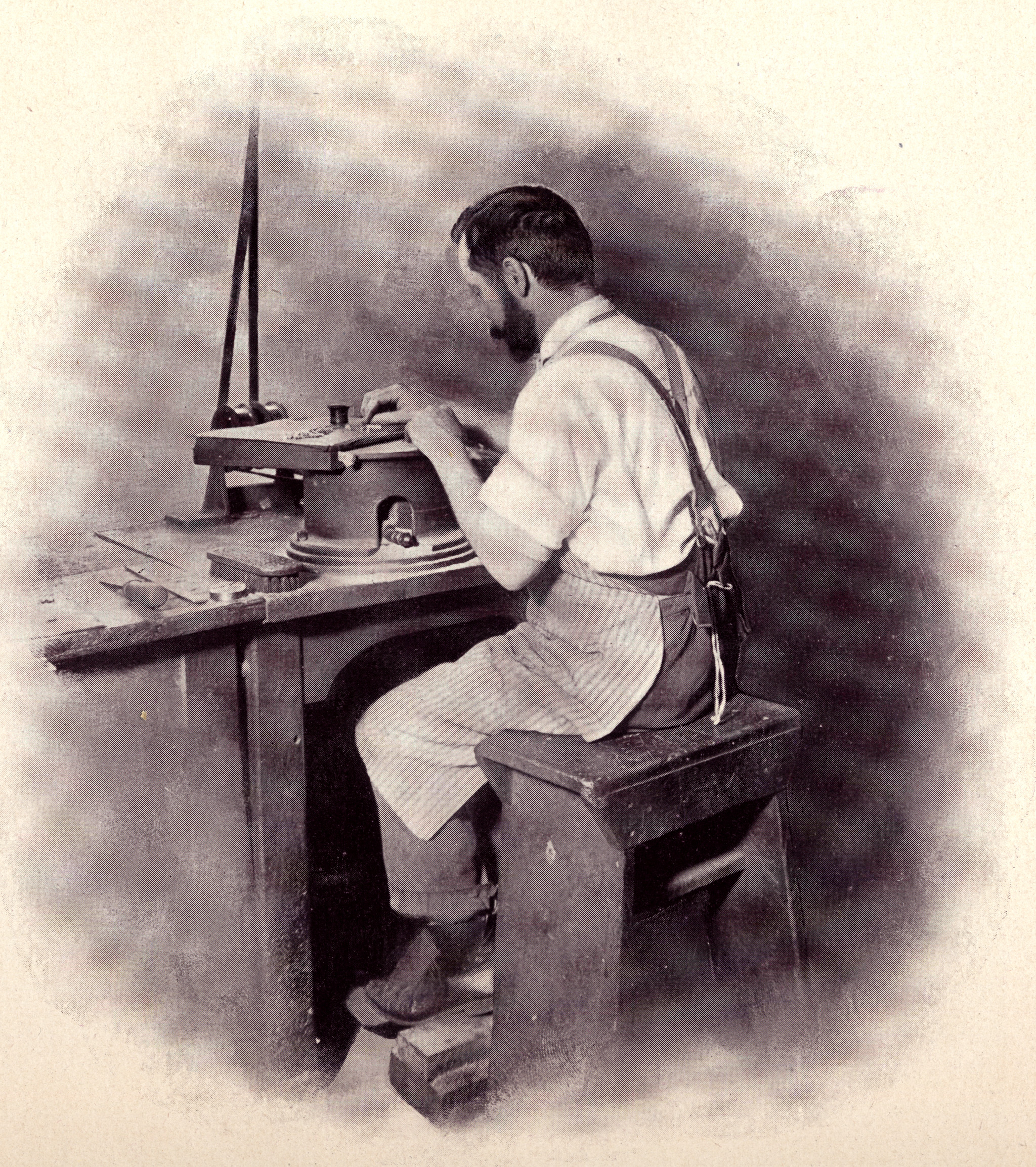
| (p. 48) Matrix-Making Department. 1200 dpi version | (p. 49) Matrix Electroforming. 1200 dpi version |
|
|
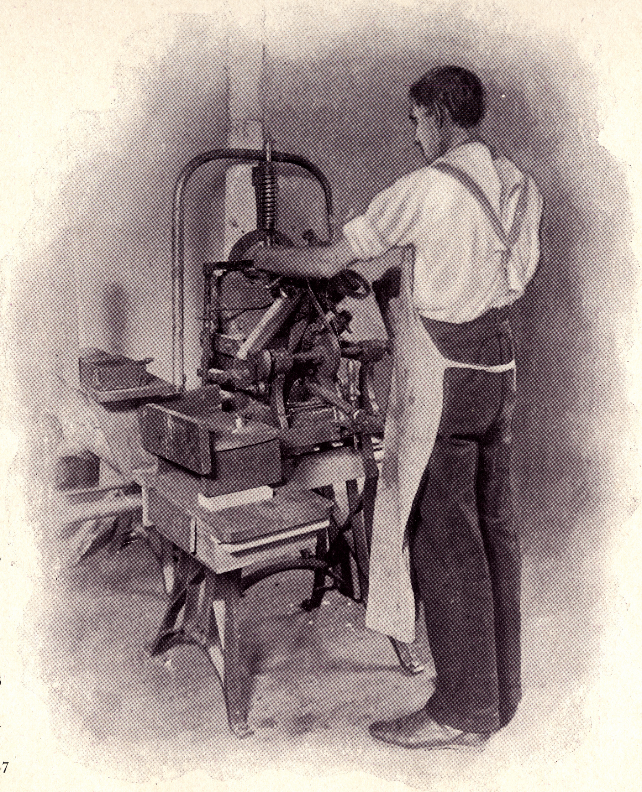
| (p. 49) A matrix justifier taking a test cast using a jusifier's hand mold and a justifier's force pump. This image is perhaps confusing because the force pump is in this instance made out of an old pivotal type caster. (You can see the holes in its frame where the cam shaft of the pivotal caster had been located.) In a pivotal caster the spring at top is compressed by a cam (no longer present here) and forces the piston down. In a justifier's force pump, this action is reversed: the justifier pushes the piston down by means of a long handle and then the spring returns the piston to its raised position. 1200 dpi version | (p. 50) Mould Making. I believe that what is being shown here is the lapping and hand fitting of moulds. 1200 dpi version |
|
|
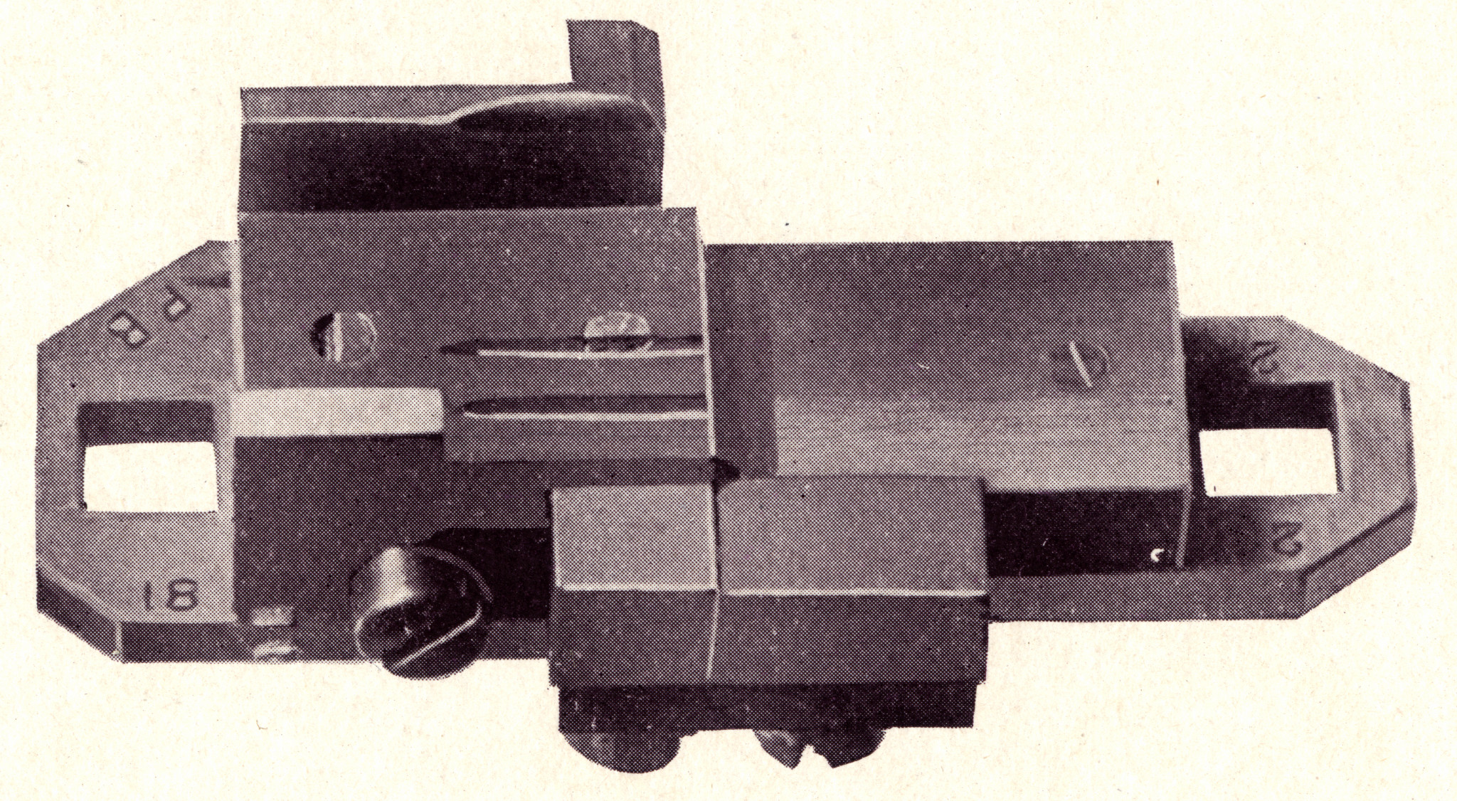
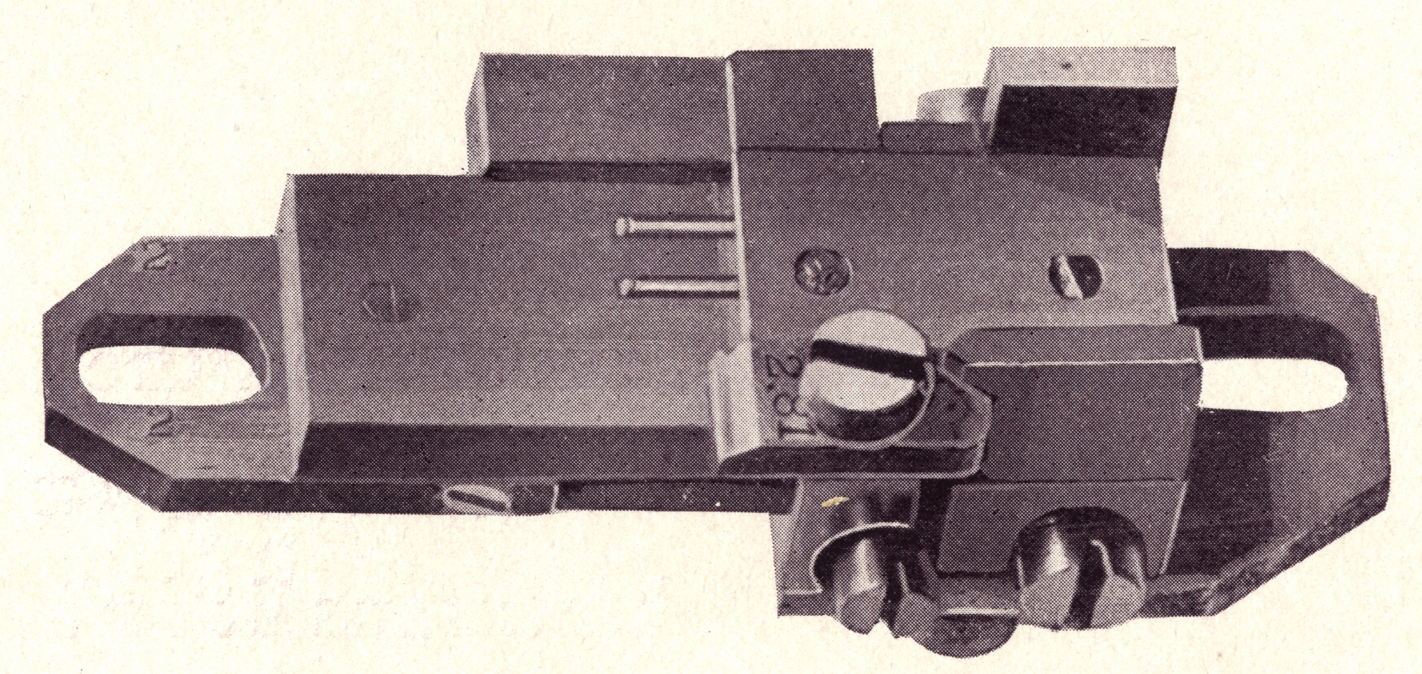
| (p. 52) A pivotal type caster mold for Roman type; top half seen from the jet side. 1200 dpi version | (p. 52) A pivotal type caster mold for Roman type, assembled but not placed in the machine. This is a side view from the matrix side. The matrix is not present as shown, but a type is shown where it would have been cast. 1200 dpi version |
|
|
| (p. 52) A pivotal type caster mold for Roman type; bottom half as seen from the matrix side. 1200 dpi version | |

|

|
| (p. 53) A pivotal type caster mold for script type; top half as seen from the matrix side. These types are cast on rectangular (not angled) bodies with projections to support those parts of the face extending beyond the body. Whether or not this constitutes a "kern" is a matter of opinion. MS&J do use this term, but a traditional kern is supported by the shoulder of an adjoining type, not by a projection of the body of its own type. 1200 dpi version | (p. 53) A pivotal type caster mold for script type, assembled but not in place on the machine. This is a side view from the matrix side; as before, the matrix is not shown, but a cast type is. 1200 dpi version |

|
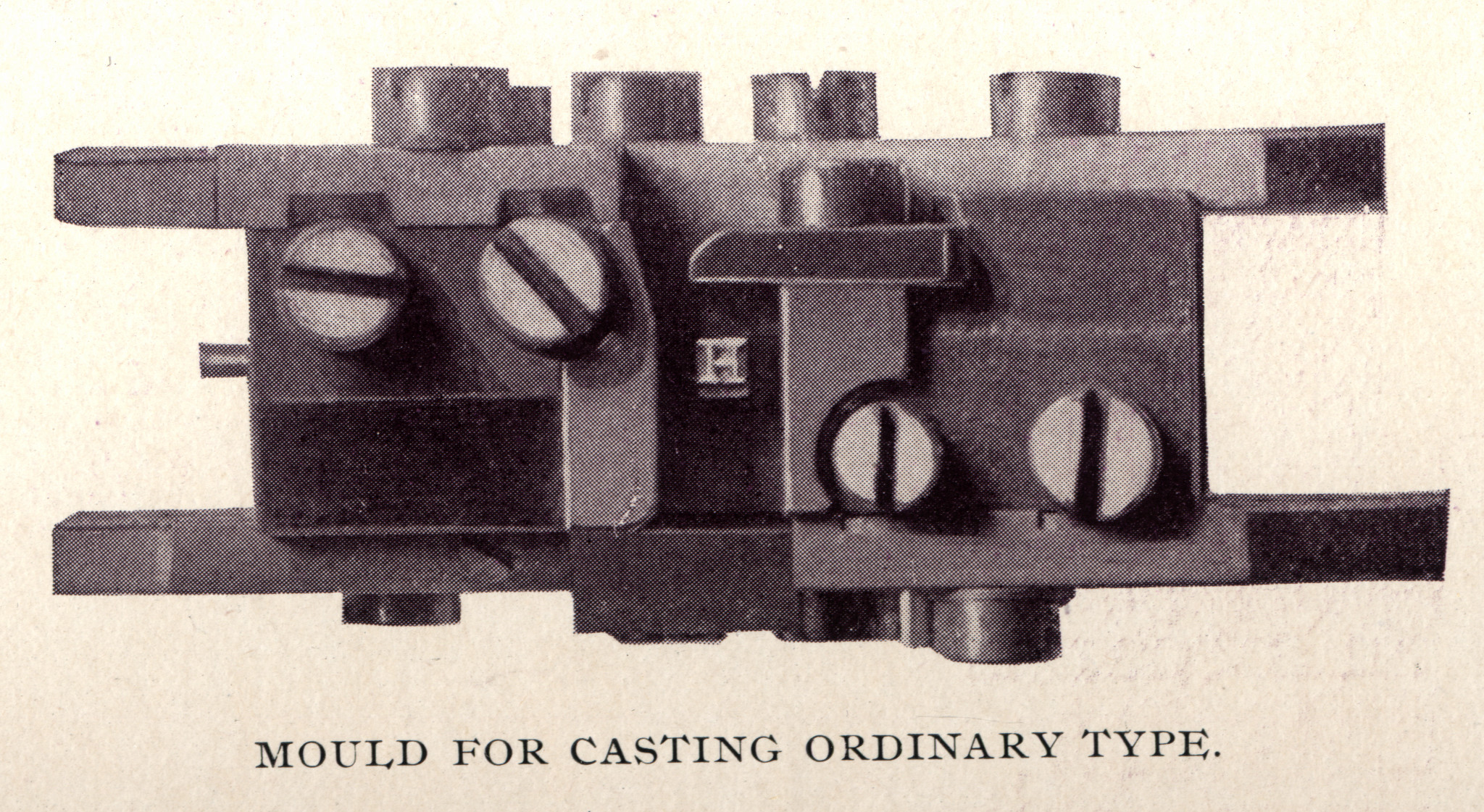
From the text: "Moulds for casting script type are what is known as 'left-handed,' and are opened the reverse of moulds for casting ordinary type. This is in order to allow the kern on the flange of the letter to discharge. By the use of adjustable beveled slides, which look like knife-blades, the same moulds also cast characters without kerns." |
| (p. 53) A pivotal type caster mold for script type; bottom half as seen from the jet side. 1200 dpi version | |
|
|
| (p. 54) The mould and matrix vault. 1200 dpi version | |
|

|
| (p. 55) A pivotal type caster mold for cored and/or mortised type; top half as seen from the jet side. 1200 dpi version | (p. 55) A pivotal type caster mold for cored and/or mortised type, assembled but not in place on the machine. This is a side view from the matrix side; as bevore, the matrix is not shown but a cast type is. top half as seen from the jet side. 1200 dpi version |
|
|
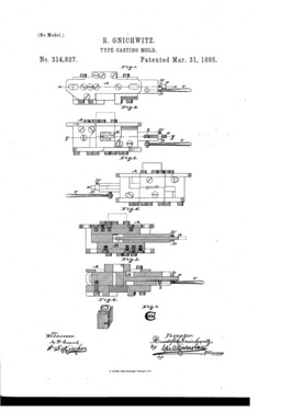
| (p. 55) A pivotal type caster mold for cored and/or mortised type; bottom half (the matrix side is at the top of the illustration). 1200 dpi version | Note: The "cored" mold shown here looks very much like the mold for mortised types with an "adjustable core" patented March 31, 1885 by Rudolph Gnichwitz (US patent no. 314,827, assigned to MacKellar, Smiths & Jordan). Click on the image above for a PDF of the entire patent. 1200 dpi version |

|
|
| (p. 56) The hand-driven pivotal caster type casting department. 1200 dpi version | (p. 57) A hand-driven pivotal type casting machine. 1200 dpi version, less tightly cropped |
|

|
| (p. 58) Steam-driven (via overhead shafts) pivotal type caster casting, rubbing, and dressing department. The type casting machines on the left are (at least near the camera) the double pivotal casters shown in the next photograph. An easily overlooked detail is the workman at a type dressing bench in front of the rightmost window at the far right of the photograph. 1200 dpi version | A steam-driven double pivotal type casting machine. This consists of two ordinary pivotal type casters mounted on the same table/frame. 1200 dpi version |

|
|
| (p. 60) Type rubbing table. 1200 dpi version | (p. 61) Kerning. Note that this is an operation in the making of type, performed by the typefounder. This is as true in the digital world as it was in 1896. The appropriation of the term "kerning" to mean "letterspacing" is disrespectful of the labor involved in the making of type with all technologies, and reduces our ability to describe the operations of type-making precisely. 1200 dpi version |
|

|
| (p. 62) The automatic type-casting department. The term "automatic" signifies that these machines cast type, break the jet, plow the groove, and dress the type (the step formerly accomplished by rubbing) without hand operations. 1200 dpi version | (p. 63) Although at this early period in the amalgamation of American Type Founders the formerly independent MacKellar, Smiths & Jordan Type Foundry will not name it, this automatic type-caster is the Barth machine as developed by their one-time rivals the Cincinnati Type Foundry. 1200 dpi version |
|
|
| (p. 64) The machine constructing department. The two machines in the foreground may be unfamiliar to modern readers. The machine at front center is a metalworking planer. The machine to its right (at which an operator is seated) is a metalworking shaper. 1200 dpi version |

Loy. "Designers & Engravers." (Johnston/Saxe)
Between 1898 and 1900 William E. Loy published 28 short biographical sketches of "[American] Designers and Engravers of Type." These have been collected and reprinted in a fine modern edition edited by Alastair M. Johnston and Stephen O. Saxe. The Johnston/Saxe edition also includes specimens of as many types as could be found which were designed by the type-makers in question, and an exceedingly useful list of 19th century type design patents. It is a necessary edition to any typefounder's library.
Loy. "Designers & Engravers." (original)
Here are the original articles of Loy's series from The Inland Printer in frequently very imperfect digitizations. This is no substitute for the Johnston/Saxe edition.
Loy. "Typefounders & Typefounding."
A second, and less well-known, series of articles. This one, on "Typefounders and Typefounding in America," is primarily a biographical and historical treatment of the industry.
Pye. Inland Printer (1885)
Pye, Alfred. "Typefounding." The Inland Printer. In five parts: No. I (Vol. 3, No. 1 (Oct., 1885): 29-30), No. II (Vol. 3, No. 2 (Nov., 1885): 84-85), No. III (Vol. 3, No. 3 (Oct., 1885): 143-144), No. IV (Vol. 3, No. 4 (Jan., 1886): 203-204), No. V (Vol. 3, No. 5 (Feb., 1886): 258-2590).
Pye's series of articles is a high-level semi-technical overview of typefounding in an intermediate stage in its mechanization. It is significant for its acknowledgment of the importance of patrix engraving and electroforming: "Most of the job type, and the larger faces of Roman letter are made by the electrotype process, which is less costly, and, in fact, more practicable." (No. II, p. 84)
I scanned this from an original. The icon above links to a PDF presentation (66 Megabytes). The scans were done several years ago, before I'd really figured out proper ways of doing things, so there are some infelicities in this presentation. It does contain all of the original, though.
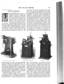
Pye's article also has a nice engraving of a pivotal type caster. Here it is (click through for a 1200 dpi greyscale PNG image, 8.5 Megabytes):
Skopeo, of No. Six (1896)
Skopeo, of No. Six. "The Typefounder's Art" [part 1], The Typographical Journal, Vol. 9, No. 6 (September 15, 1896): 211-214.
Skopeo, of No. Six. "The Typefounder's Art" [part 2], The Typographical Journal, Vol. 9, No. 7 (October 1, 1896): 253-256. Scanned by Google.
The Typographical Journal was the journal of the International Typographical Union. The "No. Six" in the writer's pen name is the International Typographical Union local no. 6 of New York.
The first part of this article is a general overview of traditional type-making. The second part illustrates the pivotal caster (using the same cut as Pye) and the Barth. It also observes that the practice of cutting ``soft metal punches'' (that is, patrices) is ``very common.''
Figgins. (1900)
Figgins, James. Type Founding and Printing During the Nineteenth Century, A Short Review. London: V. & J. Figgins, 1900. His remarks on electrotyping [electroforming] matrices and on the American Point System are particularly interesting.
This has been scanned by Stephen O. Saxe from his original.
The icon at left links to a presentation of this document at The Internet Archive, where it may be read online. Here is a local copy of the PDF (103 Megabytes): figgins-1900-type-founding-and-printing-19thc-0600rgbjpg.pdf
McCue. Inland Printer (1909)
McCue, Alfred. "Talks on Typecasting." The Inland Printer. Part 1 in Vol. 44, No. 2 (Nov. 1909): 219-220. Part 2 in Vol. 44, No. 3 (Dec. 1909): 381-382. Part 3 in Vol. 44, No. 4 (Jan. 1910): 542-544.
This series of articles is quite interesting, but not, perhaps, for the reasons that its author might have hoped.
The first installment gives a very brief general overview of traditional punchcutting and illustrates the Bruce pivotal caster (with the by now standard illustration from MacKellar) and the Barth. It would be seen as notable today for acknowledging the priority of the Foucher type caster over the Barth, but this had not yet been forgotten at that time. It is notable also for mentioning the electroforming of matrices for new faces (that is, by cutting patrices in soft metal). What is curious about its treatment of electroforming is that it emphasizes the electroforming of existing types into matrices by printers rather than typefounders. This would seem to play directly in to the next installment, which discusses typecasting machines developed for sale to printers. ("Every Printer His Own Type Pirate"?)
On the priority of Foucher, he notes that: "In the early eighties, Foucher, of Paris, France, patented in Europe an automatic typecaster, which became the model of the present-day foundry machines." and "In 1888 the late Henry Barth of Cincinnati, Ohio, made substantial improvements in the Foucher machine." (Part 1, pp. 219-220) Later sources credited Barth with the invention, ex novo, of this machine, though Barth himself never claims this in his patents.
On patrix engraving and electroforming, he says "Typefounders themselves have long employed this method to rapidly produce new faces and reproduce old ones" [italics mine] and "If a new design is wanted, it is cut in type-metal, cheaply and rapidly." (Part 1, p. 220)
The second installment contains a very useful comparison of the Compositype, Nuernberger-Rettig, and Thompson type casters and the matrices for each. It makes the interesting assertion, that heretofore I had not heard, that Nuernberger-Rettig matrices were "copper driven" (presumably meaning not electroformed). Finally, it also discusses the Monotype Type-&-Rule Caster, although not by that name.
The third installment is a very detailed study of the composition, characteristics, and creation of typemetal alloys which, unfortunately, has little to do with real metallurgy. In his defense, the basic research into the metallurgy of the lead-tin-antimony ternary alloy had not yet been published in 1909, and nobody had ever seen a phase diagram for the system. Still, this installment should be treated as a historical curiousity rather than a pratical guide for the typefounder.
Digitized by Google from the University of Minnesota Copy and available via The Hathi Trust (Hathi ID: umn.31951001898769z). The icon at left links to a PDF assembled from Hathi page images. Since its illustration of the Compositype, Nuernberger-Rettig, and Thompson side-by-side is quite useful, here (below) it is in "full-available" (still pretty fuzzy) resolution from this Google scan. It shows a very early style of Thompson.
Wylie (1902)
Wylie, Donald. "A Study of Modern Typefounding." The American Printer. Vol. 32, No. 5 (January, 1902): 353-364.
Many of the photographs in this article were used earlier by MacKeller, Smiths & Jordan in their 1896 book One Hundred Years (see above) .
This volume of The American Printer has been digitized by Google from the University of Michigan copy. I cannot presently find it via Google Books, but it is available via The Hathi Trust (Hathi ID: mdp.39015086752956). The icon here links to an extract of this article from the Hathi imagery.
This article was reprinted by American Type Founders in their 1902 book American Type Founders Co.: Its Business and Resources Illustrated. This book has been reprinted from scans by Richard L. Hopkins of the Skyline Type Foundry copy and is available in the CircuitousRoot Notebook on ATF. The selection of images in the ATF version differs from that in the American Printer version, however. But when images in the two versions are the same, the digitizations in the Hopkins/Skyline edition are of much better quality than those in the Google/Hathi version. (But the Google/Hathi version is 6.5 Megabytes while the Hopkins/Skyline version is 217 Megabytes.)
Legros (1908)
Legros, Lucien A. "Typecasting and Composing Machinery." In 1908 Legros presented this very long paper to the Institution of Mechanical Engineers. It's a sort of a warm-up exercise for the definitive Typographical Printing Surfaces that he wrote with J.C. Grant in 1916. His 1908 paper was published initially in the Proceedings [of the Institution of Mechanical Engineers]. 1908, Parts 3-4. London: The Institution of Mechanical Engineers, 1908. Pages 1027-1222. Google Books has digitized the University of Michigan copy; the version here is a local copy of the Google Books digitization. This digitization is of indifferent quality, and several of the plates are incomplete.
Legros (1908, offprint)
Legros, Lucien A. "Typecasting and Composing Machinery." This is the same paper as that in the Proceedings , but excerpted as a separate publication by the Institution. It, too, has been digitized by Google Books (Harvard University copy); the version here is a local copy of that digitization.
Legros & Grant. Typog. Printing Surfaces. (Google)
Legros, Lucien A. and John Cameron Grant. Typographical Printing Surfaces. (London: Longmans, Green, and Co., 1916). A century later, this remains the definitive work on the subject.
The copyright status of this work presents a puzzle. In the US it is in the public domain due to the expiration of all possible US copyright. In the UK, it may or may not be in copyright depending upon the date of the death of John Cameron Grant. Its UK copyright expires 70 years after his death, but his date of death is not known. Google Books has digitized this volume and made it available for full view in the US. They're playing it safe, though, and not releasing it overseas. I, however, am in the US (Google is international) and can legally reprint it to my website (which is also located in the US). The version linked here is, therefore, a local copy of the Google Books digitization (of the University of Michigan copy). Whether you may legally view it if you are outside of the US is entirely up to you to determine.
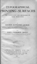
Legros & Grant. Typog. Printing Surfaces. (CR scan).
Legros, Lucien A. and John Cameron Grant. Typographical Printing Surfaces. (London: Longmans, Green, and Co., 1916). See the previous entry for a note on the curious copyright status of this work. I have myself scanned an original printed version of this work and uploaded a reasonably high-resolution version of this scan to The Internet Archive. The link here takes you to that version.
Mahr, Karl. Der Druckbuchstabe: Sein Werdegang in der Schriftgießerei dargestellt in Holzschnitten und Versen . ([no location, but Mahr in Frankfurt a. M.]: Verein Deutscher Schriftgießereien E.D., 1928).
This book contains nine woodcuts (at least I think they are woodcuts; they might be wood engravings) by Karl Mahr illustrating the making of type ("Druckbuchstabe" = druck buchstabe = printed letter). Each illustration is accompanied by a verse describing the phase of typefounding that it illustrates. These are:
Three of these illustrations (the Hand Punch-Cutter, the Matrix Engraver, and the Handcaster) were reproduced in the 1937 volume by the Bauer Type Foundry, Human Touch. (NY: The Spiral Press, 1937).
This book has been translated by the late Paul Hayden Duensing and printed in a magnificent edition by Richard L. Hopkins under the title Printing Types: Their Birth in the Typefoundry Depicted in Woodcut and Verse by Karl Mahr . (Terra Alta, WV: The Hill and Dale Private Press and Typefoundry, 2000).
The three articles by Goudy, Koch, and Warde which appeared in the first two numbers of The Dolphin in the early 1930s long remained the best general introduction to type-making methods. It is only to be regretted that they ignored completely the method of engraving patrices (by hand or machine) to electroform matrices; because of this, they address only two-thirds of the field.
A scan of The Dolphin is online at Carnegie-Mellon University's Posner Library: http://posner.library.cmu.edu/Posner/
Goudy, Frederic. "On Designing a Type-Face." The Dolphin. No. 1 (1933): 3-23.
See also Goudy, below.
Koch, Paul. Trans. Otto W. Furhmann. "The Making of Printing Types." The Dolphin. No. 1 (1933): 24-44, 45-57.
This is in two parts. Part I, "The Cutting of Punches" (an illustrated account of traditional hand punchcutting), pp. 24-44. Part II, "Justification and Hand-Casting," pp. 45-57.
Carter's edition of Fournier, p. 29, notes that "Modern" (i.e., 19th and 20th century) German hand punchcutting practice was to fashion the punches exclusively through the use of gravers and files, while earlier (18th century and before) German practice, as well as French and English practice, was to employ counterpunches. However, Paul Koch, a 20th century German punchcutter, employs counterpunches.
Warde, Beatrice L. "Cutting Types for the Machines: A Layman's Account." The Dolphin. No. 2 (1935): 60-70.
Konrad F. Bauer's Wie eine Buchdruckschrift entsteht is a short illustrated survey of all of the phases of type-making, from punchcutting through casting to fonting. It is significant as it is one of the few publications which gives equal emphasis to the method of engraving patrices for electroforming matrices. It is in German, with good pictures.
This book was issued in two different editions (one of 20 pages and one of 30 pages). Unfortunately, neither is dated. The text differs between editions, and the illustrations are different between editions (even when they show the same operation). A biographical sketch of Konrad Friedrich Bauer at the Klingspor Museum ( http://www.klingspor-museum.de/KlingsporKuenstler/Schriftdesigner/BauerK_BaumW/BauerBaum.pdf) identifies the 20 page version, in a list of his publications, as "30er Jahre"; the other (30 pages) is identified as "50er Jahre." K.F.Bauer was born 1903-12-09, so I presume that "30er Jahre," if it refers to his age at the time, would be roughly 1933. If so, 50er Jahre would be roughly 1953.
It is good to have both versions. Were I a designer drawing type, I would choose the later edition. As a maker of type, my preference is for the earlier.
Bauer. Wie eine Buchdruckschrift entsteht. [20pp]
Bauer, Konrad F. Wie eine Buchdruckschrift entsteht. (Frankfurt am Main: Bauersche Giesserei, n.d. [1933?]) 20 pages. 190x253mm. Title and captions printed in red.
A scan of this book is online at http://www.drukwerkindemarge.org/techniek/documentatie/
Here is a list of the illustrations in this edition:
Bauer. Wie eine Buchdruckschrift entsteht. [30pp]
Bauer, Konrad F. Wie eine Buchdruckschrift entsteht. (Frankfurt am Main: Bauersche Giesserei, n.d. [1953?]) 30 pages. 170x237mm.
It is interesting how much more space is devoted to design in this volume. Type designers are here well on their way to their current rock-star status.
Here is a list of the illustrations in this edition:
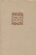
Human Touch (Bauer Type Foundry, 1937)
Bauer Type Foundry. Human Touch. (NY: The Spiral Press, 1937). This short work is for the most part a piece of advertising arguing that Bauer's machine-made types retain that "human touch." It is quite well written, however, and it possesses two additional merits: First, it was printed by Joseph Blumenthal's Spiral Press and so is a work of fine printing uncommon in the advertising world. Second, it reproduces three woodcuts by Karl Mahr depicting aspects of type-making. The presence of these three illustrations in it is especially important because, due to technicalities it happens that this work is in the public domain. (The text is also notable because it makes specific reference to the often ignored or maligned method of engraving patrices and electroforming matrices from them; it notes that the electroformed matrices are "usually" of nickel fitted into a zinc block. Such nickel/zinc matrices are uncommon in US practice.)
The icon at above left links to a presentation of this volume at The Internet Archive, where it may be read online or downloaded in several forms. Here is a local copy of the PDF (196 Megabytes): bauer-human-touch-1937-0600rgbjpg.pdf
The three icons below link to pages with each of the three Mahr woodcuts as larger images (plus annotations). These engravings appeared originally in Der Druckbuchstabe: Sein Werdegang in der Schriftgießerei dargestellt in Holzschnitten und Versen . ([no location, but Mahr in Frankfurt a. M.]: Verein Deutscher Schriftgießereien E.D., 1928). ( q.v.) In all, there were nine engravings in the original. These were (in translation): The Hand Punch-Cutter. The Matrix Engraver. The Machine Punch-Cutter. The Matrix Justifer. The Hand Typecaster. The Machine Typecaster. The Height Cutter (Duensing says "Height Grinder"). The Finisher. The Divider.
At some point, the Klingspor foundry put out a series of posters illustrating:
These contain, in particular, good drawings of some of the tools and gauges used by the punchcutter and matrix justifier (e.g., lining gauges, the turning gauge, etc.)
R. Hunter Middleton was the second most important type designer in America in the 20th century, right after Morris Fuller Benton. (Goudy comes in at an honorable third place.) He was, moreover, one of the few type designers to write accurately about more than one method of making type.
See also Middleton's An Essay on the Forgotton Art of the Punchcutter (1965).
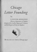
Middleton. Chicago Letter Founding
Middleton, R. Hunter. Chicago Letter Founding. (Chicago: The Black Cat Press, 1937.)
This is one of the primary sources for information on Robert Wiebking. "What Edward P. Prince contributed to English private press printing when he engraved the punches for the Kelmscott Press fonts, the Doves Press fonts, and others, Robert Wiebking of Chicago contributed to fine printing in America." (12)
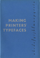
Middleton. Making Printers' Typefaces
Middleton, R. Hunter. Making Printers' Typefaces. (Chicago: The Black Cat Press, 1938.)
This is one of the few volumes by someone who really knew every aspect of what he talked about and talked about more than one method of type-making. His only serious omission is the method of electroforming from pattern types (he mentions one variation of this as being "in vogue" in Europe, but seems unaware of the extensive history of this method in America in the Nineteenth Century).
Although William Addison Dwiggins was merely a designer of letterforms rather than a maker of type, he enjoyed an unusually close relationship with the makers of matrices at Mergenthaler Linotype Company. His perspective on type design is therefore especially useful.
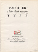
WAD to RR (1940)
WAD to RR: A Letter about Designing Type . (Cambridge, MA: Harvard College Library, 1940.) This is a letter, revised and edited for publication, from Dwiggins to Rudolph Ruzicka. "G," mentioned in the text, is Chauncey H. Griffith, a typeface designer in his own right but also the vice president in charge of typograhic development for the Mergenthaler Linotype Company.
To save space, this digitization omits several pages blank in the original: the front cover fold-down, the front flyleaf entirely, the verso of the tipped-in drawing, the back flyleaf entirely, and the back cover entirely.
Most people would file these under a "Goudy" section of type designers and artists. I'm a machine geek, though, so I've filed it here with the mechanics of making type. Goudy, who did not believe that a mere mechanic could create type, would have been appalled. Still, Goudy had the gumption to undertake the physical production of type himself, and this sets him apart from those who were only artists and not also artisans.
Note: My scans of Lewis and of Goudy's Half-Century aren't very good - they're just quick scans of library copies done on my office scanner. But these are important works by and about Goudy, and by chance and benign neglect they have passed into the public domain (other important works by Goudy have not). It seemed therefore more important to make them easily available than to fail to do so through lack of time to make them beautiful.
"On Designing a Type-Face." (1933)
Goudy, Frederic. "On Designing a Type-Face." The Dolphin. No. 1 (1933): 3-23
This article is available online at Carnegie-Mellon University's Posner Library: http://posner.library.cmu.edu/Posner/
Goudy. Creation of a Printing Type.
[Goudy], and Maurice Kellerman (director). The Creation of a Printing Type: From the Design to the Print by Frederic W. Goudy . "A Paramount Picture presented by Adolph Zukor." 1933.
This shows Goudy at work drawing a letter, tracing the letter, cutting the cardstock pattern for it, engraving the working pattern using an industrial pantograph engraver, engraving the matrix using a Benton-style vertical pantograph engraver (not clearly shown, alas). The matrix is then cast on a Monotype display caster, though it is not clear that Goudy is doing the casting (did he have a caster in his Deepdene studio?) Curiously, while the matrix so engraved and cast is a standard Lanston Monotype display matrix, the matrix shown being placed into an array of matrices afterward is not. Goudy (himself) then prints the type on an iron handpress.
A tiny version of this film is online at: http://www.TypeCulture.org/ Streaming video doesn't work well in all browsers, though. If it helps, the real RTSP address is: rtsp://streaming.typeculture.org/streaming.typeculture.org/Goudy_stream.mov
This film formerly was available from the late Carl Schlesinger. His film collection has been donated to The Museum of Printing (in Massachusetts). For those who might still have a copy of Carl's catalog and/or a version distributed by him, note that in this catalog he calls this film "Type designer in Action". On the DVD itself, he calls it 'Frederick [sic] Goudy "Designing Type"'. It's all the same film.
Finally, this film is also available as one of the "extras" on the DVD of the film Making Faces, about the late Jim Rimmer .
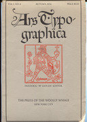
Ars Typographica, Vol. 1, No. 4 (1934)
Goudy, Frederic W. "Type Design: A Homily" In Ars Typographica Vol. 1, No. 4 (Autumn, 1934): 3-27. This is in three parts, "I. The Force of Tradition." "II. Type, What It Is." "III. The Technique of Type Engraving." Although this article is similar to Goudy's 1933 piece for the Dolphin, and contains some text in commmon with it, it is not the same. Neither does it have the same illustrations.
The volume/issue numbering of Ars Typographica is confusing. Goudy started it, and published three issues sequentially in the 1918-1920 period (Vol. 1, Nos. 1, 2, 3). These were published by The Marchbanks Press. Then Douglas C. McMurtrie took over the editorship and produced Vol. 2 in the 1925-1926 timeframe (Vol. 2, Nos. 1-4) and a single issue of Vol. 3 (No. 1, 1926). These were published by McMurtrie. However, throughout this period Goudy never considered "his" Volume 1 to be complete. Consequently, in 1934 he issued what he viewed as the final number of Vol. 1 (Vol. 1, No. 4 (Autumn, 1934)). This was published by Melbert B. Cary's Press of the Woolly Whale.
The entire run of this periodical was reprinted in 1970 by the Greenwood Reprint Co. of Westport, CT. This 1970 reprint was in two physical volumes. Physical volume 1 contains all four numbers of Goudy's logical Vol. 1. Physical Vol. 2 contains all of McMurtrie's Vol. 2 and Vol. 3. Thus Vol. 1, No. 4 appears in physical volume 1 of the Greenwood reprint, even though it was the final number to be issued.
This scan was done by me from my own copy of the original 1934 printing of Vol. 1, No. 4. The icon above left links to a presentation of this digitization at The Internet Archive. Here is a local copy of the PDF (699 Megabytes): ars-typographica-vol-1-no-4-1934-0600rgbjpg.pdf
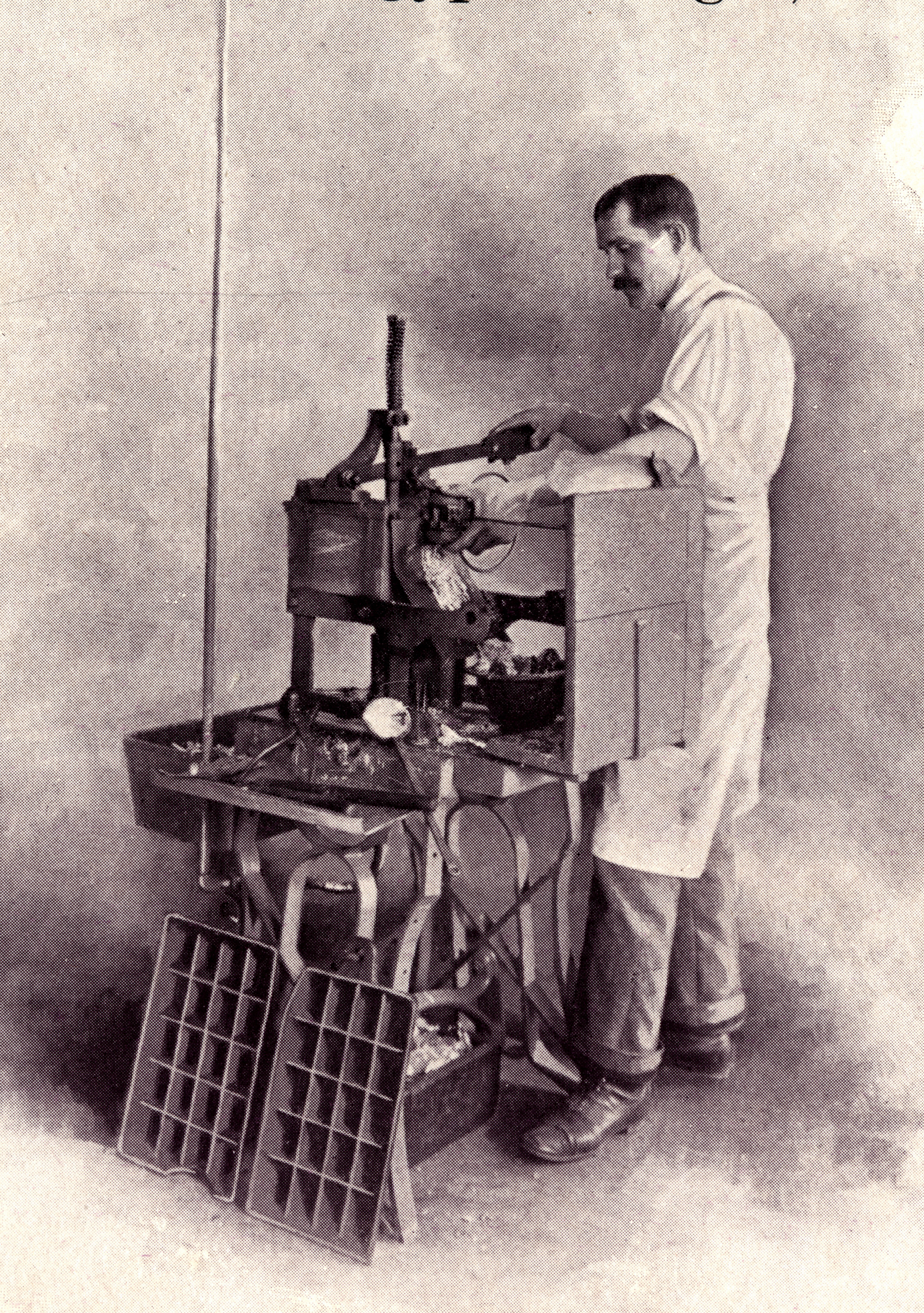
Here is the photograph in it of Goudy at one of his two matrix engraving pantographs in his studio in the old mill at the home he named "Deepdene" at Marlboro, NY (before the 1939 fire which destroyed it). The pantograph itself is unfortunately (but deliberately) out of focus in this photograph, yet enough of it is shown to confirm that it is a machine made by the Engravers' and Printers' Machinery Co. after US patent No. 1,039,714 of William S. Eaton
(The image above links to a 2048 pixel wide version of this photograph, which, really, shows you everything you're ever going to see in it. But since it is a photograph of some historic importance, here is the full resoution 1200dpi RGB PNG version of this scan of it (88 Megabytes): ars-typographica-vol-1-no-4-1934-1200rgb-goudy-at-matrix-pantograph.png )
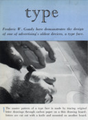
Advertising & Selling (1939)
"Type: Frederic W. Goudy Here Demonstrates the Design of One of Advertising's Oldest Devices, a Type Face." Advertising and Selling. Vol. 32, No. 6 (May, 1939): 38-39. This is a two-page photographic spread from an advertising industry trade magazine. It contains no text other than the photo captions.
The icon at left links to an approximately (not exactly) 600dpi PDF assembled from these images. It is 48 Megabytes.
Scanning note: The pages of this magazine are just slightly larger than my scanner. So I scanned each of the eight images separately, at 1200 dpi RGB. I also scanned each page as a whole (with inevitable loss around the edges). In the PDF above I've reduced these images to about 600dpi and converted them lossily to JPGs. I've also appended the whole-page scans to show the original order of the photographs.
Below are all eight photographs, arranged in the order in which they appeared in the two-page spread. Each small image below links to the full-resolution (1200dpi RGB) original as a lossless PNG image file. These are relatively large files (about 70 Megabytes each). You only need them if you're really interested in Goudy's methods. These images are the best presently known public domain images of Goudy at his pantographs.
The full-scale images linked from the eight icons above are what you want if you really need to work with or very closely examine these photographs. But given 2012 computer technology, if you look at them full-scale you'll just be treated to a microscopic examination of halftone dots. They're hard to work with in a browser.
Because of that, I've copied below what is (to me) the most important of these images (Goudy at his matrix engraving pantograph) at a size which ought to be useful when just looking at it, linked to a 2048 pixel wide version that won't overwhelm your browser. This photograph shows very clearly that for matrix engraving Goudy used a pantograph made by the Engravers' and Printers' Machinery Co.
Boone. Type by Goudy. (1942)
Boone, Andrew R. "Type by Goudy." Popular Science. (April, 1942): 114-119.
This is a rather well-done popular article on Goudy's methods for engraving matrices. It has several good photographs and illustrations, including some of the Benton-derived (but not Benton) pantograph engraver used by Goudy and the cutter grinder he used. Drawings of Scripps and Hadriano. This article has been scanned and is online on the " Modern Mechanix" blog. It is also online for full view (but not download) at Google Books (but the images in this presentation are not as good).
Lewis. Behind the Type. (1941)
Lewis, Bernard. Behind the Type: The Life Story of Frederic W. Goudy . Pittsburgh, PA: Department of Printing, Carnegie Institute of Technology, 1941. Also contains "The Ethics and Aesthetics of Type and Typography" by Goudy ("An address delivered at Carnegie Institute of Technology, Pittsburgh, February 12, 1938.")
Contains photographs of Goudy's patterns and of Goudy at his industrial (non-Benton-style) pantograph engraver.
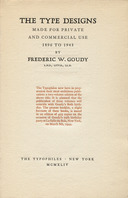
Typophile Monograph VIII (1944)
The Type Designs Made for Private and Commercial use, 1896 to 1943, by Frederic W. Goudy . (NY: The Typophiles, 1944). This cover chapbook bears the title "A Keepsake for Friends of Fred W. Goudy, Produced for His Seventy-Ninth Birthday." It was "issued ... on the occasion of Goudy's 79th birthday party at La Salle du Bois, New York, on March 8th, 1944." It contains an apology to Goudy by its printers for setting it on a Linotype rather than in handset type, a two-page "Author's Prologue" by Goudy (an early version of the "Prologue" of A Half-Century (see below), and a four-page list of "The Type Designs of Frederic W. Goudy from Camelot (1896) to Goudy Thirty (1942).
The icon here links to a presentation of this work in the Notebook of How Do We Know? (Who Accomplished Which Aspect of Which Types)
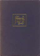
Goudy. A Half-Century. (1946, v. 1)
Goudy, Frederic W. A Half-Century of Type Design and Typography: 1895-1945. Volume 1. (NY: The Typophiles, 1946.) Typophile Chap Books: XIII.
Goudy. A Half-Century. (1946, v. 2)
Goudy, Frederic W. A Half-Century of Type Design and Typography: 1895-1945. Volume 2. (NY: The Typophiles, 1946.) Typophile Chap Books: XIV.
Typologia
Goudy, Frederic. Typologia: Studies in Type Design and Type Making. (Berkeley, CA: The University of California Press, 1940.) Reprinted in paperback by the UC Press in 1977.
This book is still in copyright, and indeed still in print, and so is not reprinted here. It is, however, online for full viewing (but not downloading) via Google Books by permission of the University of California Press. Go to the Google Books Advanced Search page at http://books.google.com/advanced_book_search and search for it under its title.
Typographer's Digest No. 27
Alexander Lawson's Typographer's Digest, No. 27 (Spring 1969). The entire issue is devoted to Goudy.
The icon at left links to a presentation of this journal on The Internet Archive, where it may be read online. Here is a local copy of the PDF (216 Megabytes): typographers-digest-27-spring-1969-0600dpijpg.pdf
This issue, while interesting in its entirety, contains several items of particular interest to the student of Goudy which deserve reprint independently. (No doubt it cannot be agreed that the Refusal Order Blank not written by Goudy is not his greatest gift to the typefounding profession.)
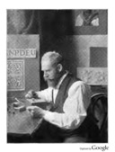
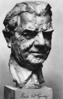
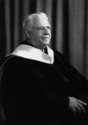
(The image of the portrait of Goudy by Alexander Stern, above, links to a 2048 pixel wide JPEG version of the same (2.8 Megabytes). Here is a version at the full resolution at which I scanned it (600dpi) as a lossless PNG (34 Megabytes, 3344x4696 pixels): typographers-digest-27-spring-1969-0600rgb-002-crop-3344x4696.png The image of the Refusal Order Blank links to a PDF version wrapped around a JPEG conversion of it (2.3 Megabytes). Here is the full-resolution version as a lossless PNG image (600dpi, 2656x3608pixels, 14 Megabyts) typographers-digest-27-spring-1969-0600rgb-026-crop-order-blank-2656x3608.pdf)
(See the discussion of this photograph in ../../ Making Matrices -> Goudy's Method)
(This is just a PDF containing pages 8-11 of the journal (28 Megabytes). In other words, if you get or read the entire journal in the original links above, you'll get this too. But I think that it is a document important enough to merit reprinting in its own right. It is the text of a letter by Goudy to Sol Hess in which he describes some of his methods. It's not the most extensive description of his methods, but in it he happens to provide evidence that I have not found anywhere else for the methods he used for justifying revising the lining and fitting of) (his types. (He did it "hot," at the typecaster, and didn't fold this information back into his designs!) For a discussion of this, see ../../ Making Matrices -> Justifying for a discussion of this.)
The Building of a Book (1906)
Hitchcock, Frederick H. The Building of a Book. (NY: The Grafton Press, 1906). Linn Boyd Benton wrote the chapter on "The Making of Type," pp. 31-40. It is not illustrated, it is too brief, and it (the chapter, not the book as a whole) describes ATF's method of this period as if it is the only method by which type is made - but it is Benton speaking here for himself, and that makes it worthwhile.
This book has been digitized several times, and copies are available online from The Internet Archive, The Hathi Trust, and Google Books. The link here is to a local copy of the digization of the Univ. of California copy from The Internet Archive. It is to a PDF version. Here's the much nicer DJVU version .
Modern Automatic Type Making Methods (1909)
Kaup, W. J. "Modern Automatic Type Making Methods." American Machinist. Vol. 32 (December 16, 1909): 1042-1046. In addition to the more or less conventional views of the Benton Engraving Machine, Cutter Grinder, and Microscope for cutter inspection, this article shows the Benton Delineator and a matrix-fitting machine.
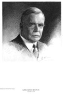
Bullen on Benton in The Inland Printer (1922)
Bullen, Henry Lewis. "Linn Boyd Benton - The Man and His Work." The Inland Printer, Vol. 70, No. 1 (October, 1922): frontis, pp. 60-64.
This is an important source both for Benton and for ATF matrix making methods. It must be treated with great caution, however, as Bullen is not a reliable source. In this article, his discussion of Ottmar Mergenthaler's involvement with the Linotype is inaccurate, his story of the evolution of Benton's pantograph into a punch-cutting machine cannot be correct, and his story of the reasons for Benton's original development of a pantograph engraver, even if true, is misleading. These errors cast doubt upon the entire article. See the presentation of this article in the Linn Boyd Benton Notebook for links to discussions of these problems.
This volume of The Inland Printer has been digitized by Google from the University of Michigan copy and is available via The Hathi Trust (Hathi ID: mdp.39015086783449). The icon at left links to a local copy of an extract of just the Bullen article on Benton as presented in the CircuitousRoot Notebook on Linn Boyd Benton.
Type Speaks! (1948)
ATF. Type Speaks! (Elizabeth, NJ: American Type Founders Sales Corp., 1948) Narrated by Ben Grauer. Film, 16mm, sound, color, 25 minutes, [N.B. the title is "Type Speaks!", not "The Type Speaks!"]
Update: The best possible transcription of this film to digital format has now been done by Doug Wilson (the printer and filmmaker who made Linotype: The Film) and is available on his website: http://printingfilms.com I would advise you to use his version there, not my version here.
"Excellent section showing operation of Benton punch and matrix cutting machine; how individual type is cast at ATF, designing of typefaces" (description from the late Carl Schlesinger's catalog). It features Ben Grauer being literate and Warren Chappell drawing Lydian. It shows a little punchcutting and matrix driving, but concentrates on the machine engraving methods in use at ATF. Theo Rehak, in Practical Typecasting, notes that the procedures shown here were those employed at ATF from the period 1941-1948 under wartime pressures of economy. (That is, it does not show the methods used by ATF at other times - in particular it does not show the methods used in the first four decades of the 20th century, the details of which are actually better preserved in the English Monotype literature. There's more than one way to make a matrix.) The pantograph engraving machine shown engraving working patterns in this film is a Gorton model 3-B three-dimensional pantograph engraver stripped of some of its 3-D equipment and used here in 2-D work. (It is not a Gorton 3-U, which is a much smaller machine.)
Please note, however, that even though this film was produced by ATF, everything that it says in the animated sequence about the "two movements" of the plunger of the Barth Type Caster piston is wrong. By 1948, ATF didn't even know how its own type casting machines worked. See Gregory Jackson Walters' article "Risking Life & Limb for 120-Point Type" in The American Typecasting Fellowship Newsletter No. 40 (March 2015), pp. 14-18 (esp. p. 17) for an analysis of what's really going on.
This film formerly was available from the late Carl Schlesinger as a DVD of a VHS transcription from the original. Here is a MP4 conversion of the film as distributed by Carl: type-speaks-cs.mp4 This is a 239 Megabyte file. Please not that it almost certainly won't play if you just click on the link above. Download it to your own computing environment and view it offline.
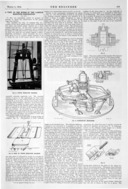
The Engineer (1914)
Anon. "A Visit to the Works of the Lanston Monotype Corporation." This article appeared in three parts in the London-based periodical The Engineer in the issues of 1914-02-20, 1914-02-27, and 1914-03-06. The icon at left links to a PDF assembled from the pages of these three issues which contain this article. (It's 28 Megabytes in size; be patient if you are on a slow internet link. If you're not sure if you got it completely, note that it is 28,938,307 bytes in length and has an sha1sum of "61da29cea01653026251b9f35c2f1ab248b37414".)
This is one of the few early accounts to treat in any technical detail the entire process of matrix production by machine methods. It is also an important piece of historical documentation because it describes a method of cutting working patterns through wax on a zinc plate (not the glass plate of later English Monotype practice). This method is not described elsewhere; it is interesting to speculate on whether it might illuminate the incompletely understood early ATF practice of using zinc plates for working patterns.
Note: From 1897 to 1931 the English Monotype company, which was independent of the Lanston Monotype Machine Company in America, was known as "The Lanston Monotype Corporation." In 1931 it changed its name to "The Monotype Corporation Limited." The works at Salfords, near Redhill, Surrey, were established in the final years of the 19th century.
My thanks to Dan Jones, proprietor of Pygment Press, for discovering this long-forgotten but very detailed account of early English Monotype punch and matrix making. My thanks to the "Grace's Guide" British Industrial History project/website http://www.gracesguide.co.uk/ for having digitized these issues of The Engineer. Please note and observe the licensing terms of these scans and the extract from them which is presented here (GFDL 1.2, not Creative Commons or public domain).
Because these scans contain a number of interesting illustrations not found elsewhere, here are the original Grace's Guide page scans as image files (at the full resolution available from these scans):
The Monotype Recorder (1932)
In the September-October 1932 number of The Monotype Recorder (Vol. 31, Whole Number 247) there appeared an article, the title of which is unknown to me, on making matrices. I have not yet acquired this issue (and could not reprint it in any case, as 1932 English material, while in the public domain in England, is now in copyright in the US). Images from it were formerly posted to a now inactive flickr account which showed: "Fig. 3. Making the 10-inch drawing from the original by means of the Monotype Projecting Machine," "Fig. 4. Cutting the Punch," and "Fig. 5. The Matrix Striking Machine."
How the Machines are Made (Film, ca. 1956)
Monotype Corporation Limited. "Making Sure" At the Monotype Works: How the Machines are Made . Commentary by Bob Danvers Walker. Directed by R. C. B. Holton. Film. Color. It is undated, but it must have been produced after the Spring of 1953 (because it is not mentioned in Monotype Recorder, Vol. 40, No. 1 (Spring, 1953), "'Monotype' Machines in the Making" ) and before the Autumn of 1956 (by which time companion film, 'Making Sure' At the Monotype Works: Type Faces in the Making must have been produced).
Note: The Spring 1953 issue of The Monotype Recorder ("'Monotype' Machines in the Making") was a tour of the Monotype (UK) Salfords works with photographs by Guy Gravett. From a later perspective it works well as a companion publication to this film. However, it would appear that it was not so originally; there is no mention in it of this film. (This was for some time a source of confusion for me, because the Autumn 1956 issue of the Monotype Recorder ("'Monotype' Matrices and Moulds in the Making") also a long essay with photographs by Guy Gravett, was produced as a companion piece to the 1956 film co-produced with this one, 'Making Sure' At the Monotype Works: Type Faces In the Making .)
Type Faces In the Making (Film, 1956)
Monotype Corporation Limited. 'Making Sure' At the Monotype Works: Type Faces In the Making. Film. 1956. Peak Film Productions [from photograph by Dan Rhatigan of an original film canister]. Commentary by Bob Danvers Walker. Directed by R. C. B. Holton.
The best reference ever published on the post-WWII English Monotype method of making both composition and display matrices. It is undated, but it must have been produced by the Autumn of 1956, the date in which a companion issue of The Monotype Recorder was published.
"'Monotype' Matrices and Moulds in the Making" (1956)
"'Monotype' Matrices and Moulds in the Making" [the full issue of] The Monotype Recorder. Vol. 40, No. 3 (Autumn 1956). A tour of the Monotype matrix and mould making facilities with a partial explanation of the process. Illustrated with photographs by Guy Gravett and with stills from the film 'Making Sure' At the Monotype Works: Type Faces In the Making .
This number of The Monotype Recorder was published in conjunction with the film 'Making Sure' At the Monotype Works: Type Faces In the Making .
Bohadhi (1954)
Bohadti, Gustav. Die Buchdruckletter: Ein handbuch für das schriftgiesserei- und buchdruckgewerbe. Berlin: Im Deutschen Verlag der Ullstein A.G., 1954.
This is the most comprehensive treatise of the mid-20th century, in any language, on all of the major methods of type-making (punchcutting, patrix engraving, direct matrix engraving) and typecasting.
Practical Typecasting. (1993)
Rehak, Theo. Practical Typecasting. New Castle, DE: Oak Knoll Books, 1993. Rehak was the last typecaster trained at American Type Founders. He and the type foundry he created, the former Dale Guild Type Foundry, were central in the preservation of what was salvaged from the wreckage of that once great company. Despite its name, Practical Typecasting is not just about casting. It has much in it on the making of matrices and related processes.
Through the kind permission and encouragement of Theo Rehak, a digital version of this book is presented here. Plesae note that it remains copyright © 1993 by Theo Rehak. This digital edition is licensed under the Creative Commons Attribution-NonCommercial 4.0 International license. 422 Meg PDF.
From about 1980 until his untimely passing in 2010, the Canadian printer, artist, and typefounder Jim Rimmer accomplished something quite extraordinary. Not only did he teach himself to make type, and in fact make and cast a number of very good faces, but he shared his knowledge and taught others to do it as well.
He employed a number of different methods. He began by engraving type by hand directly on typemetal blanks to make patrices (pattern types) from which matrices for typecasting were then electroformed. Later he employed pantographs to produce metal working patterns and, from them, patrices for electroforming. Finally, he employed pantographs not only for working patterns but also for the direct engraving of matrices (this is the procedure documented in Kegler's film Making Faces).
The list here highlights only a few of Rimmer's works (and presents a few new ones). For a more complete list, see the ../../ Bibliography, and also the hand-lists and bibliographies in several of the works noted there.
It is one of my great regrets that I became involved in type-making too late to meet him.
Making Faces
Making Faces: Metal Type in the 21st Century. A film by Richard Kegler.
This film is, to me, inspirational. It is a well-produced, semi-technical account of the production of printing type from design through casting. He employed a method derived from Goudy's, using paper master patterns, pantographically engraved typemetal working patterns, and the pantographic engraving of matrices. But as the great Theo Rehak said of Rimmer and this film in his address at the 2010 American Typecasting Fellowship conference in Piqua, Ohio: "Do you understand what this man has done for you? He's smoothed out Goudy." By this I believe that Rehak meant three things: First, Rimmer did it all himself, without the support Goudy enjoyed from his institutional sponsors. In Rimmer we can find all of the necessary steps, not just most of them. Second, Rimmer incorporated digital technology as an intermediate step, making the computer serve metal type. Finally, by allowing his process to be documented extensively, Rimmer gave this complete path to us. He teased the thread of this method out of Goudy and out of his own knowledge of typefounding, smoothed it out for the 21st century, and passed it on to us.
This film is of course in copyright and therefore not reproduced here. It is available from the P22 digital typefoundry, at http://www.p22.com/products/makingfaces.html. If you're seriously interested in pantographic type-making, this will be the best $24.95 you ever spent. The trailer is on Youtube at http://www.youtube.com/watch?v=Ph0ooDzD4ZQ
Since early 2017 this film has also been available from Richard Kegler on the Vimeo service. It can be rented (streaming) or purchased (streaming plus download). The vimeo page also has the trailer and a two-minute clip of Rimmer discussing ``Making Things.'' https://vimeo.com/ondemand/makingfaces/
Pie Tree Press
Rimmer, Jim. Pie Tree Press. Kentville, Nova Scotia: Gaspereau Press, 2008.
Rimmer printed his autobiography, Leaves from the Pie Tree as a fine edition of very few copies. From this, Pie Tree Press was derived, with additional material, as a more widely available work. It contains a number of important technical observations on and illustrations of his type-making procedures.
This book is in copyright and not reprinted here. Unfortunately, secondhand copies are becoming scarce.
Letters from Jim Rimmer to Alex Widen
Several letters by Jim Rimmer to Alex Widen. These are amazing. They do presume that you already understand the process, but given that you do this is like having Rimmer sit down beside you and tell you about all of the tricky parts that took him years of effort to learn.
Engraving Type Designs in Lead
Rimmer, Jim. "Engraving Type Designs in Lead." The Devil's Artisan. No. 15 (1984): 14-20. [The table of contents of this issue gives the title as "Engraving Type Designs in Metal," while the article itself says "Lead."] On the hand-engraving (no pantograph) of patrices on typemetal quads for electroforming matrices for Juliana Oldstyle. This is a reprint, with additional comments and with new (and very nice) illustrations of the process, of an article which previously appeared under the title "Original Font Cut in Lead, Matrics [sic] Are Electroformed" in the American Typecasting Fellowship Newsletter, No. 9 (May, 1984): 27-31 .
In Making Faces, Rimmer says that in his previous methods he simply "whacked them [the types] out with a knife." He speaks too modestly. In the procedure he used, he had his large-size artwork transferred at final type body size to "INT" (3-M Image-N-Transfer) dry-transfer media (a Letraset-like product, no longer available, which allowed the making of transfers from artwork; I believe that the film shows actual Letraset transfers here, not Rimmer's INT transfers). He used these to define the letterform on cast typemetal blanks which he then hand-engraved into patrices. These, in turn, were used to electroform matrices. With the exception of the INT transfers, this is the same procedure used to make many of the most elaborate typefaces of the 19th century. There is nothing at all primitive about it; it is basically hand punchcutting in typemetal. The article here, "Engraving Type Designs in Metal," is to the best of my knowledge the only substantial treatment of this method, in English at least. He has some additional comments on this method in Pie Tree Press, as well.
This article is in copyright and not reprinted here.
The Cutting of Cartier in Metal
Rimmer, Jim. "The Cutting of Cartier in Metal." DA [Devil's Artisan], A Journal of the Printing Arts. No. 52 (Spring/Summer 2003): 15-20. Rimmer's own description of his using Goudy's style of cut paper master patterns with a Taylor-Hobson pantograph to cut typemetal working patterns, and then using his Weibking-Ludlow pantograph to engrave patrices for electroforming of matrices. In this case, his first attempt at the cutting of Cartier, he abandoned the project after he discovered that the pantograph's adjustments had shifted during the cutting of the series. Rimmer did later finish the project and cut Cartier in metal.
This article is in copyright and not reprinted here.
Nelson. From Punch to Printing Type. (1985)
Nelson, R. Stan. Directed by Peter Herdrich. From Punch to Printing Type: The Art and Craft of Hand Punchcutting and Typecasting . (Videotape) NY: The Book Arts Press of the Columbia University School of Library Service, 1985.
This is a complete demonstration of cutting a punch, striking and justifying a matrix, casting type from it, and dressing the type.
Essential. This film formerly was available from the late Carl Schlesinger. It is still available from the Book Arts Press of the Rare Books Schoold of the University of Virginia. Update 2011: now on DVD from Book Arts Press.
Schmets. Vom Schriftgießen. (1987)
Schmets, Ronald. Vom Schriftgießen: Porträt der Firma D. Stempel, Frankfurt am Main. (Darmstadt: Technische Hochschule Darmstadt, 1987). ISBN: 3-88607-050-6.
Images from this book have been put on the flickr account of interrobang918. They contain the only published photographs of which I am aware of some of the details of Stempel's procedures for type-making (e.g., what the working patterns looked like) and therefore constitute an extremely important documentary history of type-making.
Wilkes. Das Schriftgießen. (1990)
Wilkes, Walter. Das Schriftgießen: Von Stempelschnitt, Matrizenfertigung und Letterguss: eine Dokumentation von Walter Wilkes . (Darmstadt, Germany: Technische Hochschule Darmstadt, 1990.) also (Stuttgart:, Germany Hauswedell, 1990) ISBN: 3-7762-0311-0 (same for both Darmstadt and Stuttgart editions). ISBN-13: 978377620311.
This is almost certainly the best comprehensive overview of all aspects of matrix making and typecasting. Even though it is in German (a language I cannot read) I find it to be valuable to me - the illustrations alone are worth it. It is, regrettably, out of print.
The distinguished American hand punchcutter Stan Nelson has identified the Schriftschneider in the photograph on page 42 of this book as August Rosenberger (most famous perhaps for engraving Zapf's Feder und Stichel (Pen and Graver) as plates in 1949.
Burnette. Out of Sorts. (2009-?)
Burnette was working on this film in the 2009 timeframe. At present (2011) there are video clips of portions of it online on youtube. These show Stan Nelson at work making type.
Saxe. Pivotal Caster & Electroforming. 2016
Saxe, Stephen O. "The Bruce Pivotal Typecaster and Its Influence on Nineteenth-century Typography." Journal of the Printing Historical Society. New Series, No. 24 (2016): 37-62.
In addition to a detailed history of the Bruce "pivotal" type caster, this article also contains an important argument for the importance of hand patrix cutting (and matrix electroforming from hand-cut patrices) in the 19th century.
I had the honor and pleasure of corresponding with Steve during the development of this article, and I can confirm that as he wrote it this article contained an accurate description of the pivotal type caster. In particular, it correctly described the operation of the so-called "discharging pin" (which is fixed to the mold and is completely stationary during operation). Steve went to considerable lengths to ensure that these technical details of the pivotal caster were correct (in particular, he consulted Stan Nelson, who has practical experience with the pivotal caster). Unfortunately, at some point during the peer review process this description of the discharging pin was changed and the text as printed says that it moves (p. 45). It does not. Steve knew that it did not. See {Nelson/Saxe/MacMillan/Hopkins 2020} for a corrected version of this material.
Nelson, Saxe et al. Making Printers' Type. (2020)
Nelson, R. Stanley, Stephen O. Saxe, David M. MacMillan Richard L. Hopkins. Richard L. Hopkins, Ed. Making Printers' Type. (Terra Alta, WV: Hill and Dale Private Press and Typefoundry, 2020.)
As of its date of publication, this is the only comprehensive technical history of type-making in English (Wilkes' Das Schriftgießen, in German, is of comparable scope). It contains a corrected version of Saxe's very important essay on the Bruce pivotal type caster and patrix cutting / matrix electroforming (See {Saxe 2016}, above) with an accurate description of the stationary nature of the discharging pin (p. 59). Saxe's essay is the core of this book; it grew around the editor and publisher's desire to reprint it. The book also contains the most extensive material published to date about the hand mold by the noted punchcutter and mold maker Stan Nelson (formerly of the Smithsonian). The editor, Rich Hopkins, has contributed important material from his own background in the transition of type from metal through photographic to digital methods.
This book is available directly from the editor and publisher, Richard L. Hopkins, at: Hill and Dale Private Press and Typefoundry, 169 Oak Grove Road, Terra Alta, WV 26764, USA.
1. Describing the political location of Yverdon in 1767 is not simple. Yverdon-les-Bains is a municipality located in the Canton of Vaud, which is now in Switzerland (the Swiss Confederation). In 1767, it was the former Barony of Vaud, which was at that time territory forcibly occupied by the city of Bern. Bern was, in turn, a member of the Old Swiss Confederacy (Eidgenossenschaft).
{Carter 1969} Carter, Harry. A View of Early Typography, Up to about 1600 . Oxford, UK: Oxford University Press, 1969. Reprint with a new introduction, corrigenda and addenda by James Mosely (London: Hyphen Press, 2002).
This printed version of a series of lectures, delivered to bibliographers, contains an excellent semi-technical overview of the early technologies of type making. It is also the source of the wonderful comment that "Type is something that you can pick up and hold in your hand."
{Mosley 1991} Mosley, James. "Illustrations of Typefounding engraved for the Description des Arts et Métiers of the Académie Royale des Sciences, Paris, 1695 to c. 1700." Matrix No. 11 (Winter 1991): 60 - 80.
Theo Rehak's Practical Typecasting is copyright 1993 by Theo Rehak. It is presented here with this kind permission and encouragement. The digital edition here is licensed under the Cretive Commons Attribution-NonCommercial 4.0 International license (CC BY-NC).
Paul Hayden Duensing's Proposed Draft for A Syllabus of Typographic Taxonomy is in the public domain because it was published in the US without copyright notice at a time when such notice was required to secure copyright. This digital reprint remains in the public domain. However, Ginger Duensing requests that Paul Hayden Duensing always be identified as the author of this work.
The texts of Moxon, Fournier (1764, 1766 editions), Bachmann, Benton, Wylie, Legros (1908), and Kaup digitized by Google Books and/or available at The Hathi Trust are in the public domain.
While Fournier (1764 and 1766 editions) is in the public domain, the digitization of it by the Bibliothèque nationale de France / Gallica is licensed by them for noncommercial use only. It is so used here; please respect their licensing terms if you use it further.
The digitization of Hallens [Halle] (1762) by the Bayerische StaatsBibliothek and the Münchener DigitalisierungsZentrum is in the public domain but is licensed for them for noncommercial use only. Please note that this licensing is more restrictive than the CreativeCommons Attribution-ShareAlike license which governs most of this Notebook. My use of it here is noncommercial. The digitization of this same work by the Getty Research Institute is also in the public domain, but is presented by them without additional terms.
The digitizations of Gessner (1740ff) by the Wellcome Library are in the public domain. The image of typefounding from Gessner developed by Paul Hayden Duensing is in the public domain, but is used here by permission of Ginger Duensing. She requests that Paul Hayden Duensing always be credited when reproducing his work. Please respect her wishes and Duensing's memory.
Universal Magazine from 1750 and The Penny Magazine from 1833 are in the public domain. The reprints of and extracts from them here, both in scans by Google and by DMM, remain in the public domain.
The report of George Bruce to the Commissioner of Patents is a US federal government publication which has always been in the public domain. The extract from it reprinted here remains in the public domain.
The articles by Loy, Pye, and McCue from The Inland Printer and Skopeo of No. Six from The Typographical Journal are in the public domain in the original. The reprints of them here remain in the public domain.
Figgins Type Founding and Printing in the Nineteenth Century is in the public domain in the original. The scans of it by Stephen O. Saxe and the reprint of it here remain in the public domain.
The works of Anthoensen (and his reprint of a 1750 extract from Moxon), Middleton, Dwiggins, and Goudy, Ringwalt, Two Centuries of Typefounding, Typographer's Digest No. 27, and the photographs of Goudy in Advertising and Selling which are reprinted here are in the public domain.
Legros & Grant's Typographical Printing Surfaces is in the public domain in the US. Its copyright status in the UK is unknown.
The 1937 American publication Human Touch was published in the US without copyright notice at a time when such notice was required to secure copyright. It therefore passed into the public domain upon initial publication. This digital reprint remains in the public domain.
The 1948 American Type Fouders' film Type Speaks! is in the public domain due to failure to renew copyright as then required. Carl Schlesinger asserted no new rights over the versions of it that he distributed. The digital version of it presented here, derived from Carl's version, remains in the public domain.
The original text of the article from The Engineer from 1914 extraced and reprinted here is in the public domain. However, this extract is taken from scans done by the "Grace's Guide" British Industrial History project/website. http://www.gracesguide.co.uk/ These scans are therefore copyright by them. They have released them under the GNU Free Documentation License, Version 1.2 or any later version published by the Free Software Foundation. The extracts from these scans, both reprinted individually and assembled into a PDF here, are therefore also licensed under the same GNU Free Documentation License. Please note that this differs from the Creative Commons licensing of most of the rest of this page.
All portions of this document not noted otherwise are Copyright © 2011-2012, 2020, 2023 by David M. MacMillan.
Circuitous Root is a Registered Trademark of David M. MacMillan.
This work is licensed under the Creative Commons "Attribution - ShareAlike" license, version 4.0 International. See http://creativecommons.org/licenses/by-sa/4.0/ for its terms.
Presented originally by Circuitous Root®
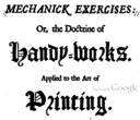
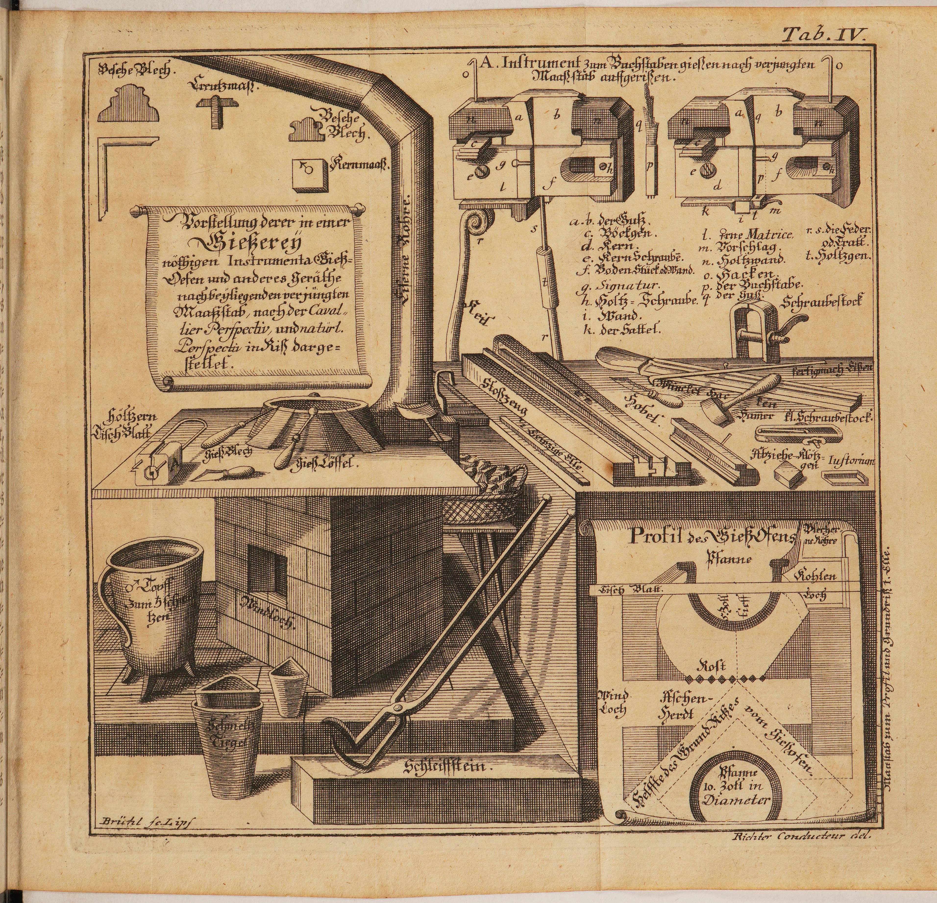
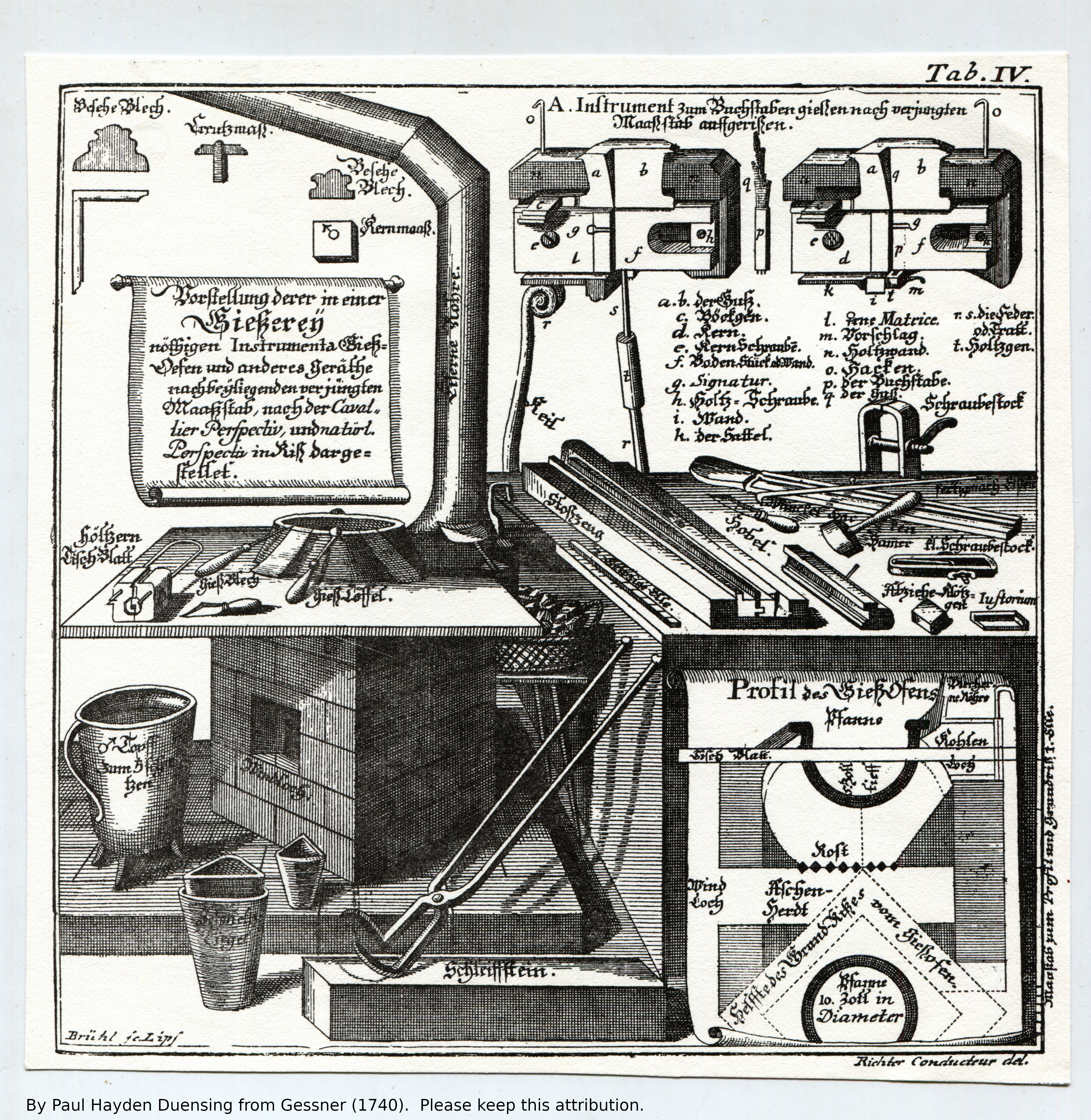
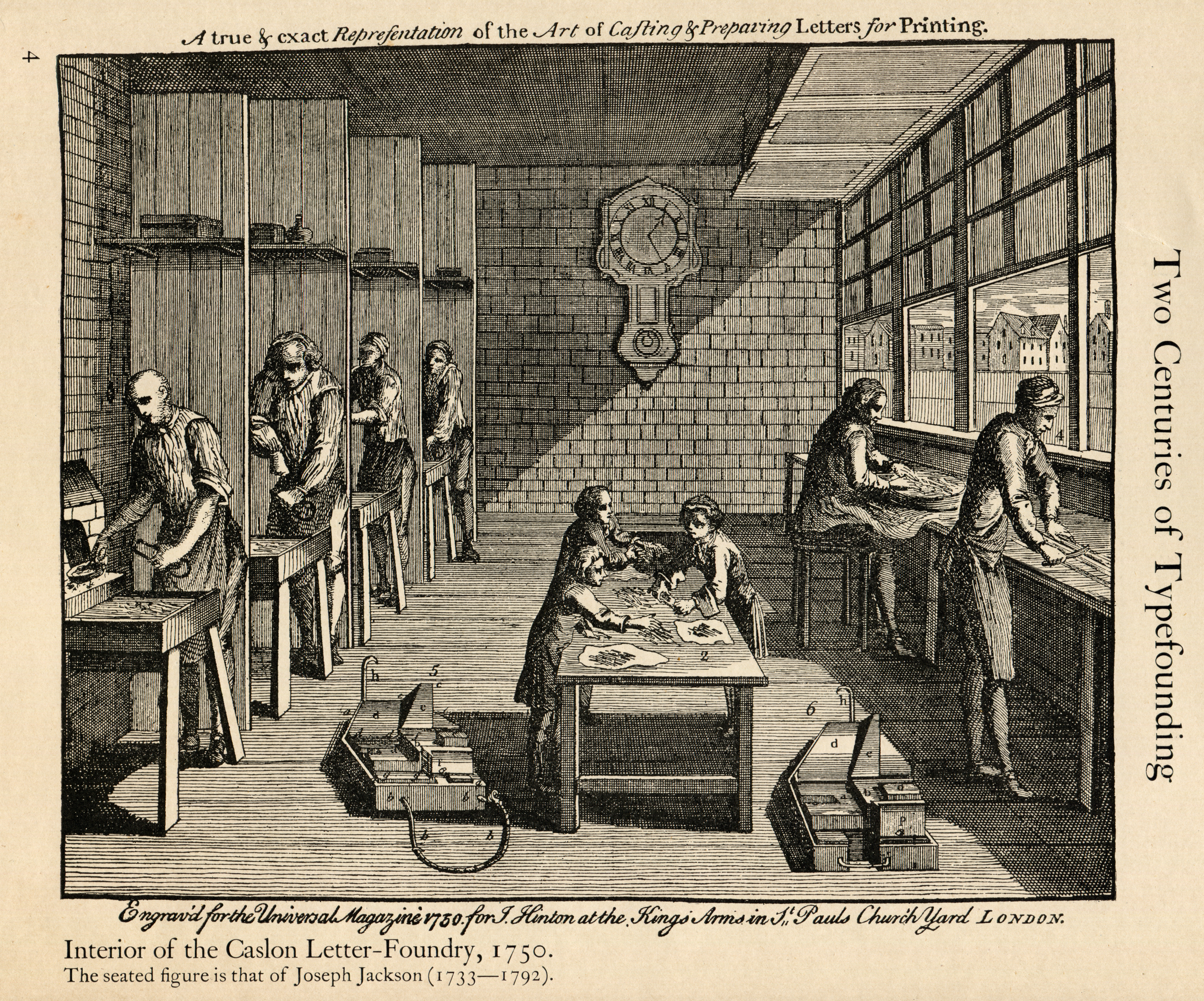
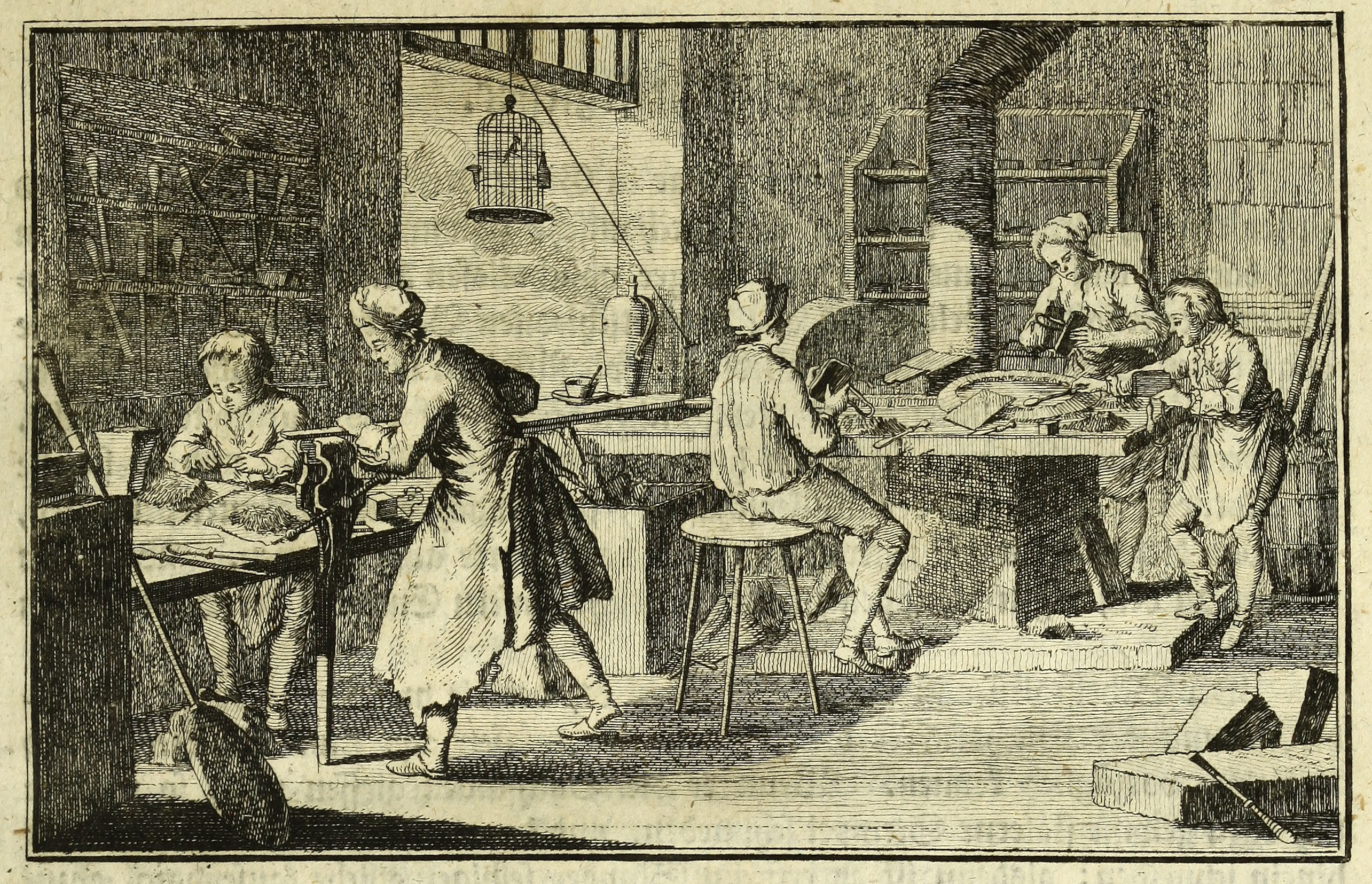
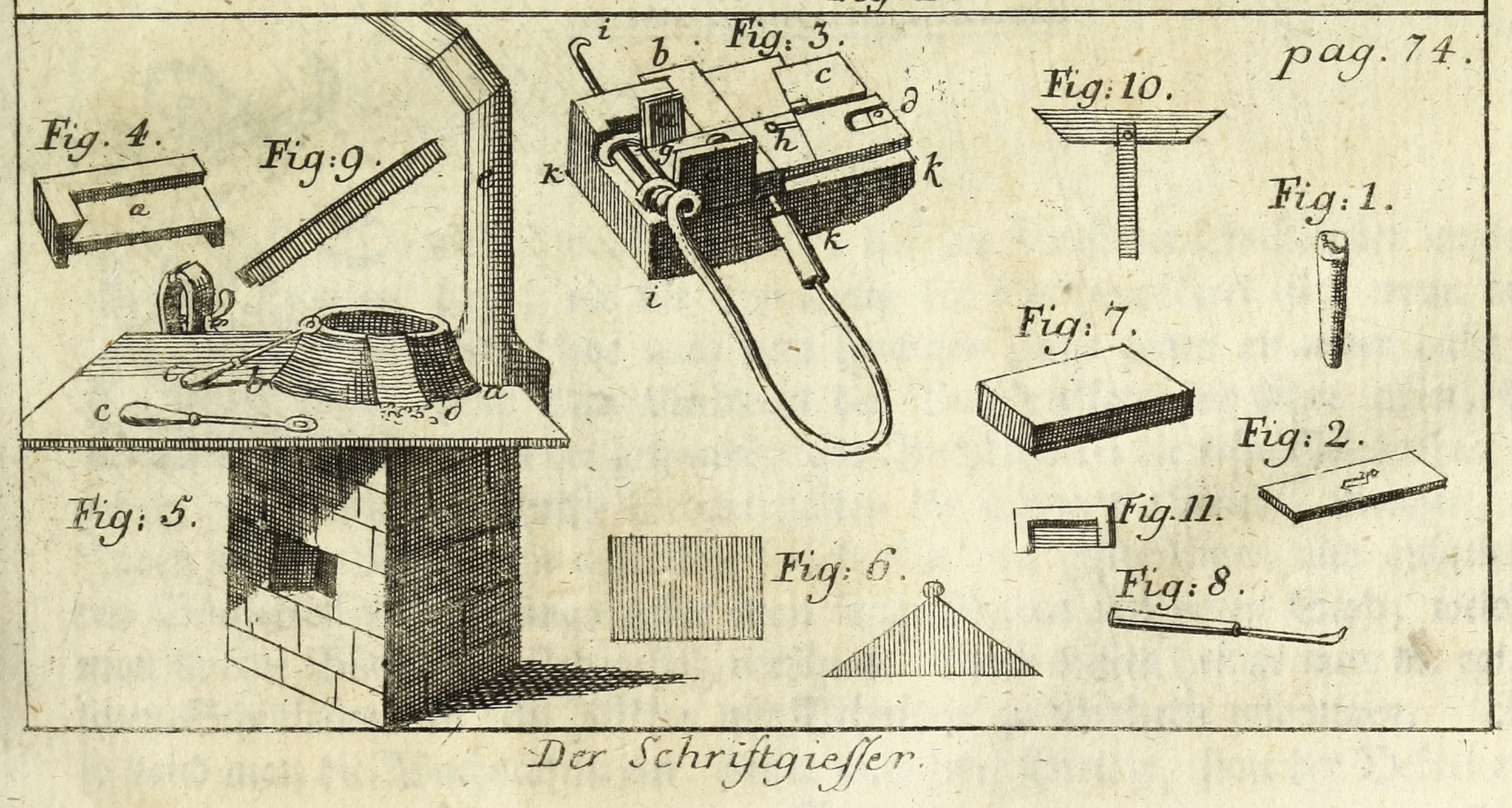
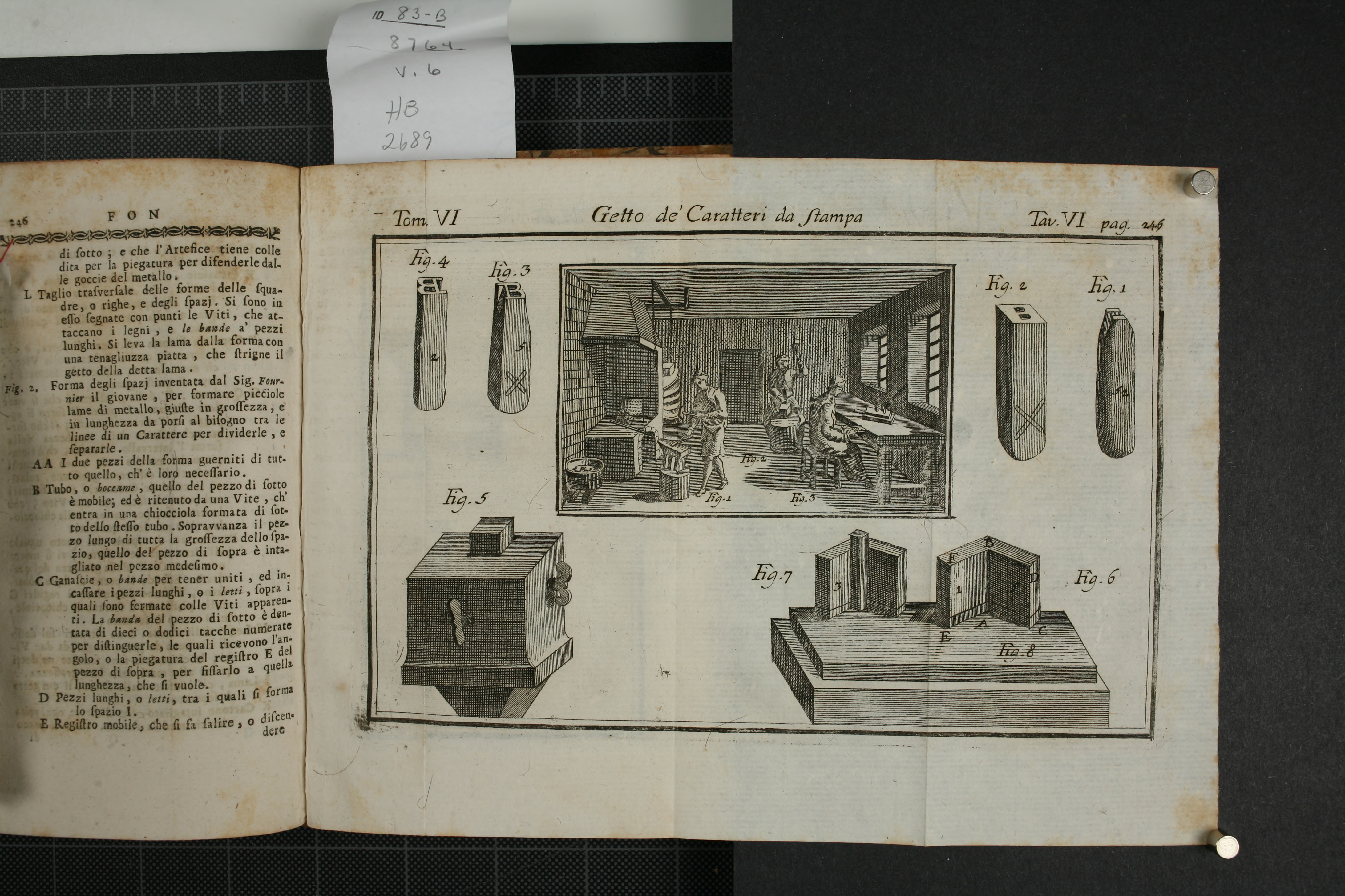
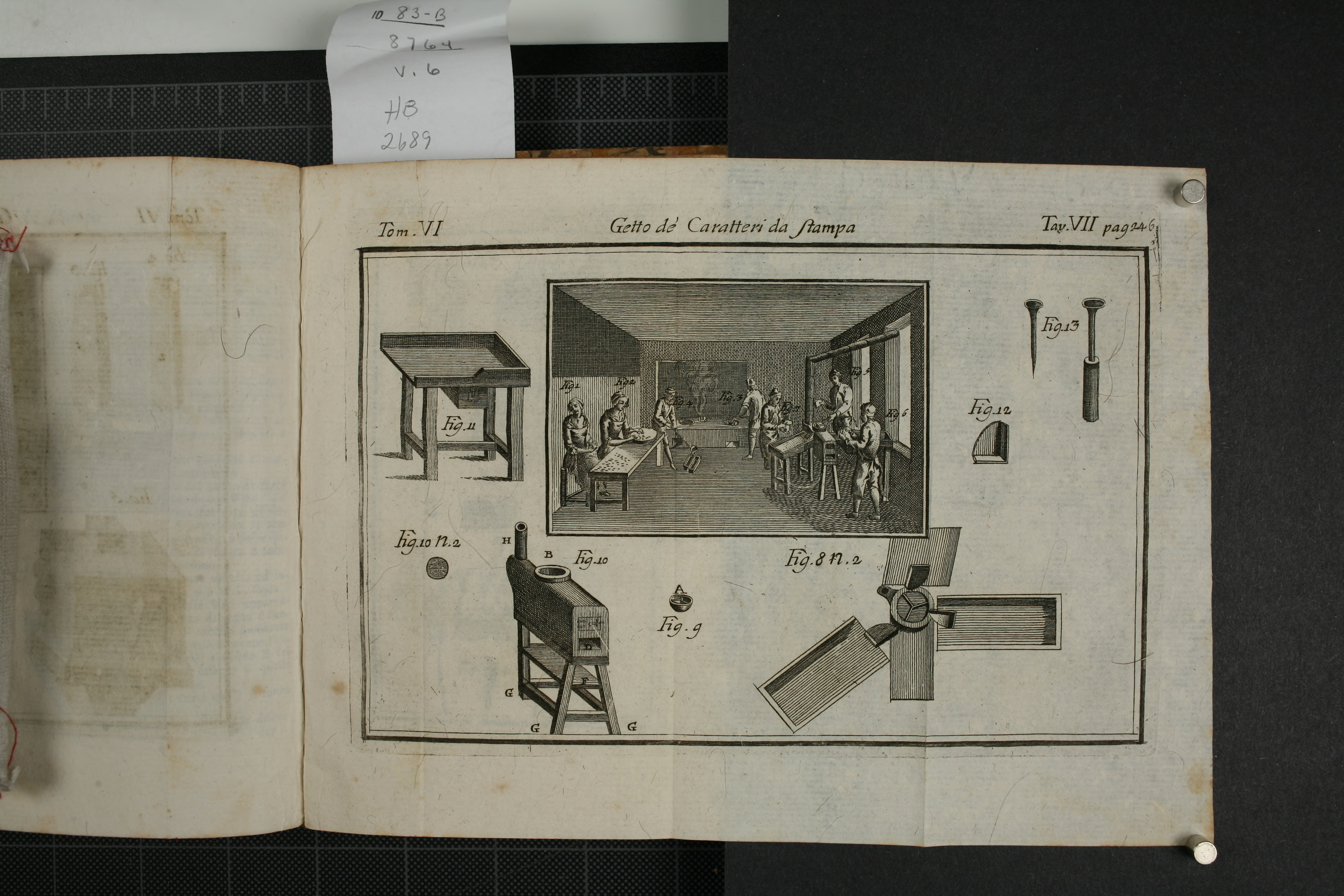
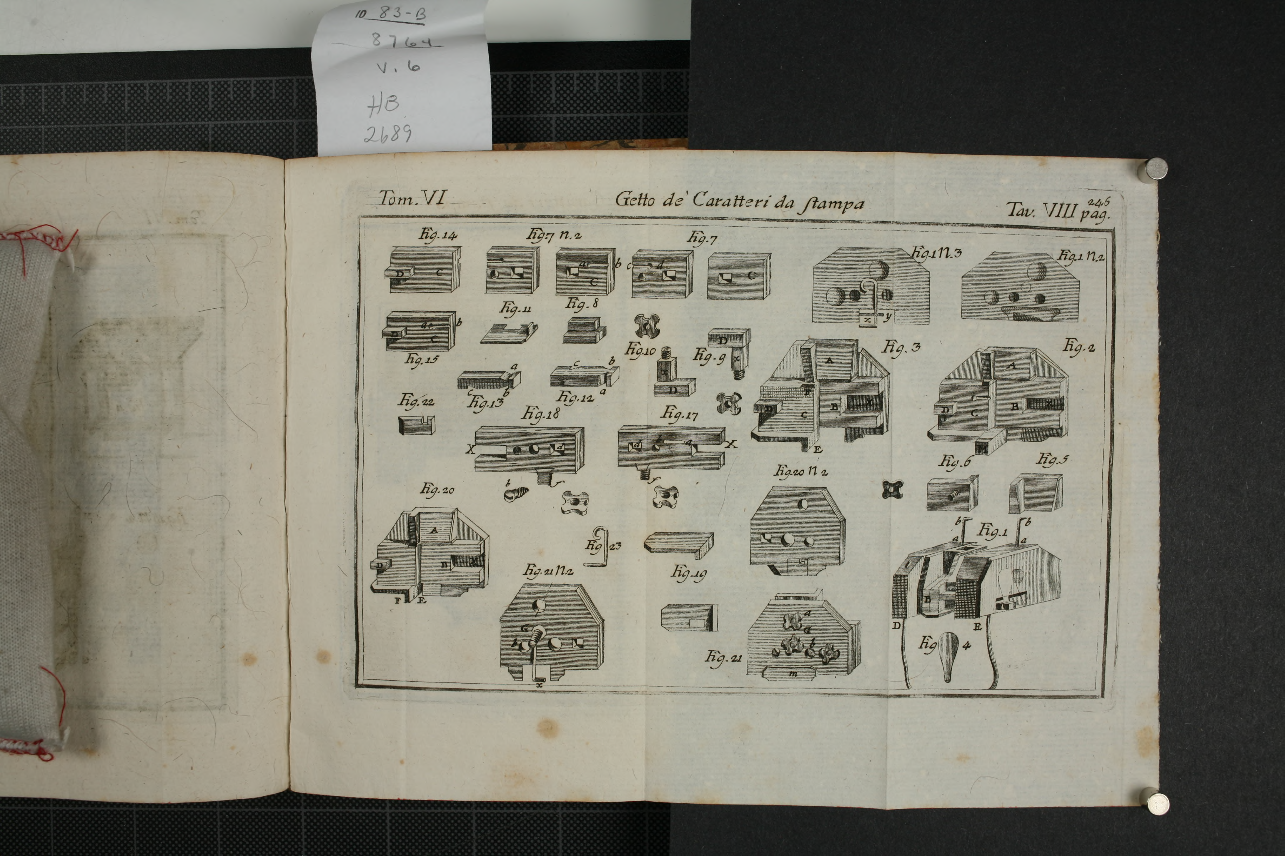
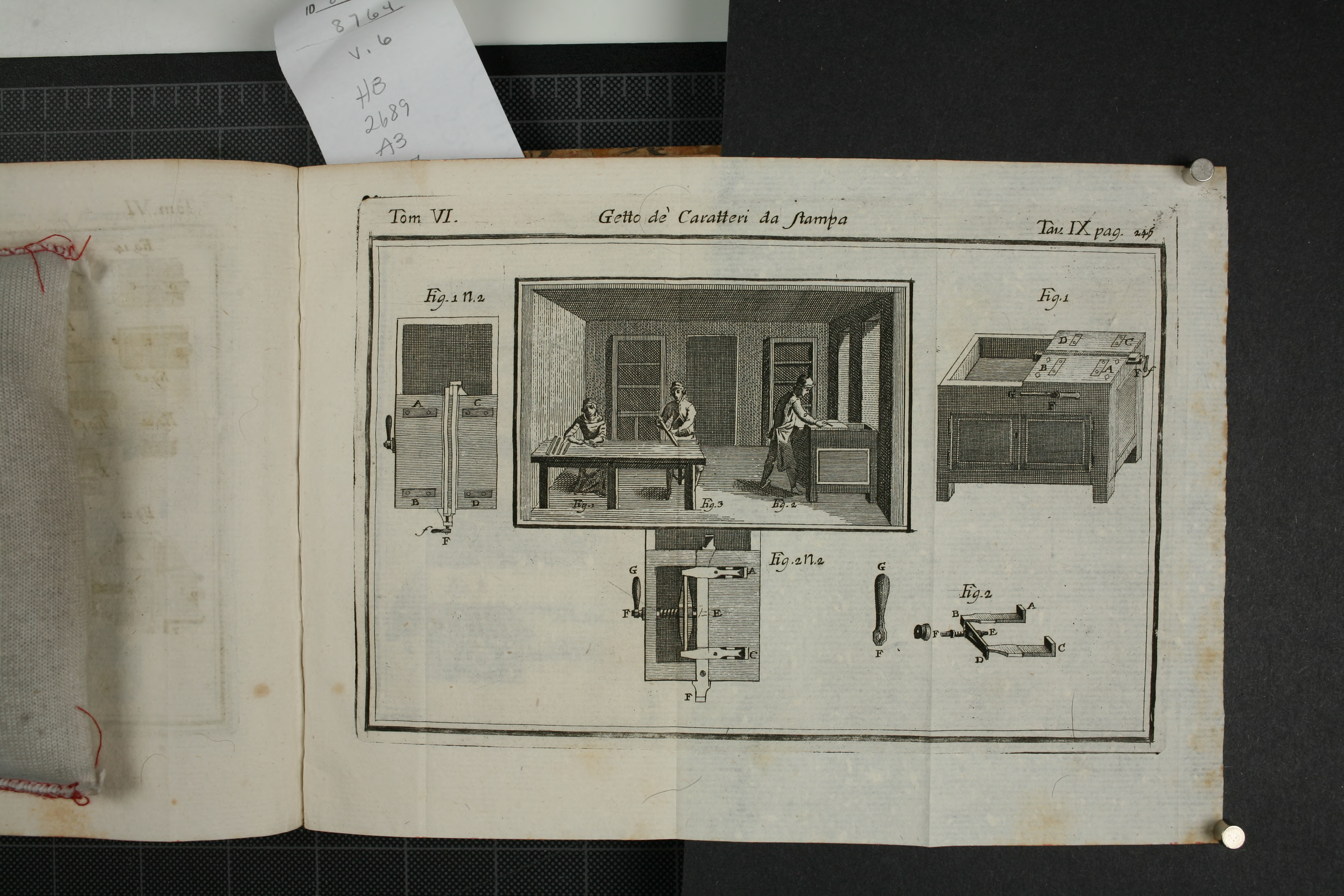
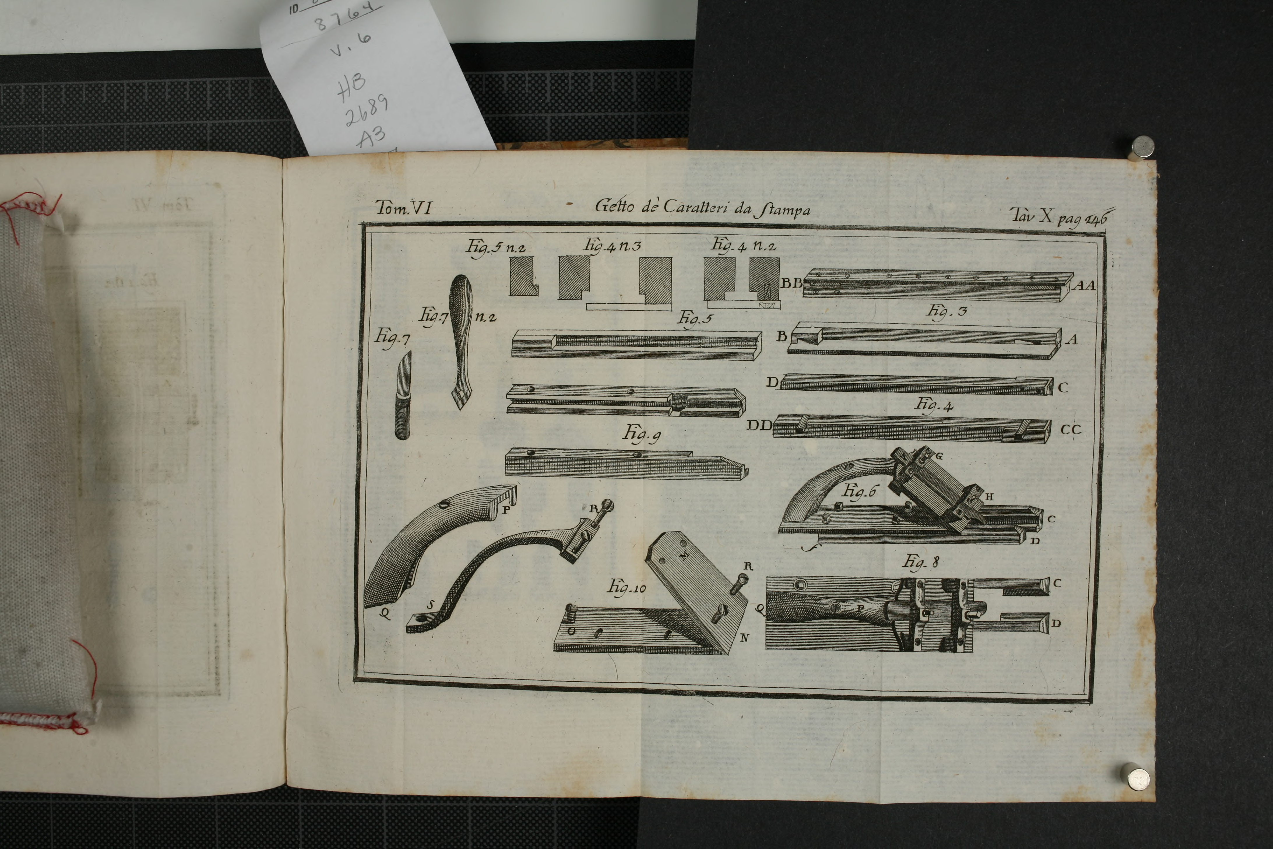
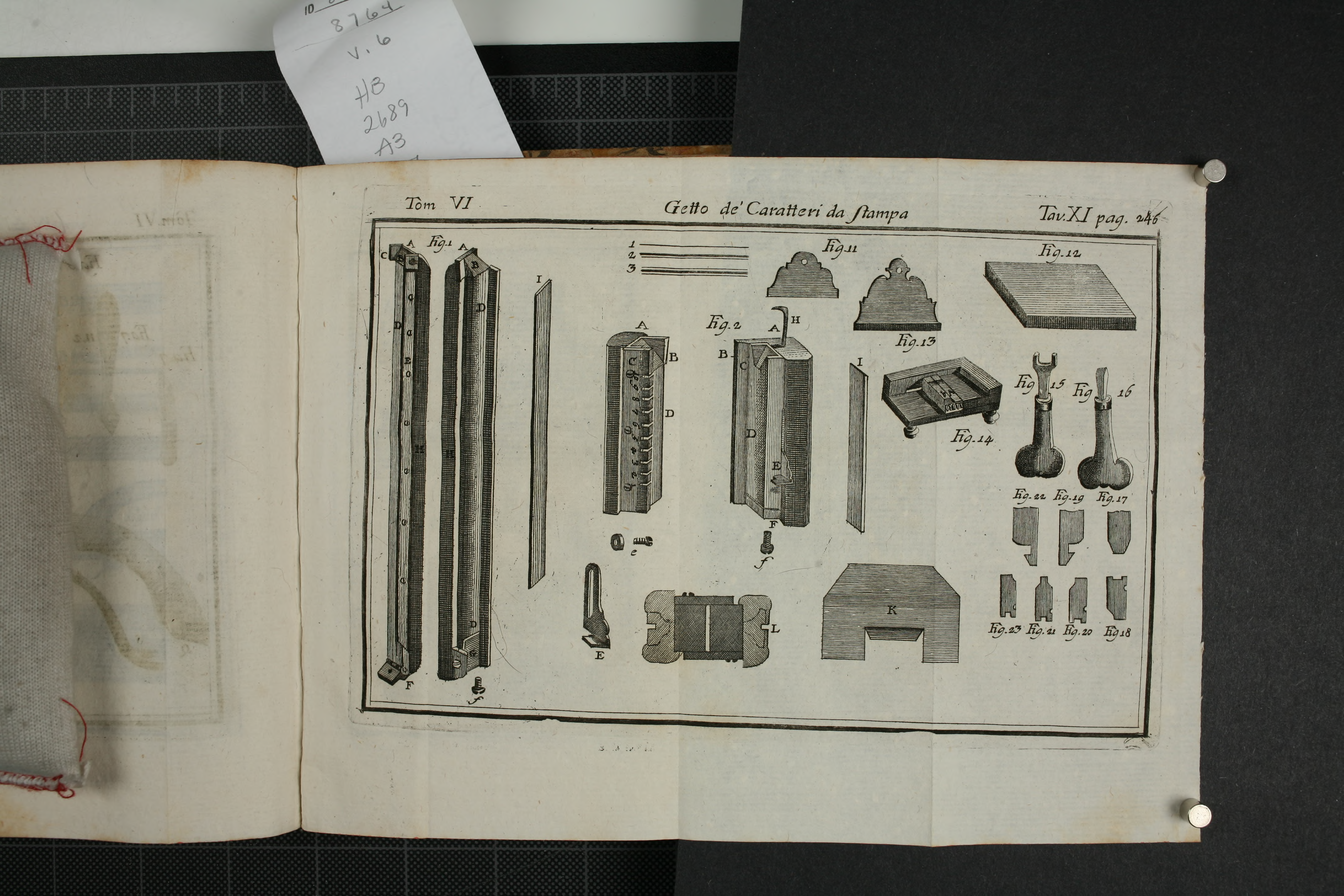
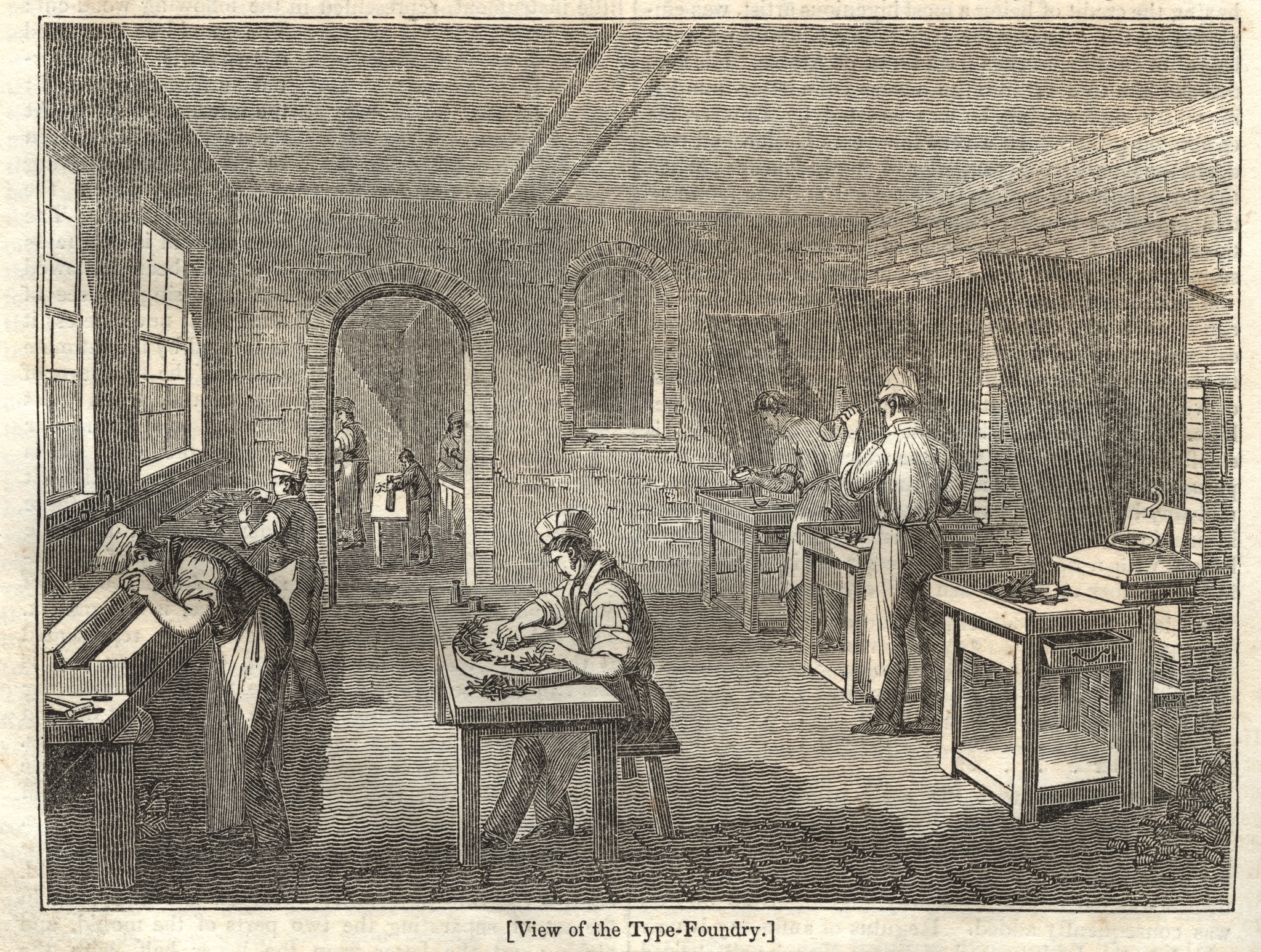
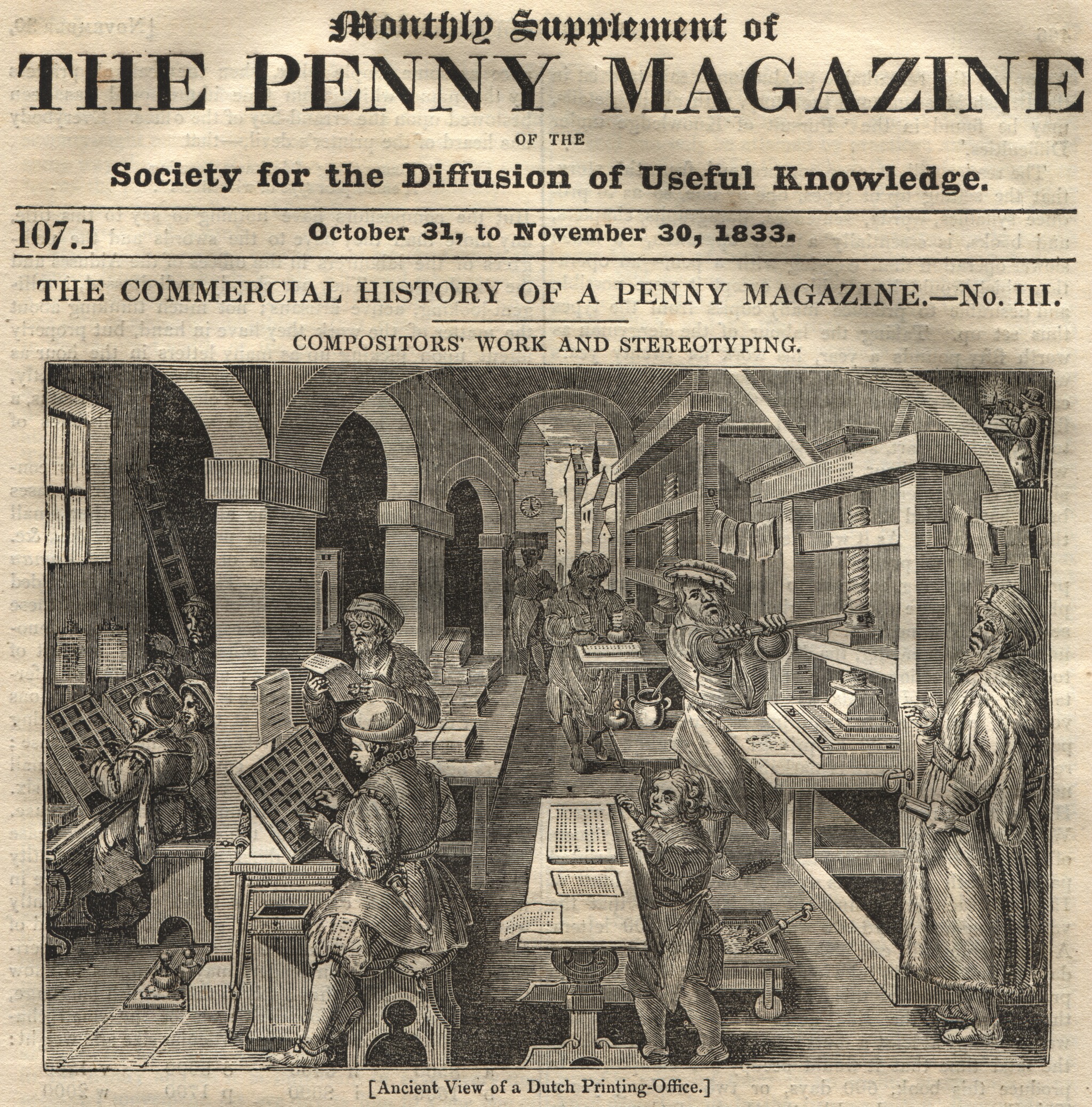
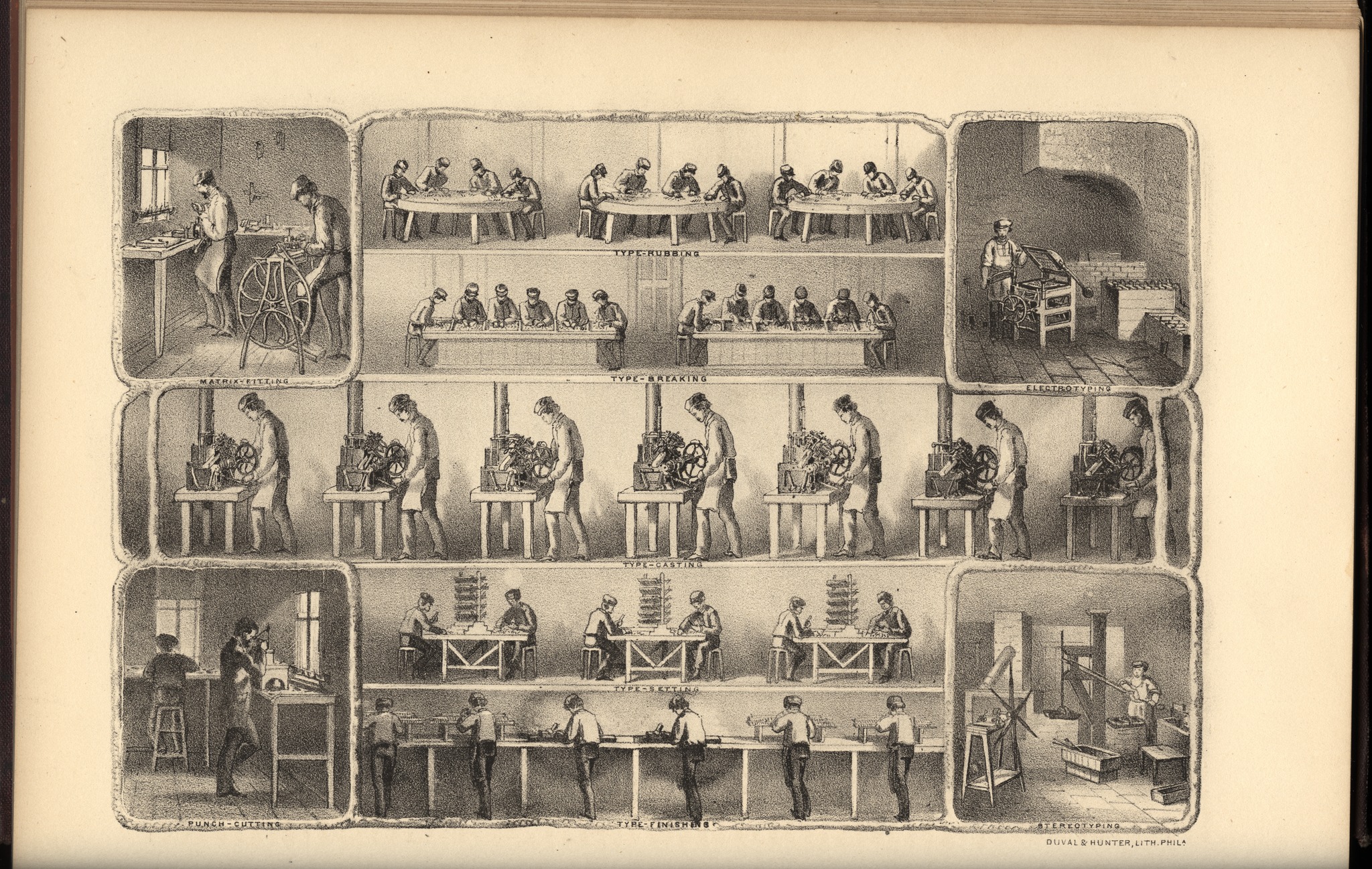
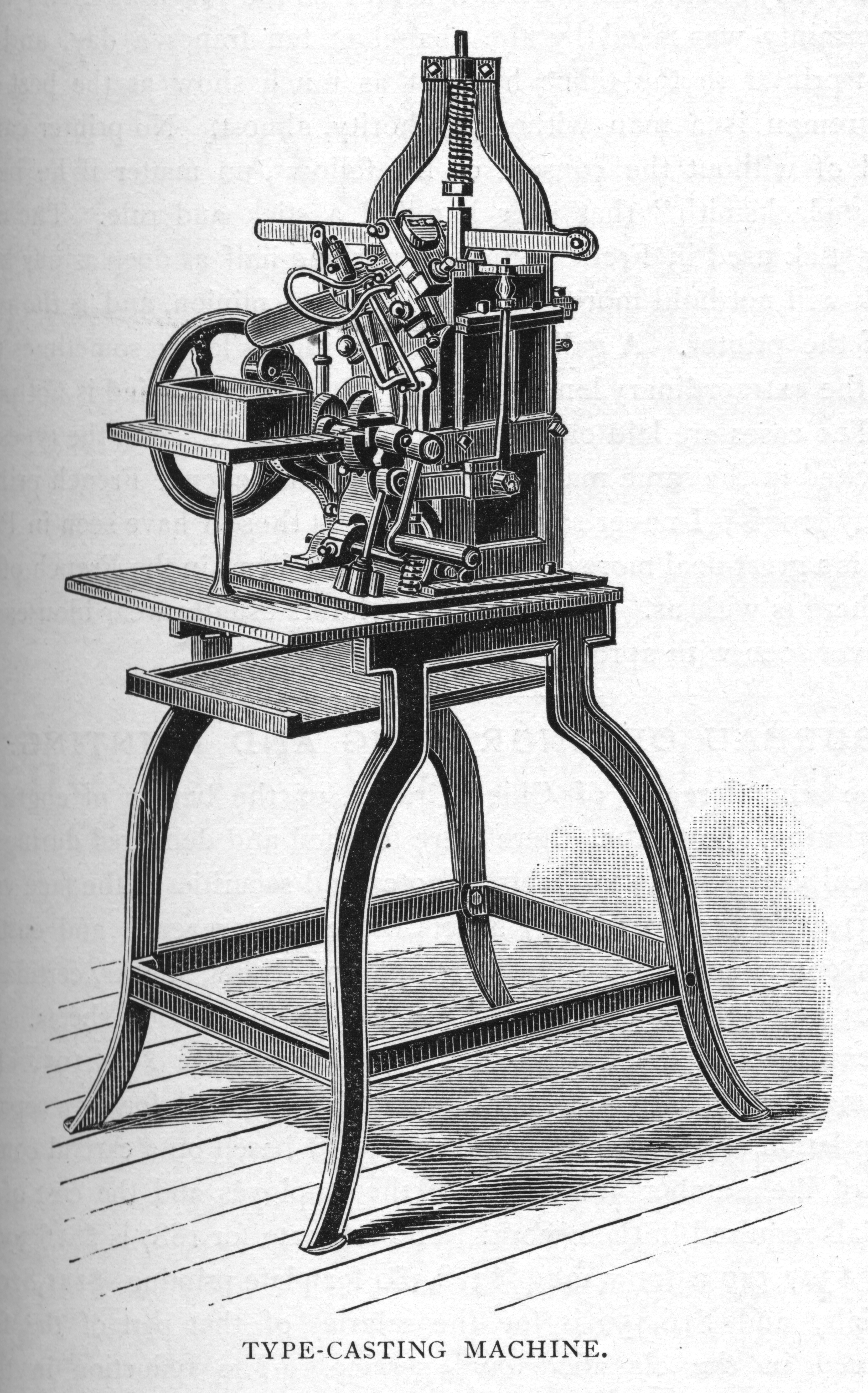
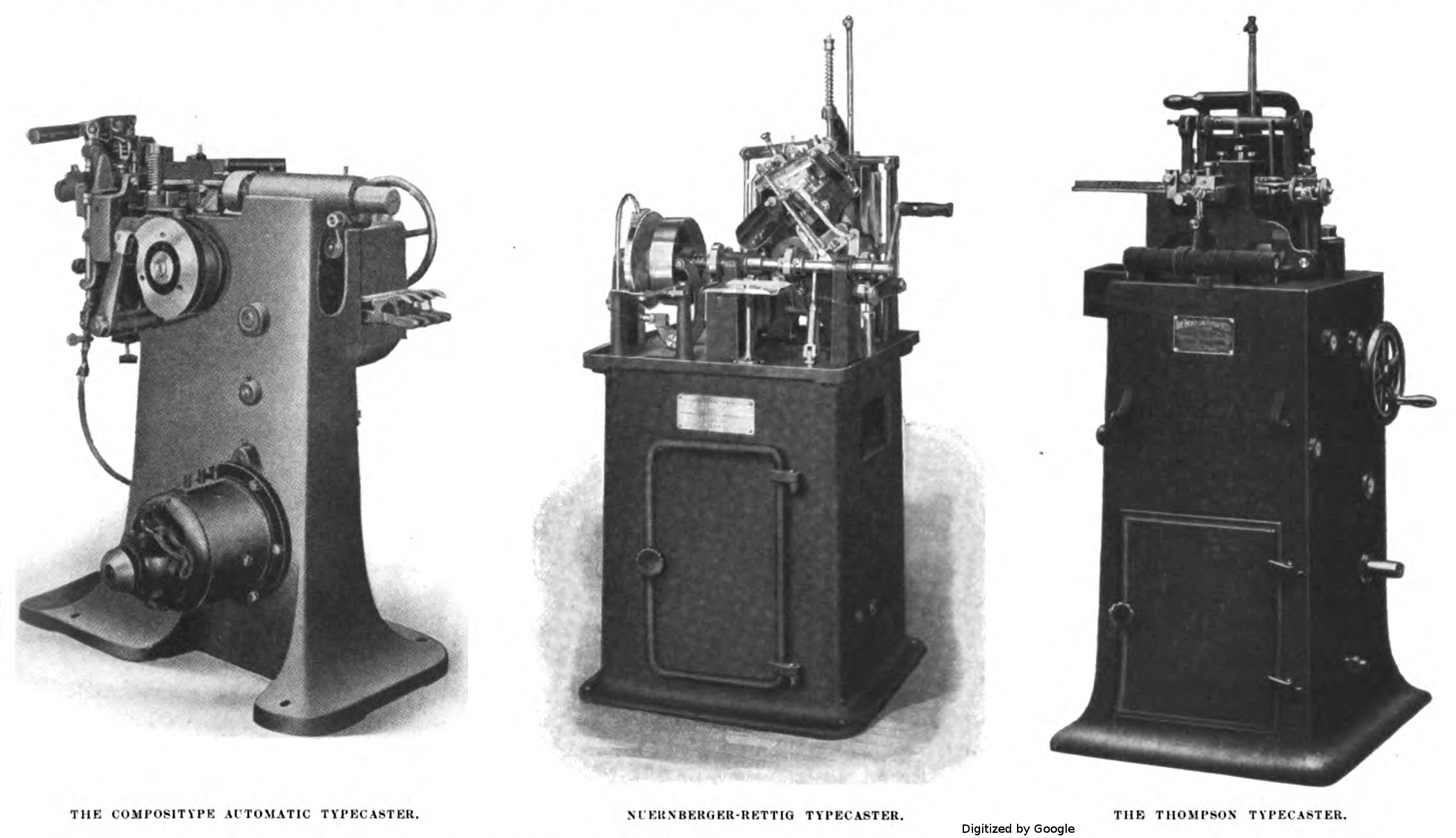
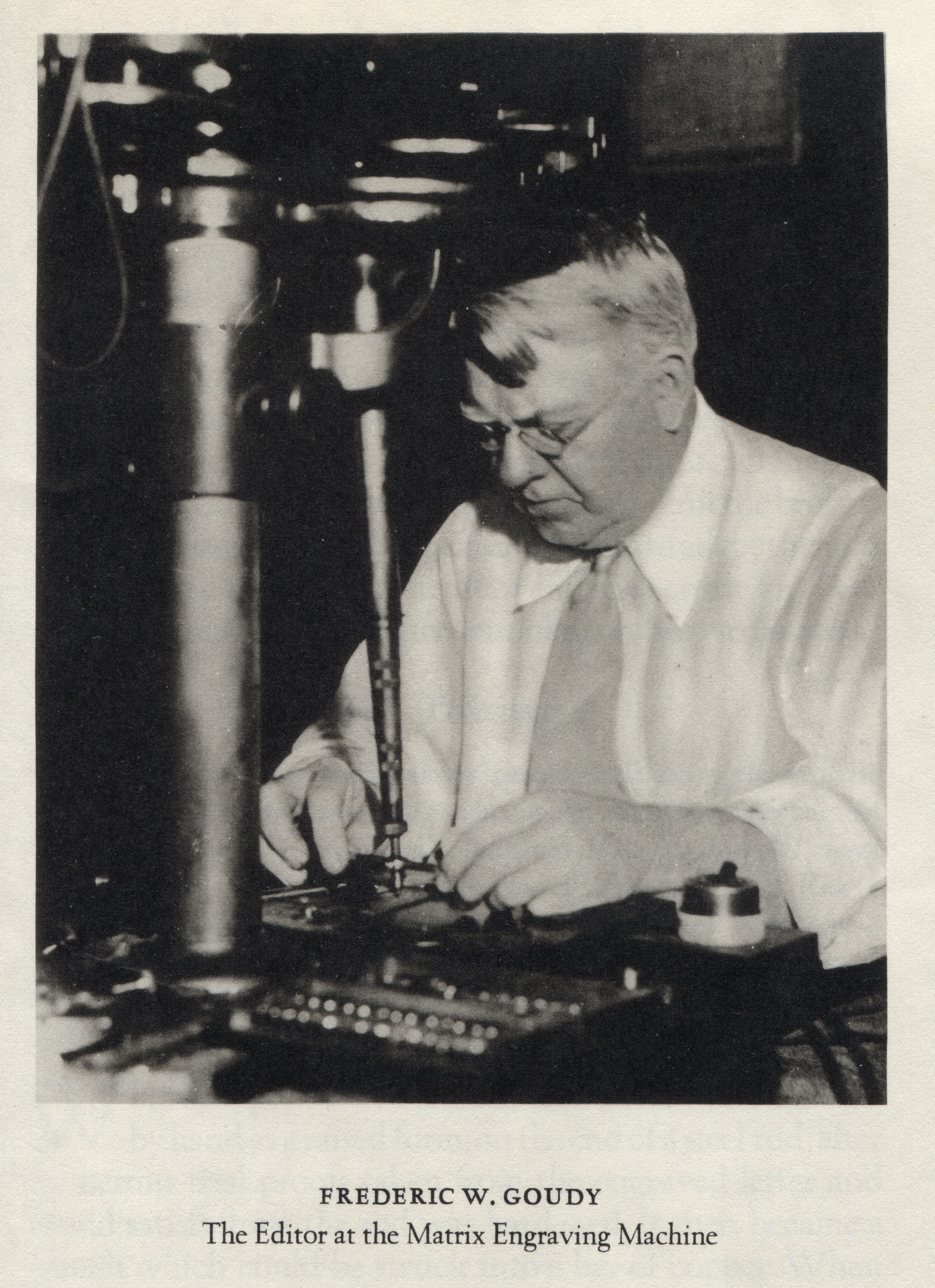
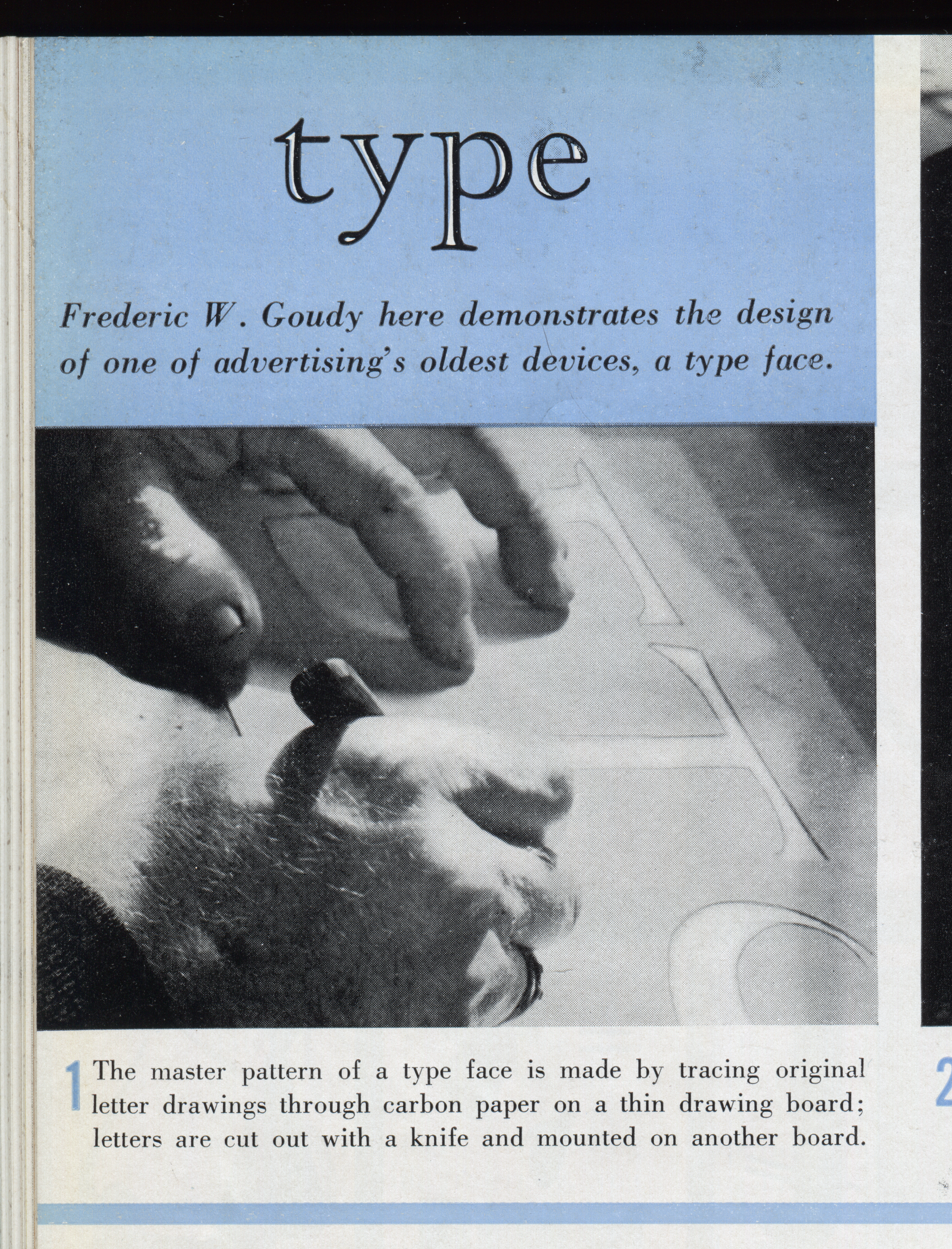
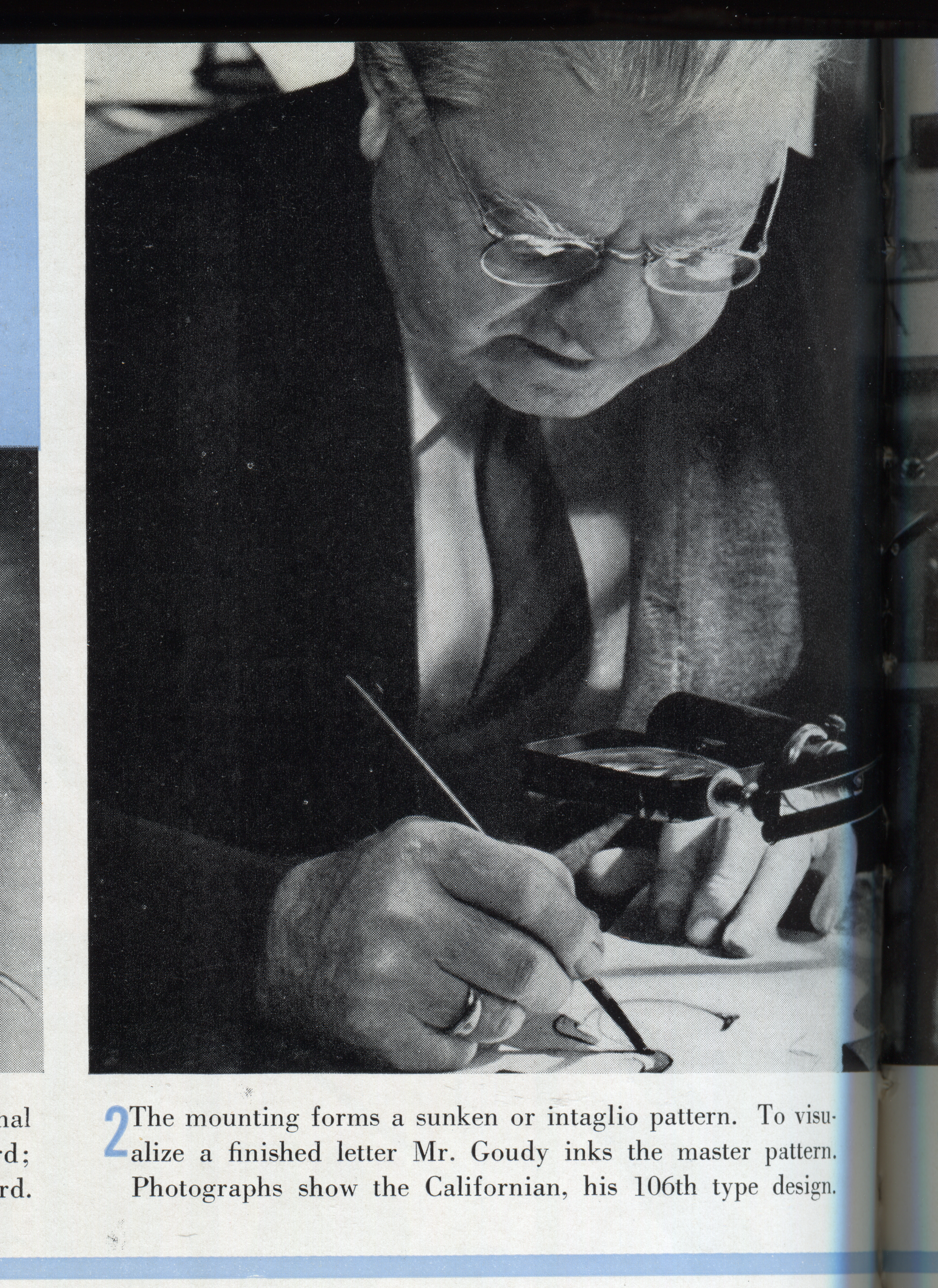
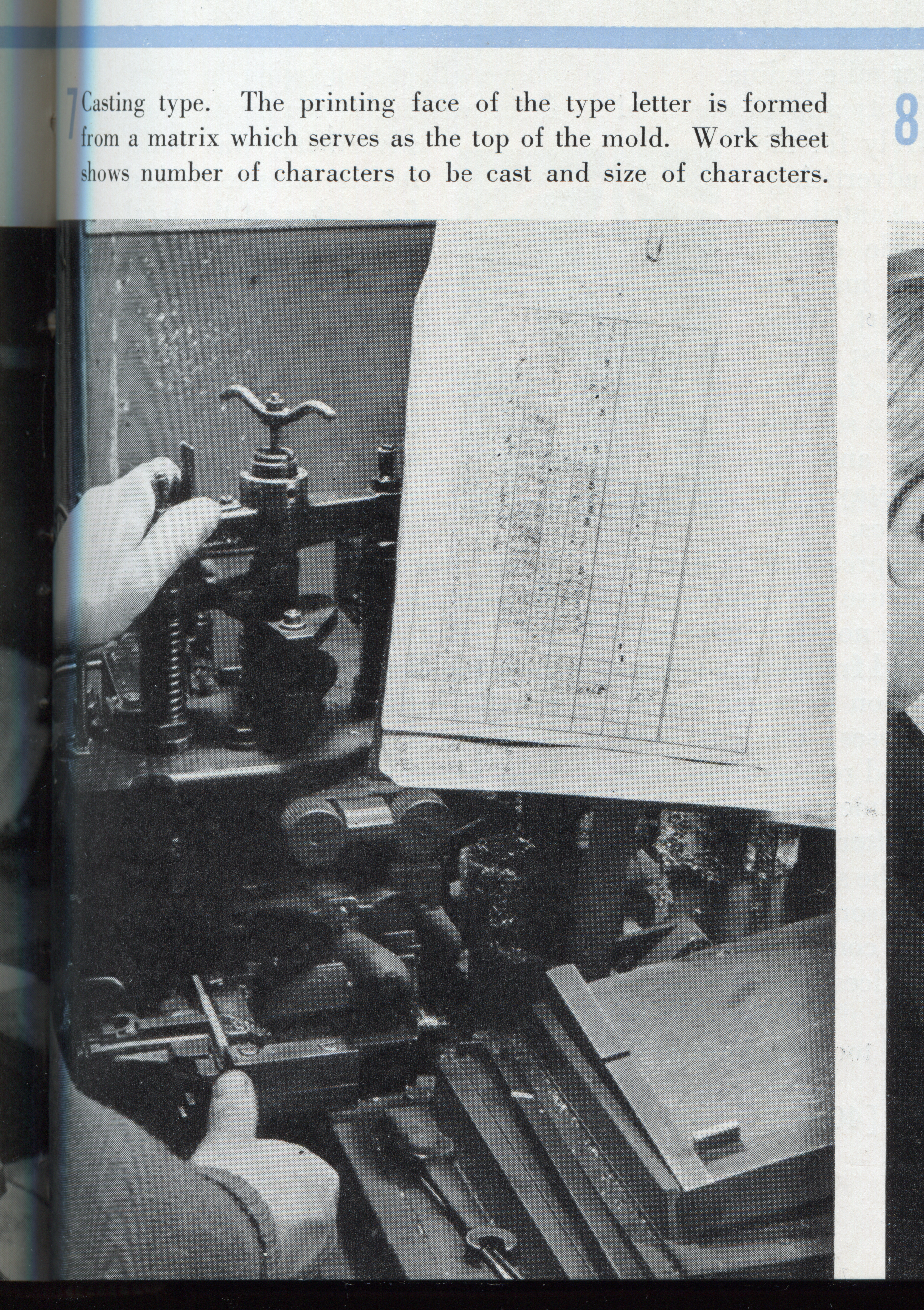
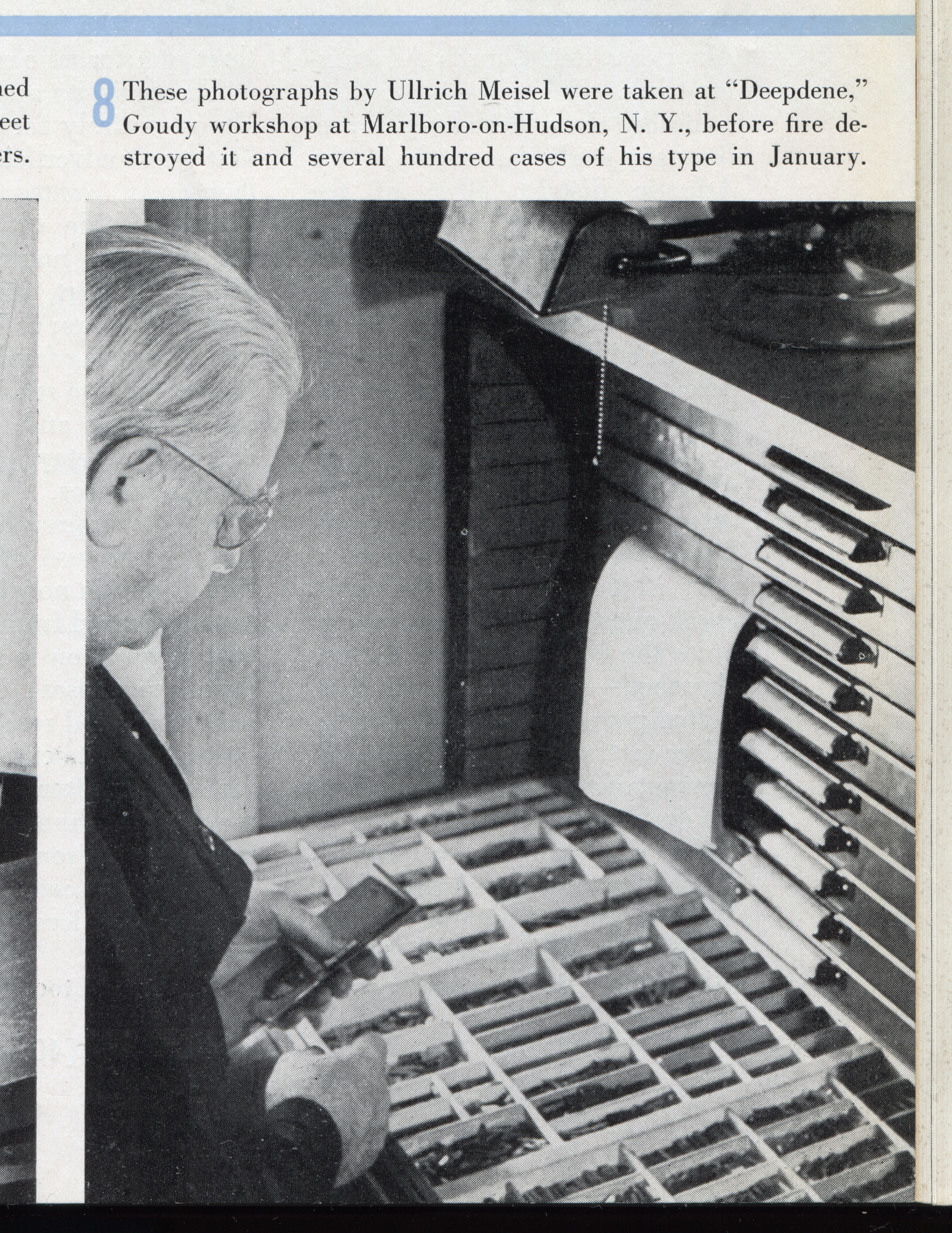

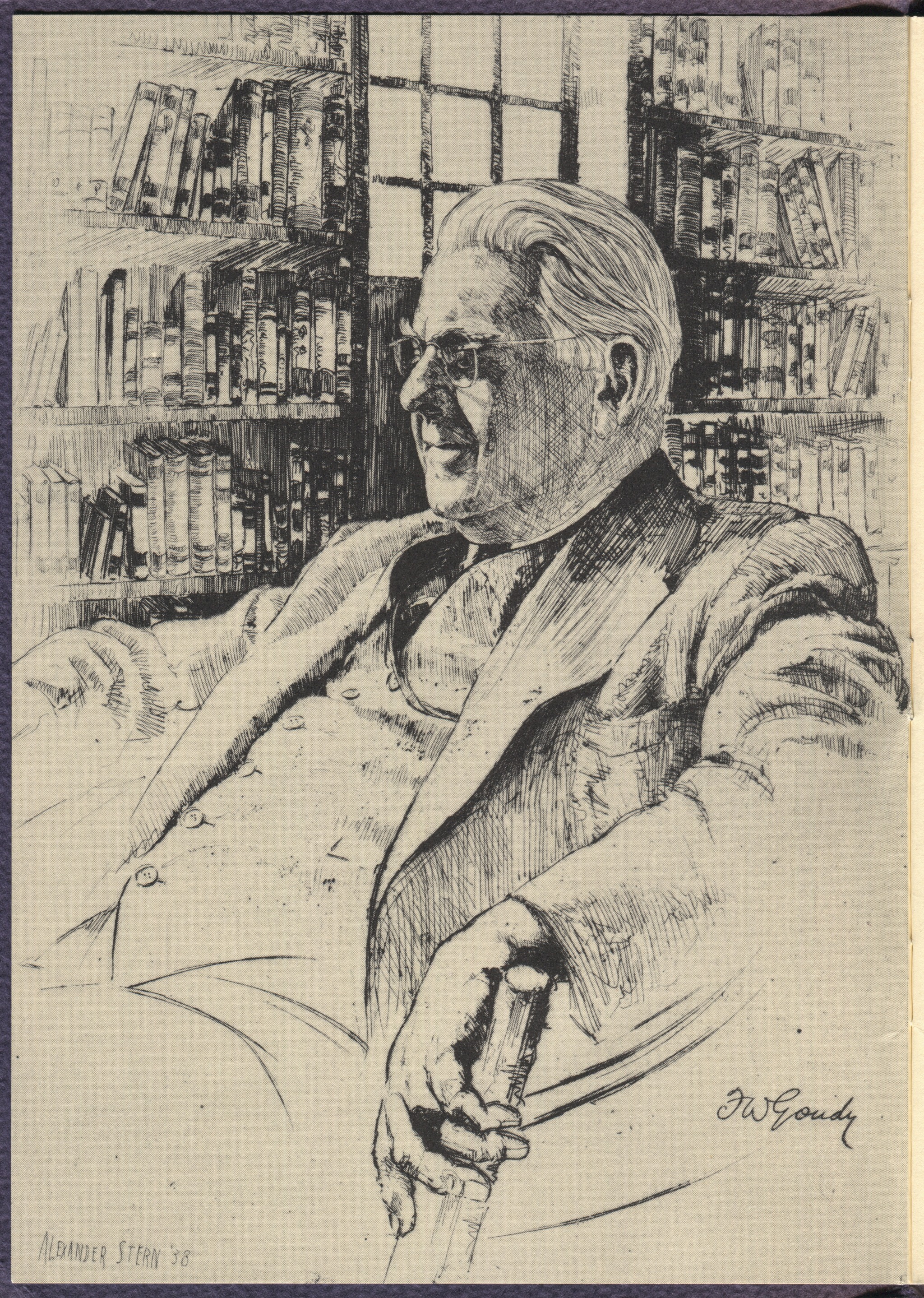
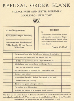


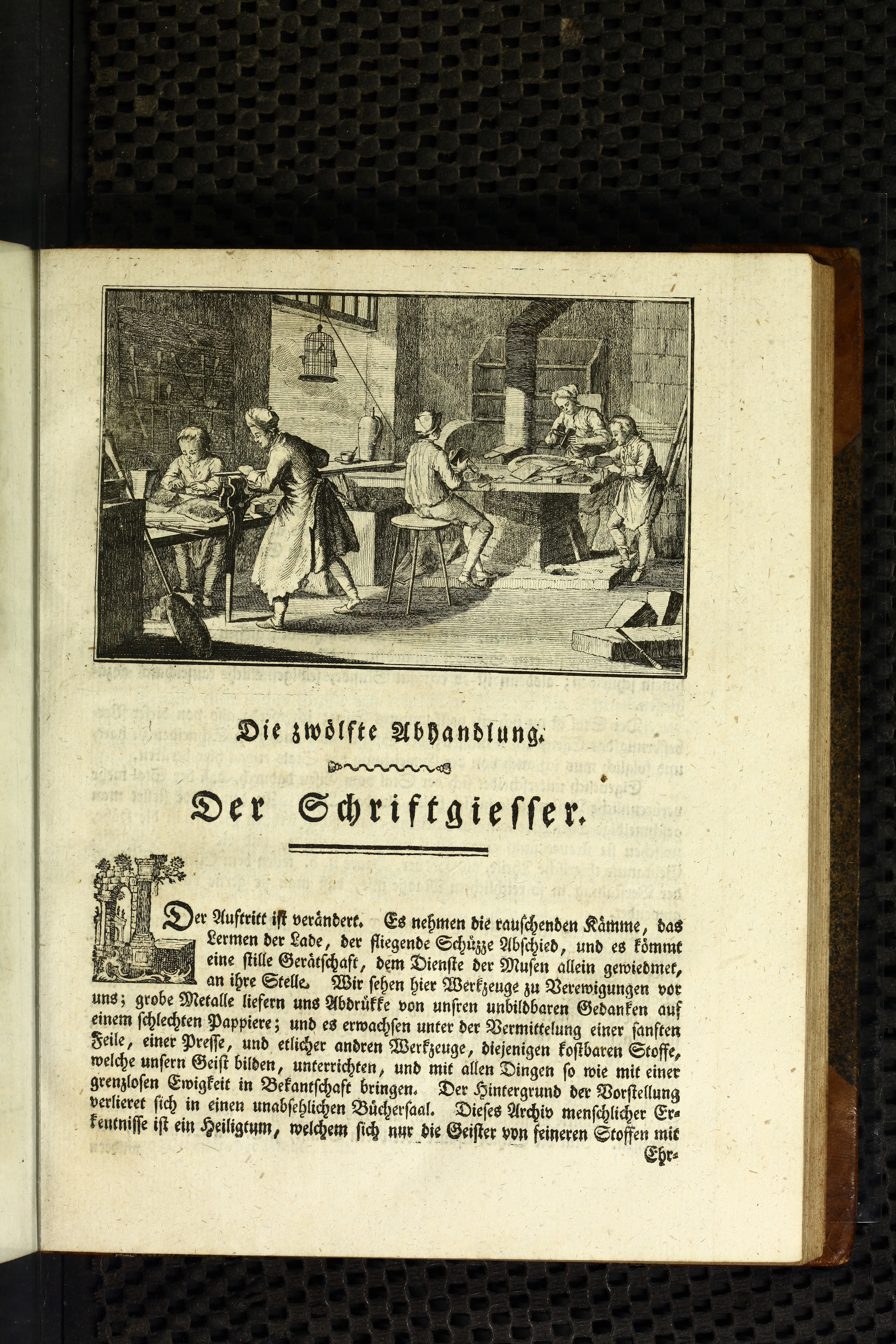
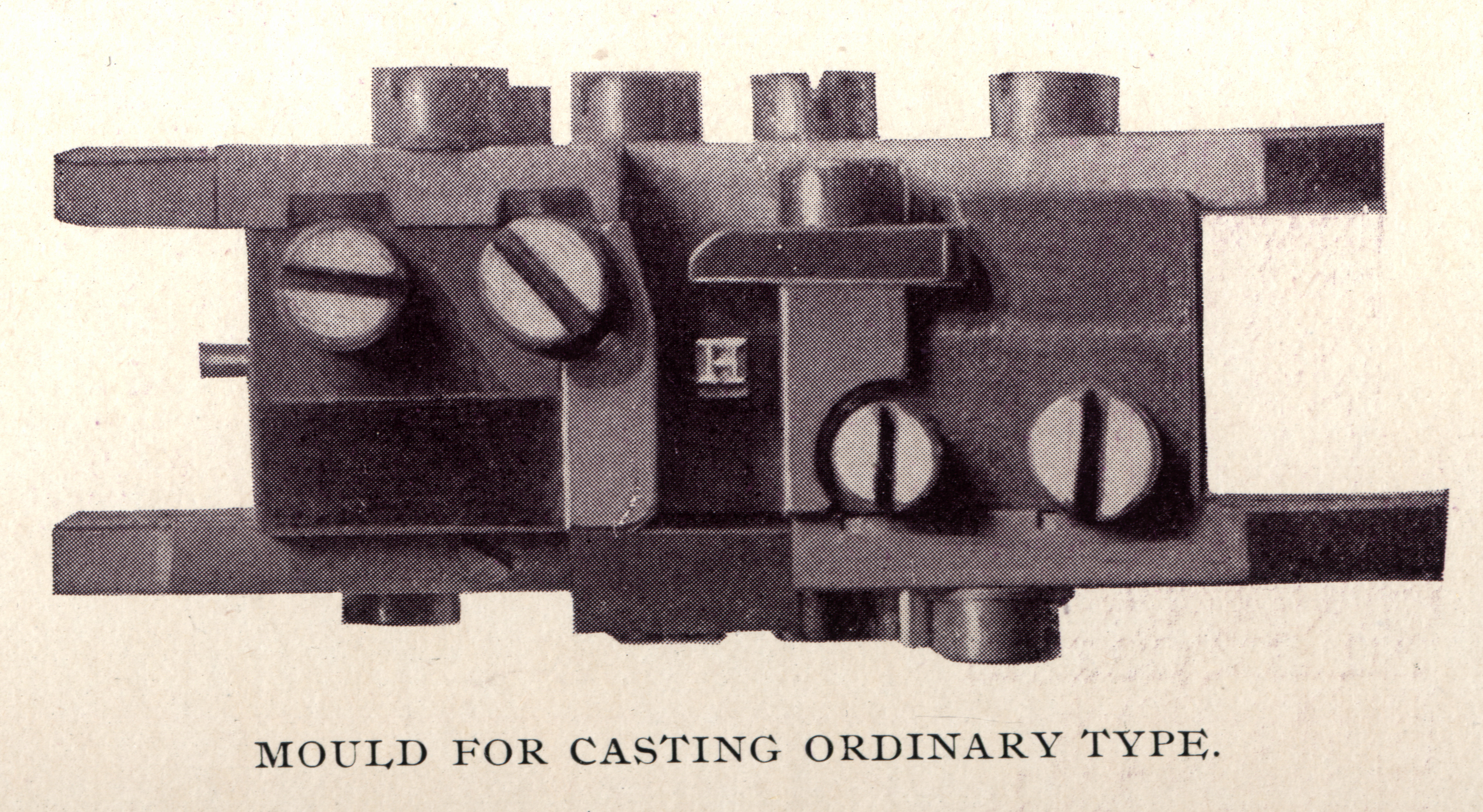
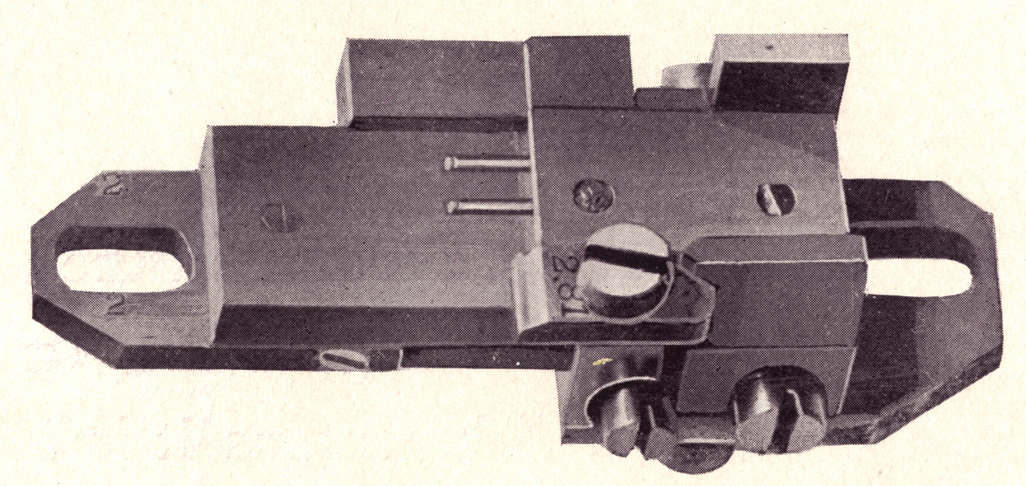
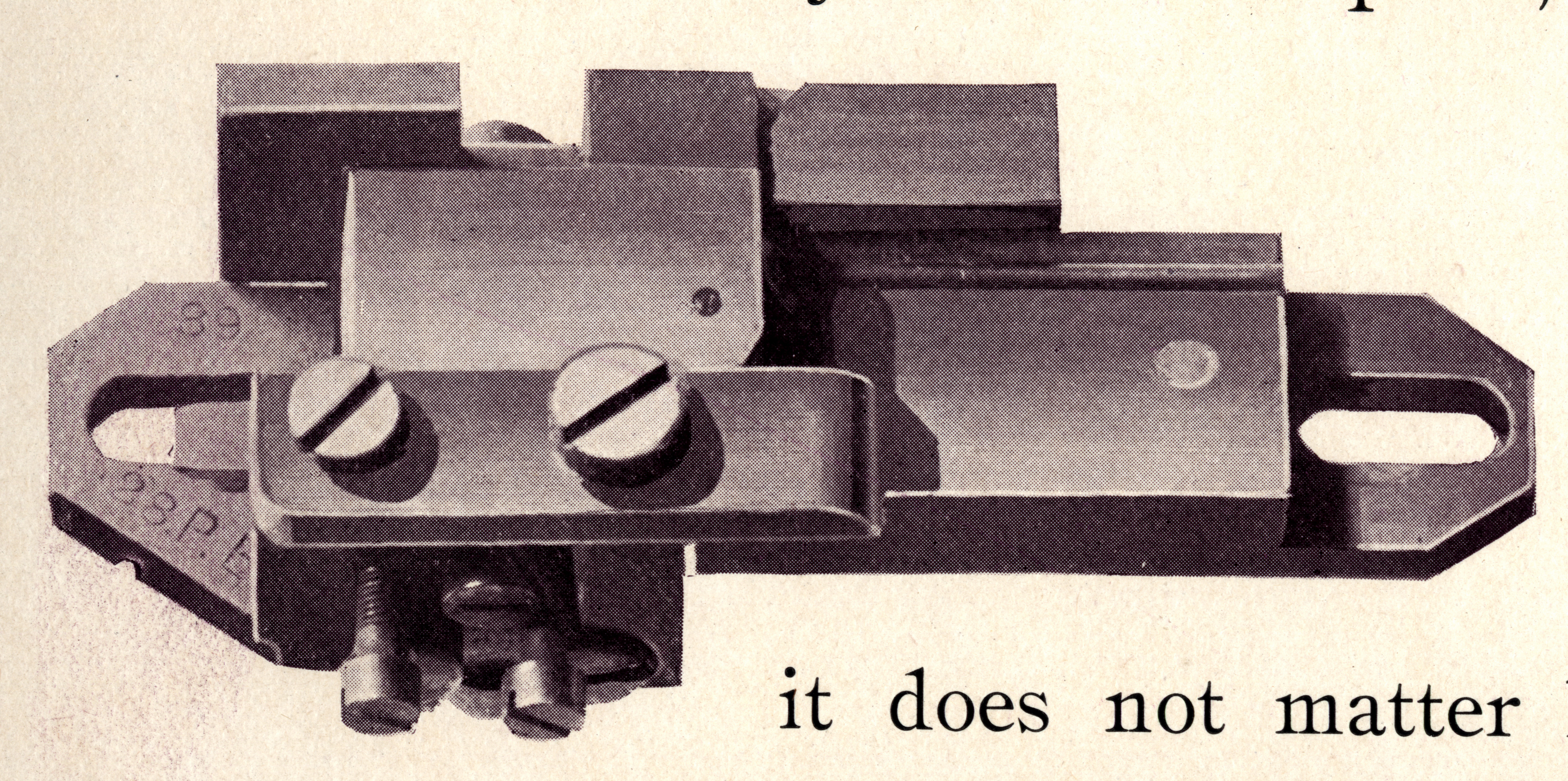
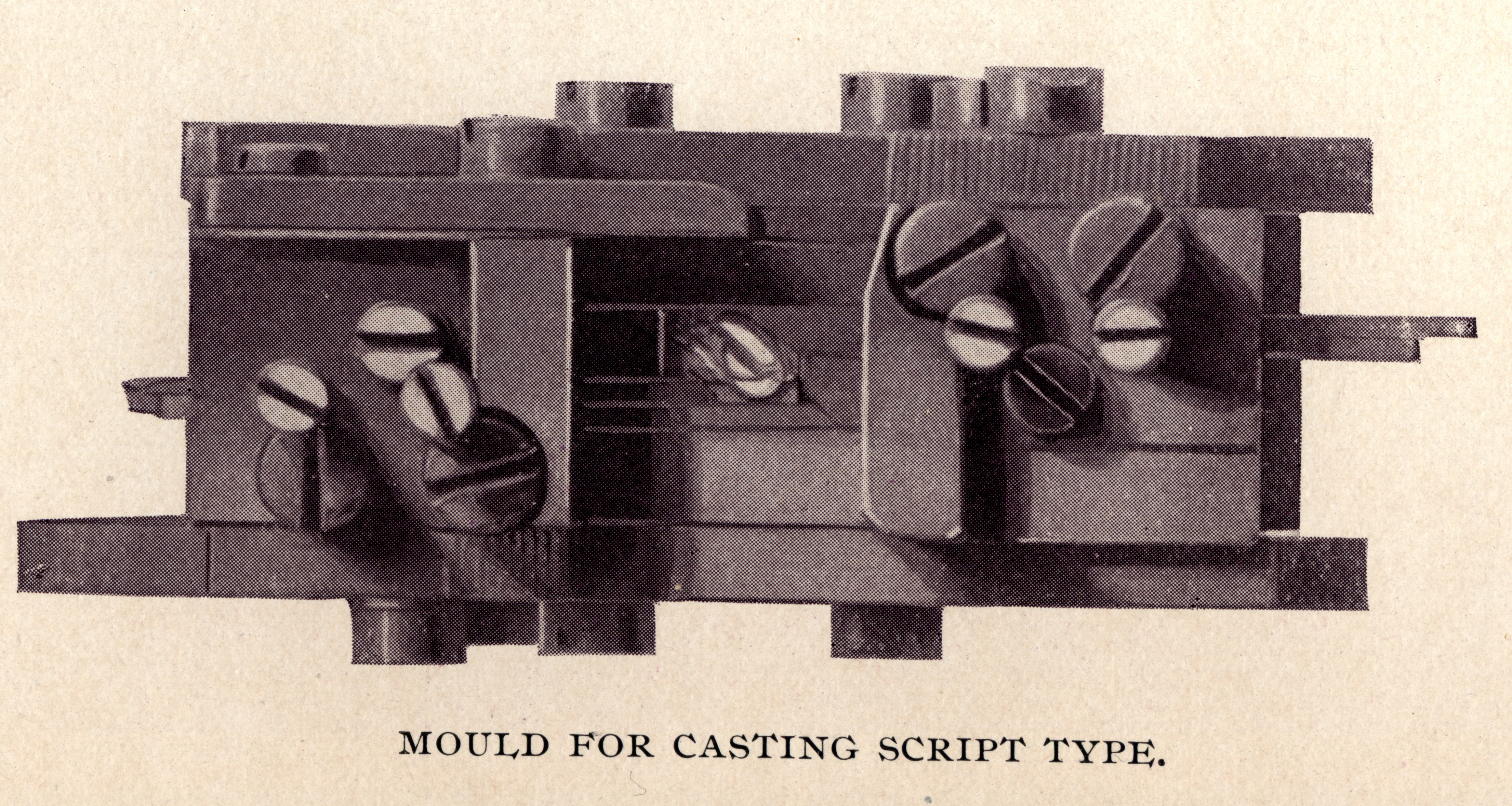
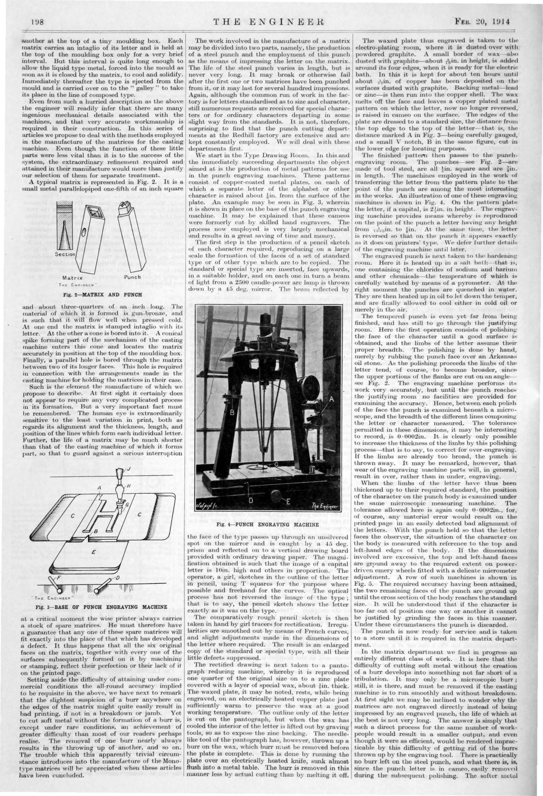
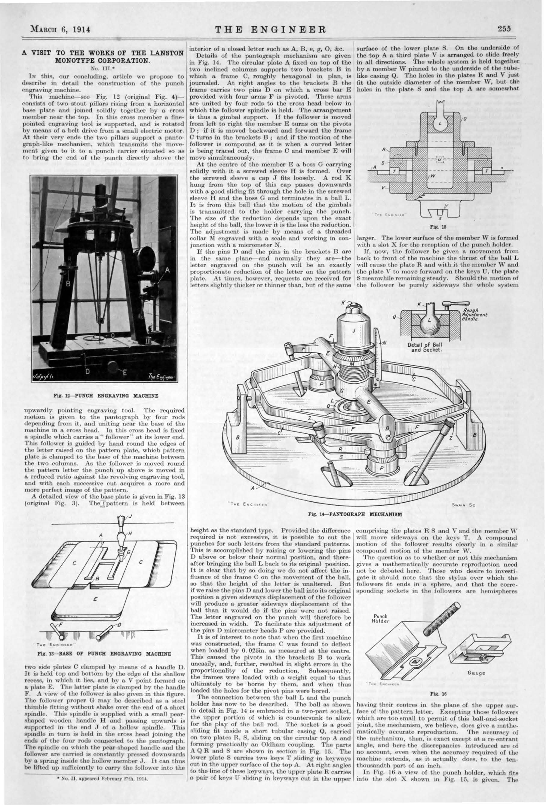
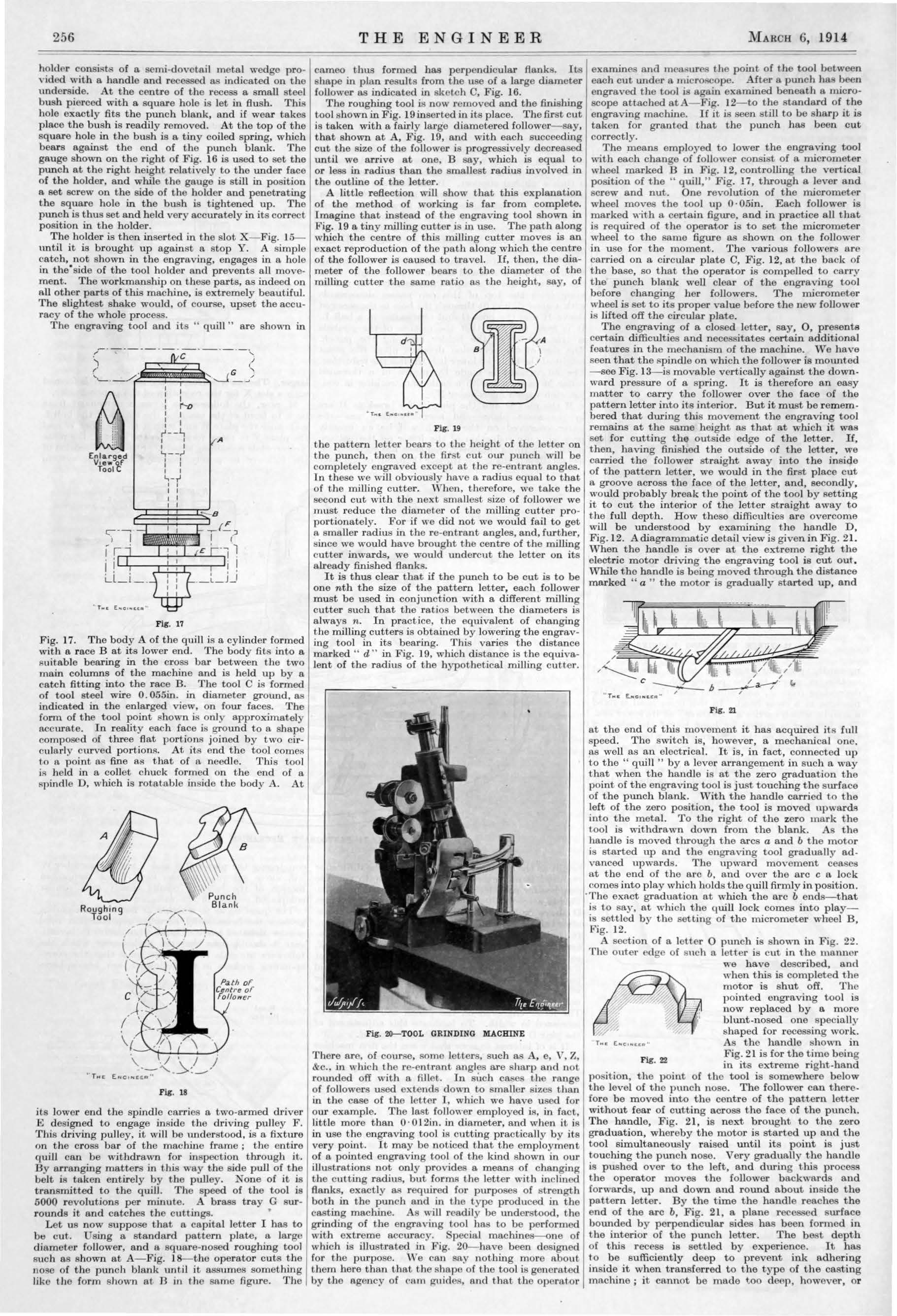
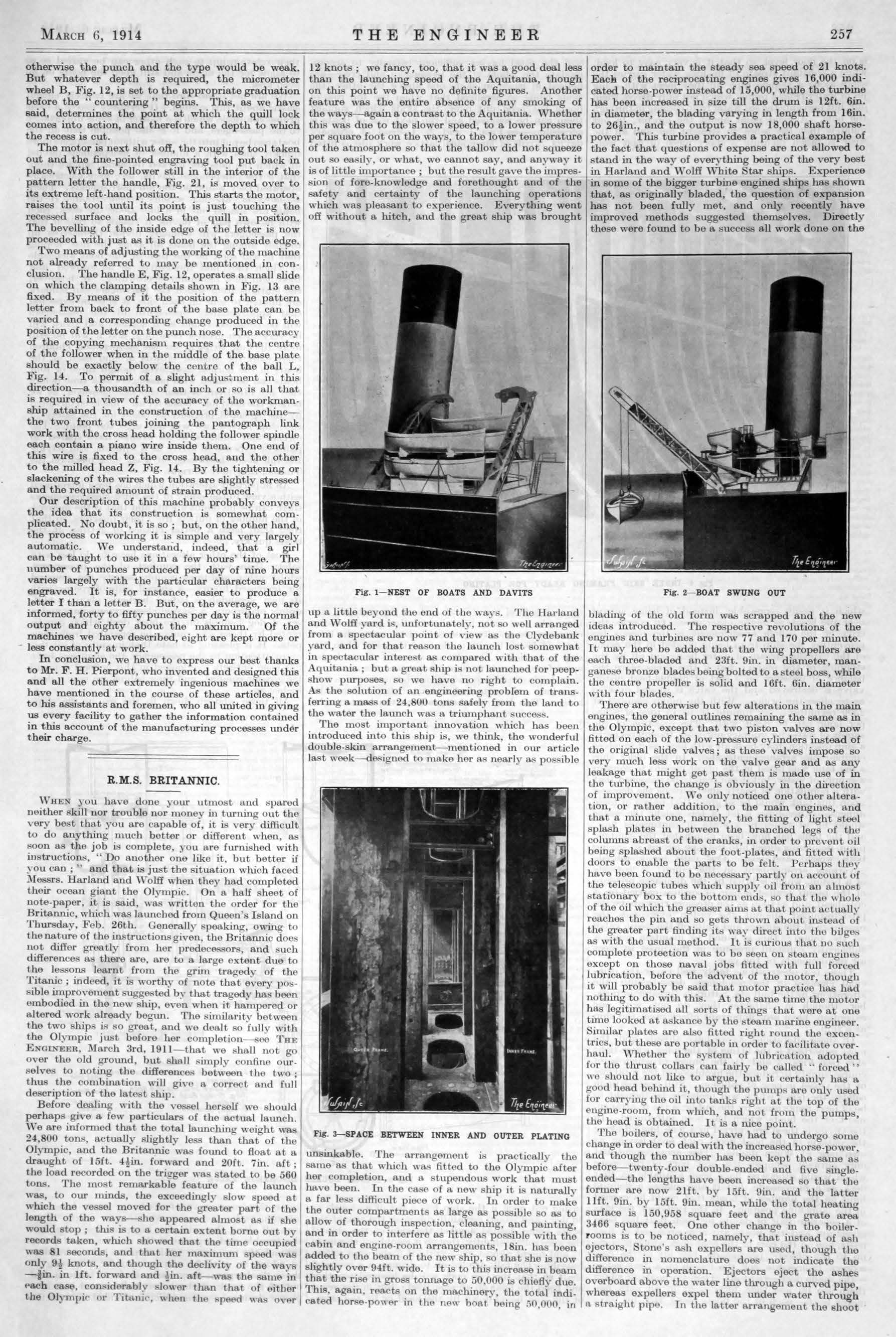